A Daily History of Holes, Dots, Lines, Science, History, Math, Physics, Art, the Unintentional Absurd, Architecture, Maps, Data Visualization, Blank and Missing Things, and so on. |1.6 million words, 7500 images, 4.9 million hits| Press & appearances in The Times, Le Figaro, Mensa, The Economist, The Guardian, Discovery News, Slate, Le Monde, Sci American Blogs, Le Pont, and many other places… 5000+ total posts since 2008.

Category: Art

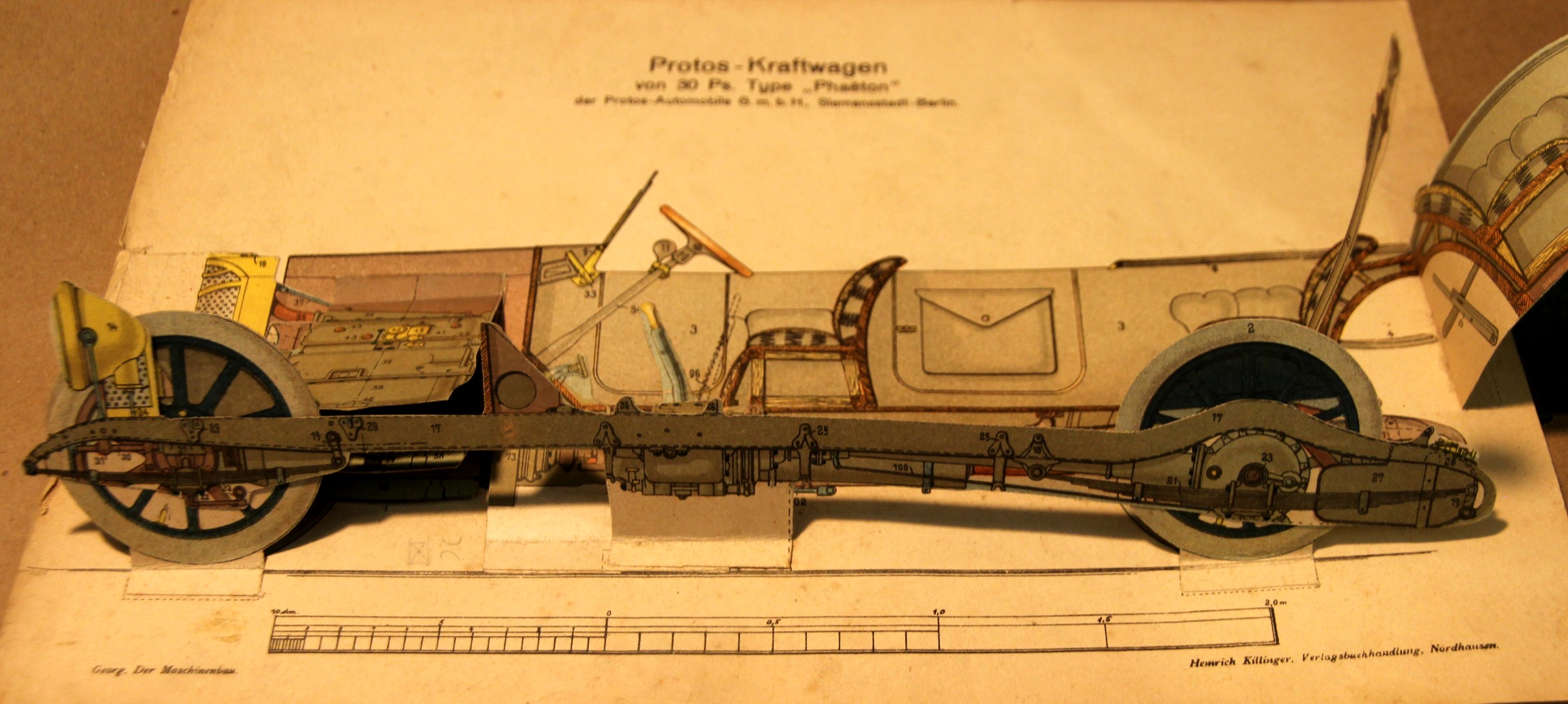
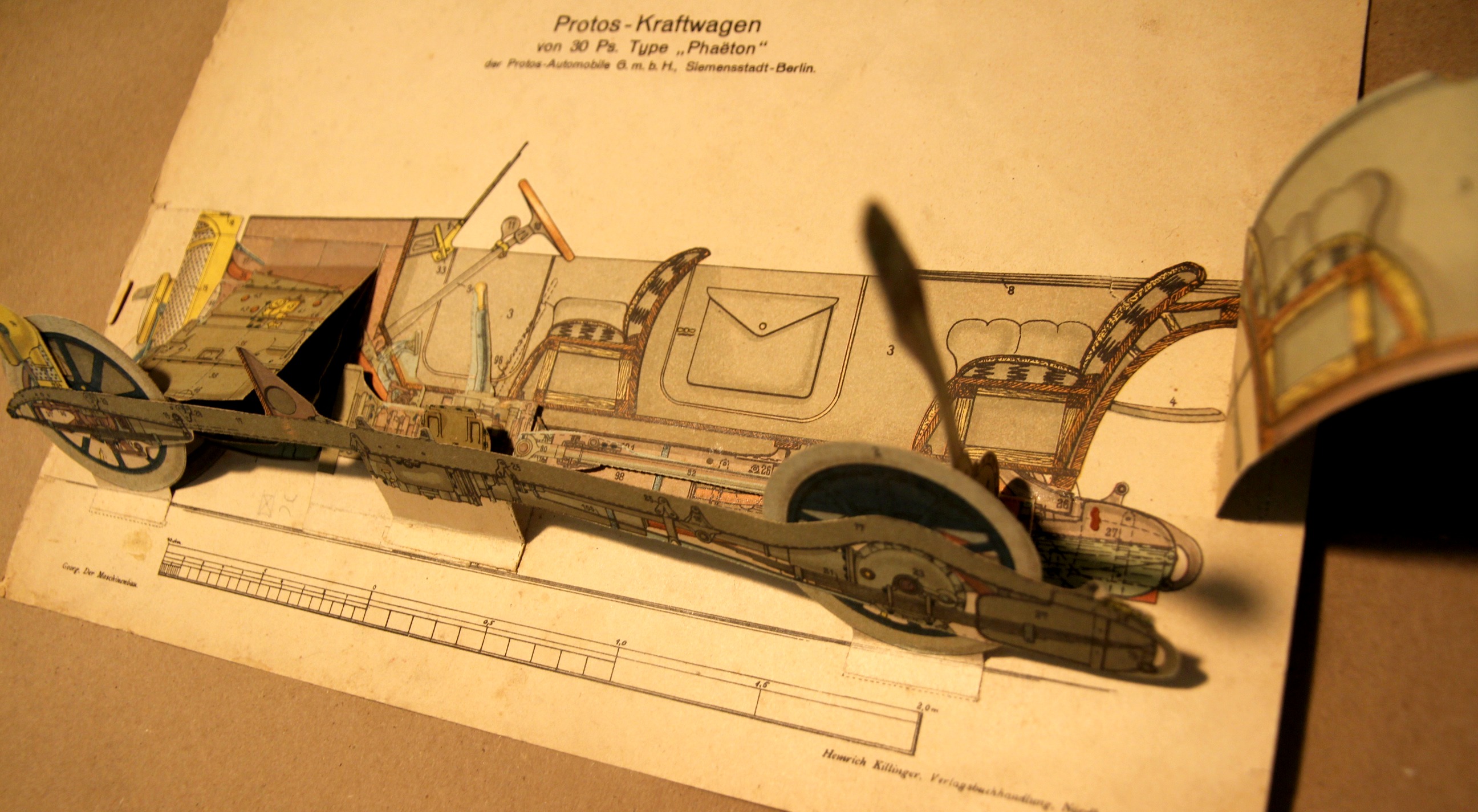
  • Paper Love–Moveable Paper Prints: the Protos Automobile, 1925

    JF Ptak Science Books  Quick Post

    The moveable book (flapbook) has long been interesting to me–unfortunate though that in my own fields they weren’t used very often. There are some very notable exceptions–early geometries would occasionally be published with many of the geometric illustrations made to pull out a little with the tug of a string to show you the construction in 3-D. Then of course there are the paper dissection manikins, where you can find nearly-life-sized paper anatomies with hundreds of movable/liftable flaps, and smaller examples of the body and specific organs that can be simple or not simple whatsoever.  These were time-intensive efforts, and in their own way they provided a sort of pre-MRI MRI by revealing the various layers of 3-D objects with 2-D tools–and they’re beautiful and captivating objects.

    (And this example is for sale at the blog bookstore, here.)

    Moveable_car_3

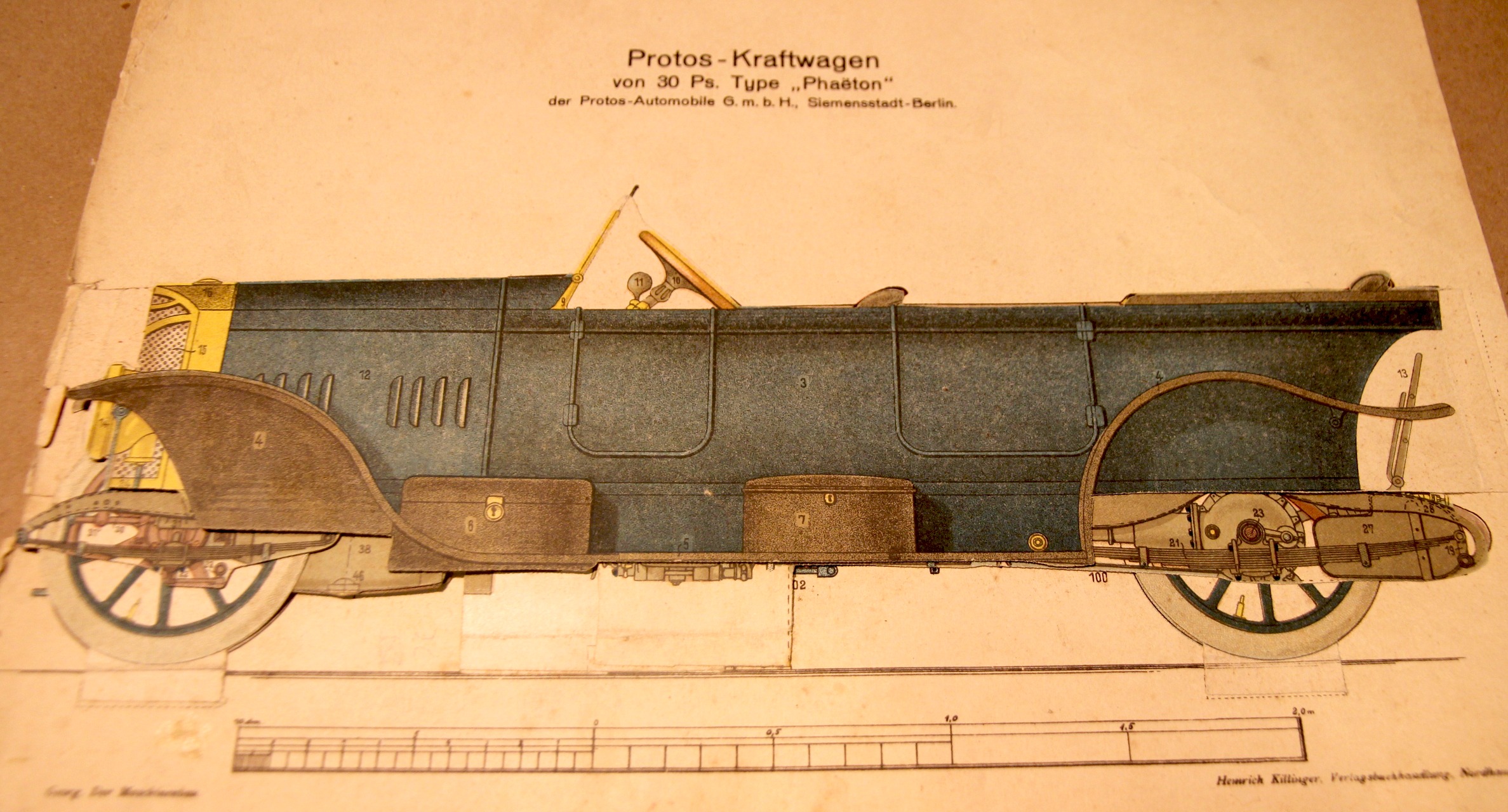
    This plate appears in Der Maschinenbau. Modelle.Zeichenerklärungen zu den Modellen des Werkes, by R. Georg, printed by Heinrich Killinger in Nordhausen in 1925.  The major detraction here is an old 5-inch tear that has been repaired verso with aacid-free tape, otherwise in nice condition. 

    The full image, “unmoved”:

    Moveable_car

    Moveable_car_2_


  • What Everything Sold for in the Armory Show, 1913

    JF Ptak Science Books  Post 2352

    Between 17 February and 15 March 1913 there occurred in the huge building at Lex between 25th and 26th streets in NYC–the monumental International Exhibition of Modern Art at the armory of the Sixty-Ninth Regiment, the Fighting 69th (so called by Robert E. Lee), the “Fighting Irish”, the famous Armory Show, the Armory Show.  This was the first large public exhibition of modern art in America, and even though the 69th regiment had seen five wars (at least, so far as I can tell), the armory itself hadn’t really seen one, until 1913, when battle lines were drawn among the Cubists and within and without the confines of the modern” part of modern art, the sensitive honor of the nature of art laid bare.  

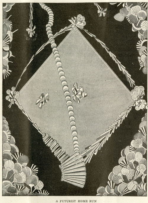
    FuturistHomeRun-LIFE2[Source: the New York Historical Society’s excellent 100th anniversary celebration of the Armory Show,   armory.nyhistory.org.]

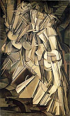
    The most legendary of the most public battles fought here was probably over Maestro Duchamp’s Nude Descending a Staircase (1912), presenting itself as a shocking state of a-stairs, creating whimsical diversions even amongst the cognoscenti who found their way down every avenue for diversion and especially derision. (Check this fine site celebrating the 100th anniversary of the show, listing and displaying many of the most famous of the cartoons published taking a swing against art and Duchamp here http://armory.nyhistory.org/category/artworks/)

    But my reason for stopping here with the Armory Show today is a chance find in Steven Watson’s Strange Bedfellows, the First American Avant-Garde (Abbeville 1991) where on page 168 is a data box stating:

    • “Total Sales:  $44,148 ($30,491 for works by European Artists, $13,675 for works by American artists.”

    …which I found extraordinary.  Even using the Bureau of Labor Statistic’s CPI calculator this figure gets bumped up to the buying power of somewhat more than $1,000,000 in 2014 dollars, it is still incredibly shy of anything approaching any aspect of the financials of the art world.  Here was the greatest collection of artists (perhaps?) of modern times under one roof with their works offered for sale for nearly a month and only $44,000 was generated, with only a third of that going to American artists.  

    When you consider some of the individual successes at the show–Redon collecting $7000, Cezanne $6700, Wilhelm Lehmbuch  $1600, Edward Kramer $1675–you have four artists collecting more than a third of the total sales, leaving $27,000 to be shared by the rest of the exhibitors. (This is a very impressive and long list, some of names of the blockbuster of blockbuster shows shown below, via a Wiki article on the exhibition http://en.wikipedia.org/wiki/Armory_Show.)

    And then when you consider that some 1600 pieces of art were exhibited, it leads me to the conclusion based on these bits of data that not all that much was sold at the monster show. 

    Now of course $44,000 was a lot of money in 1913, though it was still not very much money at all actually spent in a creative/explorative/appreciative manner.  The total was about 100 times the average salary of an American worker (about 400/year).  TO put things in perspective, the total sales at the show in terms of 100 times the average American yearly income would be about $5,000,000 which is still a tiny percentage of what the enormous sum could be had these pieces of art been for sale in 2014.  

    In short, really, the difference in the numbers is so vast that they are almost without meaning sop far as comparison goes between 1913 and today.  That said, I still find it extraordinary.

    By the way, Duchamp sold four pieces for a total of $972, according to Mr. Watson.  

    Notes: 

    ·Posted by :

    ·in:

    —

  • A Note on the History of Simultaneity

    JF Ptak Science Books     

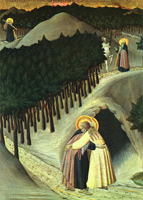
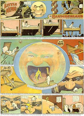
    There is a great, unifying factor drawing together Aztec glyphs, Little Nemo in Slumberland, Marcel Duchamp, the Renaissance Sienese Sassetta, Guillaume Appolinaire, William S. Porter—they all display disparate chronological sense to a single story.

    Blog--may 25--st. anthony
    The concept of displaying the passage of time, relating multiple events taking place at the same (or different) times, is really quite a lot older than the what is generally considered to be its recent modernist beginning.  Duchamp’s Nude Descending, which is a masterpiece of modernism displaying unfolding time and multiple perspective views across time of the same object, is the direct descendant of centuries-old artworks.  The Egyptians and the Aztecs certainly made use of this idea of multiple stories at multiple times in their stone storyboards.  Closer to the present is the genre of early Renaissance painting like Sassetta’s The Meeting of St Anthony Abbot and St Paul the Hermit (painted circa 1440), which shows several aspects of the story over time, and depicted on the same canvas. (We see the beginning of St. Anthony’s journey at top left, heading out on his journey as a younger man, winding his way through dark wood and along a curving trail; we see him a second time as an old man, and then lastly at bottom, elderly, finally meeting the other monk.)


    Blog--may 26--nemo

    The rollout of the Sassetta masterpiece (hanging happily at  the National Gallery in D.C.) reminds me a lot of the great hallmark of storytelling at the beginning of the twentieth century—no, not Barzun or Cendars, but Little Nemo (who predates all of the other greats who were to come in the next ten years or so).  Winsor McCay’s (1871-1934) Little Nemo in Slumberland (appearing in the Hearst newspapers beginning in 1902)—better yet, the comic strip in general—adopts a platform for storytelling that is nothing short of revolutionary.  By breaking out the development of the narrative in front of the reader and on one single sheet of paper gives the author fantastic maneuverability.  This is also seen in the early motion pictures of Edwin S. Porter (like The Ex Convict, 1905) and D.W. Griffith (The Lonely Villa, 1909) who both use a new concept of contrasting editing—cutaways from the main action and pace of the.

    Blog--may 26--nude descending


    film and incorporating vignettes of actions that are related and happening elsewhere, sometimes all of it happening at once.   The story is able to develop multiple themes that are occurring at the same time but in disparate locations—the artwork of futurists Balla and Boccioni and the unclassifiable Duchamp reach for the same end, and so to (again) with Apollinaire and Cendars and the rest…and all of them coming into view in 1912/1913 or so.

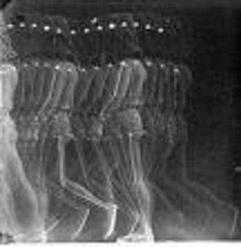
    There’s a lot to talk about on the tech end of this too, not the least of which is the work of Etienne Marey who made highly successful photographic investigations (in the 1870’s and 1880’s)
    of all manner of locomotion, some of the results of which look like the x-ray of Duchamp’s Nude.  Perhaps the greatest early enablers of technological simultaneity are the telegraph and (more impressively) the telephone, both of which allowed people to be in two different places at the same time (so to speak).

    Blog--may26--marey

    Again, this is just a note, thinking out loud, about the concept of simultaneity, and I doubt that I’ve even broken the surface…I’ve not even considered the math and physical aspects of it all, not even a whisper about Einstein and Schroedinger.  I’ve just done a search and found two works by eminent historians of science on this topic which I should think would demand reading:  Max Jammer’s Concept of Simultaneity (2005) and Peter Galison’s Einstein’s Clocks, Poincare’s Maps and the Empire of Time (2003).  I’d like to return to this post when I think I might have an idea of what I’m talking about…


    ·Posted by :

    ·in:

    — —

  • Found-Art in Electrical Discharge, 1880

    JF Ptak Science Books   Post 2212  History of Anticipation series   

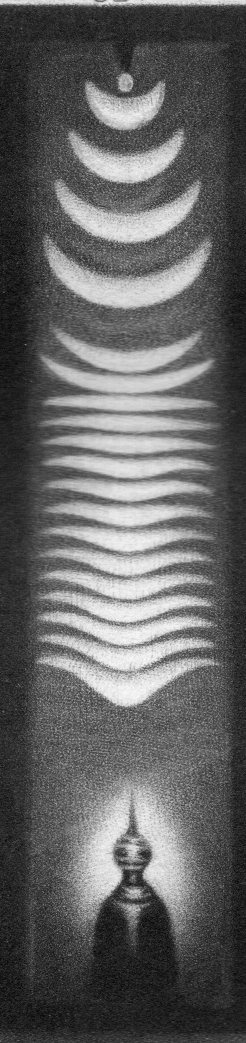
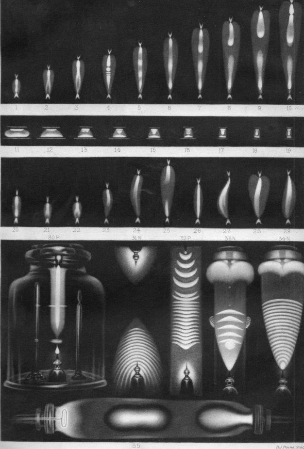
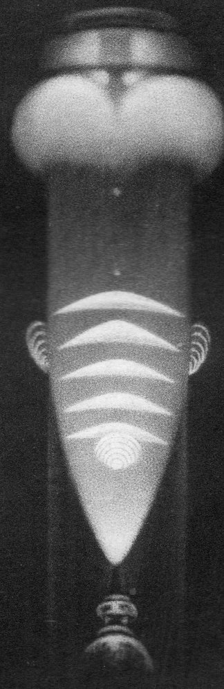
    It makes me wonder about how things were labeled “art” in the history of labeling things.  In a way it is not at all like naming where the American “West” is, or where the “South” begins, because those definitions seem to get very local and very detailed very quickly, and then the labels get bigger and wider and more open to interpretation.  That is to say that the labels make more accommodation for the idea, at least far more so than the labeling of “art” was concerned in the pre-Kandinsky/Cubist/Abstract era, or at the very least before the era of early impressionism.  
    Electrical discharge031

    This is a tiny detail from a full-plate plate from Nature, in an article by Warren de la Rue on electrical discharge (and printed 24 June 1880). (Actually, the big full-page images like this are fairly rare in Nature–more so when the image is mostly very dark, meaning they took a lot of ink to print.)  It is a beautiful thing, and was probably always considered beautiful in a scientific sense, though I think it would have been very highly unlikely for it to have been appreciated in an extra-scientific artistic sense by significant portion of the viewing population, let alone be called “art”.  Even if someone approached it as Impressionistic, it still did not resemble anything recognizable, and those days for non-representational art was still more than 30 years away.  

     Calling things “art” was far more regulated at this in the art history than what it would become in the decade of so after the popularization of discussion on the fourth dimension and the discovery of the X-rays and Thomson’s atom and then, just a little while later, the first appearance of the theory of relativity. The protocols were far more strict prior to the invention of Impressionism (I have no idea how J.M.W. Turner survived in his Outsider-y genre for all of those decades before progressive Impressionism) than those that existed in 1880, or at least for those that existed that could consider these electrical discharge images as “art”.  

    Of course Roualt and van Gogh and Rosseau and Braque and the rests had their own difficult experiences with acceptance, and some were even rejected by the groups that they helped to establish (like Duchamp with his readymades getting the heave-ho in NYC).  

    In general though there were very few people who had one foot in the Beaux Ecole school who could have another foot in the expansive world who could have considered scientific images like these as “art”.  

    The full image: 

    Electrical discharge030


    See also this post on Emily Van der Poel’s beautiful pre-abstract/cubist found art :  

    Art-vanderpoel186 


    Electrical discharge032


    ·Posted by :

    ·in:

    — —

  • Finding a Common Face in 1506

    JF Ptak Science Books   Quick Post

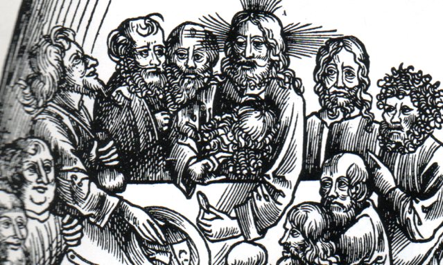
    The “thing” about Urs Graf’s art, for me, is the utter humanness of many of his figures–many of them, even the significant characters in his works, have a certain unexpected everyday quality to them, a common touch, right down to unruly Homer Simpson hairs on bald men, disciples or not.  

    Urs graf073

    This is a detail from Graf’s (1485-1527/9) Passionis Christi... which was printed in 1506, the date of which makes Graf’s achievement even more remarkable.  

    From Grove Art Online: Urs Graf  (b Solothurn, c. 1485; d ?Basle, 1527–9).

    “Swiss draughtsman, goldsmith, die-cutter, engraver, woodcut and stained-glass designer,painter and glass painter. He was the most original and gifted artist of the early Renaissance in German-speaking Switzerland. His highly imaginative drawings, created as independent works of art, are works of exceptional quality, vitality, expressiveness and often humour. For northern European art, Graf played an important role in the liberation of drawing from its traditionally subsidiary status as preparatory study for works of art in other media.”

    Here’s the full version of the print, showing the Last Supper and Christ washing the feet of the Disciples:

    ·Posted by :

    ·in:

    —

  • Found Art: Re-Purposed Book, 1848

    JF Ptak Science Books  Quick Post

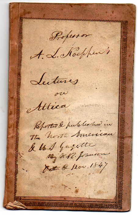
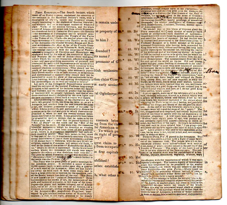
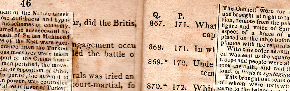
    This beautiful, home-made pamphlet was pieced together in 1847 or thereabouts, bits of an article on Attica by Professor A.L. Koeppen, cut from the North American and U.S. Gazetteer, and then pasted onto and covering the pages and cover of a chapbook. Everything about this little (5″-tall) book is stiff–the flexible paper wrappers of the pamphlet and its pages had been soaked with glue to such a degree that they’re all like boards, but with the feel and sound of paper.  All in all the feel of the book is very satisfying, and very comforting, somehow.

    Found art288
    Found art289
    Found art291

    ·Posted by :

    ·in:

    —

  • Dots and Lines in Optical Diversion

    JF Ptak Science Books     Part of the History of Dots series  Post 2007

    Follow Me on Pinterest

    Long is the line in the history of art–far less so the dot. 

     
    Artyping216

    The line has been part of a long and deep inheritance of rendering a truth, factual, perspectival presence–in general, at least. Certain symbolic and metaphoric elements will sometimes confuse and collapse bits of the image, but the effort for centuries has been to present a balanced nature as close as practicable to its perfection.  That was the strength of the line. 

    The strength of the dot was in doing something not quite the opposite but approaching it. 

    It is interesting to think of the importance of dots in the first revolutionary changes in 500 years in the history of art.  Honestly, there wasn’t anything epochal that happened between the re-discovery of perspective (ca. 1330-1400) and the arrival of Impressionism (and just afterwards of non-representational art) in the 1872/3/4-1915 period.  

    Suerat Dots aren’t brought to bear formally in the revolutionary movement until the early 1880’s.  Impressionism for all intents and purposes is formed with the Societe Anonyme in 1872 (whose members included Monet, Pissaro, Degas, Sisley, Morisot and eleven others), and perhaps more realistically in 1874 when the Societe exhibited its first salon.  (The first show held at the Nadar Studio in Paris in April 1874; a tiny, one month long affair, compared to mammoth exhibitions like the Universal Exposition in Paris in 1867.) 

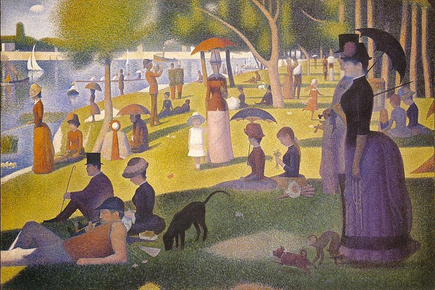
    It was Georges Seurat who brought the whole world to the dot experience with his artistic method of Pointilism, in particular with his magnificent Un dimanche après-midi à l’Île de la Grande Jatte, an enormous work given its composition—dots.  The dots replaced the brushstroke, and their placement in relation to their color was an absolutely brilliant innovation, establishing a perfect result for the viewer when examining the work as a whole.  (It may well be that the French chemist an designer Michel Chevreul made this discovery a few decades earlier, noticing the effect and changes in color depending on placement and—in his case, with fabric—color in the dyes for his material.)

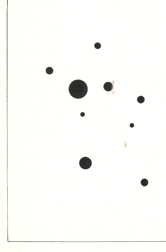
    Wassily Kandinsky (1866-1944), the discoverer of nothingness in art and the introduction of the first BLOG==july 13=kamd non-representational paintings in art history (1913) used his fair share of dots in his exploration of the previously invisible.  One good example is his 9 Points in Ascendance (1918), which is nothing but black dots, an impossible composition just two decades prior to its creation. 

    In the middle of this appeared the half-tone illustration, the great liberator of photographic illustration in popular publication.  Invented in the late 1870’s by Stephen Henry Horgan and used in the Illustrated London News for the first time in 1881, it made the publication of accurate images much feasible and economical.  No longer were readers dependent on the accuracies of artists interpreting photographs or photographed scenes—the photographs themselves were now publishable at little cost and in high quality, vastly increasing the veracity of published reports dependent upon images.  This was revolutionary in its own way, democratizing the sharing of images and icons.


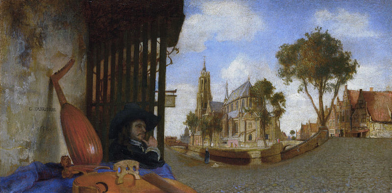
    That said about dots, the line was surely used to transport a bit of reality in art, even before the 18th century–among the earliest appearances being with Hans Holbein in his The Ambassadors of 1533, and a beautiful and very famous use was made by Andrea Pozzo in his illusionistic works at S. Ignazio in Rome in 1685 (and which I mention in an earlier post).  Certainly Carel Fabritius attempted and succeeded in this throughout his career, playing with the substance of perspective, as we can see here in his View in Delft, in 1652:

    Fabritius
    Also the lines of the anamorphic image severely distorted the presentation of reality–if you had the mirror to distort it and if you had the mirror to reconstitute it:

    Anamorphic art
    Source:  Anamorphic Art

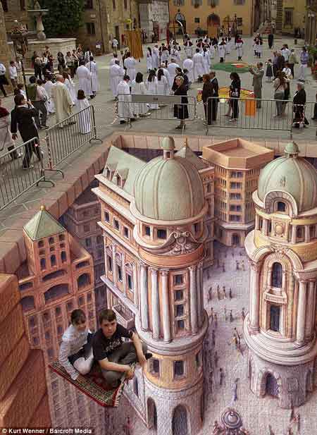
    This example is much more recognizable in widely-circulated images of the modern work of  people like Kurt Wenner, who have continued in the tradition of Leonardo’s researches in the difficulties of wide angle distortion:

    Anamorphic art b
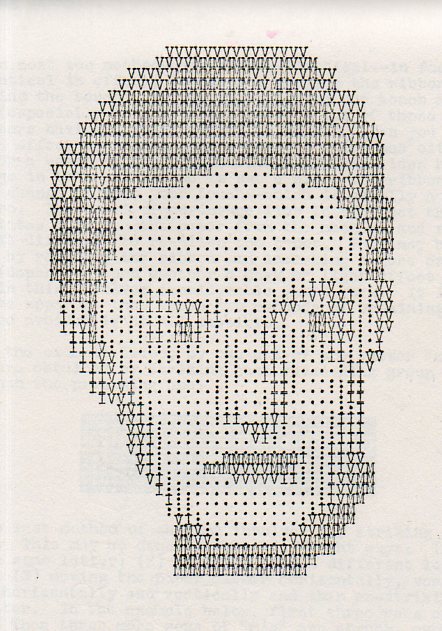
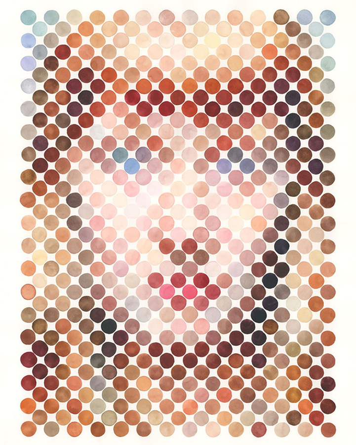
    Seeing this collection of dots in the construction of human faces I was reminded very strongly of the portraits made on the typewriter by Julius Nelson in his work, Artyping, published and sold for a dollar by the Artyping Bureau of Johnstown, Pennsylvania, in 1939 (and pictured first, above).  Nelson was an instructor in “secretarial science” in Windber High School in Pennsylvania and no doubt put together this pamphlet as something expressive of his artform and as an advertisement for his profession.  This was hardly the first time that anyone used the typewriter artistically, as I can recall some measure of artistic expression in type in Punch magazine as far back as 1869, though portraiture by typewriter does not appear to be a very wide section in the art world between those times. In any event, a portrait that he made here is rather close to those presented on the Modern Metropolis site–the “Dot Portraits”  Nathan Manire.

    Dot portraits

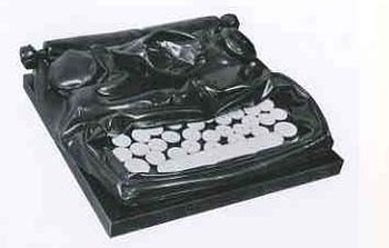
     Modern Art would have the final dispositional comment on the typewriter as an instrument of art, when Claes Oldenburg made his Soft Typewriter in 1963:

    Blogtypewriter_nwrriter_soft036_2 

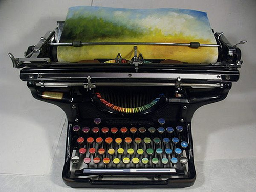
    And then, of course, the magnificent resurrection of the typewriter artform, replacing the spplication of black or red with something a little more complex:
    Typewriter chromatic
    [Source: the chromatic typewriter, by Tyree Callahan, found here  http://www.samanthahahn.com/blog/2012/01/16/chromatic-typewriter/]


  • The Most Beautiful Perspective Drawings of the Baroque?

    JF Ptak Science Books  Quick Post

    Follow Me on Pinterest

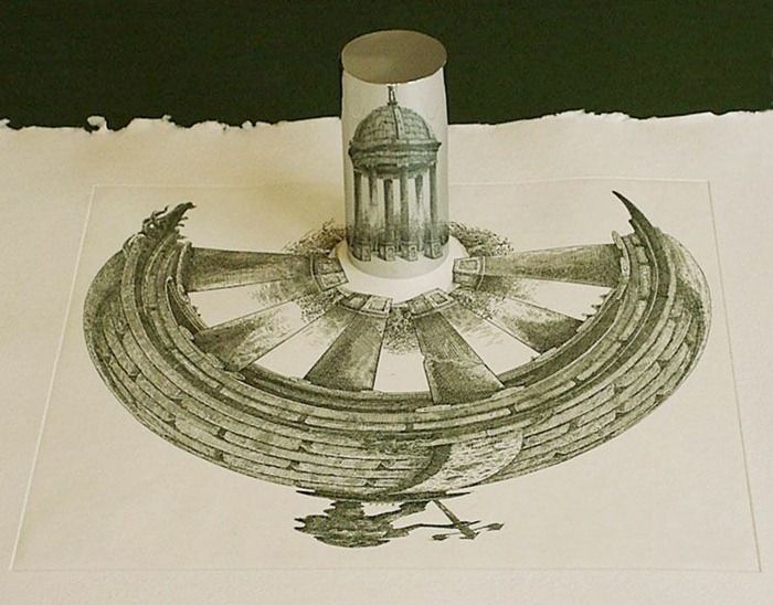
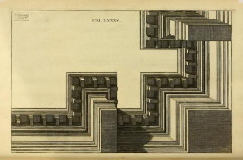
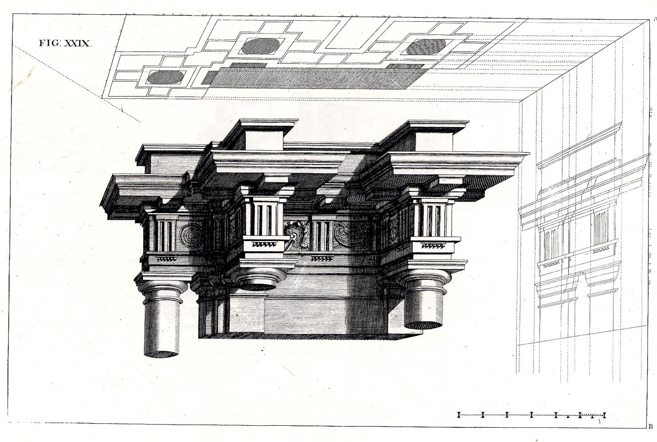
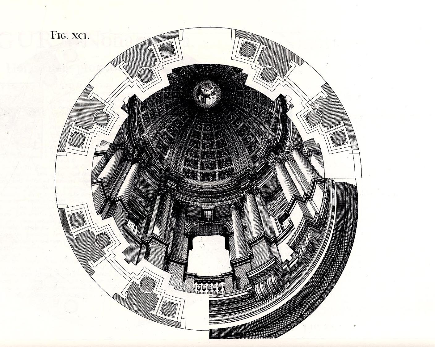
     The fantastic Jesuit Andrea Pozzo published results of his researches on perspective in his Perspectiva pictorum et architectoru (1693),
    explaining how he was able to compellingly, unbelievably  represent
    three-dimensional images on two-dimensional spaces, this image showing
    plan and projection and profile, effectively giving you a
    three-dimensional cross section of the architectural element…and having them seemingly float in space. His work is just absolutely gorgeous. 

    Pozzo 7


    Pozo
    Pozo 2


  • Fabulist Images from an Accomplished Genre-ist

    JF Ptak Science Books  Quick Post

    I stumbled upon these very inventive, peep-into-the-future of  imagination images by Theodor Hosemann in journal Exlibris Buchkunst (for the year 1910).  Hosemann’s (1807-1875) name came into a blurry recognition as a leading genre painter and very busy illustrator in mid-century Germany, but certainly not for these images, which remind me very much of J.J. Grandville, one of the leading imagist illustrators of the 19th century.  (Grandville has been a subject in this blog quite often; for example, see here.)

    Hosemann908
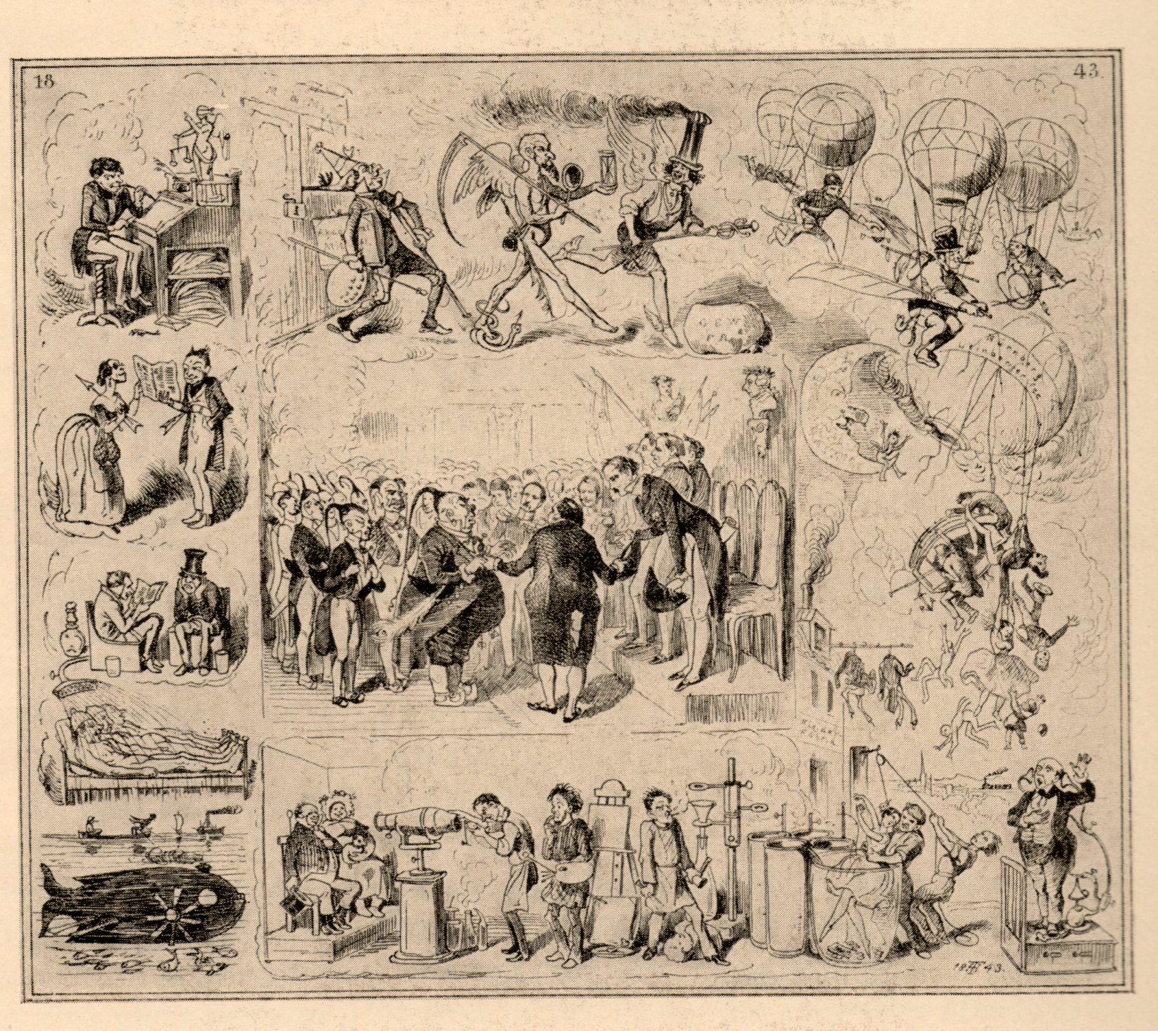
    The originals were completed in 1847 and depict some of the trials demanded of future vision, looking into the year 1947. I particularly like the steam-driven horse-mobiles and the steaming-hatted Mercury laughingly outrunning a grimaced Time. 


  • Marble Clouds and their Emotional Shadows: Cloud Geometries in Art

    JF Ptak Science Books   Post 1942 (Part I)
    Follow Me on Pinterest

    I silently laugh at my own cenotaph 
    	And out of the caverns of rain..  Percy B. Shelley, "The Cloud", 1820
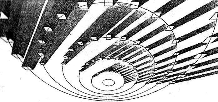
    [John Ruskin, Cloud Perspectival, 1860. Source for all Ruskin images:  “Cloud Studies: The Visible Invisible”,
    by Mary Jacobus, here.]

    John Ruskin (1819-1900) was still a very young man when he published the start of a series of works in art criticism, Modern Painters, in 18431.  To refer to it as a great work in critical theory is painting the work with a narrow brush, though–it had a very sweeping overall effect, and addressed all manner of issues integral to art, and was a developing vision of what art was looking at in the 19th century.  Ostensibly it began as a defense of the work of J.M.W. Turner and the way in which that man represented nature in his pre-Impressionist, pre-Expressionist work. Ruskin makes the case that the works that were so grating part of the art world i the 1830’s were highly consistent with centuries of representing nature in art–and not only that, but presenting evidence that turner did so like no other artist in history.  Ruskin would weave further volumes of Modern Painters through the body of his other work for the next 17 years, publishing the last installment in a fifth volume in 1860.

    Turner (1775-1851) was a great Romantic and a lot of that work tends towards a very full and very early expression of Impressionism and Expressionism, something that not everyone was ready for in the first quarter of the 19th century. This is particularly so in his paintings of clouds, and even more so in cloud/ocean interaction.  They are sweeping and breath-taking and very emotional works, in some ways like the late string quartets of Beethoven–powerful, provocative, internal dialogs of the deep power of nature. He must stand with John Constable as the Cloud Man of the 19th Century, or perhaps Constable stands with him.  They both in a way stand with Luke Howard, the scientist who was really the first classifier of clouds–an undertaking which in some impossible way escaped the recognition of the greatest classifiers it he history of science–and who did so in a paper in 1802, written at a time when Constable and Turner were both young artists.

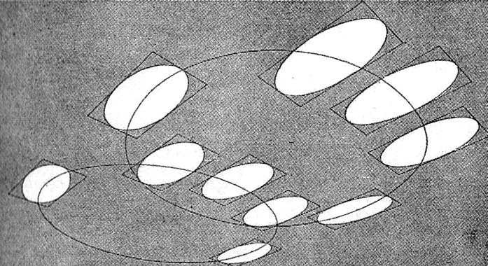
    Turner and Constable both painted clouds like perhaps no others before them; and Ruskin, in his deep appreciation for the importance of the representation of nature int he art, also made a contribution to the understanding of clouds that was of an extraordinary nature. In the fifth volume of his Modern Painters Ruskin attempts a perspective study of clouds, and may have been about the first to do so. The illustrations of this effort I think are incredible, and remind me very much of installing a sort of rigidity to clouds, a cloud geometry, veritable studies of stones and blocks in the sky.  The imaging part of this exercise must have been an enormous thing back there in 1860, to think of clouds in a perspectival way, floating very large geometric objects in the sky. The astonishing results are seen (above) and following:
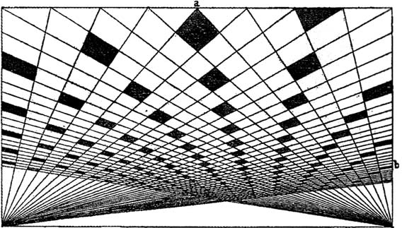
     And this:
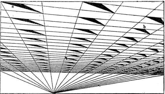
    [John Ruskin, Cloud Perspective: Curvilinear., Modern Painters, Vol. V, Plate LXV.]

     In a way the first image reminds me of Andrea Pozzo’s work in his monumental   Rules and
    examples of perspective proper for painters and architects
    (1693):
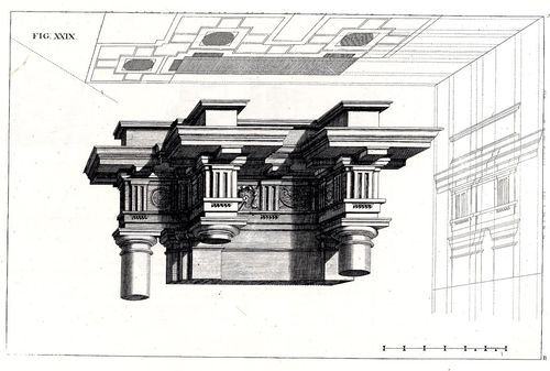
     
    Pozo

    but really more in the way that Pozzo’s work seems to be elevated and floating in a heavy perspectivist space, bigger and blockier sky-borne marble than with ruskin.  But still, the disembodied floatiness of the Pozzo work is ethereal.

    Ruskin does round out his blocky and beautiful geometry, which definitely reminds me of work w=that would appear 90 years later:  Ruskin, again:
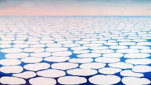
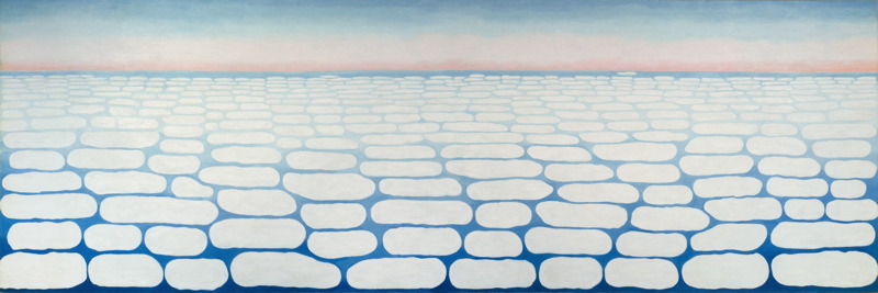
    And  Georgia O’Keefe’s Clouds III (1963), though her clouds tend towards a more rigid geometry in Clouds IV (1965, following):
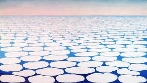
    Clouds O'KeefeO’Keefe, Clouds Above the Sky III, 1963
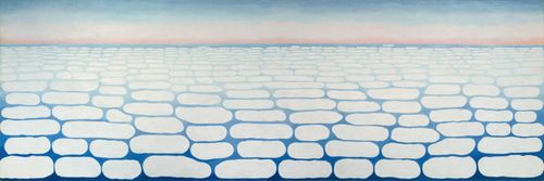
    Clouds okeefe sky above iv 1965O’Keefe, Clouds Above the Sky IV, 1965

    Ms. Georgia is definitely seeing her clouds with different eyes than Ruskin, and they are entirely different creatures–but still, the two come together in my head as relatives. The clouds, I mean.

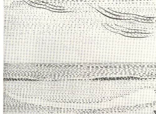
    I started looking around for early hard-line cloud geometries and thus far I haven’t found very much, though there is a tremendous example by Henry Van de Velde’s (1863-1957) “Sun at Ocean (Rhythmic Synthesis”) which I found in  Werner Hoffman’s Turning Points in Twentieth century Art, 1890-1917 and which was executed in 1888/9, looks to me to be absolutely incredible for its time, a nearly non-representational, proto-abstract something, done three decades before these genres came into being.
    Clouds van de velde
    I don;t know where the designer Van de Velde fits in the early history of non-representational art, but his effort in the second to last decade of the 19th century certainly seems to be very unusual for its time, and a good example of creative cloud representation. 

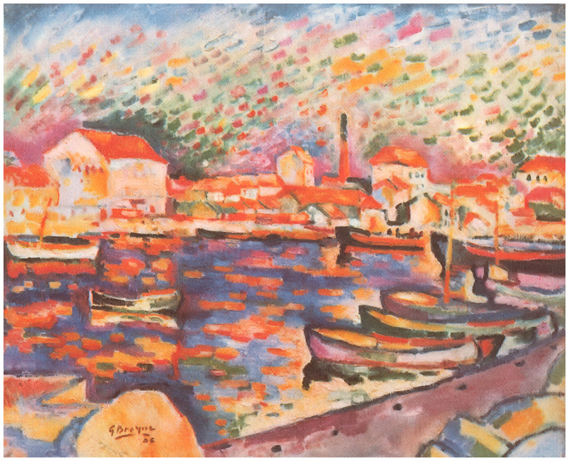
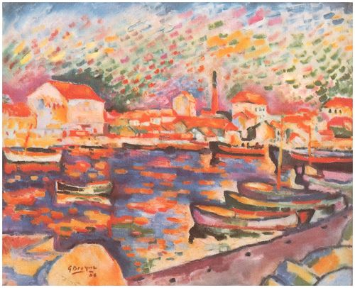
    Non-standard cloud imagery is much easier to finding the 20th century, like those of Georges Braque in his La Ciotat Harbor (1906):
    Clouds braque
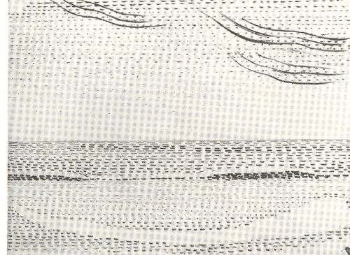
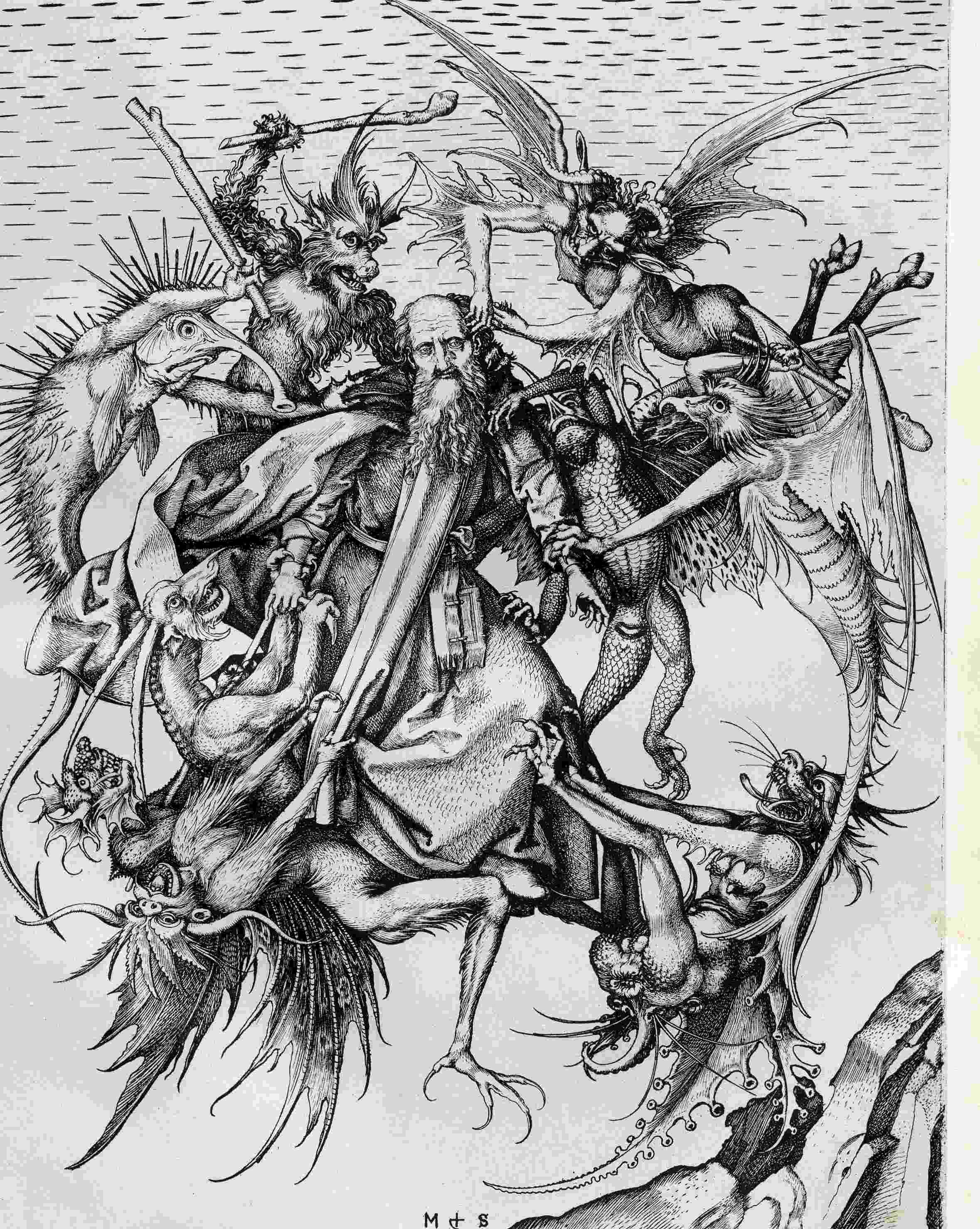
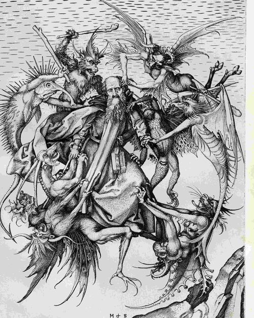
    Even this starts to have the look of something earlier, particularly if you turned the clouds-in-art clock way back, say, into the Renaissance. For example Martin Schoengauer‘s spectacular  The Temptation of St. Anthony, which was printed in 1470/5, has
    a beautiful, fluid circularity to it, full of an earthy roundness even
    as the saint is pursued by demons.  But the sky in the background is
    populated with nothing but dashes to suggest clouds, and which also starts to look something like the Fauvist and Expressionist works to come, 400/500 years later.
    Clouds schoengauer

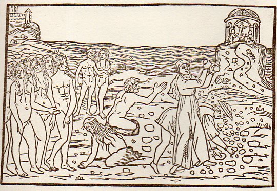
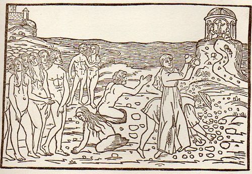
    (There are many examples of the sky being simply not represented at all, particularly in woodblock,

    like this image from Ovid (Accipe Studiose Lector P. Ouidij Metamorphosin...printed in Venice in 1509:
    Clouds no couds livy913

    “You could not see a cloud, because
    No cloud was in the sky:
    No birds were flying overhead —
    There were no birds to fly”.–Lewis Carroll, Through the Looking Glass.

    There are many non-sky images like this.

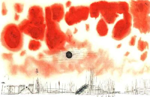
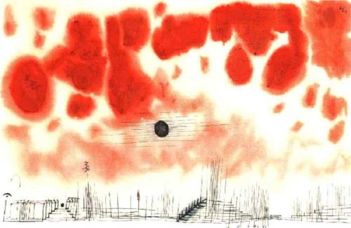
    Another interesting modern example is this Paul Klee (though it comes fairly late in that career, in 1940):
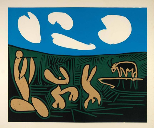
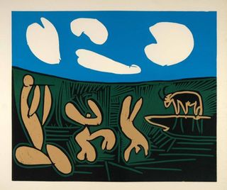
    Clouds Paul Klee 1940And an example from the ubiquitous Picasso, still later, in 1962:
    Clouds Picasso

    But earlier images are harder to locate.  The obvious early-ish source (though still much later in the century) would be Van Gogh (say, with Starry Night) and Monet, though the fractalesque Van Gogh gets much closer to the re-interperative power of the Ruskin images than the reflected impressionist beauty of the Monet.

    Clouds Monet
    On a cursory look around the antiquarian painterly sky-world, it is becoming obvious that the cloud geometries of Ruskin are very uncommon. 

    Notes

    1.  For full text of Ruskin’s  Modern Painters , see  (1873)volume 5 for (1860) and  (1873)