A Daily History of Holes, Dots, Lines, Science, History, Math, Physics, Art, the Unintentional Absurd, Architecture, Maps, Data Visualization, Blank and Missing Things, and so on. |1.6 million words, 7500 images, 4.9 million hits| Press & appearances in The Times, Le Figaro, Mensa, The Economist, The Guardian, Discovery News, Slate, Le Monde, Sci American Blogs, Le Pont, and many other places… 5000+ total posts since 2008.

Author: JF Ptak

  • The Famine of 1920

    JF Ptak Science Books   Post 2820

    “The Most Awful Spectacle in History” screams the headline of this full-page (16″ tall)  Illustrated London News advertisement for the “Save the Children” fund, appearing 22 May 1920.  There was good reason for the screaming–following the Great War there were millions and millions of people in dire need of food in the months and years following 11.11.18.  Hundreds of thousands–millions–of these people were children. The ad makes a direct plea for the sake of the children, where the reader is told that in some districts there is “not a child under the age of 7 years”, as all have died. To not donate a penny or a shilling and allow the catastrophe to continue would mean that “we are for ever humiliated in the eyes of God and Man”.  
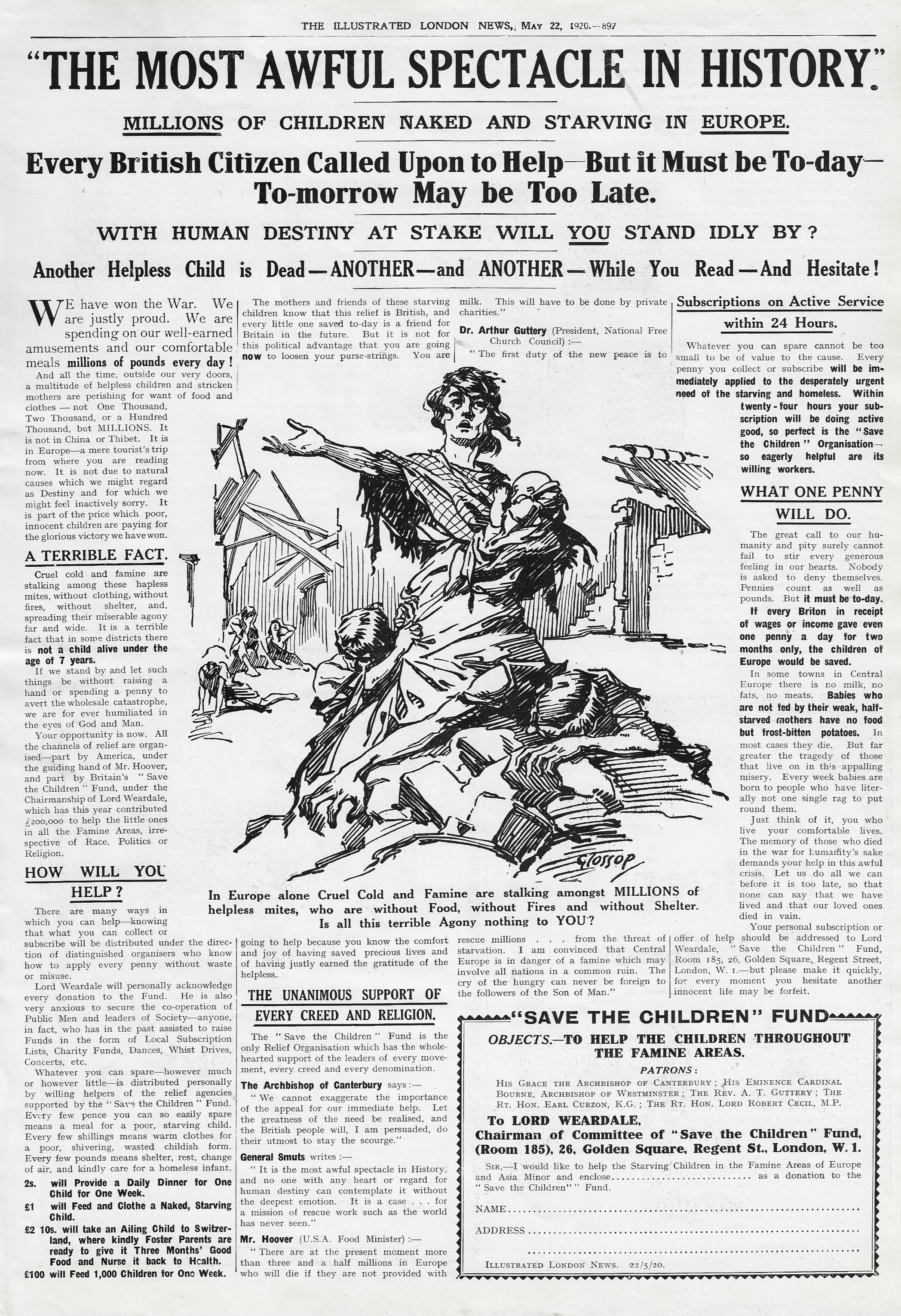
    ILN 1920 Famine adThe appeal here is simple–Lord Weardale (Philip Stanhope, 1847-1923), who was the chair of the “Save the Children” fund (London) is asking for a penny, from everyone, as the accumulation of that penny a day for two months “the children of Europe would be saved”. 

    With assistance from other countries–including the U.S. where the effort was spearheaded by Herbert Hoover–the Fund raised more than a million pounds and averted an enormous catastrophe. Unfortunately, a larger disaster loomed to the east–the Great Famine in Russia of 1921-1922 (following by just thirty years the Russian Famine of 1891-2)–and in rhis circumstance the relief efforts failed. The Russian famine began with a natural disaster which was then inflamed by complete (sometimes intentional) mismanagement by the government, the result of which caused the deaths of between five and eight million people.  Hoover–as Secretary of Commerce–guided the Russian Famine Relief Act spending of 20 million dollars for the purchase of U.S. foods to be sent to Russia, but the combinations of political intrigue, capital mismanagement, and of course natural disasters leading to more disease and death, left millions dead.  

    As the 1920 ad sums the situation: “the cry of the hungry can never be foreign to the followers of the Son of Man”–but they were, and are. 
    ·Posted by :

    ·in:


  • ROYGBV Redux via Emily Vanderpoel’s “Color Problems” (1903)

    JF Ptak Science Books  Quick Post

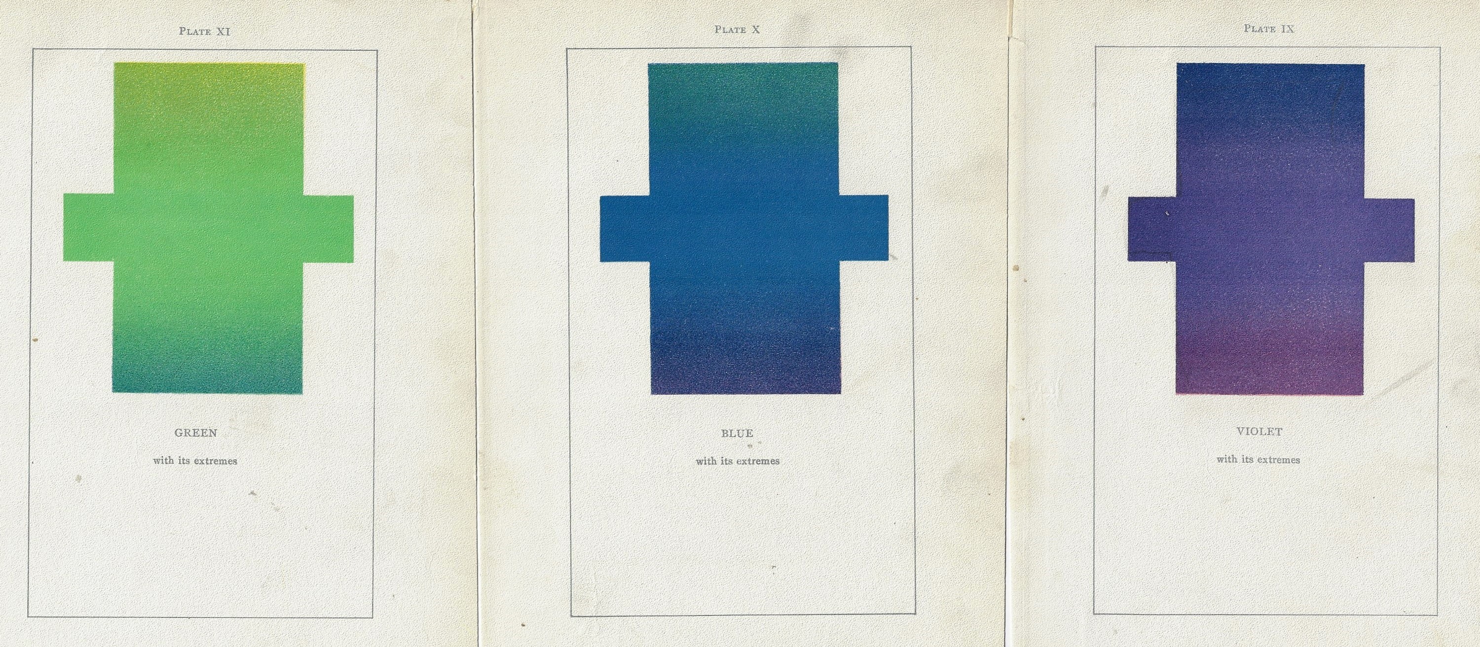
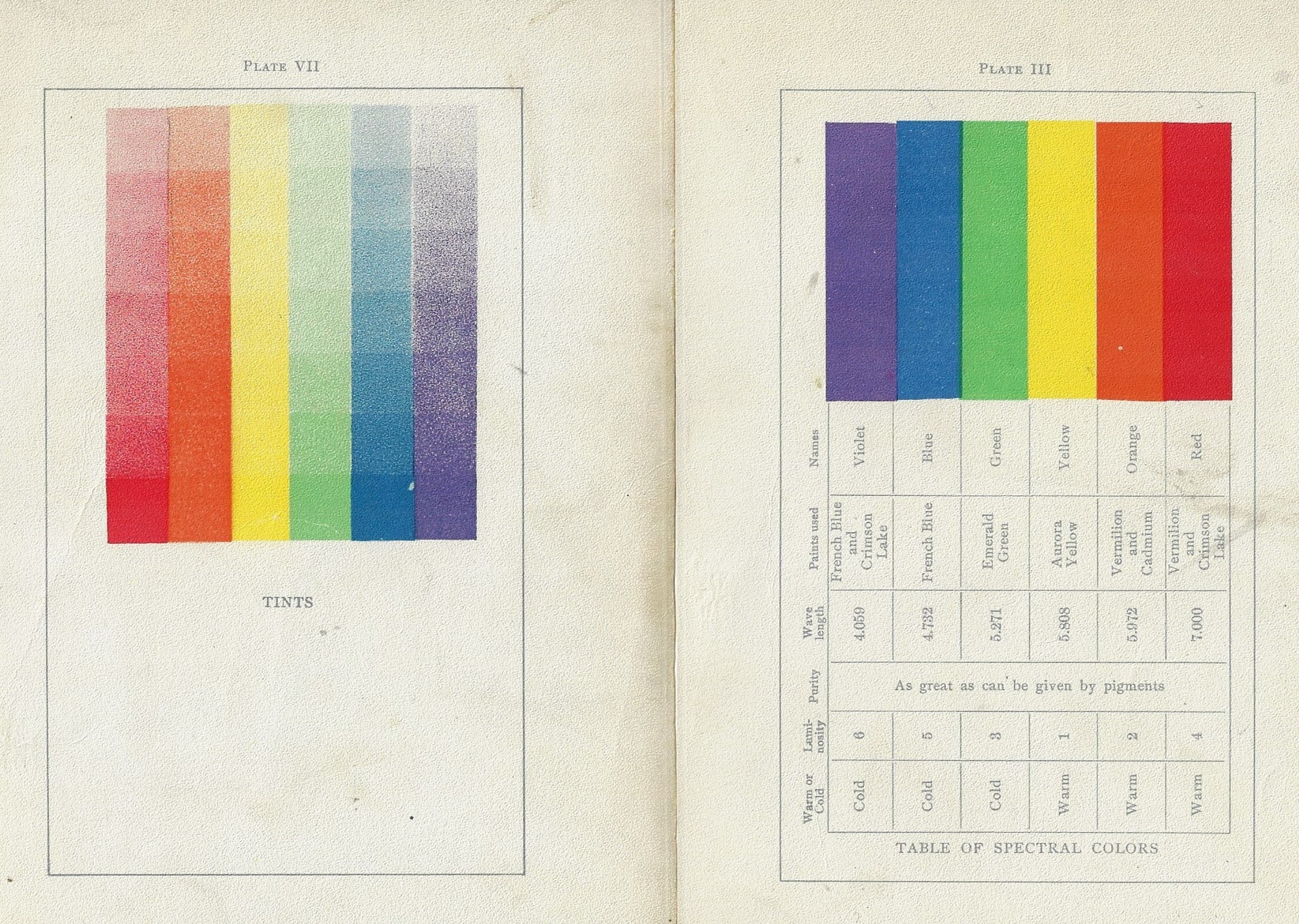
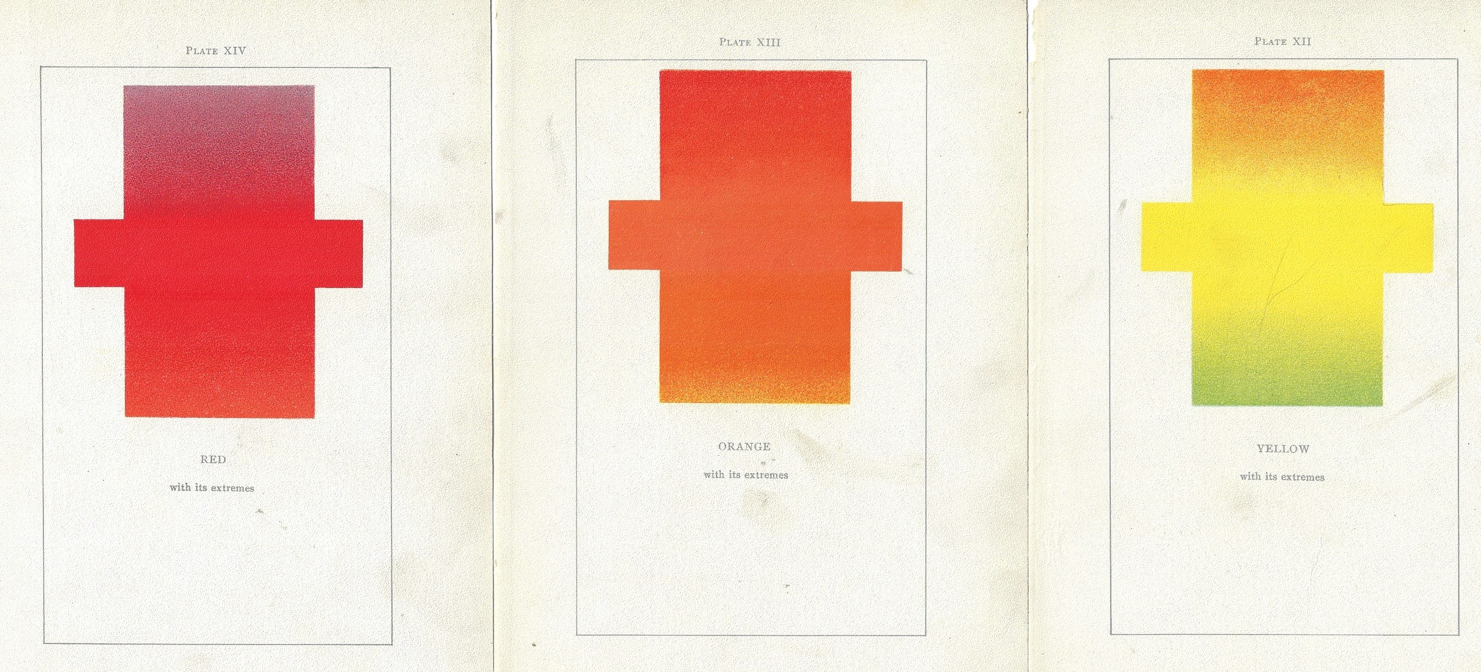
    Just on the heels of yesterday’s post of RIYBBV vs. ROYGBIV comes this lovely discovery in the highly unusual and original work by Emily Vanderpoel, Color Problems of the Layman, printed in 1903, a gorgeous but mysterious book in which she sought not so much to analyze the components of color itself, but rather to quantify the overall interpretative effect of color on the imagination.  I know this sounds begging and vague, but I really haven’t been able to make much headway in her theory.  Ms. Vanderpoel looked deeply and arithmetically into art—she also produced a numerical grid of the artwork that she analyzed, going a step further to re-order the reality of the painting into a representative 10×10 square, distributing the color sense according to a secret algebra that I cannot identify.

    Color vanderpoel roygbv _1_ Color vanderpoel roygbv _2_


    The series is preceded by a further presentation of the colors side-by-side (and reversed) as well as another plates of the colors side-by-side presnting their gradient tints:

    Color vanderpoel roygbv _3_And lastly, those lovely plates, larger:


  • The Not-so-Shiny Diamond: Mining Compounds, South Africa, 1906

    JF Ptak Science Books   Post 2815

    National Geog 1906 diamond thiefI uncovered a little cache of National Geographic magazines from 1900-1915, and picked out the 1906 volume to have a look at what I hoped for would be photo coverage of the San Francisco earthquake. There’s a good and very strikingly-illustrated article to be found there, but what got my real attention was the article “The Diamond Mines of South Africa”. Actually it was one photograph that grabbed me away from the rest of the book—an image of a diamond miner who was caught stealing diamonds from the mine, extracted during his shift. It is a singularly sad photo—the man’s face is pained and troubled, standing there behind a mine official, naked, and wearing gigantic baseball mitt type gloves with a heavy chain.

    Here are a few questions that sprang to mind: Who were the workers? How did they steal” How did the company catch them? How did the company prevent such theft?

    In this case the theft occurred in one of the De Beers mining facilities in South Africa. Although De Beers used convict labor, at this camp the workers were there of their own free will (I guess), joining the company to work for periods of about three months.

    • “To enter the service of the company, each applicant must sign a written con tract binding himself to live in the com pound and work continuously and faith fully for a period of at least three months or longer if he so desires. At the expiration of a contract the applicant may leave if he chooses or his contract may be renewed indefinitely. Some of the natives in De Beers compound have been employed continuously for ten years or more in the service of the company,…”

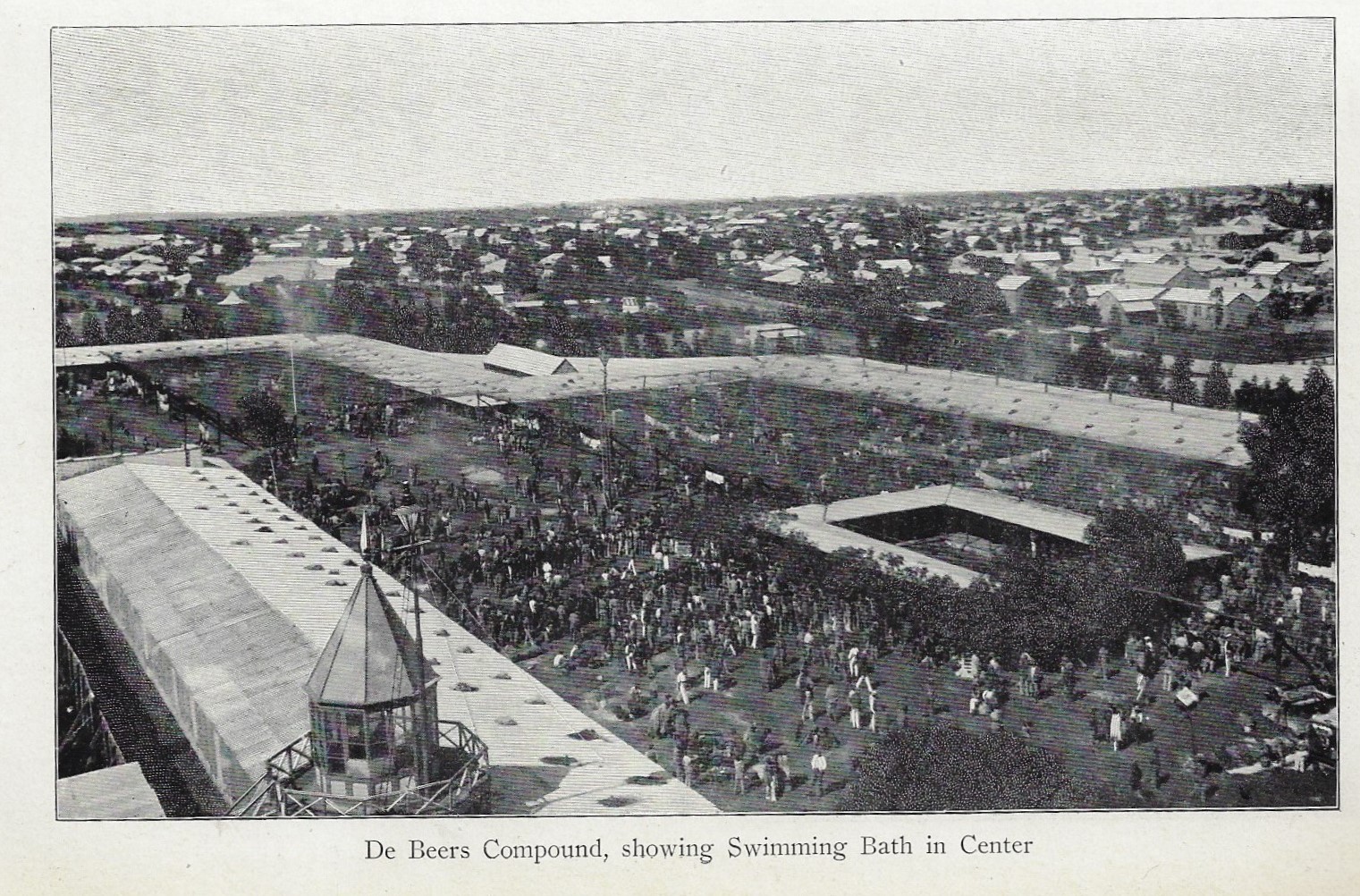
    National Geo 1906 de beers _2_Once the contract was signed, the agreement was strictly enforced,and the lifestyle of all who worked at the mind seemed to become of one solid mass, the workers held there life inmates. It looks as though every aspect of their lives was regulated, not the least of which involved travel outside the compound or interacting with any outsiders—this to prevent the theft and exchange of diamonds.

    The article describe the general layouts of the compounds housing the diamond workers: there were 17 in the diamond fields, 12 owned by De Beer. The largest belonged to De Beer: it was 4 acres and held 3,000 workers, who were contained in the area by 10′ tall corrugated iron fences; they slept 20-25 to a 25’x30′ room. 3K people on 4 acres is a huge number:

    ·Posted by :

    ·in:


  • Found-Abstract Art and the Coming of the NCC-1701: the Capazza Lenticular Airship, 1909

    JF Ptak Science Books  Quick Post

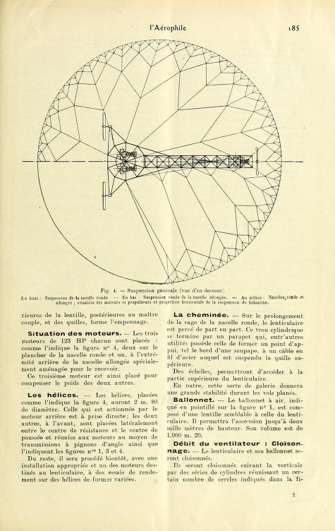
    Smithsonian Aeroph Capazza cross sectionHere’s another early aviation post, as I seem to be a little stuck this morning in the 1908-1911 period…or suitably enough down a small rabbit hole to keep me from doing my mailing duties.  This is a fascinating period with tremendous steps forward in technology taking place just five years after the first successful Wright powered flight test–it is hard to imagine the Wrights were roundly ridiculed in their efforts and worked for the most part in deep privacy; and yet here, just 1500 days or so later, there are hundreds of aeronauts and a dozen or so journals devoted to tech aspects of flight.

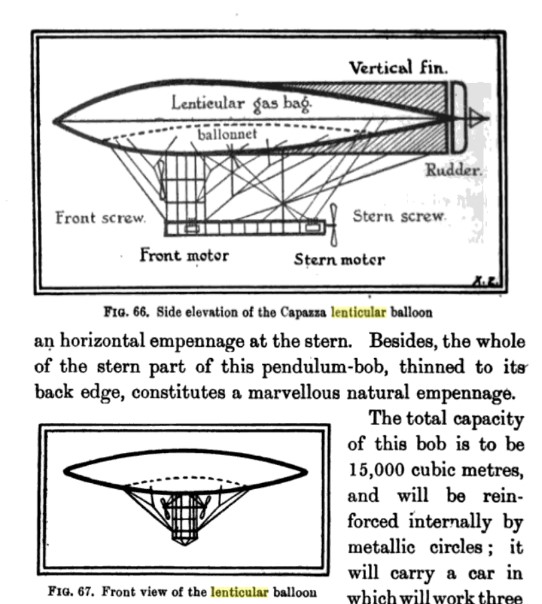
    What caught my Star Trekian eye here in this May 1908 article in l’Aerophile was the lovely found-abstract plans for supporting the envelope of Louis Capazza’s lenticular airship, a composite balloon/aircraft. The firm of Adolphe Bayard-Clement was the planned producer of the airship (they were the first to go into general production of an airplane, the Santos-Dumont Demoiselle 19) though it never was built. It was certainly intriguing–it was lighter than air, non-symmetrical, top be powered by three 120 hp engines supplying power to three screws fore and aft–it was lovely in its way, and of course given it plan and profile immediately suggests to me the Starship Enterprise, though I may be alone in that.  

    And here’s the Found-Abstract art end of the deal–the structure for the non-symmetrical support for the balloon/plane envelope:
    SMithsonian Aeroph Capazza planeur _1_ plan

    Tech info (and image source, above) see Berget, Conquest of the Air, 1909, pp 183-186. 

    Images sources (below):  https://archive.org/details/larophile16besa/page/182


  • Atlas of the Engines–the Antoinette Aero Motor, 1908

    JF Ptak Science Books  Quick Post

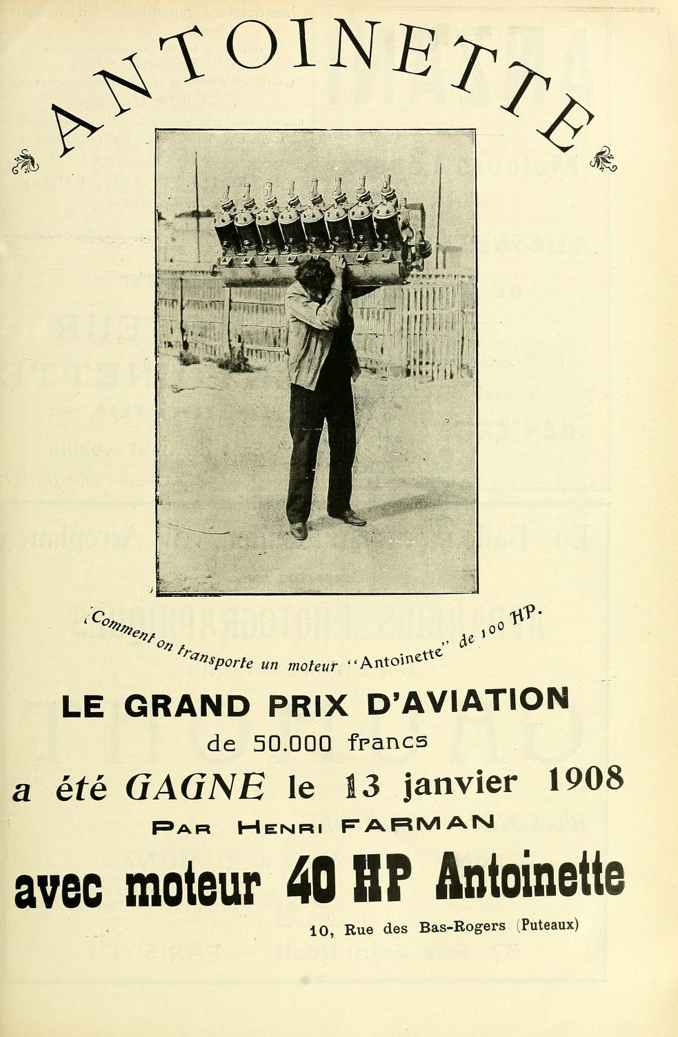
    Smithsonian aeroph antoninette 90hpI couldn’t but help to share this terrific advertisement found in the page of Aerophile magazine for 1908 (via the “Unbound” section of the Smithsonian Institution and Internet Archive. This is the famous “Antoinette” engine, designed and construction by Leon Levavasseur in an aircraft-building partnership with  Jules Gastambide (whose daughter’s name became that of the series of engines). As you can see the man supporting the engine is not having an easy time of it (assuming the guy is 5’8″ 150 lbs or so), though this was a far-advanced aircraft engine for the day, a V-16 (?) developing 100- horse (the Wright’s 1903 engine was 12hp 180lbs but did its job perfectly).  In any event this was an interesting demonstration of comparative lightness and power, delivered in January, 1908.  (I’m reasonably sure that this is not the 40hp engine of the Farman flight…)

    Source: https://archive.org/details/larophile16besa/page/28)


  • An Anti-Gravity Space Ship (?) of the Year 2659 (1911)

    JF Ptak Science Books  Quick Post

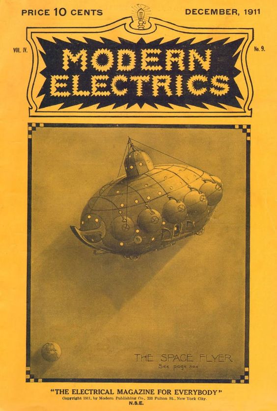
    Modern electrics 1911 _1_I was very curious about the cover illustration for the Hugo Gernsback sci fi story, “Ralph 129 C 41 +”, in Modern Electrics for December 1911 (volume 4 #9).  “129 C 41 +” was the name of a scientist who was working on the discovery by another “famous scientist” named “1246 41”–it seems that they were all involved in looking for a particular “space flyer” (first discovered by “famous scientist” 96929 in the year 2210), but then there was a kidnapped woman involved and talk of an anti-graviton antigravity engine of some sort, and then the whole thing gets a little misty. (It looks like those semi-sphere around the perimeter of the pace ship were the anti-gravity devices.)  All I really want to do here is share the cover, which I think is the best part of the story. Modern Electrics isn’t that familiar a magazine to me, but there seems to be plenty of real stuff in it, not the least of which is a pretty good article on the Bleriot flyer just a few pages after the Gernsback.  

    The entire issue is available at Hathi Trust.  


  • The Beautiful Ephemeral: the Perfect Desktop, plus Ads for Pencils and Matches (Japan, 1955)

    JF Ptak Science Books  Quick Post (Part of the “Magnificent Mundane” series) 

    The Japan External Trade Recovery Organization’s General Merchandise of Japan was an “effort is made to introduce every category of general merchandise” being made in the country in 1955.  Ten years after the war the country was still of course recovering from its devastating defeat, though the national economy did make tremendous progress back to some sort of normalcy during that time, particularly during the ‘fifties. This is not a Sears catalog, though, as it weighs in at 110 (thick) pages plus 30 pages of advertisements. The merchandise does spread out wide, if not very deep at all, and it makes for an interesting browse to see what sorts of goods were being manufactured and sold overseas so soon after the war.  What caught my eye (following ads for tribal table art, “Japanese-style lanterns”, cigarette lights, reed organs, toys, glasses, shoes, scissors, wooden bowls, eyeglasses (two varieties), and so on were the ads for pencils. There were at least four of them, three of which are visually striking. (And speaking of that, there’s also a great ad for matches.)  On the “Pencils of Japan” page there is also a peep into perfection, showing an office desktop outfitted with goods manufactured in Japan. There’s not much, but the necessaries are there, and it is very tidy in a geo-Spartan way (and nothing like my own desk). In any event, I share the “Pencils of Japan”:
    Japan merch 1955 pencil _1_

    Japan merch 1955 pencil _1_

    ·Posted by :

    ·in:

    —

  • Nature Magazine Reviews Hitler (1933)

    JF Ptak Science Books  Quick Post

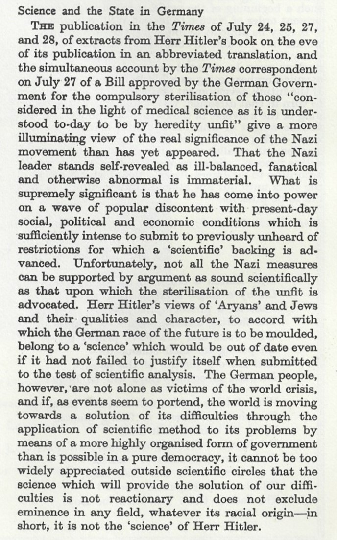
    Here’s a razor-sharp summation and review of Adolf Hitler, being an uncommon appearance of that man and his “science” in Nature, volume 132, p. 198, 1933. 

    “That the Nazi leader stands self-revealed as an ill-balanced, fanatical and otherwise abnormal is immaterial. What is supremely significant is that he has come into power on a wave of popular discontent  with present day social, political and economic conditions which is sufficiently intense to submit to previously unheard of restrictions for which a “scientific” backing is advanced.”

    Nature 1935 HITLER

    ·Posted by :

    ·in:


  • Plans of Major Aircraft, 1908

    JF Ptak Science Books   Quick Post    

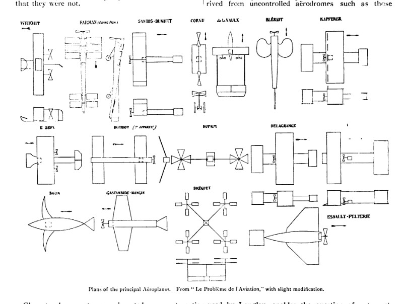
    This interesting illustrations shows the plans of 16 different aircraft and the triumph of aviation in the scant five years since the Wright brothers’ successful first powered flight in 1903.  From left-to-right and top-to-bottom the designer/builder reads: Wright, Farman, Santos Dumont, Cornu, de la Vaux, Bleriot, Apferer, Bleriot (again), Dufaux, Delagrange, Farman, Bazin, Langly, Brequet, and Esnault-Peletrie.  The image is found in Nature, 1908, vol 78, pp 668-672.

    NAture 1908 vo 78 670

    There’s a lot in this article but what I focused on was the shot across the bow to the Brits, the author taking issue with their capacities, and telling them to go and get some better maths (or someone better than them to do the thinking and work the numbers): “The recent flights show what can be done in aviation by a person possessed of skill and experience. They are a necessary factor in the development of artificial flight. The problem is quite in a different position from what it was a year ago. But if flying machines are to be made accessible to the million, the sooner English aeronauts learn mathematics or get someone to do the mathematics the better. At the present time a great deal of rubbish passes off as mathematics which is quite unworthy of the name…”


    ·Posted by :

    ·in:


  • Rhymes on the Value of Pi (1905)

    JF Ptak Science Books   Quick Post


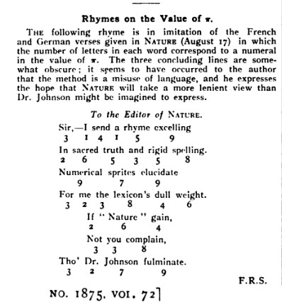
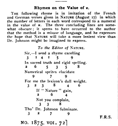
    Nature 1905 Pi rhymesHere’s an interesting little aside from the 1905 issue of Nature–the notice is a great example of what made this one of the most interesting science journals in the modern period, as they were not adverse to including some lighthearted and thoughtful pieces along with their very concise and exacting coverage of science news and discovery.  Here we see a reader contributing a poem based on the value of pi: they used the number of letters in the poem corresponding to the number in pi: so, 3.1415 meant that part of the first line had words of 3 then 1 then 4 the 1 letters/word. This is a little more difficult than it looks, and harder still I think to have something decent come of it as Haiku.