A Daily History of Holes, Dots, Lines, Science, History, Math, Physics, Art, the Unintentional Absurd, Architecture, Maps, Data Visualization, Blank and Missing Things, and so on. |1.6 million words, 7500 images, 4.9 million hits| Press & appearances in The Times, Le Figaro, Mensa, The Economist, The Guardian, Discovery News, Slate, Le Monde, Sci American Blogs, Le Pont, and many other places… 5000+ total posts since 2008.

Category: Impossible Books

  • Women Meat Pioneers, 1943

    JF Ptak Science Books LLC  Post 570

    (Science Book Blog)

    4-1 prop meat
    This simply irresistible, charmingly uncomfortable, and semi-surreal title is an excellent example of what I’ve come to know (and forget) in my  career of doing whatever it is I’m doing.  Generally though the thousand or so titles in my Naive Surreal collection belong to pamphlets and the occasional book, but the occasional advertisement makes its way into the fray.  (None really come quite close to the work of the immortal Otto Fleiss, who produced America’s greatest work on making art with fat,  White Art in the Meat Food Business.  A Practical Handbook for
    Butcher, Pork Stores, Restaurants, Hotels and Delicatessens on How to
    Make Lasting and Transferable White Art Decorations out of Bacon Fat
    Back for Window Displays, Ornaments on Meat Food Cold Buffets and for
    Exhibits and Advertising Purposes.  Enrich yourself with Personal
    Knowledge.
    It is a toweringly fantabulous work, and is one of this blog’s most-viewed posts.)

    This ad is innocent enough:  appearing in the 1 November 1943 issue of LIFE magazine, it was simply encouraging the modern housewife to go adventuring into cuts of meat that had been deemed unacceptable before rationing and the war, which brought about a meat drought.  (The Brits had a far worse time–this issue of LIFE also contained a photo of a leggy London showgirl posing with a “real lemon” which was being raffled off to raise hundreds of pounds for the general welfare.) 
    4-1 renaissance pandora
    I’m sorry to say that this image reminded me of an older, finer, more whimsical but far more damning and stern woodcut.  The two aren’t terribly-well related, I know, but as I shocked myself in being able to locate it I’m bound to use it now before it slips back into my misty print purgatory. 

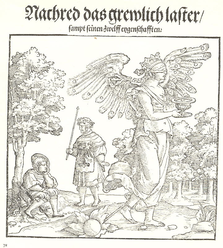
    This image is probably the work of Georg Pencz and appeared in Hans Sachs’ Nachred das grewlihc laster...published in Nuremberg in 1535 The booklet was a work directed against the evils of libel and lying and spreading rumor.  Pencz’ woodcut personified all of this wrapped up in the form of a vice-charmed woman.

    The libel-charged rumor-mongre woman (watched from under a tree by a poet who is protected from her by a fellow with an imperial seal and stanchion) is outfitted with very feathery wings and a crowned seat on a collection of snakes.  She carries a lidded pot, an offering of some sort, while she hides a knife behind her back with her other hand.  She advances with a breast barred and another breast vut and bleeding, while she tugs along in her wake a ball and chain, which sets her traveled path on fire.  All-in-all, Pencz paints a dismal picture of womanhood. 

    As I said, it has little to do with the original image of a Pioneer Meat Woman, but they sort of looked similar in my memory. 

  • Titles of the Sublime Mundane: the Empty Calories of the Over-Obvious

    JF Ptak Science Books LLC  Post 540

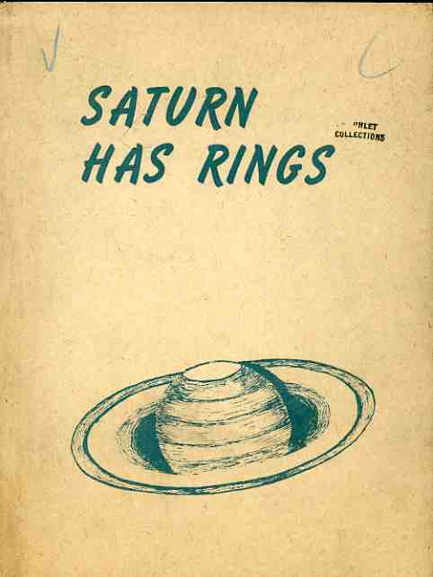
      blog mar 10 obvious sublime saturn679
    Sometimes publications have absolutely no pretense, stating exactly what it is that sleeps between their covers. And sometimes these titles seem more like declarative broadsides or posters and not books at all, the “book part”, or any writing furthering the cover’s statement,  being unnecessary.  The first example here (and one which begs the response “yup!”), Saturn Has Rings, written in 1944 by Donald Lee Cyr (of El Centro), should’ve stopped at the end of the title of chapter one, “A Rose has Petals”.  But no, it didn’t, and stretched itself over another fifty thin pages. 

    Frederick Blaine Humphrey’s Know Your Groceries (1931) takes an unexpected twist, spiraling into something called “biochesspathy”, “natural dianetics”, and somehow “applying the natural science of the Bible…to the philosophy of youth and health”. 

      blog mar 10 obvious sublime groceries677

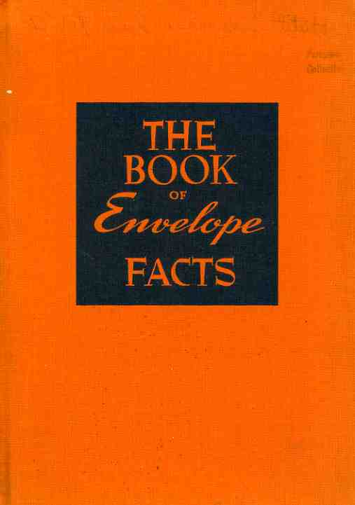
    The Book of Envelope Facts…yes.  This is actually a lovely book, in its very special way, with 55 pages of non-stop facts and semi-useless information on envelopes.  Chapter Two’s “Arousing Interest with Envelopes” competes wildly with Chapter Three “Attracting Attention with Envelopes” and Chapter Four’s “Creating Desire with Envelopes”.  It is completed with eight pages of a glossary of envelope terms.

      blog mar 10 obvious sublime envelope680

    This last example, Alice Mills’ Notes on Reading Aloud, really doesn’t belong, because it is mainly on acting; but the title is so lovely I just couldn’t resist. 

      blog mar 10 obvious sublime aloud678

    ·Posted by :

    ·in:

    — —

  • Bad Titles Department: Huh? Confusing Nothingness, Making Stuff, and Radio Hair

    JF Ptak Science Books LLC  Post 537

    0 blog march 9 titlitle that which661
    There is a constant and imaginary warfare going on among certain categories in this blog:  mainly, its “bad ideas” vs. “outsider logic” vs. “impossible books”.  The result is that I just give up and fold them all into each other so I don’t have to think about them at all.  I also haven’t made many entries in these areas because, well, there’s just so many of them to deal with–but I can tell you that they would make a fantastic Mystery Books gallery show, especially if the viewers were made to supply their interpretation of what the written material was all about from their problematic, time-sucking covers and titles.  And I can tell you that reading the content sometimes doesn’t help to understand the title or the cover art, the logic of investigation passing through it all like a stony Bushism (where you know that something was said,  with words, but that’s about all). 

    Take for example Scorn Not That Which You Do Not Understand:  the title begs you to do so as you read it, though it took me a few turns to actually understand what it was saying.  The problem with the tiny pamphlet is that once you’ve read a few pages, you know a little less about the book before you knew it existed, which is a hard thing to do.  (The writing goes downhill after the title.) 
    0 blog march 9 titles making of things660

    The Making of Things made me not want to know what was being made, and so I have not to this day opened it, though I judge from outside appearances that it was published around 1940 and is at least three pages long.  The title is just so on-beyond simple that knowing what it actually refers to is bound to disappoint. 

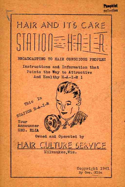
    Station Hair, Hair and its Care
    , is a written radio broadcast from Station H-A-I-R (brought to you by George Elia of the Hair Culture Service of Milwaukee Wisconsin, and evidently with offices in the Lake Wobegon region near Overthere, Minnesota), taches us all how to have healthy, radiant and attractive hair good enough for radio.  In the looks-made-for-radio genre, my own hair (or whatever it is) is definitely in the hair-made-for-radio department, so long as I get enough bootblack to color my scalp. 
    0 blog march 9 tittle hair662

    (This leads me to a semi-connected memory:  does anyone remember a street person in Manhattan, midtown, who was a drummer, with gigantic painted-on jet black eyebrows and painted-on black hair?  This wouild’ve been around 1970.  He was heavy, short, and would walk around with drumsticks and play on whatever was available, announcing, if I recall correctly, the famous drummer that he was immitating. He had to have been a famous street performer….Ring a bell with anyone.  Jeff?)

    ·Posted by :

    ·in:

    — —

  • A Map of The Office, 1942 -&- On the Cusp of Color: Bringing Color to Packaging

    JF Ptak Science Books LLC  Post 564

    Color 001


    An Occasion An Appreciation,
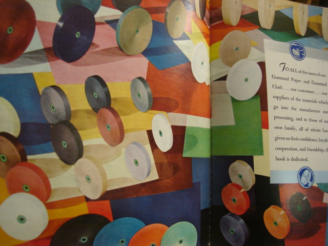
    a badly-titled but butterly-produced and broadly-illustrated work is a shiny, slippery and slick celebration of gummed paper.  It may well be the Gutenberg Bible of gummed paper celebration books. 

    The book is a silver anniversary (1917-1942) of the Mid-States Gummed Paper Company of Chicago, makers of gummed,.flat, non-curling special gum gummed papers.  It was a company started by box makers, the logical extension of that business. (“Gummed cloth tapes completed the manufactured joint of corrugated boxes, and gummed kraft sealing tape close the box,” Indeed. Also its a nicely-written Color 003
    sentence, and a well-written book.)  There is a continuous reference throughout the book to “flat, really flat” gummed tape, something that is lost on me if I don’t think about it–the use of splashy color throughout the work, though, isn’t. 

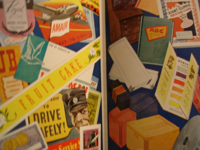
    The company’s color tapes washed over a wide spectrum, adding an artistic touch to a packaging world which was largely black and white. It also produced color gummed labels for  packaging and advertising, which made all the difference. (To appreciate this all you have to do is wind your way through a year or two of LIFE magazine from 1939/1940 and see the vanilla- and blandly-colored boxes of cereals and cans of  such and so spread across the issues.  People Color 004are much more convinced to buy something that has a colorful, pictorial image on the box than one that is a white box with black lettering. )*

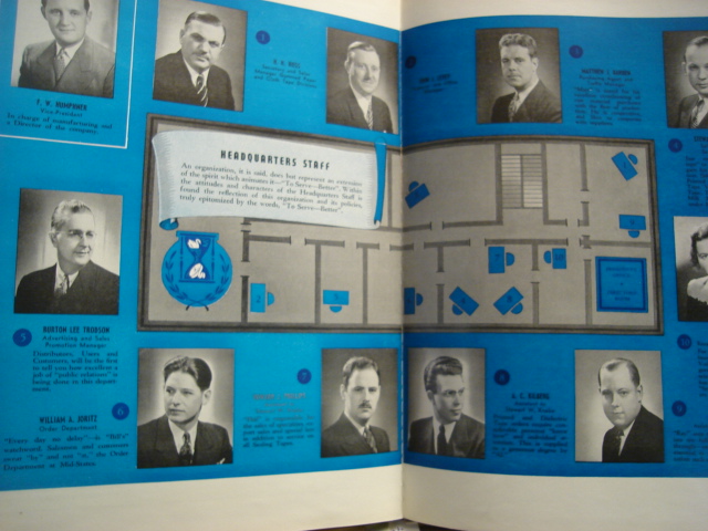
    Another very interesting bit about this book is that it published an indexed map of the offices of the headquarters staff–which is a very unusual map to my experience, very.  I’ve got a small collection of office layouts/maps from the 1900-1940 period, mainly because it belongs to a period long ago and far away, even though the tail end of office design like this creeps its way into my own life, showing up at places like “computer headquarters” in tv shows like the Rockford Files in 1980. It is a wonderful insight into the way business was done, and I can just about see the polished red linoleum floors, open Color 002transoms and abundant oak everything, all swirling in cigarette smoke, populated with people wearing real clothing.

    Yet another oddity is the map of the locations of the company–it definitely belongs to the Blank and Empty Things category of this blog–showing the five cities where it  had offices.  The resulting map though is quite unusual, as it shows just the five point and leaves the rest of the country jet black in a deep blue background, everything else missing. 

    I know I’ve had some fun with this book, but I’ve got to say that it was very well done, very well written, and about as interesting as its topic could allow. 

    * I believe that the first mass-produced book illustrated with color photos was by Leica for its labs, published in Berlin in 1938 (?).  color printing in photography had been around by a laborious process since at least the 1890’s, but that’s a different story


  • The Microscopy of Boredom

    JF Ptak Science Books LLC  Post 555

    “Contrive to have as many treats
    for your mind as you can, as many things to which it can fly from itself”  
    Sam.
    Johnson.   (James Boswell, Ominous Years, pg. 287

     blog 20 point missed717
    Boredom is a powerful thing.  It is also, at least as a word if not as a
    concept, relatively young—it first appeared in Dicken’s Bleak House in 1852,
    with the word bore making an earlier appearance in 1762. (Bitter Ambrose Bierce
    redefines “bore” as a person who speaks when you wish them to listen.)  Boredom is distinct from Melancholy, which
    relates more to depression than to boredom, and is an idea and word thousands
    of years old.  Boredom is a universal
    constant, a wide acknowledged entity of enormous reach and singular acuity—and the
    fact of the matter is that you cannot translate boredom into a narrative.  You can create art depicting boredom, and you
    can tell what boredom is, but you cannot, really, cannot write a novel with a
    boredom narrative.  Unless you’re Jane
    Austen.  It is a tired pursuit of
    tireless insipidity which simply escapes capture in the form of a novel—or I
    should say, a novel that you’d like to read, or was readable.  Boredom still awaits its Quixote.  Melancholy on the other hand has many, not
    the least of which is one of the most unreadable and fascinating books in the
    canons of English lit, Burton’s
    Anatomy of Melancholy (which would be an interesting film if another Burton,
    Tim, got his hands on it.).

    I was thinking about boredom in
    terms of some of the printed material  in
    my Naïve Surreal category—those are the pamphlets where the meanings of their
    titles and subjects, once popular in their day, are now aloof and unhinged,
    floating in the present with almost no bearing on what their original logical
    intent was.  And so these titles
    sometimes take on a fantastically removed appearance, and sometimes they are
    simply simple, so simple that they can be at first blush quite boring.  But they’re boring only for a moment, until
    the brain wraps itself around the illogic of them, and then they become not
    boring—fascinating, someti blog 20 donj't716mes.  And what
    is that tiny space between the wide widths of boredom and fascination?  How microscopic are those pores between the
    two entities? And what exactly is that place where boredom and fascination meet?  

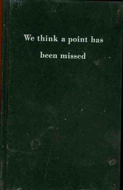
    We Think a Point Has Been Missed (published in March, 1933) is an odd example, going from boring to puzzling to incredible to disappointing to interesting all in about a minute.  It is a lovely title to be sure, flying at the heights of the sublime mundane, hiding in its own obvious nature.  Opening the booklet we find that it was published by the Columbia Broadcasting System, and at first blush it seems a fainting on miniature problems of the naiscent radio company.  But it turns out that it is actually fairly topical:  CBS wanted to make it very clear that the eight-minute radio broadcast of President Roosevelt on  March 4th 1933* was a significant and exceptional use of the new medium,  CBS points out that “Roosevelt did advertising’s most significant job…advertising ‘courage” and “conquered despair”, and that those eight minutes  over the radio “added cash value of the nation….commodity markets pulsated, dollars rose around the world, demand for department store credit rose 40 percent”.  In short, this was an early recognition of the extreme value of immediate access to a national population.  

    The Roosevelt speech, which went without quotation in this short report, was his inaugural address, the day of his taking the reigns from Herbert Hoover–the “All  we have to fear is fear itself” speech, which did indeed galvanize the nation, delivered virtually immediately via radio. (“God bless Roosevelt; god bless radio” intoned Will Rogers.)   It is one of the country’s best inaugural speeches, made at a time when the country needed one, there in the depths of the Great Depression in the late winter of 1933.  But all of this is so far down in this slender seven-page book that the speech almost smokily wisps its way through it, the main emphasis being the importance of the delivery system and not the stuff of delivery.  Its a queer little thing, all of its importances semi-hidden, made more pronounced in this particular copy since it was owned by Roosevelt.  

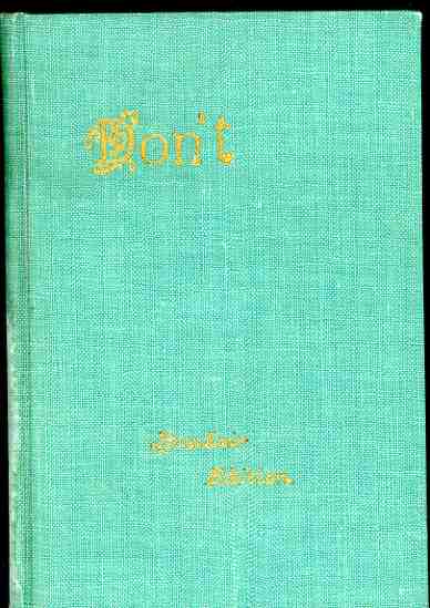
    The second example or boring-interesting is the ultra-under compelling Don’t, which when published in 1926 threatened directions for advising improprieties in conduct and common errors of speech.  Written by “Censor”, it dragged itself through 76 pages of nitty dialog details that are in a way interesting as a window on correct conduct during the roaring times.  Ultimately though the text doesn’t survive interest, and all we’re left with is the very unusual title. 

    Which takes us back to appearances and second-life and the intersection of boredom and the fantastic.  I suspect that if we apply the microscope to that boundary that we see exactly what we want to see.

    ·Posted by :

    ·in:

    —

  • Naively Surreal Bad Ideas: Marriage, Women, Satan and Fleshy Ribs

    JF Ptak Science Books LLC  Post 544

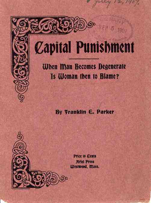
    Well.  In this tortuously ripped 1907 poetic headbanger on blame and retribution and innocence–and somehow ultimately about capital punishment–are neural squeezings that I have never se   blog 12 marriage696en or heard before, which are so loftily bad, and so logically weak, as to make a grown man puddle-up in amazement.  I don’t want to get too far into this thing, as the entire entertainment part of the work can stop right at the sub-title, because this little pamphlet is just tremendously bad, it transcends being about bad; it climbs out of badness into the so-bad-it-is-good department, and then slips instantly into the bad-good-bad-bad genre.  

    Listen:
    Since woman has been made of a rib of man, and is the “pupil of man’s schooling”,

    How then can woman obviate

    the crimson flesh of shame;
    when man becomes degenerate,
    is woman then to blame
    ?

    For woman being part of man,
    and should she cause an aching,
    how can her sins be other than
    the image of his making

    It goes on from there, of course, but we really don’t need to follow.  The answer, by the way, is “yes”.

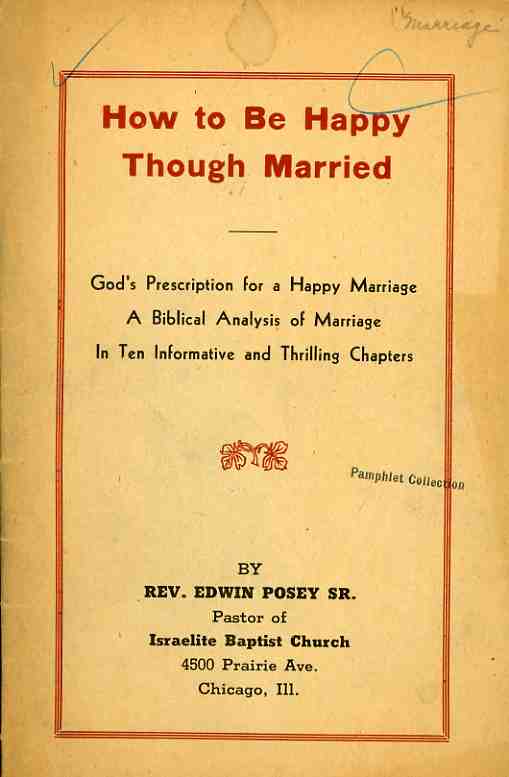
       blog 12 marriage695 When I first saw Rev. Posey  Sr’s.1947  pamphlet I thought that it read “How to be Happy Through Marriage”.  Oops.  My mistake, though the title as it stands is infinitely more entertaining, what with the story being told in ten thrilling chapters (seeded over 28 sparse pages).  In the final installment of these prescriptions for happiness in spite of it all, we are reminded that “Satan is God’s arch enemy”, and that “IF YOU WOULD BE HAPPY KEEP SATAN OFF YOUR SHIP” and “do all to the glory of god” and MARRY IN SEASON”.  DO NOT marry a man for a “meal ticket”, or “to keep him from marrying someone else”, and DO NOT marry too soon or too late. And so on.  [Caps in original.]

    There’s much more sage advice sprinkled liberally around biblical verses, but I think you’ve already gotten enough of the  flavor to appreciate the rest of the meal (food itself sometimes getting in the way of its promise).

    ·Posted by :

    ·in:

    — —

  • Titles of The Sublime Mundane, 2: Salt and Wire

    JF Ptak Science Books LLC  Post 543

    Read last year’  March 11, 2008 entry “The X-Ray of the Imagination 2: Phrenology, Chinese Hell Scrolls, and the Beauty of the Thought Balloon”.

    The covers of this book are too far apart. (A book review, in toto, by Ambrose Bierce)

    There are books of which the backs and covers are by far the best parts. Charles Dickens

    0 a bay march 11 001
    Following yesterday’s post on the Sublime Mundane are these pamphlets, which are as perfectly and invisibly mundane as can be, if we were judging them solely by their covers.  What turns out to be the case, though, is that they are beautifully composed,  very well written, and extremely informative.  They are  drop-dead serious.
    0 a bay march 11 002

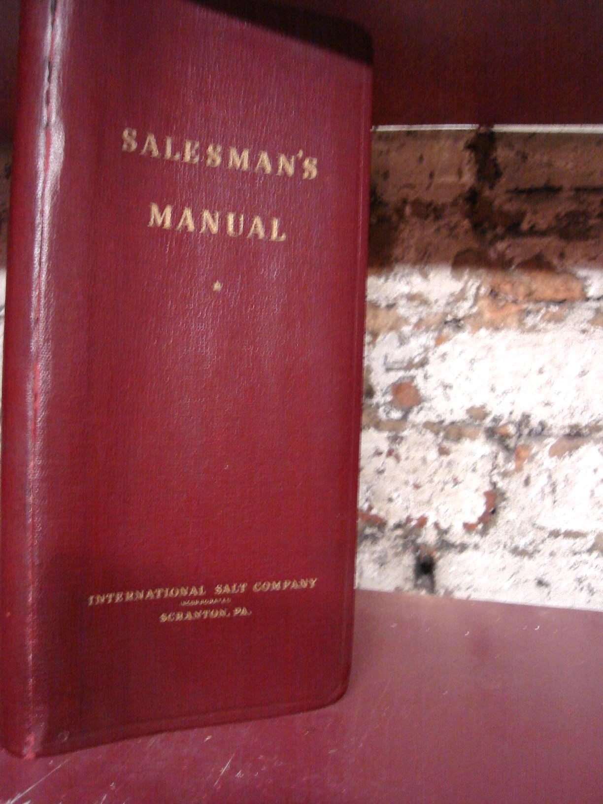
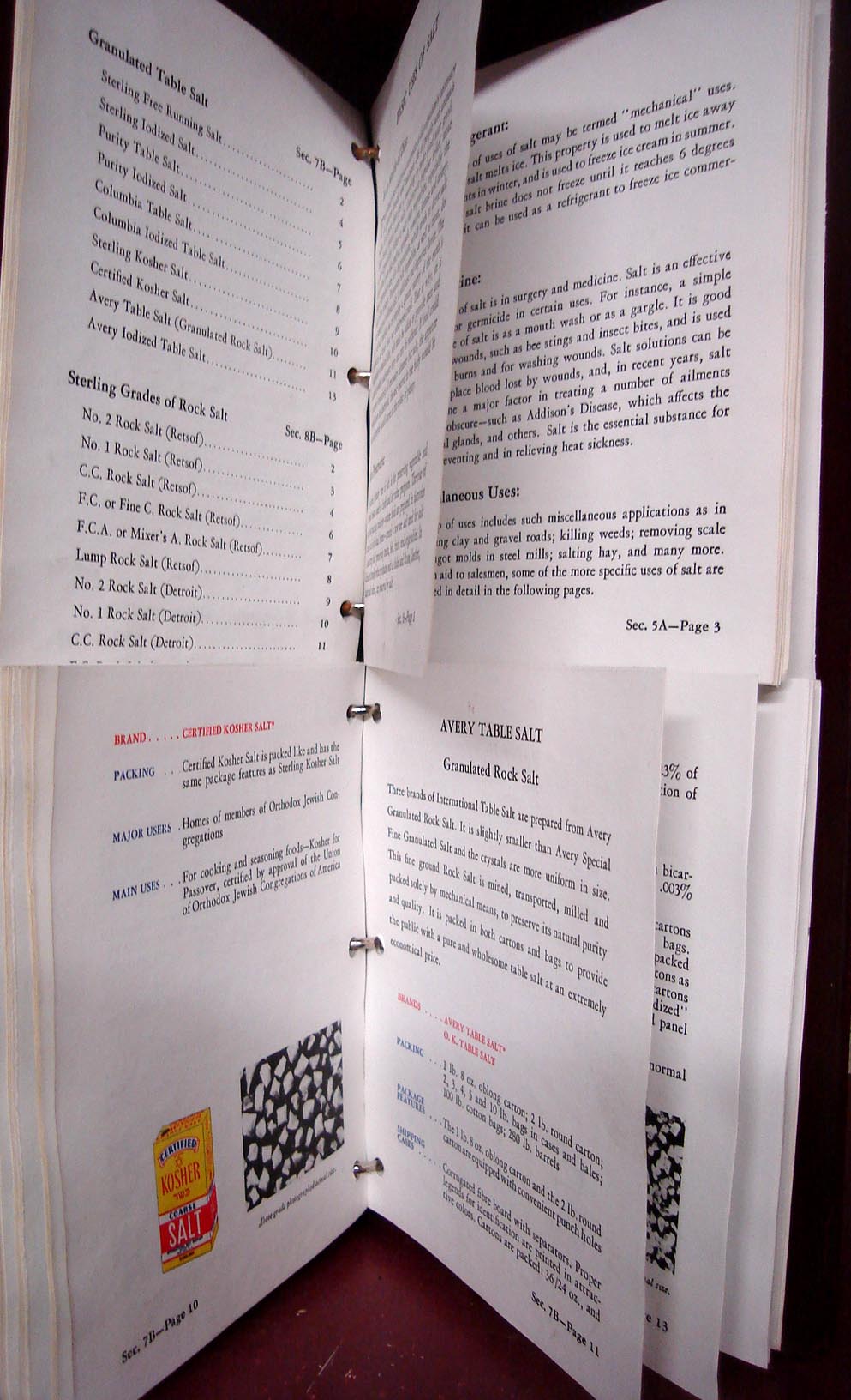
    The first is the International Salt Company’s Salesmans’ Manual for, yes, the selling of salt*.  The 12-inch tall , 6-ring binder instructional has 13 sections and is 75 pages long and strong; not only that, but most of the text is cut in two, so that there are some intricate associations that can be built between the bottom part of sec 2 page 8 and the top half of sec 4 page 2 and so on.  It is just brilliantly done,a work to be proud of!  And of course it looks like absolutely nothing and less than that, or that you’re whacking a quarter-inch brad with a 12-pound hammer.  Which may be the case, because the salesman who was familiar with all of these aspects of salt could put down just about anyone who got in between them and their salt sale.

    0 a bay march 11 003
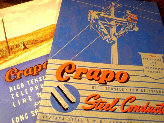
    Next are two 1945 versions of the unfortunately-named CRAPO Company’s product brochures,  makers of steel conduits, and who were evidently part of the Indiana Steel and Wire Company (of Muncie).  It turns out here, too, that these were packed with engineering data and construction practices for electrifying and improving electrical conditions in the great midwest.  The catalogs were also deftly  illustrated with elegant engineering drawings of their products.  So:  on  the outside, seeming nothingness for one book and badly-named for the other; inside, they are state-of-the-art, well written and bountiful.  They just look weird. 

    0 a bay march 11 004

    *I am in no way demeaning the importance of salt here–I just don’t want to deal with the whole overwhelming issue of its important history.  Suffice to say that stuff hasn’t been much more important than salt over the last few thousand years.

    ·Posted by :

    ·in:

    —

  • Naive Combat and the Romance of Secret Death Holds: Utopiaic pre-Gore Imagery of Intentional Violence

    JF Ptak Science Books    Post 487

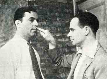
    0 blog jan 26 roy rogers443


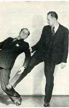
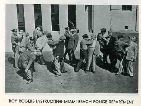
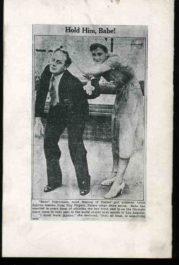
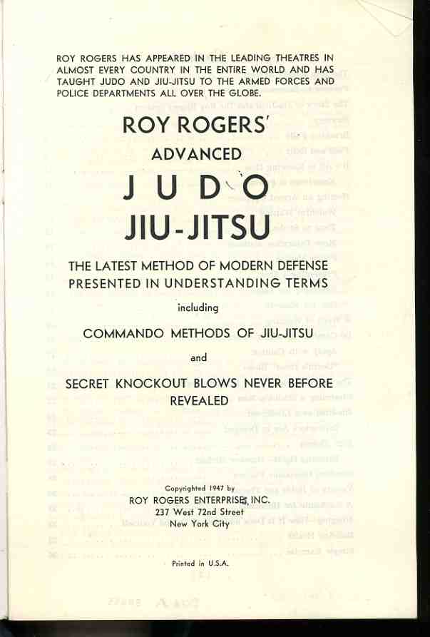
    Roy Rogers–not the singing cowboy but a black-shirted, black-suited, white-bow-tied private slickee cop–shows us here all of the secret and impossible moves from those fast-fighting sequences in those hundreds of 1930’s movies in which men would fight furiously and not lose their hats.  Or, the same guys would have no hats but would have wildly whipping grease-hair and would be knocked down with an open-fisted shot the chest, collapsing on conveniently-placed collapsing-couches.  But Mr. Rogers, who claims to have taught these methods “in leading theatres in in almost every country in the entire world” was serious about his craft, even though the images used to illustrate his serousness look naive and sweetly quaint to our 2009 eyes.  In a series of images that almost never show anyone with an open or grimacing mouth, Mr. Rogers tried to show his grasping audience the tricks of his trade, or the trade of his tricks,

    0 blog jan 26 roy rogers444


    with various methods of restraint, and head butts, and finger holds, and balance-upsetters, and, yes, even the “death” blow.  It is remarkable, really, how far things have progressed in the way of savage fighting in the last 62 years–things have gotten so ultra-modern, so (in the words of the lovely Anthony Burgess) ultra-violent, that these secret combat doings from 1947 look like baby-room wallpaper compared to the nastiness of today.  And yet teaching this stuff kept Mr. Rogers in white ties and jet-black clothing.

    0 blog jan 26 roy rogers445

    If only this sort of combat packed the modern nightmare with dread, what a better place we would wake to–for me, these are pre-gore images of violence which look strangely removed when viewing them from our post-gore world.  Blood as a result of violence in the movies of the 1930’s and 1940’s (and even into the ’50’s) was a rare commodity; blood after the late 1960’s was delivered by the buckets-full, and then by torrent. The delivery of the visual birth of administered violence is relatively new in the history of “entertainment”, and we might’ve moved a little beyond that, as well, as almost nothing is shocking anymore in our pictures of advanced and sometimes impossibly-violent violence.  I imagine that the thought of depicting violence in the movies via 2009 standards to Mr. Rogers back there in 1947 would’ve seemed as remote to him then as the possibility of a computer smaller than an automobile.  

    In any event, I find this to be a remarkable and quiet piece of Americana, capturing some of the stuff of life not normally captured. 

    0 blog jan 26 roy rogers441 0 blog jan 26 roy rogers442

    ·Posted by :

    ·in:

    —

  • The “Huh?” Department: Pig Graphs, Pig Checkers and Other Small Confusions. Naive Surreal Advertising Art

    JF Ptak Science Books   Post 485


    “Always remember, a cat looks down on man, a dog looks up to man, but a pig will look man right in the eye and see his equal.”–W.S. Churchill

    0 blog jan 24purina425

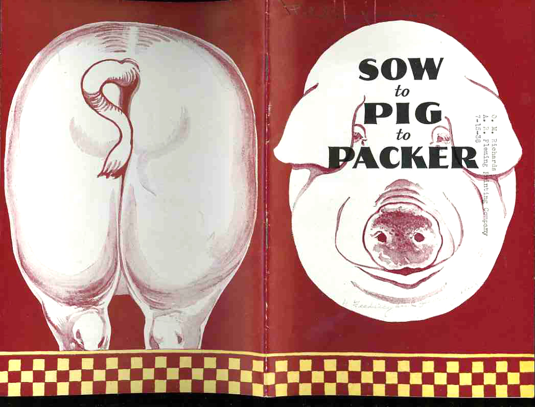
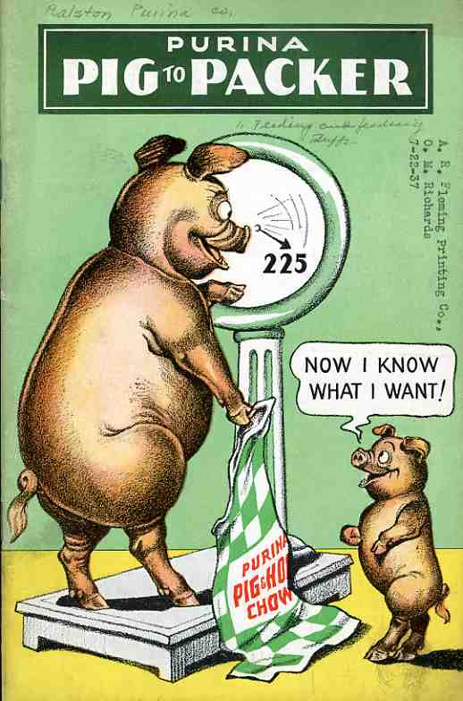
    Well.  Some things can just speak for themselves, as in the case(s) of these curious images brought to you by the graphic design folks working to push feed for Purina Company.  There were still tens of millions of farmers in the U.S. when this pamphlet was printed in 1935, and most of these farms were quite small, and so the Purina Company was reaching out with a broad stroke, right down to the neighborhood guy with 6 pigs on a half acre.  Of course what makes these images so appealing now is that they seem other-worldly, from a time that we have very little connection to even though it existed in the lifetimes of my parents.  The images are discordant, off-centre, not-quite-right–which places them perfectly into my Naive Surreal category.  The images are in their own accidental way quite surreal in that they look to be intentionally bizarre, when the opposite is true.
    0 blog jan 24purina graph426


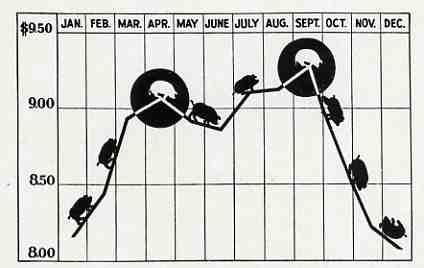
    Nestled snuggly away though is this remarkable graph of pig value versus time–its interest has nothing to do with the data which I suspect was accurate and universally known to be so (at the time), but for the PIG MARKERS at the X/Y interface.  That is something I’m sure I’ve never seen before, and I pay very close attention to the history of the display of quantitative data.  It is a small jewel.  a pearl among, well you know.


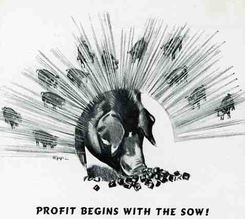
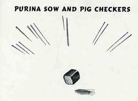
    As for some of the other images and their pig-centeredness, I can only speculate.  “Profit begins with the sow” is a solar porcine sunrise with little pig radiances.  “Purina Sow and Pig Checkers” I thought at first and continue to wrongly think that the cube in the middle was a loaf of bread (complete with shadow!), beautifully confounding the image-heading dichotomy; but it isn’t.  It is still a small magnificance of confusion, thank goodness.

    0 blog jan 24purina profits 428 0 blog jan 24purina graph427

    0 blog jan 24purina profits 429

    ·Posted by :

    ·in:

    — —

  • Is Dance Dangerous? The Naive Surreal Collection, Part 8.

    JF Ptak Science Books LLC  Post 477
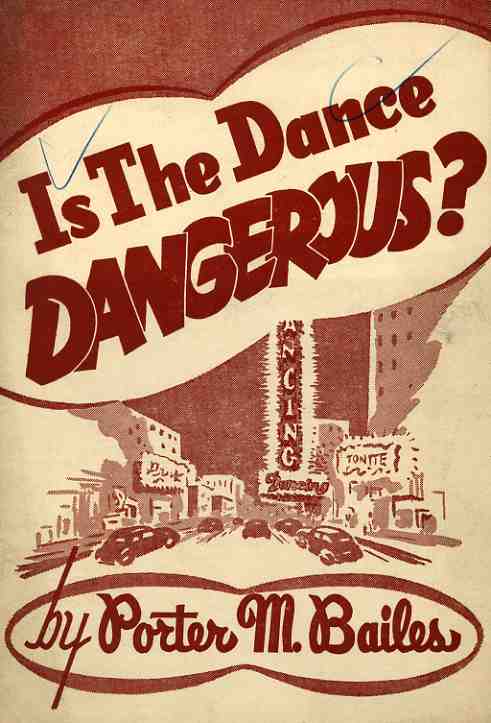
    0 blog jan 20 dance danger391 In the history of questions, this  (“Is the dance dangerous?”) certainly must rank in the bottom tenth percentile.  Or at least I hope it does.  The question is the title of this small pamphlet, written by Porter Bailes (of the First Baptist Church of Tyler, Texas) in 1947, a work which is part of my Naive Surreal collection.  “If it’s doubtful, it’s dirty” is the major maxim that floats it way through this work, and proceeds to attacks it subject of “the”dance on its unholy, immoral, unnatural, imprudent, prayer-defeating nature. 

    “Can any one stretch the imagination as to think of Jesus as being congenial and at ease in the atmosphere that the dance creates? No! Dancing is not to the glory of god. It never made anyone feel the nearness of god.  It robs us of the desire to pray. A dancing foot and a praying knee are not found long on the same limb.”

    And also:

    “There are many fine people who dance.  They are fine not because they dance, but in spite of the dance.”

    And:

    “The dance does not involve any moral requirements.  The more lewd the people are, the more proficient they may become. The gestures of the dance demand lewdness.” 

    Lastly:  “the tine of the dance makes it dangerous. Its hours are unearthly and abnormal”

    And lastly last:  ” The position of the dance make it dangerous.  For two normal people to place their bodies in the close personal contact that the modern dance demands and not have impure thoughts and unholy emotions stirred, would be very unnatural.  In truth, it is against all the known laws of human nature.”

    This is last just for my examples:  there are 20 pages of this.  It is remarkable that, in this highly restrictive and judgmental work,  the paper is allowed to bend. 

    And not to be outdone, the author tells us that 97% of professional gamblers “attribute their habit to the practice of playing cards at home”.  “The risk is too great, young people” Pastor Bailes tells us, “for you to start gambling–even at home”.  He began to warm to this subject but I guess was saving this subject for later.