A Daily History of Holes, Dots, Lines, Science, History, Math, Physics, Art, the Unintentional Absurd, Architecture, Maps, Data Visualization, Blank and Missing Things, and so on. |1.6 million words, 7500 images, 4.9 million hits| Press & appearances in The Times, Le Figaro, Mensa, The Economist, The Guardian, Discovery News, Slate, Le Monde, Sci American Blogs, Le Pont, and many other places… 5000+ total posts since 2008.

Category: Books–Great Cover Art

  • Big and Heavy–Cover Design for Industrial Pamphlets, 1932-1941

    JF Ptak Science Books Quick Post

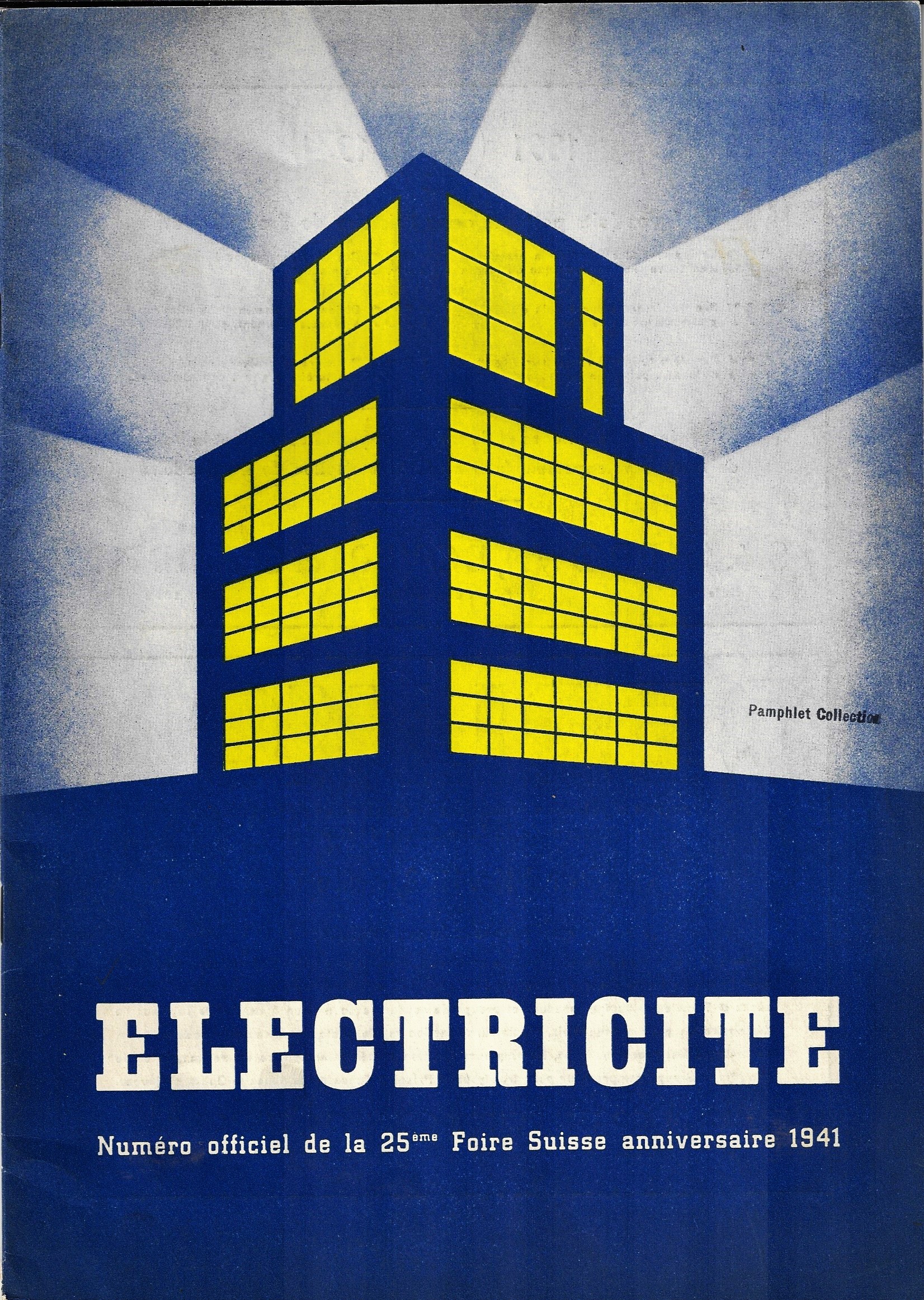
    I’ve not made a study of this, but it seems to me that of the industrial-related pamphlets and manufacturer catalogs and such that I have here the majority of their covers show as big/heavy/bulky. Perhaps this is just a function of what my mind tells my brain to tell my eyes what to see, which is possible. In any event, the selection of what I’ve dealt with here on the blog over the years bears out the Heavy hypothesis.  

    Books covers industrial cvr _1_

    (1941)


    Books covers industrial cover _5_

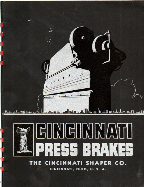
    This imagery bears out remarkably well in this catalog for press brakes from 1935, with an overwhelming image of the machinery, which, when you look at it in a certain way, takes on an athropomorphic and/or utterly massive gecko-like facial persona:
    Books covers cincinnati

    (1935)

    Books covers cincinnati

    ·Posted by :

    ·in:


  • When a Map Should Probably Not Have Been Made

    JF Ptak Science Books  Quick Post

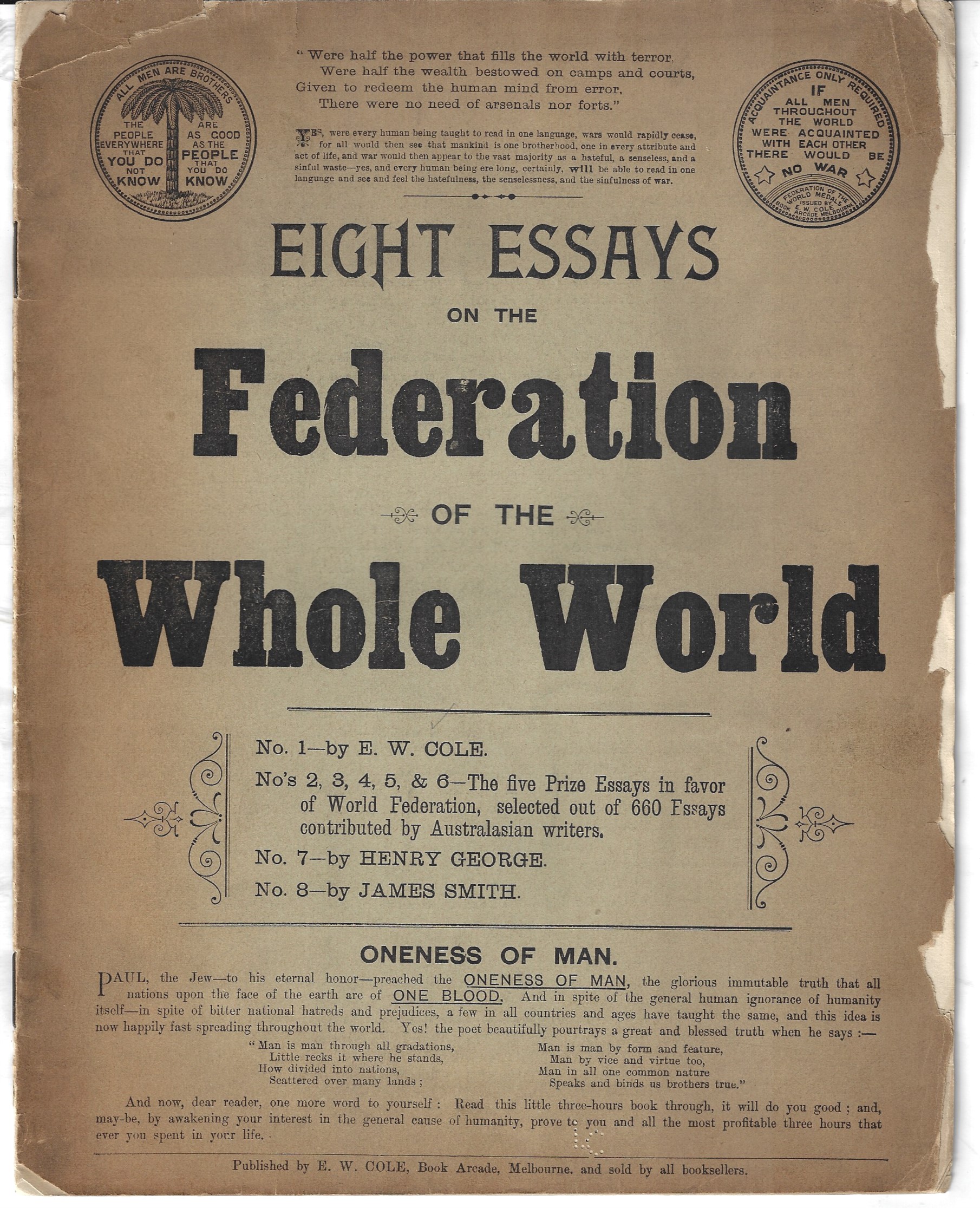
    This pamphlet was a little confusing to me–at first I thought it would fit into a category of Outsider creations, a small collection of pamphlets filled with some towering and submerged ideas on curing the Depression, keeping the U.S. out of war, flagpole painting, zipper repair, exrta-Earths populating the (regular) Earth, eyestalk plant people of Mars, flooding the Sahara, damming the Hudson River, nuclear powered _____, mega weapons, mega planes, hair massage for higher IQ, and so on. The design of the pamphlet certainly had the feel and look of a great attempt at conveying some secret truth, it turns out that it is pretty straightforward, an 1890’s/1900’s  appeal to folk on acting courteously and amicably towards others to achieve a one-government-something. 

    The message was very simple: do good, be kind, help people, live your religion.  It was the work of a very successful bookseller and publisher in Melbourne, Edward William Cole1. He sounds like he was an interesting guy, autodidact and entrepreneurial, born in the U.K. and migrating to Cape Colony and on to Australia, spending time in the gold diggings, exploring the Murray, and settling into Melbourne where he opened up a bookshop in 1864 which morphed into a large arcade with many rented kiosks.

    Cole wrote a number of short pamphlets, published them, and either sold or gave them away–the pamphlet presented here was probably a gift to his customers. It published eight essays of 660 collected for the prize of publication, extolling brotherhood and the commonality of the human condition, appealing for kindness and the common good, and reading above nearly all else. 

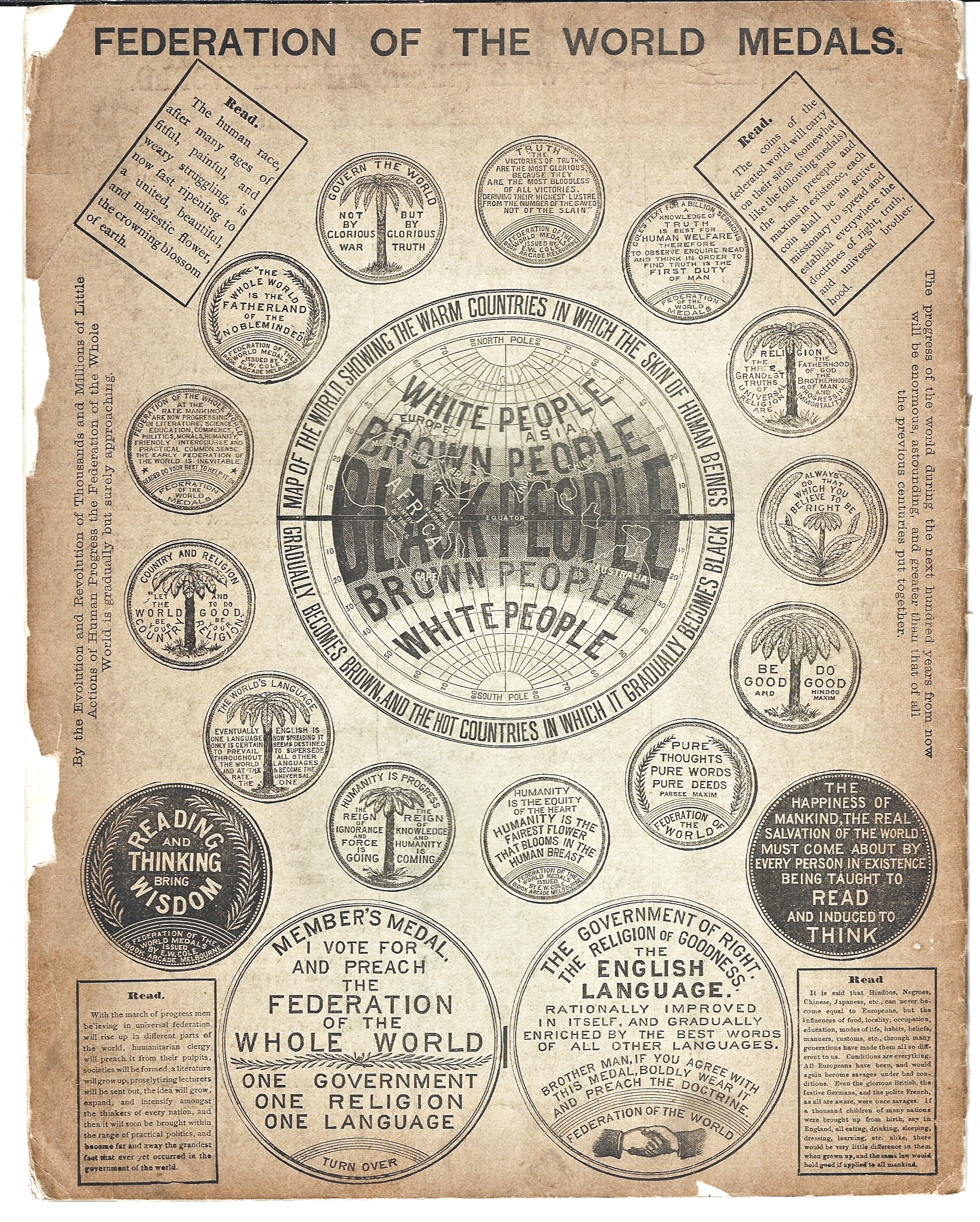
    The imagery on the rear cover is striking, most of the artwork being the fronts and backs of medals/medallions that Cole had made. The image in the middle of it all is, well, very surprising, and potentially disturbing, though it seems unconnected to any of the essays or sentiments of the pamphlet, and seems largely to be a non sequitur.  In any event there seems to be no connective text, nothing on race dominance or eugenicism, the only thing that comes close to that is a repeated belief that English should be the dominant world language for its “perfection”.  As dire as it seems the map seems to be open to speculation, though on the face of it doesn’t look like much good could come . Is it something as nasty as showing what the map maker thinks are the natural divisions of the world according to race, or could it possibly be suggesting that skin color is based on location on the globe and has nothing to do with any sponsorship of superiority or inferiority based on color? Given the rest of what seems to be in this pamphlet, it seems likely that the later is the case. The guy would’ve been better served if he left the map out.

    I’m reproducing the artwork here because there seems to be little mention2 of this work outside of stiff and undated bibliographies of books-received. 

    Black People front

    Black People front
    Black People front

    Notes:

    1.  Cole’s entry in the Dictionary of Australian Biography: http://adb.anu.edu.au/biography/cole-edward-william-3243

    2.  According to WorldCat there’s another version of this work, fleshed out to 207pp,, printed around the same time (the librarian guesses ‘189_’) and located in just one library (Victoria). There’s only one copy located of the copy mentioned here, located at the Murdoch library, 11,564 miles from where I sit in western North Carolina. 


  • The Young Communist League is at Your Service

    JF Ptak Science Books  Quick Post

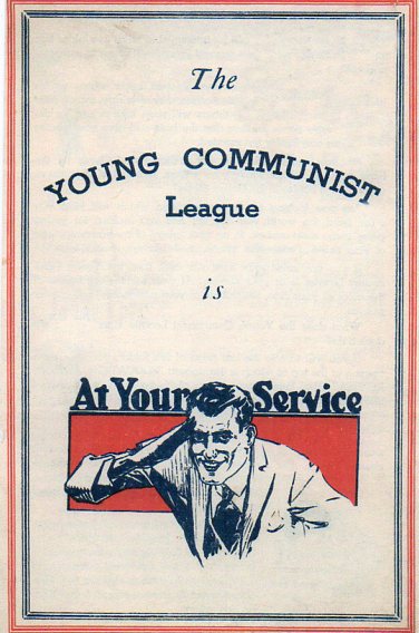
    Books cover young communistThis dapper young man with the sharply snapped salute is a Communist, and as he tells you, he’s at your service.  But the Young Communist League (of the United States) in the 1920’s–when this pamphlet was printed–was a semi-underground organization with few members who wanted to serve you and which was also “devoted to the interests of all young people and is dedicated to the revolutionary cause of the working class of our country, the transformation of the United States through mass democratic struggle into a socialist society”. 

    So the YCL service venture may have been more helpful to someone with Communism in mind than anything else.  It did have a diffident bit of patriotism in the design of the pamphlet’s covers, but they wanted a United States that wasn’t the United States that very many other people wanted. 

    Perhaps the October Revolution wasn’t what the people of Russia wanted, either. They certainly wanted their freedom from Tsarist rule, but the revolution orchestrated in the name of freedom was hardly that. Significant American thinkers and writers on the plight of the people in Russia at the end of the 19th century–including George Kennan, author of the still very readable and absorbing Siberia and the Exile System (1891)–pretty much jumped off of the bandwagon by WWI.  I can understand a haphazard interest in the Communist Party and the idea of socialism in the United States in the 1920’s and even the support of the still relatively new Soviet Union, but this was a period in which the member in the cascade of three-letter acronyms of Communist political affiliates and parties had a weak draw.  Interest in them picked up in the United States in the 1930’s, though this was also the period during which the atrocities of the monster Stalin were being discussed.  I’m not sure why this popularity grew in the light of these revelations–I just don’t know the history.  (Even though this was supposed to be Stalin’s quote but wasn’t, it fits quite well: “death of one man is a tragedy, death of a million is a statistic”–as a murderer of millions of people, he was very well versed in statistics of genocidal sadism.)  

    In any event, I simply liked the public face that the YCL engraved for themselves–it looks much like any other face you’d see in any other magazine hawking coats or cigarettes or Dunlop tires.  A face like any other.  
    ______
    Notes
    Kennan wrote in 1923: “The Russian leopard has not changed its spots… The new Bolshevik constitution … leaves all power just where it has been for the last five years–in the hands of a small group of self-appointed bureaucrats which the people can neither remove nor control.”

    ·Posted by :

    ·in:


  • The Mundane Glory of Pig Bristles, Hooking, and the Mystery of Filters–Pamphlet Covers, 1930s

    JF Ptak Science Books  (Expanding on an earlier post)   Blog Bookstore  
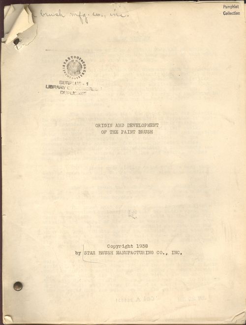
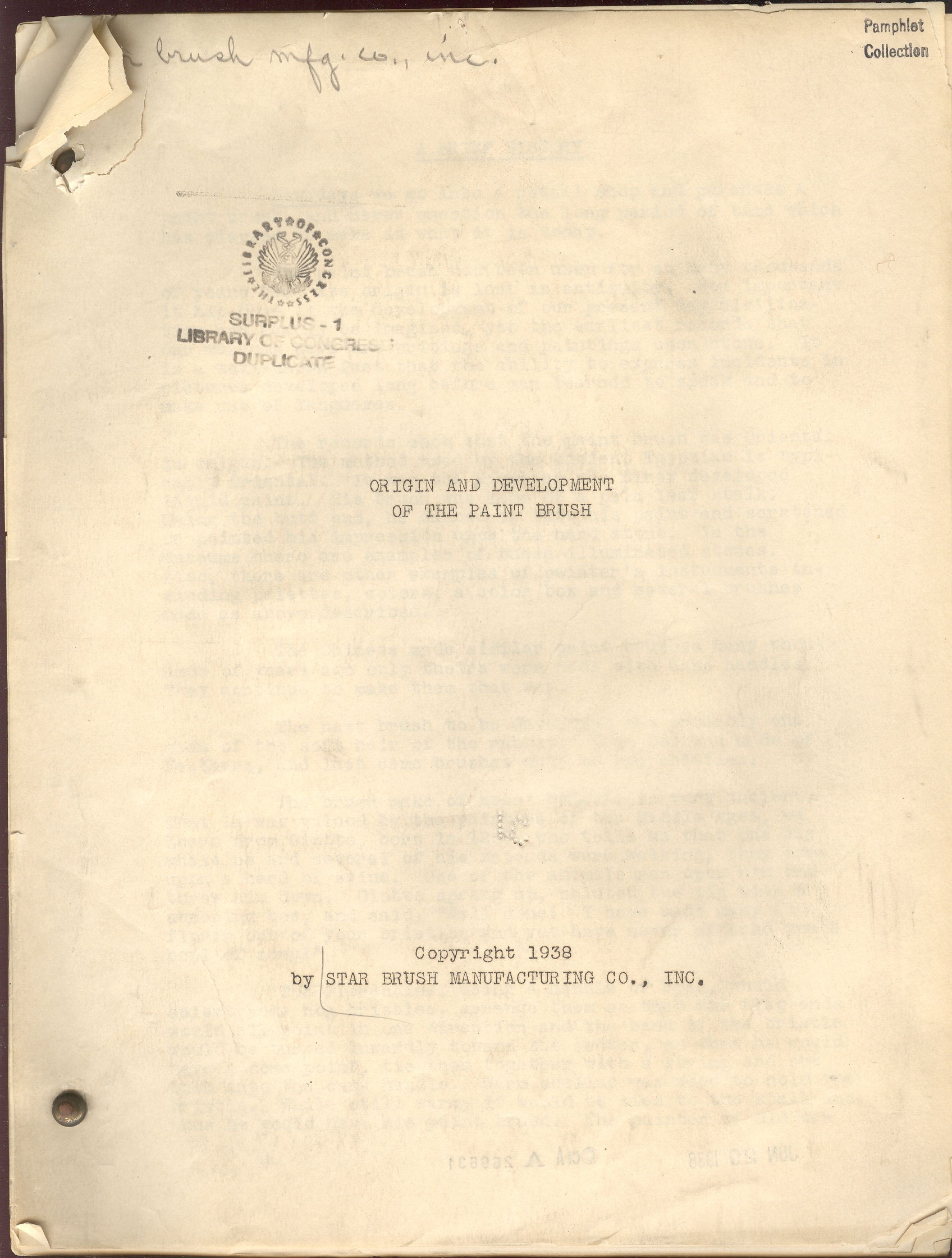
    Books covers origin paint brushI wonder what is was like to be a traveling salesman hauling around hundred-pound barrels of pig bristles?

    We don’t really find out the answer to that question in Origin and Development of the Paint Brush (1938), but that remarkable, far from the maddening crowd question does present itself in the text.  And that is why I love pamphlets like these.

    Spending my professional life with the book, and being a reader, I’ve come into contact with and have been exposed to a good, solid, Big  Number of books, a Big Book of Big Numbers of books.  And so when the unusual creeps in or is stumbled upon, they shine like little novas in my book-sky.  And the ones that shine with their own special light are the titles come in three favorite flavors:  the Sublime Mundane, Outsider Logic, and Fantastic (and Impossible).  Today’s selection are from the first category, and exhibit titles and texts that look like non-luminous and uni-dimensional but turn out to be anything but mundane.

    Earlier in this blog I’ve written on pamphlets entitled Flagpole Painting, School Safety Pioneers, Fortunes to be Made with Frogs, Where are the Dead?, How to Repair a Zipper, Mud’s Romantic Story, Soap in Everyday Life, The Fine Art of Squeezing, Salt Salesman’s Manual, Know Your Groceries, The Book of Envelope Facts (and others), and they’ve all shown a terrific inner quality that is completely hidden by their so-sleepy and yet strangely-compelling titles.  Like the paint brush history pamphlet.  Here are a few other new examples:

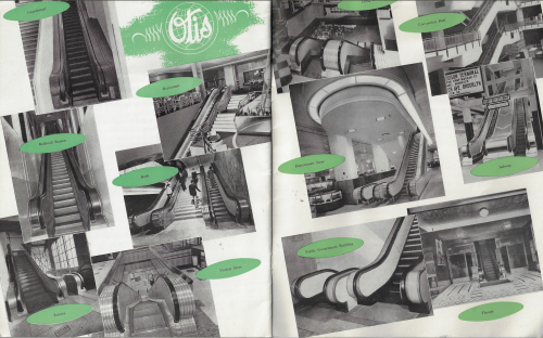
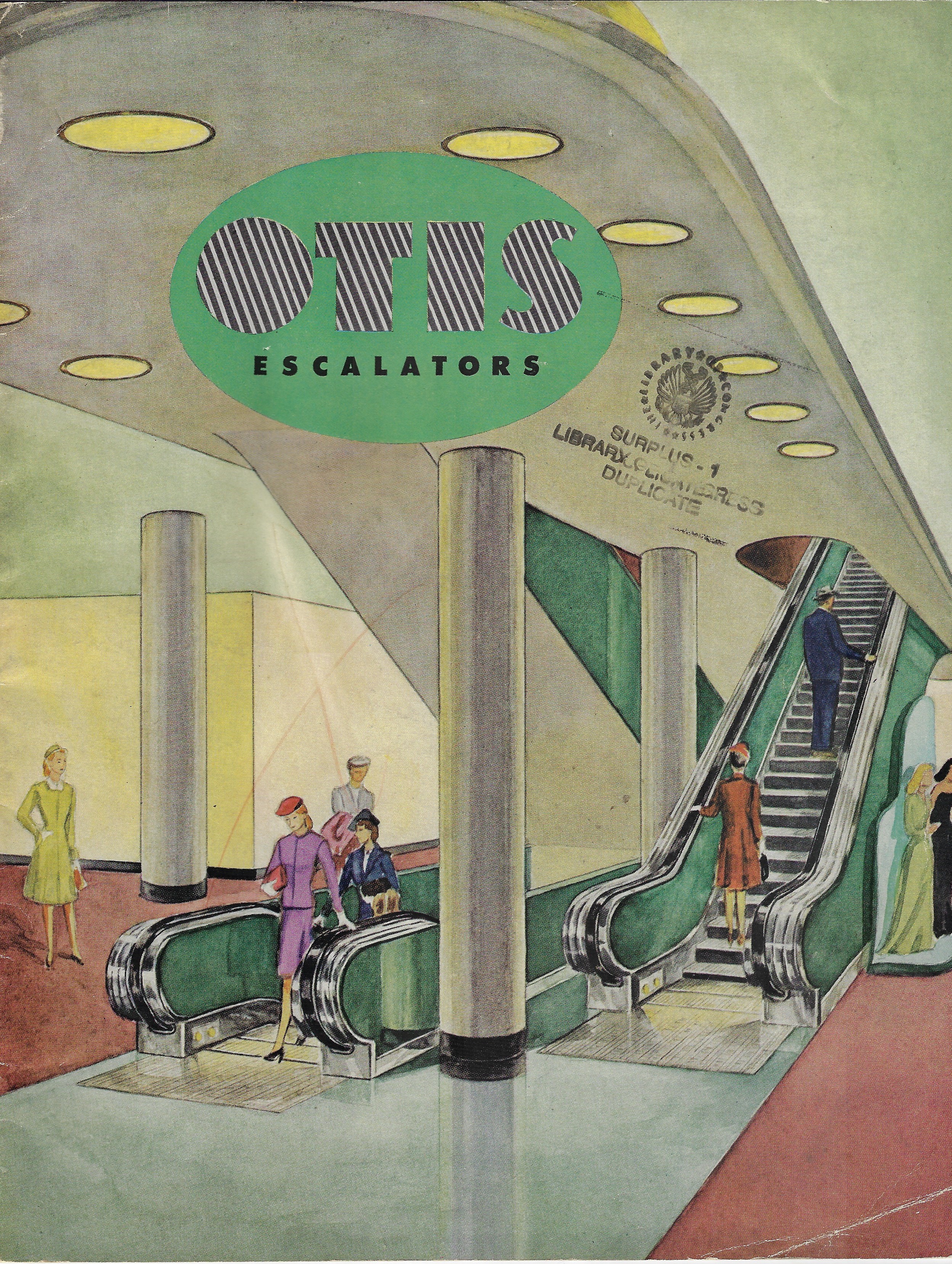
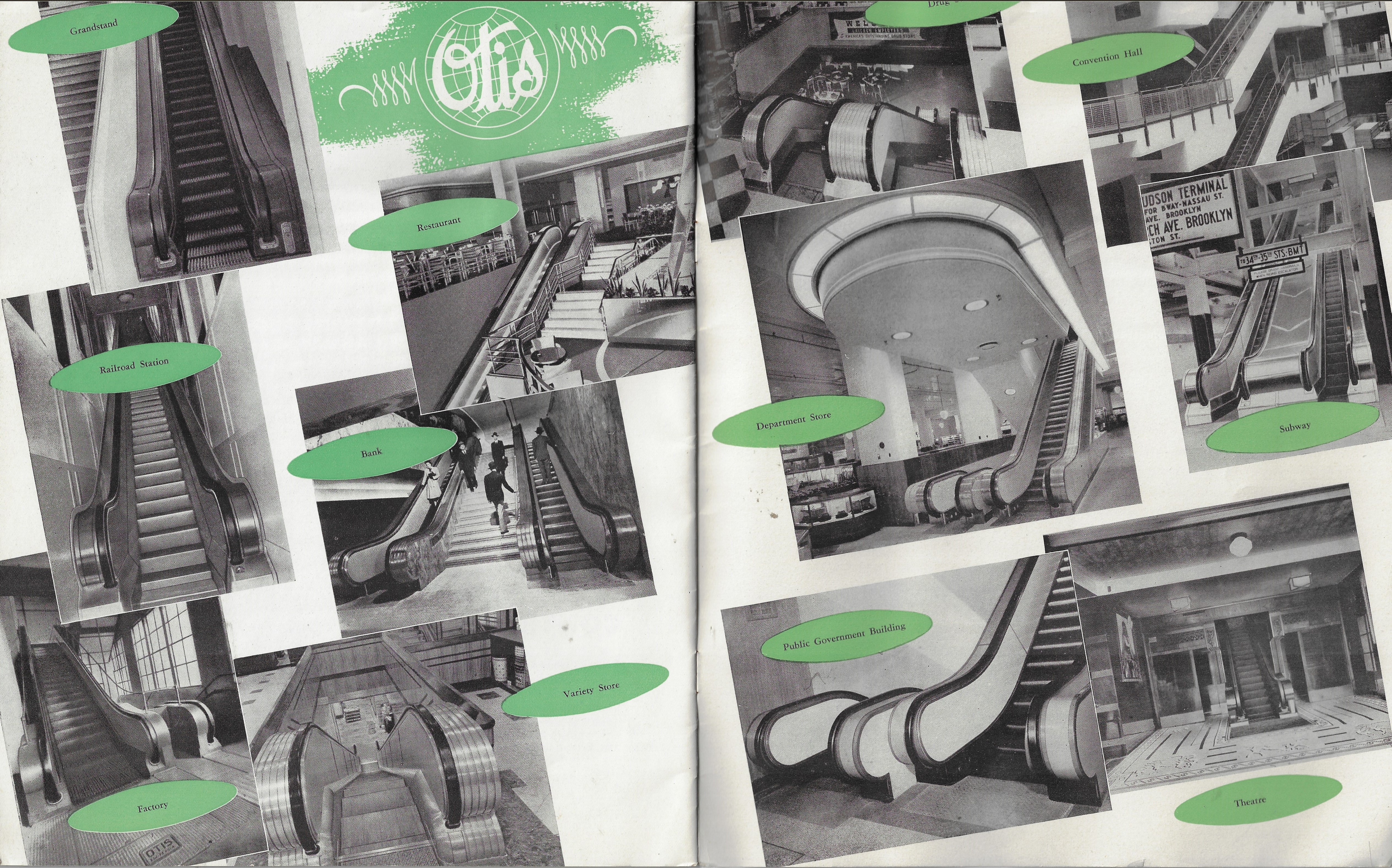
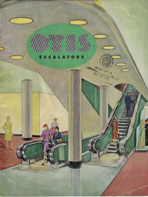
    The Otis Elevator pamphlet (1947) is efficiently designed beneath its semi-bizarre cover, floating in odd typeface, completely lifeless design, mannequin humans, and washed-out pastels.  The Chinese coloring book style of its covers hides a superior content, complete with schematics and beautifully supplied with photos of elevators long-since removed from sight and memory. 
      Books covers otis

    Books covers otis _2_

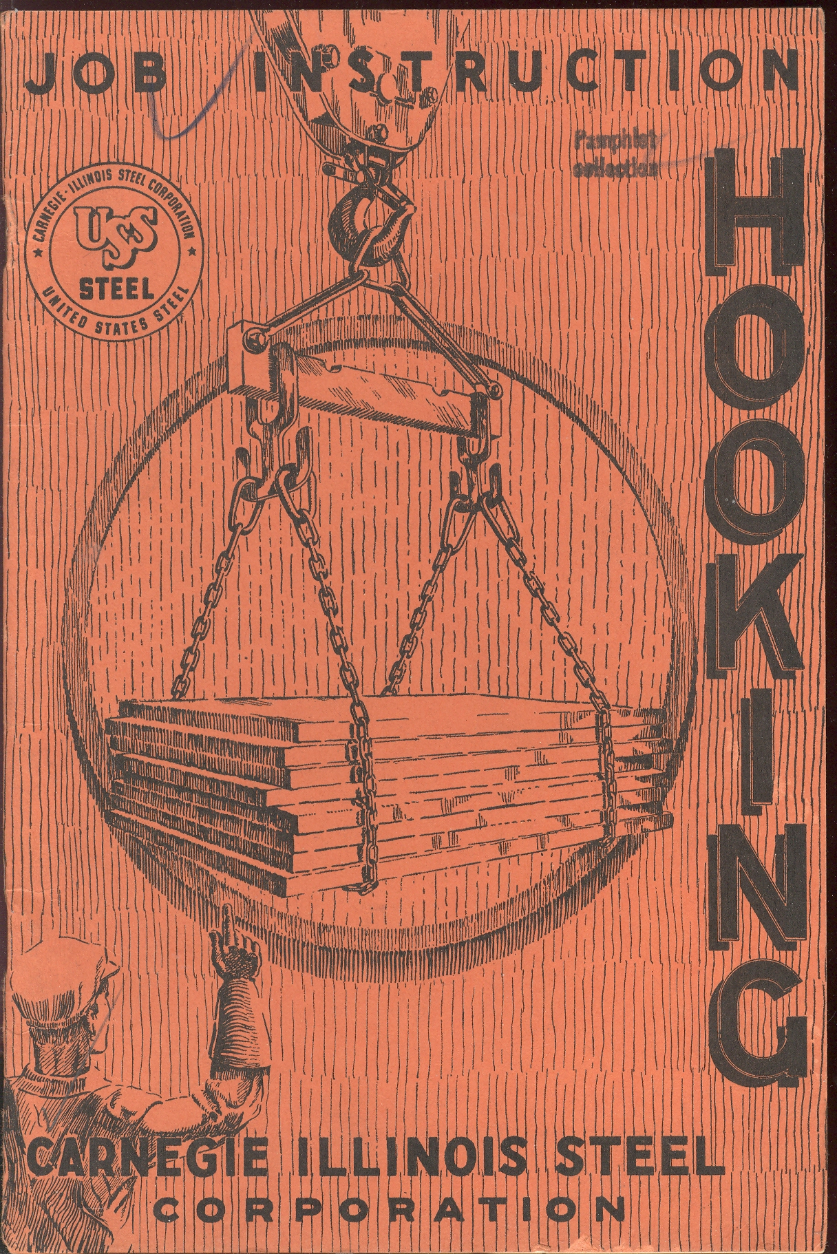
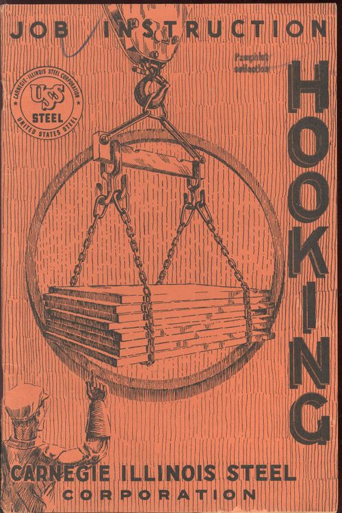
    The Hooking pamphlet is not about its obvious contemporary counterpart, but is a luminous, luxurious introduction and stylizer to the science of hooking large objects to cranes via giant hooks and chains, and especially about how to keep yourself from being  crushed by tons of steel not hooked properly. 
      Books covers hooking

    The Mystery of Filters charm is wholly in its title and cover design, its text describing nothing but camera filters.  It is still a cool cover, nonetheless.

      Books covers mystery filters

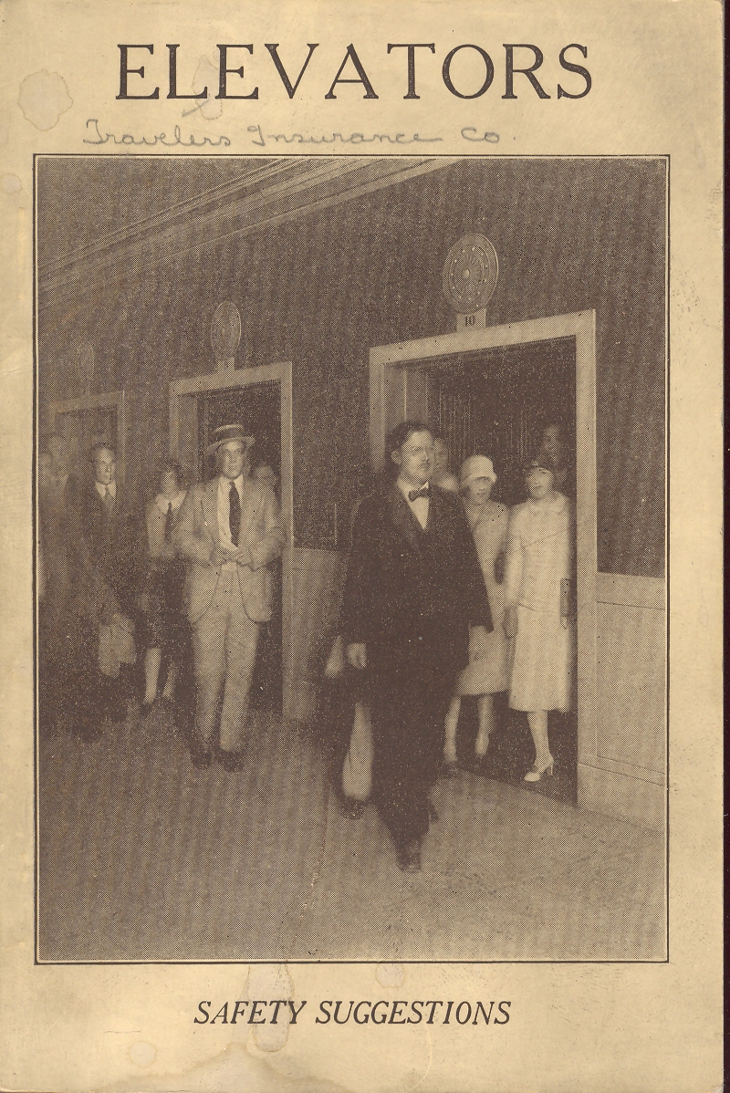
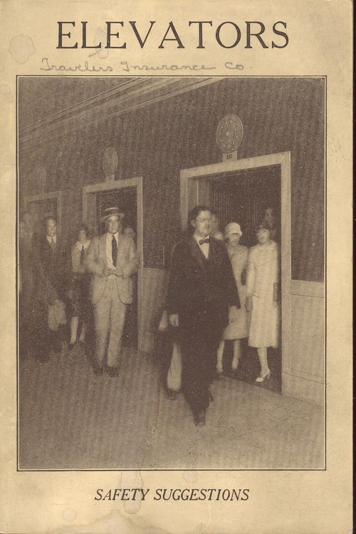
    Elevators, published by Travelers’ Insurance Company, tried to protect themselves a little further by ensuring safe practices of elevator operation, mostly in industrial settings.  This was published in 1926 and was already in its seventh printing from its inception in 1913 when the elevator was just in its second decade of popular, relatively widespread usage. The haven’t-given-this-cover-design-a-moment’s-thought hides a thorough (and bland) treatment of elevator safety; too bad, the cover photosnap-art promises something more.  Its not there, except for this beautiful photo of an industrial elevator op with a tie.
    Books covers elevators

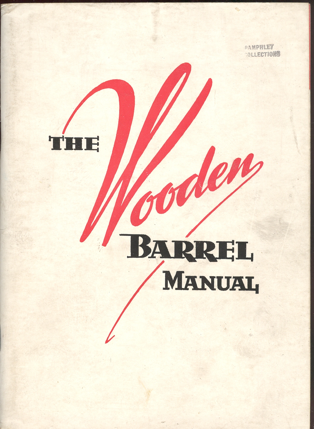
     And coming back to wood barrels that are not necessarily filled with pig (or wild boar) bristles but with something else less advanced comes this manual on making wood barrels.  Everything is there, everything you’d need to make a barrel (and a good one at that), and I admire this sort of fantastic dedication to what is essentially (to our modern mind) mundane—except that it is as dry as well-cured barrel wood.  But I admire it still,  as I do the Elevator pamphlet, because, well, they’re done right.
    Books covers wooden barrel


  • An Early Indictment of the Japanese Invasion of China, 1931

    JF Ptak Science Books  Quick Post

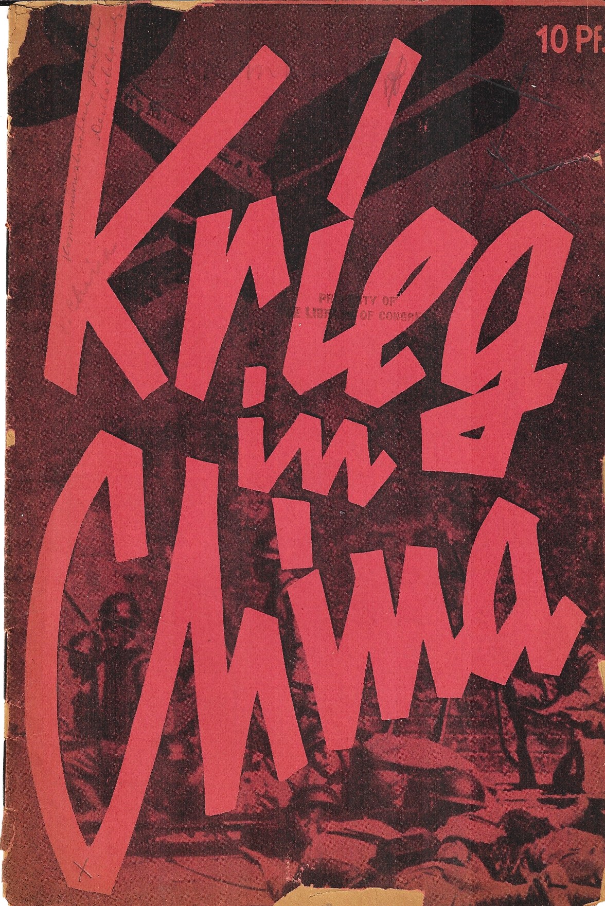
    Here’s another bit of graphic design, a very aggressive cover from 1932 for Krieg in China! by Ernst Schneller1.   Schneller–a long-time KPD member–wrote this short work as an expose on the “war” and in support of the Chinese, published it seems just months after the Japanese invasion and conquest of Manchuria and another few months after the battle known as the January 28 Incident, all of which was foundational for the war that would officially be declared in 1937 (and last until the end of WWII). 

    Schneller was himself a persecuted communist intellectual who was arrested became among the first to be imprisoned in the Nazi KZ system in 1933, and who would stay in the system until he was executed at Sachsenhausen in 1944. 

    It is interesting to note that in one chapter heading the pamphlet refers to the war as a new threat to the world (“eine neue welt droht”).

    DocFile (4)

    Notes

    1. Berlin : Kommunistische Partei Deutschlands, [1932] 9×6”, 15pp. A little confusing, though it seems that there are only three copies of this book located in WorldCat/OCLC. Provenance, Hoover Institution, and then in 1933 to the Library of Congress.


  • The Dictatorship of Hunger (1931)

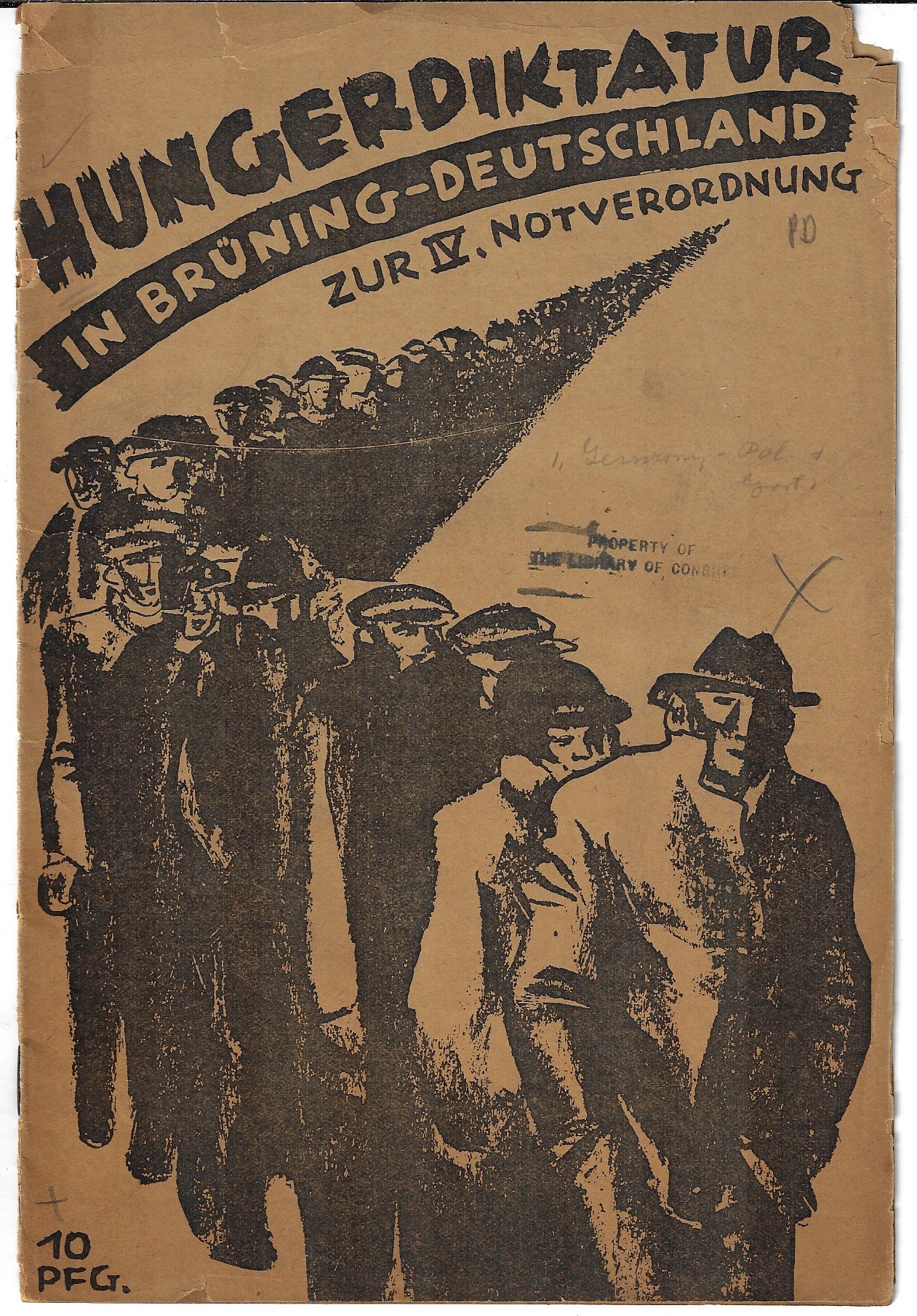
    DocFile (2)From what I can tell this pamphlet–Hungerdiktatur im Brüning-Deutschland zur IV. Notverordnung. Zk. Der KPD. 1931– is an indictment of the responses of German Chancellor Heinrich AME Bruning to the explosive Depression in Germany beginning in 1930. Bruning became Chancellor right at the outset of the Depression in 1930 and his options were already very limited, economically speaking, without the failure of the world economy adding to an already deeply compromised situation. Nevertheless, his policies are seen in different perspectives, and he was out of office by 1932 and fled Hitlerism and Germany altogether in 1934. (Bruning was two chancellors removed from Adolf Hitler taking the position in 1933.) In any event the pamphlet here leaves no doubt about the impossibility of the social situation in Germany in 1931 and places a long legion of the Hungry at the feet of Bruning’s Germany.

    The cover design is very striking, and unattributed.


  • Unexpected Beauty in Antiquarian Homemade Bindings

    JF Ptak Science Books   Quick Post 

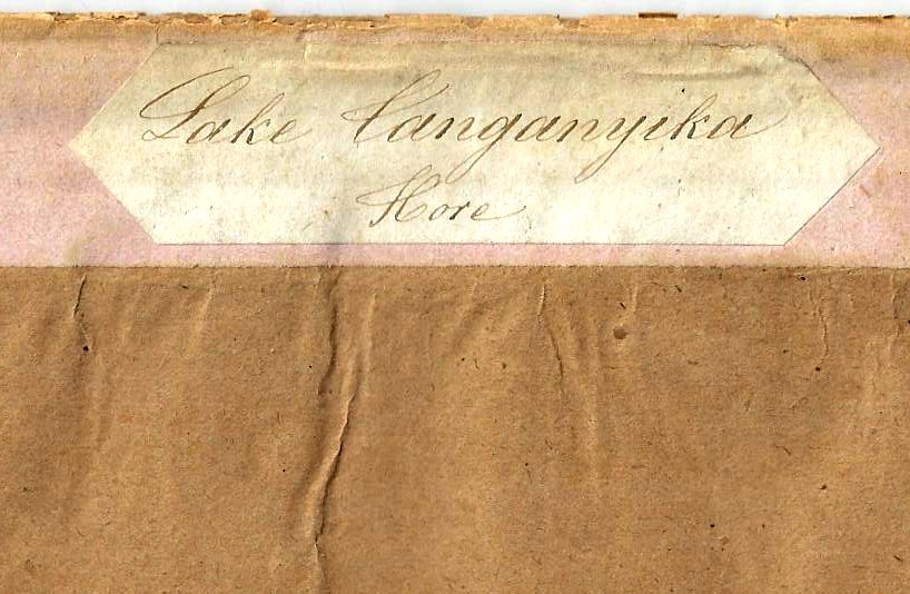
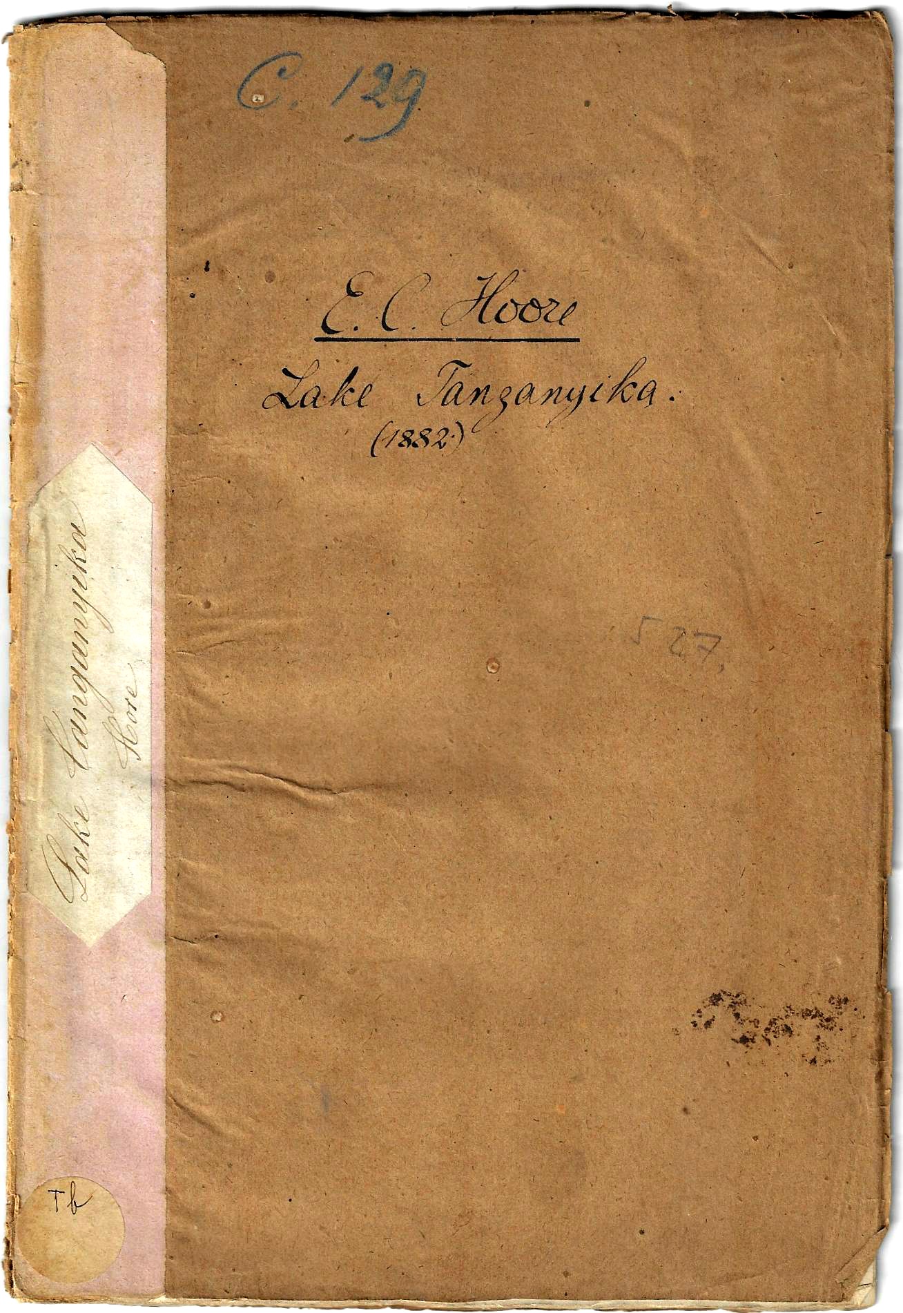
    There is a special beauty that comes with the imperfection and homemade qualities of an antiquarian bound-at-home book or pamphlet. I think that much of the time–in my experience–these bindings were made of whatever was available. Their irregularities can be charming, lovely even, the more imperfect but working/workable their attempts present an admiration for that amateur’s work so long ago. And so tonight I’m just going to quickly share one of these examples that just bobbed up–a homemade for a report from the Royal Geographical Society (1881) on Lake Tanganyika:

    Books covers Lake Tanganyeka detail


    And the full frontal:Books covers Lake Tanganyeka


  • Heavy, Chunky, Obvious, Strained, Drawn with Limited Ability–But Strangely Compelling (?)

    JF Ptak Science Books  Quick Post

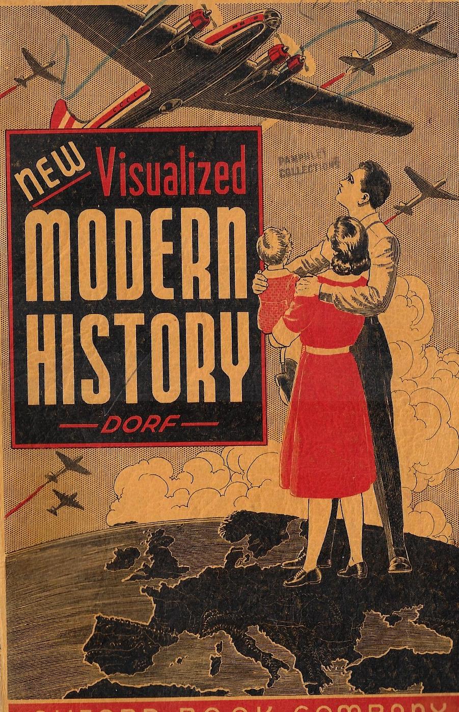
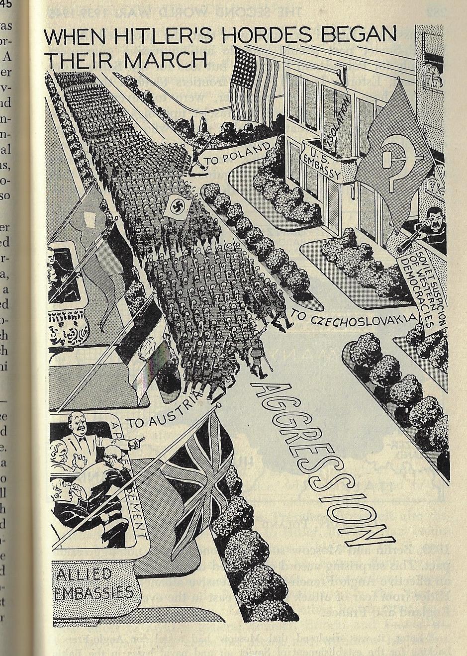
    Outsider Modern History _12_It would have been easy to judge this book by its cover–and the strange bit about that is that you would’ve been nearly correct.  Philip Dorf’s schoolbook history New Visualized Modern History was published by (not the) Oxford Book Company in NYC in 1947 has a certain look in its design that seems more like an odor. There’s some amount of talent in the illustrations that make it seem studied, except that there are many more elements that make it seem not so. The text (fairly extensive and compact in 388pp) looks to be well-written and accurate (or at least not the opposite) but it is interrupted by dozens of illustrations that are highly contrasted, very heavy,  blocky, immobile, strained, and somehow off-putting, but in the final result the drawings actually seem to work, delivering their message, if not in an inelegant steam-filled roller derby way. Perhaps they’re worthwhile after all, except that it is difficult to like something that you really don’t.


    Outsider Modern History _7_


  • Hammer, Sickle, Skull (1919)

    JF Ptak Science Books  Quick Post

    Here’s a very provocative piece of design meant to equate death and communism–and in that there is no question.  Sowjet-Rußlands wahres Gesicht, aus eigener Anschauung und Erfahrung geschildert von drei einst begeisterten Kommunisten,  (“The Real Face of Communism, as Told from the Personal Experiences and Intuition of Three Once-Enthusiastic Communists”) was written by Friedrich Oskar Kloetzner in 1919 in the bad days of early social struggle that led to the bad days of middle and later struggle and then Apocalypse. Here, in 1919, just after the end of the war, the great supposed golem was Communism–that would of course morph and change and accommodate other fears and hatred, but for now, there were things needed to fill the vacuum left by defeat and the coming of a bad peace, and the Communists served to fill at least one of the many niches to come. 


    SOwjet-russlands


    Notes:

    The pamphlet measures 7×5″,  and is paginated 223-256. Provenance: Library of Congress.  This has a funny record in WorldCat—there seem to be 21 results in the search on this title, though this looks like a cataloging error–for all of the different “references” there are only eight libraries locating copies of this pamphlet, with half of those in Europe.) 


  • Weekly People, 1942–definitely Not “People Magazine”

    JF Ptak Science Books  Quick Post

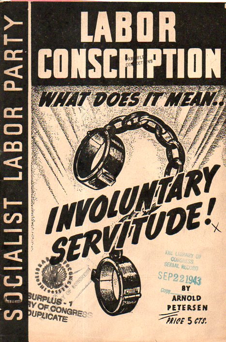
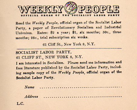
    I have developed a sort-of  collection in the History of Blank and Empty Things series of not-filled-in applications and diaries and questionnaires and such, from Hitler Jugend diaries to notebooks for Nazi Warsaw telephone directories to applications for membership in the Women’s KKK, and so on.  This small installment comes on the back inside cover of Labor Conscription, What Does it Mean…Involuntary Servitude!, a hopeful ad for the reader who might be interested in Socialism and receive the magazine People Weekly, as this far Left pamphlet was after all published by the New York Labor News Company on behalf of the Socialist Labor Party U.S.A. This of course in no way bears any resemblance to the modern People Magazine, the fruits and labor of that periodical being sweets and fats.

    Labor Conscription761 Labor Conscription762