JF Ptak Science Books Post 270
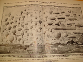
Here’s a great opening sentence: “Images of 19th century flying horses have always been difficult to find”. And, since this is a serious issue, it really is a true statement, until today, when I noticed them in a little project I was dong. I found a lovely history of balloon and aeroplane flight published in The Illustrated London News for 3 July 1909, called “The Evolution of the Great War-ships of the Air: Balloons, Non-Dirigible and Dirigible, and Aeroplanes, from the Seventeenth Century to the Twentieth Century. Its a big, double-page spread of a picture, featuring 60 or so of these flying machines–its so wonderful that I decided to reproduce the thing in a large format (35 x 45 inches), and it was then that I noticed something quite strange, at least to my experience.
.
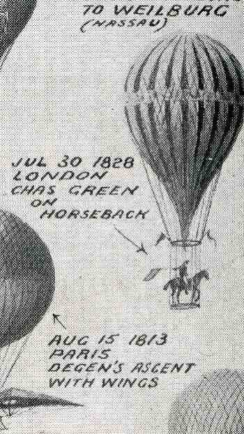
There were flying horses. And one flying stag.
Men on horseback in balloons.
Actually, 8% or so of the images in the display involved horses.
Now perhaps men on horseback in balloons in the 19th century is a well know bit of aviation history; however, not being an historian in this area I’ve got to admit that I was very surprised (!!) when I first noticed these horses.
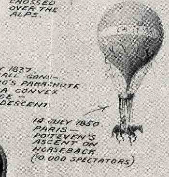 Missing them is understandable if you weren’t looking closely at the image’s little bits and pieces, what with the horses occupying something like 1/1,000 of the print’s surface. But there they are, clear and bright as day: “1798, Ascent by Testu-Brissey”, and “1828 London Chas Green on horseback”, and “1850 Paris Poiteven’s ascent on horseback (10,000 spectators)”.
In what is certainly a very uncommon notice there is also “Sep 1850 English Aeronaut Gale on horseback suffocated Bordeaux”. Is this the first man-on-horseback-in-flight death? And death by suffocation? (?) I’m not so sure that the ascent records for 1850 would’ve made allowance for running out of oxygen at high altitudes–if not, then how did this man suffocate? According to the Dictionary of National Biography, which, somehow, admitted (George) Gale (1797-1850) to its pages, reported that he died as a result of a misunderstanding of language, sent back into the heavens after landing with his pony, his balloon mistakenly released with none of its ballast remaining, with him attached to it still. It was his 114th flight, which was quite allot, but not evidently enough. Gale was a very colorful character, being an actor, then finding his way out to the American west and returning with several of the Indians he encountered and “exhibiting” them at the Victoria Theatre, and then becoming an Irish blockade defender before turning to ballooning.
Then there is the utterly fantastic “1804 Paris Margat on a stag”. Somehow I guess M. Margat thought that being on a horse just wasn’t quite enough, and elected to ride a stag. I’m not sure what to say, exactly, except that all of this renders “1836 Surrey Gardens–monkey “Jacopo” & parachute (with a little monkey dropped/thrown from the balloon in an experimental parachute device) somewhat anti-climactic.
What I was really after in this print and which I’ll get to in another post–sidetracked as I am by the horse issue–is found in the subtitle: “first used for pleasure and by scientists, destined to become engines of war…the balloon”, about the short but furious transformation of the aeroplane into a machine of war, all of which takes place in about a five-year period. But that’s for another day.
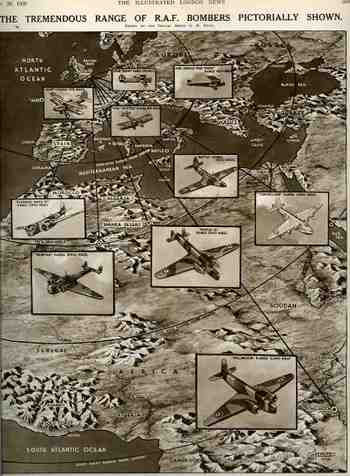
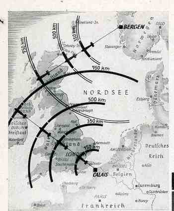
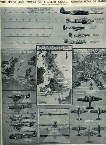
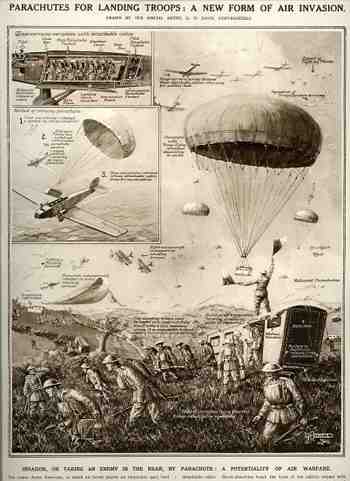 Now what was going on in this display–appearing in the Illustrated London News on 8 September 1928–was the idea that a group of soldiers (14 in this case) could be seated in a cushioned/springed box which would be parachuted onto a battlefield. The idea of getting troops into a tight or difficult spot by a parachute is a very good one, a brilliant step forward really in the history of military strategy–but doing it in this fashion, by these means, was just not correct. First of all the whole thing looks way too heavy for the aircraft to leave the ground to begin with, at least with those engines; then it looks too heavy for the chute to pull it out of the plane (and looks as though it would act as an airbrake more than anything else, as the chute seems to be gigantic, fully half the width of an already-wide aircraft. I reckon that given space for seven seated men that the cabin would have to be at least 25′ long, meaning that the parachute seems to be 10 cabin-widths in the larger image, or 250′ in diameter…in the smaller image the chute is only 4 times the length of the cabin or so, meaning it is a hundred feet across.). The intention was for the chute to be deployed and for it to somehow lift the big box up and out of the plane, without dragging into or across the tail and etc. Then there’s the issue of landing, which, springs or shock absorbers or not, looks to be very problematical.