JF Ptak Science Books LLC Post 140
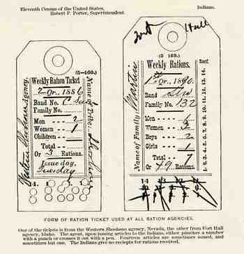
These images of the Indian ration card and the Indian Police button were found opposite page 76 in the monumental Report on Indians Taxed and Indians Not Taxed in the United States (except Alaska) at the Eleventh Census 1890 (published in Washington DC in 1891, the best single-volume statement on the conditions of the Indian tribes in the U.S. in the 19th century).
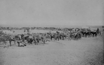
Generally tribe members would wear the white ration card on a string and attached to a button. When you see old photographs of the Indians queued up to receive their food and provisions, the little white cards stand in sharp contrast to everything else, when they are in focus,. When not (as the lens weren’t necessarily fast enough to capture things in motion) they look semi-invisible, like a puff of smoke on the chests of so many people. I can imagine then these people standing in line, waiting for food, having entered reservation life with enforced “sale” of their lands, still except for the fluttering of their ration cards, small white flags of surrender that they would fly for generations. Certainly no other element of our society would be forced to surrender so often for the need of food. And considering too the number of Indians who would die of starvation over decades’ time at the hands of this system and in the care of the federal government, it was a surrender that didn’t necessarily entitle them to the sort of treatment that a POW would receive. (The following photo is of a queue for ration distribution at camp Supply, Oklahoma Territory, 1871.)
The amount of the ration was mysteriously worded, at least to me; I couldn’t really tell how much food people were allowed. The explanation reads as follows: “the table of quantity allowed to 100 rations is: bacon, 10 pounds; beans, 3 pounds; beef (net) 150 pounds; baking powder, 1 pound; coffee, 4 pounds; ham, 50 pounds; salt, 2 pounds; soap, 2 pounds; sugar, 7 pounds; tobacco, ½ pound.” (The salt part is curious; salt was very important, and ion relation to everything else, 2 pounds wasn’t really very much salt at all. I am reminded of the very last part of the negotiations between John Ross, who was the principal chief representing the Cherokees, and the flatulent Gen.Winfield Scott, the head liaison between the Cherokees and the U.S. government, in the terrible last phases of the preparation for the Cherokee removal. Ross pleaded, and in effect offered to buy, more provisions of salt for the walking winter journey for his 12,000 charges (children included). That this was a point of negotiation is cruel and sickening. Scott “gave in” and allowed the extra salt…his other practices in this enforced emigration though resulted in the deaths of about a third of the Cherokee people. And Scott was about the best, most “Indian-friendly” general that the government had to offer.)
It continues, badly written: “Still, it frequently happens that issue same day finds the agency short of supplies and frequently rations are issued, and of limited quantity.
And closes: “The Indian, however, arrives promptly on the appointed day, no matter whether he receives or not”.
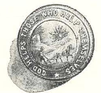
The button pictured here belonged to the uniform of the Indian Police.
It shows an Indian guiding a plow, with the legend written around the figure that reads: “God helpeth those who help themselves”. Or not.
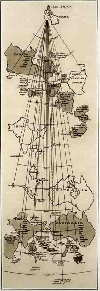 This map comes to us from The Illustrated London News, 3 August 1940, which reproduced it from an article in Fortune Magazine. Though it looks oddly wrong from the outset, it really is pretty lucid–elegant, even–once you understand its purpose. And the purpose of this map was to show the distances that the goods and raw materials from the British Empire (and from the possessions of France) had to travel via the then-closed Suez Canal route versus the new routes “not open to enemy interference” to Great Britain. Countries depicted in outline show the distance via Suez while the same country depicted in shade show the new, longer, non-Suez route. Ever stiff lipped, the Brits announced that even though some of their major natural resources are coming from these vastly removed areas, “even with the fall of France, the British Empire and its allies remain an economically self-contained and immensely powerful war unit, and still control the great part of the world production of some vital commodities…” I’m not sure why, exactly, that it was necessary to display this map to the public eye, what with England under assault in the Battle of Britain (the Nazis extending their aerial assault in preparation for Operation Sealion), the loss of France, and the nearly-there Nazi blockade of English waters. Perhaps it was drawn to show that even though the material was coming from the same places that were now further away, they were still getting there.