A Daily History of Holes, Dots, Lines, Science, History, Math, Physics, Art, the Unintentional Absurd, Architecture, Maps, Data Visualization, Blank and Missing Things, and so on. |1.6 million words, 7500 images, 4.9 million hits| Press & appearances in The Times, Le Figaro, Mensa, The Economist, The Guardian, Discovery News, Slate, Le Monde, Sci American Blogs, Le Pont, and many other places… 5000+ total posts since 2008.

Category: Uncategorized

  • Garbage (Trash) (Dust)) Can Advertisement, 1911

    JF Ptak Science Books Post 227

    [Update: as of May 2015 this is still the only time I’ve seen a 100+ year-old advertisement for a trash can.]

    Blogaugust30_trash471 In the many years of dealing with unusual publications and images and illustrations and such, I do not recall ever seeing an advertisement for a waste can.  And so today, here at the tail end of the summer of 2008, I stumbled upon one, tucked away in the back of the Official Catalogue and Guide of the Ohio Valley Exposition of Cincinnati, 1910.   (Actually I was browsing the ads in the pamphlet when I saw the eye-popping half-page ad for The Weir Frog Company.  It took as few moments for me to realize that they were selling railway frogs and other major-heavy hardware, but the thought of the frog farm did linger a bit…) I cannot say that trashcan tech had improved sharply between 1911 and now.  I can say that the advertisers used an awful lot of exclamatory arrows to make their point, which leads me to perhaps a wrong assumption that this trash can was cutting edge.  Or perhaps not; after all, how much can one say about it?  (Yes, there’s the patents for bomb-proof, smokeless, half-vented, lid-tethered, wheeled, semi-wheeled, clip-lidded and etc. garbage cans–actually I can count thousands of patents award to and about garbage cans.  But, basically, its pretty much the same.) See the wonderful Timeline of Garbage here.

    ·Posted by :

    ·in:


  • Opium Warehouses, 1851

    JF Ptak Science Books LLC  Post 219

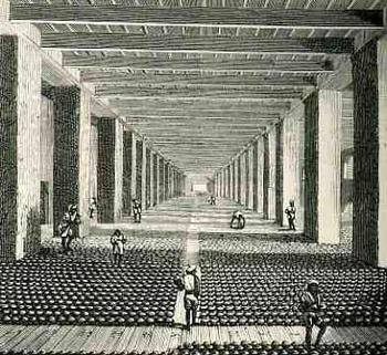
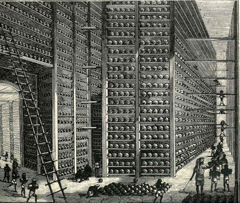
    In general, when looking at these two images we know that we are looking at ALOT of something; when that “something” is opium, it just seems like a whole lot more.  And this whole lot more is exactly that, drawn by Walter S. Sherwill (a Bengal Army Revenue Surveyor, 1815-1890, and published by The Scientific American on 29 July 1882)–these are the warehouses at the Patna opium factory in Bengal as they were in 1851. (The original drawings were published as Illustrations of the Mode of Preparing the Indian 
    Opium Intended for the Chinese Market,
    published by J. Madden in London.)  And that would be the government-controlled warehouses for the state crop, showing some of the 12,000,000 pounds of “poppy juice”  produced yearly in that district, this part intended for the captive Chinese audience, which brought to that country war(s), peonage, a ruined economy and  vast addiction.                                                                                          
    Blogaugust_25_opium_long445

    cvcvcv
    cvcvc
    cv
    Blogaugust_25_opium_long3_ladder447

    ·Posted by :

    ·in:


  • The Order of Life: 144 images showing the progression and systematization of life, 1849

    JF Ptak Science Books LLC  Post 210

    Blogaugust_21_order_of_life_detai_2

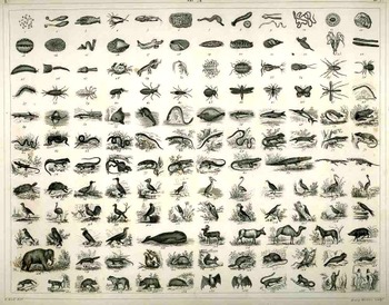
    This engraving (s small section of which is highlight from the full image below), plate I/74/B.7 (yes, an incredible but true plate number)  from Johann Georg Heck’s masterpiece, Iconographic Encyclopedia, (American edition), 1849-1852, is a 12×12 grid basically showing the progression of the orders of earthly life.  It is a result years of zoological thinking, a systemic exposition of animals created by Aristotle, Pliny, Galen, Belon, Rendeletius, Gesner, Aldrovandi, Mouffer, Linneaus, Cuvier and etc.  Most were scientists  though many repeated the fables and imagined observations of earlier, less scientifically-fortunate colleagues (like Pliny, whose fantastical assertions took root over 15 centuries).
    Blogaugust_21_order_of_life421

    This fine and minutely-detailed work packs an incredible amount of data on a sheet of paper just 8×10 inches big (or small), 145 (don’t forget Eve in the 12-square grid!) elegantly arranged and easily identified images in 80 square inches.  It is a beautiful and remarkable accomplishment, and Heck’s artists did 435 times throughout the length of the work. (I wrote a post about Heck’s illustrations of the construction of the Thames Tunnel back in June.)

    Life is arranged—here in 1849—along four division and 18 classes, from Radiata to Mollusca to Articulata to Vertebrata (ending with Adam and Eve, even though the couple is simply classified as Homo in the text, standing virtually next to Simis).  It is a classic (or should be) of scientific illustration, the net effect of which is similar to a flip book or nickelodeon–the images seem to just roll past and through the brain.   

    ·Posted by :

    ·in:


  • An Answer to Anti-Intellectualism in Wood: the Desk-Cathedral

    JF Ptak Science Books LLC  Post 200

    Blogaugust_14school_desk388
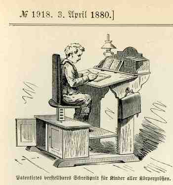
    Richard Hofstadter’s  Anti-Intellectualism in American Life (1963)–an argument establishing the American distaste for intellectual and educational elitism derives from the combat between higher education versus the pragmatic, church-wisdom, common sense Horatio Alger steadfast American legacies–established the American vanity and distrust of intellectual life.  I think.  Maybe what was needed a little more was a little less thinking and distrust of learning and building some greater monuments to the exercise, starting with the very desks that kids use.  For example, this magnificent German school desk leaves nothing to question about the value of learning–the message it delivers is very clear and unapologetic  The desk is its own cathedral, granting the occupier with an instant respect, as in “we take this stuff of learning very seriously, and we take you seriously, too”.  Perhaps if children were granted such a specific importance in the chain of knowledge the overall outcome of education might be a little changed for the better.   After all, isn’t part of the corporate  stick-and-carrot routine the bigger desk? Why wait?  Perhaps if everyone had a proud pulpit to themselves like this from the beginning, we might take the business of learning how to fill up our brains more seriously.  Let’s face it–it would be tough to fool around in surroundings like this. 

    ·Posted by :

    ·in:


  • The Human Zoo: People in Cages, Enclosures and Chained for Paid Amusement

    JF Ptak Science Books LLC  Post 169

    Bloghuman_zoo329

    Human ignorance in observing differences among different societies and races has always been a burgeoning, expanding, sub-intelligent subset of other human stupidities, frailties and incapacities.  Sometimes these are exhibited liberally and freely, and stupidly; other times it is difficult to see, vile, menially, sub-rosa, and thoughtfully thoughtless. 

    These prejudices been spectacularly exhibited in many ways over the centuries—forced immigration, complete removals, ethnic cleansing, concentration camps, slavery, expulsion, legal intolerance, and so on; an entire library can be filled with this stuff.  Sometimes people were gathered together and moved far away; other

    Bloghuman_zoo_detm331

    times they were gathered together and removed into compounds right in the middle of cities in which they lived (as in ghettos, antiquarian “hospitals” and the creation of the more modern asylum, and so on). Genres not-too often discussed is the human zoo, and this image from the Illustriete Zeitung in 1877 depicts one of them

    Bloghuman_zoo_btm330
    . 

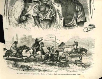
    This woodcut depicts the “Patagonian” Indians displayed in the Dresden Zoological Gardens.  They lived in a fenced exhibit (and allowed to wear clothing), and were shown is all aspects of their daily lives.  The curious would come and hang around at the perimeter fences (visible in the lower left of the hunting scene), and gawk, or study, or perhaps help themselves feel better or more superior by watching people in cages live their lives.  I don’t know what they were really thinking or feeling.

    People weren’t thinking when they were looking, paying to look, at captive humans on display for many years.   The questionable P.T. Barnum made his “contribution” to 19th century disgraces in 1835 with his exposition of a black slave (Joice Heth) who was supposed to be the world’s oldest living human (I can’t get into the slavery issue in the course of this post, although I probably should), bringing this sort of behavior to early and high entrepreneurial  exposure.  Soon after there would fellow his imitators, establishing human occupants in zoos in Hamburg, Antwerp, Barcelona, London, and Warsaw, and other places, all by the 1870’s.  There would be spectacles of human “exotics” in the semi-rarefied  atmosphere of world fairs and expositions in Paris (1878,1889, 1931), Marseilles (Colonial Expo in 1906), Barcelona, Stuttgart (1928), among others.  I should point out that there was a display of an entire Congolese Village as late as the 1958 Fair in Belgium (the Belgians evidently trying some bloody retrothink, 45 years after their long series of atrocities committed against those peoples).  Humans do have an expansive capacity for this sort of behavior. 

    ·Posted by :

    ·in:


  • Cosmology, Virgil, Symbolism and Confusion, 1533

    JF Ptak Science Books LLC   Post #128
    Blogsolar_systemgeiler

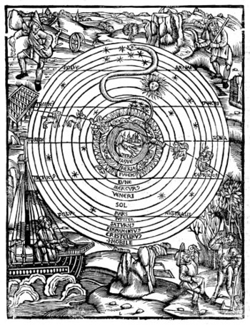
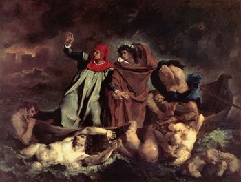
    This lovely design is a cosmological plan as it appeared in the Opera Accuratissme Castigata (published in 1533) of Publius Vergilius Maro, better known (simply) as Virgil, who was born in northern Italy near Mantua in 70 BCE, and died at 49 in 19 ACE.  His bones and ashes wound up in a tomb at Neapolis on the Via Puteolana [road to Puteoli], with the vase holding his ashes inscribed “Mantua me genuit, Calabri rapuere, tenet nunc Parthenope, cecini pascua, rura, duces; Mantua bore me, Calabria seized me, now Parthenope holds me; I sang of flocks, fields, generals..”  Nowadays the vase is gone, and the bones are on display; kept in check by iron bars; however, Virgil himself may still be in Purgatorio in spite of Dante’s Aeneid-esque homage to the great poet in the Divine Comedy.  (When Dante first meets Virgil in the Inferno (1 82-5), he cries “O light and honor of all other poets, may my long study and the intense love that made me search your volume serve me now.  You are my master and my author”.  Even still, Virgil was good enough to accompany Dante through Hell (seen below in a painting by Eugene Delacroix “Dante and Virgil in Hell”) and Purgatory, but he was too problematic to show him through Heaven.)

    This cosmological system on display here is of course the working of the ancient world—even by the time of Dante it was commonly known (though
    Dante_und_virgiluncommonly spoken and written) that the solar system (and etc..) did not revolve around the earth, as in this offering.  There are some other curious elements to the woodcut, some of which I really just don’t understand. 

    First of all, though, the image represents Creation, with Earth at the center, surrounded by 13 spheres:  the first three are the rest of the elements (earth followed by water, wind and fire), then followed by the Moon (showing a last-quarter Moon in picture) and Mercury and Venus.  The Sun comes next, followed by Mars, Jupiter and Saturn.  The planets are encapsulated by three final spheres:  the Firmamentus (including the upper sky and the planets), the Cristelenus (which is a term I am not familiar with), and the (Premium) Mobile, the sphere of the Prime Mover, God, and Heaven. 

    There are almost-allegories in the corners of the print, the upper two showing sowing and reaping, bu the bottom two are quite different to me.  At lower right we have two workers of some sort (one has an axe), stopping and refreshing themselves with a d rink.  Curiously, it seems to me that nothing at all in this picture generates a shadow except for the three stones in the middle foreground at bottom.)  Then there is the arrival of the ship at left-bottom, which I must say I’ve never seen in any of these sorts of representations of the universe…I’m not sure why this was included; the obvious symbolism really doesn’t apply to what is going on in this print, not really.

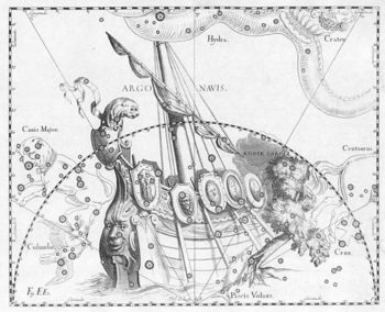
    The other thing that is strange to me is the very pronounced inclusion of the constellation Hydra—the long, undulating water snake prominently placed in the upper middle of the universe system.  It is the largest of the
    modern constellations, and it does have a relation to Hercules (being defeated by him in his second labor) and is a
    Argo_navis_hevelius

    topic in the Aeneid, but I’m still not sure why this above almost all other constellations. There is actually a little connection between the ship and bottom left and the Hydra, as the constellation nearly touching the Hydra is the Argo Navis, which at one point was the sails of Jason (and the Argonaut’s) ship Argo.  Still the connection is pretty tenuous; I’m probably missing the entire connecting theme for all of the surrounding imagery. 

    All in all though it is a lovely thing, this cosmology. 

    ·Posted by :

    ·in:


  • Five Big Lines: Representing the BigLittle World in Feynman Diagrams

    JF Ptak Science Books LLC  Post #123

    Perhaps the only bigger five put-together lines than Feynman
    diagrams may be home plate; otherwise I’m hard pressed to come up with a better
    thing that can be drawn in this way with this many lines.

    Dsc00014 The impossibly bright Richard Feynman (1918-1988, Nobel in
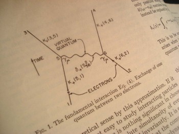
    1955 for the development of quantum electrodynamics; physics of superfluidity;
    path integral formulation of QM, etc.) worked on a schematic that would  visualize—indeed, stand for–quantum
    electrodynamical interactions, the scattering calculations in QFT. The result is known by nearly everyone on
    earth as Feynman diagrams. (Murray
    Gell-Mann, another Nobelist and ueber diligent partner and competitor of
    Feynman’s, and perhaps as influential a physicist (with the Eightfold Way and
    etc.), refers to the diagrams as Stuckelberg diagrams, named for a pretty
    obscure physicist who, among others, came up with an early schemata closely
    resembling Feynman diagrams. His refusal
    smacks more than a little of retribution and competitive jealousy even 20 years
    after Feynman’s death.)

    Dsc00016

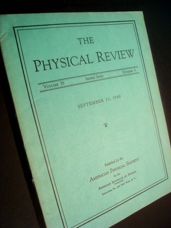
    The images here are the first time the diagrams were
    published in the 15 September 1949 issue of The Physical Review and are among
    the top-20 prettiest pictures in physics of the 20th century.

    Dsc00015
    Their descriptive power is matched only by their crystalline
    simplicity—few diagrams have ever been constructed with a greater claim.

    ·Posted by :

    ·in:


  • Upper Atmosphere In-Field Research, 1865: James Glaisher and his Balloon Ascent

    Big_archout_eiffeled140_detail_2JF Ptak Science Books LLC    Post #110
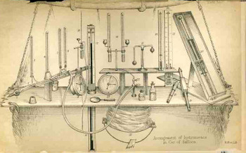
    Blogballoon_instruments142_2

    Horace Benedict DeSaussure (1740-1799) of Geneva
    (aristocrat, geologist, physicist and (maybe the first) alpinist) made
    the first truly scientific ascent in a balloon—he climbed into the
    ‘cockpit” of a hydrogen gas balloon with a few scientific instruments
    and flew to the incredible height of 15,000 feet, to the summit of Mt.
    Blanc.  He achieved a life-long dream in this ueber accomplishment and
    even did some science along the way—he was not going for height per se
    for stardom, but was in fact doing upper atmosphere research.  (He was
    strangely, or perhaps understandably, filled with nothing at the point
    of achievement:  “at the moment of my reaching the summit I did not
    feel satisfied; I was less so when I left.  I only reflected there on
    what I had not done…”)  In any event DeSaussure went aloft with not all
    that much in the way of recording and observational equipment.

    It is interesting to see the state of the art in upper atmosphere test
    equipment  in the article published by James Glaisher in the Popular
    Science Review* of 1865. Glaisher (1809-1903) was an all-around science
    guy—President of the Microscopical Society, founding member of the
    Aeronautical Club of England as well as the Meteorological Scoiety),
    and was an early and very determined balloonist/aviator and
    meteorologist.  In the accompanying image to his article we find a
    relatively safe (but not necessarily comfortable) control panel in the
    balloon containing no less than 20 pieces of scientific apparatus for
    collecting air at different elevations, noting different types of
    clouds, determining the electric state of the air, making physiological
    observations and comparisons, sound research, and other atmospheric
    phenomena in general.

    For the record, the enumerated instruments are as follows:

    1-8:  various types of blackened bulb thermometers, with dry and wet bulbs as well, placed in different aspects to the sun;
    9:  chronometer
    10:  Regnault’s hygrometer with a single silver cup
    11 + 12 Mercurial barometers (Gay-Lussac siphon)
    13:  aneroid barometer
    14:  a second Regnault hygrometer
    15. Daniel’s hygrometer
    16.  spiral bulb thermometer
    17.  gridiron form bulb thermometer
    18+19: spectroscopes
    20: Herschel’s actinometer
    21.  bottled water and aether
    22+23:  stop cocks for aspiratior

    Glaisher as it turns out set a world record for a balloon ascension in
    1862—three years before this article was published—but was unable to
    conduct any experiments, as he passed out due to the lack of oxygen and
    cold at 35,000 feet. 

    *“Balloon Ascents, and their Scientific Importance” See the NYT article.

    ·Posted by :

    ·in:


  • Graphical Representation of Data 2—What a Million Dead People Looks Like

    JF Ptak Science Books LLC

    Blogmarch

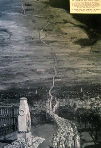
    The Illustrated London News
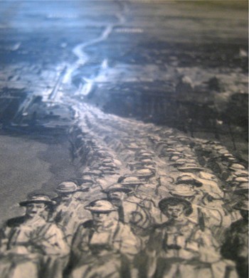
    published this very sobering image showing the general reader in London in 1933.  It is entitled “In Memory of the 1,104,890 British Dead of the Great War”, and was drawn by D. Macpherson.  It very graphically represents all of the war dead of the British Empire of 1914-1918, depicted as a line of men, four across, extending from London to Durhham.  The column passes from London through Hitchin, through Bedford and Peterborough and Grantham, past Sheffield and Leeds and York, and then on to Durham.  An extraordinary column of the war dead: 900,000 of the dead were not soldiers at the beginning of the war, but they sure died that way, and this map shows them all in a line, marching from  a point 269 miles distant.

    Blogmarching_2

    ·Posted by :

    ·in:


  • Graphical Representation of Data #1–England Invaded, 1908

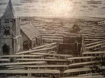
    Blogaeroplane_2


    Some of the most striking things in my collection/store/accumulation are the hundreds of images that portray data for display purposes–even more so, those that use a vernacular setting to bring closer to home an understanding of a statistic or finding.

    (One of the most popular books on this subject is The Visual Display of Quantitative Information by Edward Tufte, which uses a number of interesting images (good and bad) for the purposes of his book. Another, by fellow Asheville resident Peter Turchi (director of the MFA program for writers at Warren Wilson College) is Maps of the Imagination, the Writer as Cartographer,  which hosts a large number of interesting images the stories of which are richly and elegantly woven–this is a real piece of craftsman, and pretty, and useful, too.)

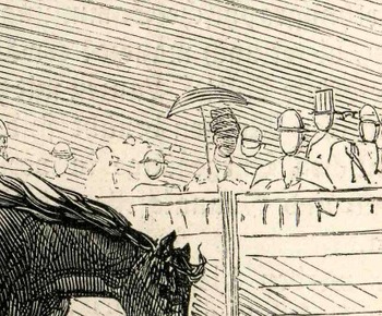
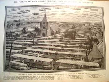
    The print that we’re looking at here appeared in the 19 December 1908  issue of The Illustrated London News and is entitled “The Futility of Herr Rudolf Martin’s Plan of Invasion by Aeroplane”. This fantastic piece of annonymous artwork graphically depicts what the author maintained was the impossibility of Germany to invade England by landing 50,000 flying machines and 100,000 men on the Kentish coast of England–impossible (quantly though realistically) because “of the impossibility of finding landing-room (for the planes) and cover for an army on aeroplanes”. The artist depicts a small town and what I guesstimate to be 60 planes in the air and 75 or so on the ground, leaving it to the imagination of the reader where the other 49, 875 might go. He DOES make a point, and very vividly.

    Blogaerooplanedetail “Nothing could show better the futility of Government Councillor Rudolf Martin’s idea that Germany could construct 50,000 flying machines for 50-million pounds…and land 100,000 men on the Kentish coast from Calais within half an hour.” Evidently Mr. Martin was very concerned with the invasion of England by Germany via airplane, and it was the editor’s job at the ILN to show him
    misguided. I would imagine that this illustration drove the point home
    to the folks who didn’t actually bother to read anything about the
    Martin defense plan. (It was in a similar way that Thomas Nast was able
    to control public opinion and sway political refuge and protection away
    from Boss Tweed. Tweed famously boasted that he didn’t care what the
    newspapers said about him because his power base didn’t read–he
    might’ve been and probably was correct here, so Nast took after Tweed
    via the political cartoon, and big too, and frequently; and the
    cartoons, even if the people looking at them couldn’t read, told the
    whole story graphically, and it was this that brought an end to Tweed
    more than anything else.)

    Martin fueled vast public concern with his procurement. Again in 1908 he granted an interview to the Daily Mail in which he outlined another plan by which he felt Germany could launch 3,500 “specially design” airships (I’m guessing dirigibles) and land 350,000 (!) men in England in, again, that half-hour time period. (I have no idea how you would do this, even today.) His speculations were well-discussed in the British press, and then found their way to Germany and Berlin,     where Rudolf’s plans against such an incredible non-existent attack by the Germans was ruefully considered. (The ILN was making the point by addressing Mr. Martin as “Herr” Martin that he was doing more harm than good in his yellowpapers.)  This evidently whipped itself into a frothy aeroplanitis in 1909, despite such efforts as this graphical reasoning by the ILN to dispense with the unreasonable fears.

    The airplane flown by the Wrights, the first powered heavier-than-air flight, occurred barely six years prior to these frantic events–the invention was still fresh (and basically “foreign”, as the Brits lagged well behind the other major powers in flight until WWI)–and understandable in a way that the fears were not understandable, not really, because of the newness and exotic aspect of the threatening invention.

    For a tour of the chronological history of the graphical representation of quantitative data as well as innovations in statistical and representational cartography, please have a look at Michael Friendly’s  magnificent site--it is an historical site the way it should be done, complete with all the trimmings, as well as the usually-absent but very important citations to the orginal articles used in the chronology. 

    ·Posted by :

    ·in: