A Daily History of Holes, Dots, Lines, Science, History, Math, Physics, Art, the Unintentional Absurd, Architecture, Maps, Data Visualization, Blank and Missing Things, and so on. |1.6 million words, 7500 images, 4.9 million hits| Press & appearances in The Times, Le Figaro, Mensa, The Economist, The Guardian, Discovery News, Slate, Le Monde, Sci American Blogs, Le Pont, and many other places… 5000+ total posts since 2008.

Category: Uncategorized

  • The Strength of Iridescence–Visualizing Mental Calculations, Part II

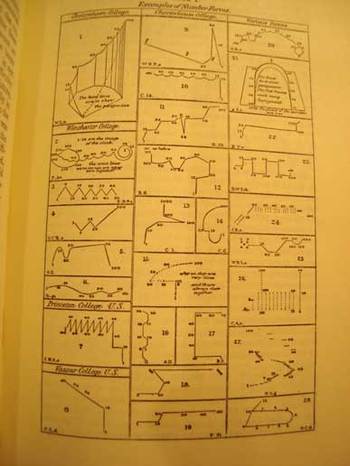
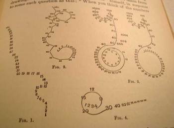
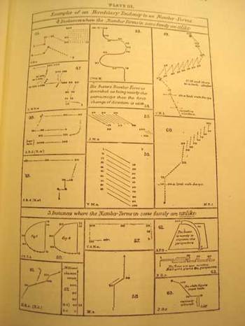
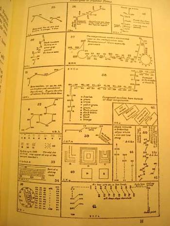
    I wanted to return and add a bit to an earlier notice concerning a series of drawings that I found utterly fascinating—the earliest illustrations of the active formation representing visualized human thought.  (I know that this titling is ungainly, but it seems to be the least inelegant solutions to stating the idea of what the images represent.)  It so happens that Francis Galton approached this same issue—though without pictorial representation—in an earlier paper with the unusual and provocative title of “Visions in Sane Persons” (1881).  Working further through this thesis and publishing an illustrated report in 1882, he continued, and greatly expanded, the study in a 26-page chapter called “Number-Forms” in his book Inquiries into Human Faculties and its Development (1883, with a second edition appearing in 1909).  Galton includes another 71 images of visualizing arithmetic, plus others on general images of mental images of numbers and letters—there is also a small but beautiful section on associations between colors and numbers and letters.  (These are all depicted in the first four images on this page.)

    Bloggalton1

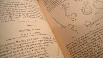
    G.T.W. Patrick (a professor of philosophy at the state university of Iowa) published one of the earliest papers in response to Galton’s work.  In “Number-forms”, published in the Popular Science Monthly in February 1893 (pp 504-515, and “illustrated”), Patrick addresses and expands Galton’s work somewhat, including another eighteen wonderful illustrations of similar images.

    But the path back to Galton is not quite a straight one.  Galton was initially concerned with imaging of numbers and numbers forms while people were performing mental calculations.  Patrick on the other hand asked his subjects if they had associative images in their mind of numbers—formally, he asked them if the number series of 1-9 presented itself in a visual, representative way in their minds.  In the second and third parts of his three-part inquiry, he asked the same question about letters and the alphabet, and then, thirdly, if they perceived any sense of color from letters and numbers, and what then what those exact relationships were.

    Bloggalton2_4

    It is interesting that in the studies of Galton and Patrick that over time in each of the subjects tested that (in Galton’s words) the images were “absolutely unchangeable except for a gradual development of complexity”.  Since I (like Galton, which is probably the only time I will ever be able to associate myself with this man
    in terms of familiar traits) have no such images in my head when I think about mathematics or numbers or letter or words in general, it is remarkable to me on the human scale that people who have these associations would have the same ones time after time.  A movable feast, as it were.  Of course it would make sense that this reference system would be constant—but for someone that doesn’t ‘see” these images at all, the fact that they are so flowing and lucid and unchanging is simply difficult for me to imagine. (In a few weeks I’ll return to this issue, looking at how some prodigiously gifted people “see” with their special attributes.)

    Bloggalton3_2

    Images below are from the Patrick paper:

    Bloggalton5

    Bloggalton6


    Bloggalton4blue

    ·Posted by :

    ·in:


  • Little Science—the Scientific Readiness of Water Bottles

    Blogmonolith
    There’s plenty of room for Big Science, as Big Science makes room for itself:  the Manhattan Project, RADLAB at MIT, CERN, Los Alamos, Human Genome Project are all examples of (really) big science, not to mention science cities like Oak Ridge, Tsukuda Academic Center (Japan)  and Akademorduk (Russia).  There’s  a much bigger list of big science, but what I want to get at right now is a look at Little Science, teeny-tiny science, and the home of the Good Idea.

    During the Anita Hill/Clarence Thomas hearings (which was constantly on the radio in the background) my friend Walter Johnson and I set out to move a half-ton piece of equipment,. in the dead of night, with no tools.  The object of course had no wheels, measured a very cubey 7x4x3 feet (or so), and presented itself in a primal crouch, like 6 refrigerators on their sides.  The Thing, a color photographic developer, needed to be put on its side, then moved down a 75’ hallway, then placed on end (!!) and then placed in a truck.

    We had a ratchet set and a few screwdrivers for tools—plus three roundish fence posts that we found in the trash outside.

    We removed as much of the innards as possible (it was a working machine so it needed to be put back together again), and were able to get it on its side so that it would fit through a door and down the hall.  I think that being bearish brutes we just muscled the thing over.  We of course used the logs to roll the beast down the hallway, a la the way we used to imagine the Egyptians moving monoliths.  We even knew how to get the thing upright—the big deal, though, was to get it back down again, horizontally, to get it into the truck.
    Monolithfz

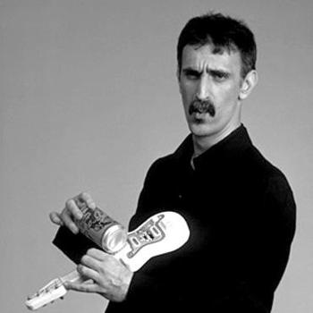
    This was, as Frank Zappa would say, the crux of the biscuit.

    Walter was and is a severely, acutely intelligent man with great creativity and a big sense of humor.
    Looking at our little bit of Stonehenge, trying to think of a way to move it from vertical to horizontal without damaging this slippery heavy stinking machine, and to continue using cave-man tools, was a thorny issue.

    Walter cracked it in an instant.

    We had five or six one-gallon jugs of water with screw tops—I think Walter had already consumed two gallons of it (he’s a big man, too)—that would serve the purpose.  Walter duct-taped the tops back on four of the empty jugs, taped the jugs across the top of the Beast, and then pushed the thousand-pound brute over.  The jugs acted perfectly, like shock absorbers; the caps stayed on, the machine never touched the ground, and we moved it into the truck and off into the night, celebrating our victory with warm Guinness. 
    Gallon_big

    It was a gorgeous and instant solution to a knotty problem, and a perfect application of a little sci and mechanics.  Of course you had to be able to see the simplest, most direct solution to the problem, which Walter did, and then have the necessary tools in the trash around you to make the dream come true.  But we hadn’t thought of that end bit, the lowering of the machine without damaging it part, which was such a heart breaker for the moment before Walter said that he knew how to do it.  But Walter was always like this, always hyper-smart and intuitive—he can master complex issues quickly and remember it all (I showed him Bergmann’s book on pi one day and without prompting he began to recite the pi through at least 50-places)—but the big deal was to recognize the shortest, best, most elegant solution to a problem.  And seeing that thousand pound behemoth fall safely to the ground as if on pillows is about the best exclamation mark that I can think of when talking about solutions like this.

    Happy 50th Birthday, Walter Johnson

    Monolithpi_2

    Here’s an unusual musical bit using the first thousand places of pi for a piano solo.

    ·Posted by :

    ·in:


  • Big Science, 1882–Hauling (Really Big) Ships Overland and up a Mountain

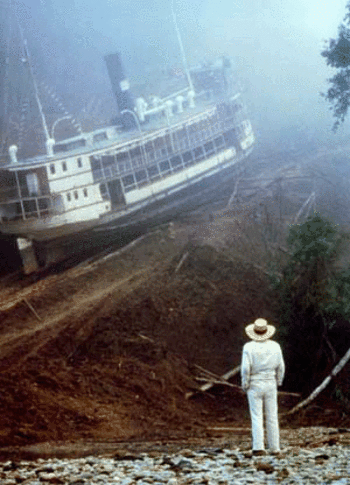
    Blogbig_sciencefitz In 1982 Werner Herzog, in what may have been the culmination of a weirdly fashioned and irresistible death-wish effort, released a film that he wrote and directed:  Fitzcarraldo.  It is a spill-over big, magnificent film about a would-be ice-making rubber baron bringing an opera house into the trans-Andes, trying to make his way into the dense forest in a huge (320 tons) steamboat on the Amazon to stake a claim in exploiting previously un-leased lands filled with rubber trees  The problem faced by Fitzcarraldo (played by the probably-slightly-insane Klaus Kinski1–just see Herzog’s 1972 Aguirre, Wrath of God and you’ll know what I mean) is that his path is blocked by unnavigable rapids–he can however reach his destination by hauling his very large ship up and over a mountain to get to a more pliant river and then to his goal.  Herzog actually does this for the film–no digital anything here2,3–in what is one of the most glorious things I’ve ever seen in the movies.  He really does have native people clear a path up the side of a mountain, and they DO haul this ship up and over.  It is truly magnificent, especially seeing the boat moving slowly up a mountain as background to a sweating Fitz.  

    The story is partially based upon the adventure of Carlos Fermín Fitzcarrald, who in 1890 attempted a similar feat, though with a much smaller vessel, and who also dismantled the craft to haul it overland. (Its not a bad idea, necessarily, to do this dismantling thing, especially if it has to be done and there’s no other way to do it. The North Vietnamese famously did the impossible by hauling artillery up through the jungle and up mountains to shockingly surround the French at Dien Bien Phu.) 

    Blogbig_sciencefitzcarraldo    The bigger and deeper back-story though is the effort–mainly by Elmer Corthell and James Eads–to build a combination railroad ship canal across the Tehuantepec isthmus in Nicaragua.  The idea of moving across Central America rather than taking the enormously long route around the tip of South America and up again is hundreds of years old.  The Corthell/Eads plan, begun in 1870’s and alive in the early ’80’s, was really the first feasible (and workable) initiative.


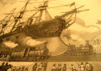
    Blog_big_large_ship

    It would have been a gigantic undertaking, and even though it was much longer (130 miles or so)  than the more-favored Panama location for the canal, it seemed more workable as there would be less digging and no need for a lock/canal system as required at Panama. 

    The French began a doomed attempt at conquering Panama shortly before this.  Ferdinand de Lesseps tried to build a canal in 1880, but the organization and general construction plan was truly inferior; also, the sanitary and medical conditions were terrible, with the French losing perhaps 22 thousand men in the failed process to disease (mainly malaria).  (The United States would lose 5,609 workers while building the Panama canal, on land granted as a payback for “helping” Panama release themselves from Columbia.)

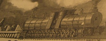
    Blog_big_closeup

    The Corthell/Eads (who by the way was a master builder perhaps best known for his inspired masterpiece of a bridge at St. Louis) plan called for hauling the ships up and out of the water in a short canal and placing them on an enormous floating roundabout; the roundabout would then be raised, and the ship place on huge cradles borne upon vastly augmented railway lines.  Once on the cradle, the ship would be pulled and pushed by a team of four large locomotive teams which were in turn composed of two large engines.  Happily aboard, the ship would then be taken on the extended, expanded wide and augmented rail 130 miles overland and dumped into the Pacific.

    It was evidently not a workable deal all the way around, though, as the U.S. decided on the new Panama to works its engineering miracle.

    Blog_big_big_closeup

    There is something pleasing though about the Ship Railway, though, something that appeals to the little bit of Mr. Herzog in me.  Perhaps it was the appraisal of the very stiff-lipped Sir Edward Reed–who was the former master engineer for the British navy and consultant to Eads—that makes it all so irresistible.  “It would be best to avoid a very high rate of speed” when hauling the massive ocean-going and heavily laden cargo ships.  Indeed.

    Notes

    1. The original actor in the Fitzcarraldo role was Jason Robards, who had to give the film up after about a third or so the way through as he came down with dysentery. Kinski came into the role after that, and the film was re-shot. 

    2. There is a scene showing the steamboat being unmoored and sent down the rapids on its own–that is done with a model. So far as I know, that is the only bit of post production trickery for the film. 

    3. There’s an interesting documentary of the film also released in 1982, Burden of Dreams.

    ·Posted by :

    ·in:


  • Transient Statues: Naming Clouds and Snowflakes

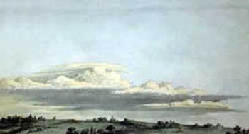
    Blogcloud_howard

    It is odd to think among the great classifiers of nature, including even the lofty-namer Aristotle, that clouds were not scientifically classified until the early 19th century.   Here they are, just about the biggest thing we have as earthlings that are gigantic and close to us, and nobody offered a good classifications scheme until 200-odd years ago—a pretty slim margin of time  in the terms of recorded human history. 

    Clouds are of course problematic, what with floating around and all—but if you didn’t already know the relative newness of their recognizable names isn’t it shocking to learn this bit of history? For the most part I think clouds must have been thought as being too transient, changeable, whimsical, wispy, to be given proper names.   The great scientist and classifier Lamarck tried to do so in his  Annuaire Méteorologique of 1802, and really is the first to try this, but his ideas weren’t terribly good (especially compared to the rest of his work), and it seems as though he left his best thinking effort on clouds at home.  For example, he gave us Hazy, dappled, massed, broom-like and grouped clouds as classifications (in French, respectively, en forme de voile, pommelés, attroupés,  en balayeurs and groupés).  They seem quite “French” to me, but largely outside the scope of being useful. 
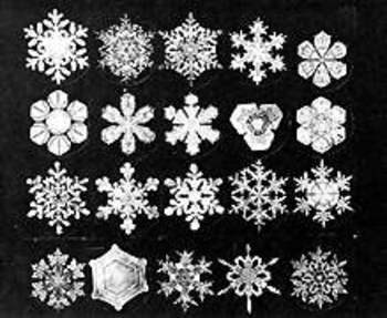
    Blogsnowflake_hooke

    It was the English pharmacist and chemist Luke Howard who in 1803 gave a greater bit of thought to structuring cloud names, classifying them according to size and shape and giving them Latin names—and this forms the basis of our naming clouds to this day.  Howard was perhaps the first, greatest, meteorologist, producing On the Modification of Clouds, (in which he describes his naming system, the “modification” part actually meaning classifying rather than changing),  The Climate of London, and the first textbook on weather,  Seven Lectures on Meteorology.  Howard’s system was expanded in 1887 by Abercromby and Hildebrandsson, who further classified clouds by height above ground as well as by appearance (and utilizing Howard’s naming system). 

    Howard began his system by identifying three basic shapes to clouds: heaps, layers, and curls.  Heaps of separated cloud  masses with flat bottoms and bulbous, splayed, tops, which he called cumulus, which is Latin for heap; the Latin stratus was applied to clouds in layers which were much wider than they were thick; and again to Latin for cirrus, which called out the wispy curls of clouds.  (Rain clouds were given the Latin nimbus, for rain, and so on.) 

    It is interesting and romantic to think of Howard being moved in his love of clouds as many Brits and Europeans were in the Volcanic Year of 1783 by the enormous eruptions of the Eldeyjar (Iceland) and Asama Yama (Japan) volcanoes—the force of their eruptions caused enormous changes in the skies (especially in Europe), creating vast sky-borne tapestries (the “Great Fogg” in England) and for such extended periods of time that it would have been impossible for the scientifically-minded Howard not to see them. 
    Blogsnowflake_bentley

    Similar, in a way, to clouds is the snow crystal (snowflake)—they change forms in their lives from sky to ground, and may well disappear on contact with a warm surface.  Of course unlike clouds they may fall and be captured, kept even, though the ability to actually perform some sort of scientific something with them didn’t occur until 400 years ago, which means that snowflakes passed in and out of human existence being very simply named (in most languages) as a mass group, and not classified at all.

    Johannes Kepler thought very deeply in In 1611 publishing a short treatise called On the Six-Cornered Snowflake, thinking that perhaps their (mistaken) six-cornered symmetry revealed something much deeper about the basis of nature and the universe. The 26-year-old  Robert Hooke seems to be recognized as the first to throw the snowflake under a microscope, publishing drawings of them and just about everything else that he saw in his monumental (and tall, being 13-inches tall) Micrographia (1665)–the first truly scientific book of modern times.  The largest of the large images was saved for the flea, showing the unsuspecting public the great and beautiful nature of what seemed like a fantastical beast (under magnification).  Snowflakes appeared in the book, revealed in their intricate and seemingly-symmetrical nature.  Fantastic, unimagined images. This aside, he seems to have, um, borrowed these images from an earlier work, Thomas Bartholin’s  De Nivus usu Medico Observationes Varieae, 1661.  But so it goes. 
     

    The Galileo of the snowflake was Wilson Bentley (1865-1931), an autodidact Vermont farmer, seen by fellow hamlet-dwellers as odd and off, who figured out how to photographically and beautifully record the intricacies of the snow crystal world—no one had ever done this so dramatically, with such gorgeous results.  It really was as though he was able to record the heights of the mountains of the moon with a slender telescope in Pisa, 350 years earlier. The results of his decades of experience were published  in 1931 his book Snow Crystals, containing more than 2400 snow crystal images.  On the heals of Bentley’s accomplishments came the classically trained nuclear physicist Ukichiro Nakaya, who was truly the first person to apply a scientific classification to snowflakes, and who published his intrepidly-beautiful work in a 1954 book entitled Snow Crystals: Natural and Artificial.  His classification system of the various types of snowflakes would prove vastly more useful, interesting and appealing than that published by the 1951 the International Commission on Snow and Ice, and forms the basis of the discussion of snow crystals today—a classification system of a massively-occurring phenomenon that is younger than me. 

    ·Posted by :

    ·in:


  • The First Shadow of a Color “Photograph”—Jan van Eyck, 1436

    Van
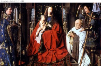
    Was it really Jan van Eyck and not J.C. Maxwell who produced the first color photograph?  Van Eyck’s after all is hanging up in Bruges in the Groeninge Museum, and Maxwell’s, well, Maxwell’s dissipated in about half an hour, leaving only an historical trace.  The problem of course is that Van Eyck’s oil (Virgin of the Canon  van der Paele) was done 403 years before the Daguerre invention (building of course on the work of others, notably Niepce), so it really doesn’t count because it really doesn’t exist.  His work though *does* exist, but not as a photo—it was, is, a painting, finished in 1436, and it stands in my mind as looking so much like a perfect capturing of a moment that it seems a (luscious) snapshot. 

    In her book Color and Meaning, Practice and Theory in Renaissance Painting (1992), Marcia Hall makes the point (on page 69) that it is the lighting in this painting that makes it so extraordinary—and differentiates it entirely from the predictable light or “stage illumination of the Italians”.  Its an excellent point.  The light source in the painting is emanates as though it were a half-hour before sunset in Santa Fe; or here, in Asheville, when there is a very low and nearly complete cloud ceiling and the sun just manages just before sunset to peek through between the mountains and the cloud layers to blaze its extraordinary, horizontal-like brilliance making everything and anything that reflects that light into a work of private art. The figures in this painting by Van Eyck reflect a softer version of that light in such a manner—they are sharply illuminated, luminous, in all of their very human glory and frailty.  We have sharp relief, great detail, deep shadow—and much of that is missing in Italy at this time.

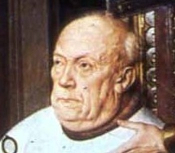
    The photo parts come in here:  the characters are caught in the middle of some very small, obscure action, and the smallness of their movements are captured perfectly

    Even though they are emotive of course the faces of the great Masaccio are relatively plain; Gozzoli, Fra Lippi, theVan2
    magnificent Fra Angelico, Pisanello, Ghirlandaio, della Francesca, Veneziano, di Credi,. Perugino, and even the emotive and colorful Rafael, all working in about the same decades as van Eyck, simply do not give this anatomical expressiveness to the faces of their subjects.

    So the extreme light and the detail in the faces gives the van Eyck this fantastical quality—on the other hand the perspective and the proportions of the characters in relation to the objects in the room and the room itself are off, secondary, not important—this too in sharp contrast to the great inventors, re0-discovers, innovators of the scientific perspective.  (This homage belongs to a slightly earlier time, to Giotto and Uccello, but their work is just a bit to early for discussion with van Eyck.)  Marcia Hall goes on in her appraisal about the way in which van Eyck applied his color (“binding his pigments in a drying oil”) to give his subjects their incredible color depth, and this of course is a major element in understanding the picture (coming as it does from a stone-cold expert). 

    What I’m thinking now, the aspect that is giving this painting its “photographic” quality, its supra-realistic event, is this new use o flight, new angle, with the immersion of anatomical detail and the “different”, Northern, perspective. 

    This is a very, overly, simple observation and simplification, but I think in general that it is true.

    ·Posted by :

    ·in:


  • Durer’s Beautiful Monsters. The Geometrical Man Takes Control, 1525.

    Dsc04744
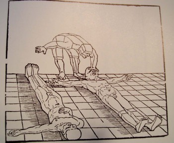
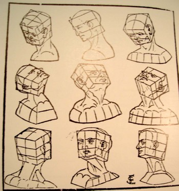
    Albrecht Durer’s (1471-1528) drawing of a geometrical man was an amazing–startling, even–object to the early 16th century consciousness. His …Symmetria partium…humanorum corporum (1537) was a masterpiece, and a key piece of visionary thinking.

    His Underwysung der Messung (“Treatise on Measuring”) written nearly 500 years ago (in 1525) set the stage for this next work–it is here that we find some of the most recognizable of
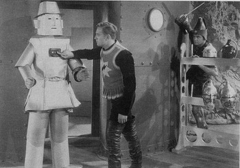
    Durer’s illustrations of the instruments that he employed to doRobot_flash_gordon his perspective work.  Durer–so far as I can tell–created an orthographically rotating human figures in three-dimensional trapezoids, creating incredibly human-like non-human forms.  To the modern eye they look  like supra- or proto- or post-human, perhaps; mechanized, calculated, structural. His use of stereometry, the science of measuring volume, was adapted to this study of human form and the relationship between that and movement. 

    They were in a sense a CAT scan.  And in this way the person in 1525, seeing this for the first time, could have been  experiencing something like the sensation of seeing an X-Ray for the first time in 1895 or a magnified flea in 1626, only the image wasn’t magnified nor was it an internal view–it did help in understanding perspective and motion. 
    Dsc04745
    This was a new way of thinking about the body, challenging the god-grace and ubiquitous church-inspired revelation of how it worked.  This was not a necessarily easy time in which to picture humans in such a scientific way.  (In 1553 the physician and theological scholar Michael Severtus would be burned at the stake for his views on the Trinity, Nicean Creed and other related things, though his undeniably revolutionary idea of cardiopulmonary circulation was in itself a direct challenge to church teachings).

    Durer’s innovation accommodated empirical observation and allowed for proportional change.  Its importance in relational drawing, anatomical and  technical, cannot be understated, which I think trumped it as a subversive agent to orthodoxy.

    Erhard Schoen  (1491-1542)  who was one of the most prolific woodcut illustrators in Europe during this period with more than 116 books to his credit, produced Unnderweissung der proportzion unnd stellung der possen, liegent und stehent…, Norenberg 1542 followed Durer showing that the human form was reducible to connected but discrete Euclidean solids, and thereby was a knowable entity. (It is interesting to footnote here that this work came after a period of a dozen or so years in which Schoen produced many heavily anti-Catholic cartoons, broadsides andAgricola illustrations.) 

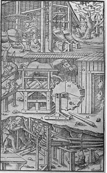
    Close on the heels of Durer was the work of Georg Bauer  (also known as Agricola, 1494-1555) whose De re metallica Liber XII (“12 Books on the Subject of Metals”) in 1556.  This work by Agricola (recognized as one of the founding fathers of a number of disciplines–mining geology and metallurgy, mineralogy, structural geology, and paleontology) was actually more concerned with mining and minerals than the title implies.  It was here, again, that the illustrations were crucial and revolutionary—his book was a chief resource in mining for hundreds of years, due chiefly for its clear and precise how-to illustrations. 

    ·Posted by :

    ·in:


  • Liserl and Mileva–Einstein’s Disposable Women

    Einsteinhans_albert_detail_2

    Looks like a Chuck Close of Albert Einstein, yes?  Well, its not–its just a heavily pixilated enlargement of Einstein’s son, Hans Albert Einstein, who at age 3 or 4 looks pretty much like his father, very much so, actually. 

    Einsteinmileva_detail_smile_2
    The Mona Lisa smile is another missing–discarded–piece of Einstein’s life.  It belongs to his first wife, Mileva Maric.  She was by most accounts an accomplished mathematician, exceptionally intelligent, and a person of her own.  She nearly succeeded in the males’ world of mathematics, but didn’t .Few women did at that time in history–or at least few succeeded under their own name.  There’s a lively debate among some that Mileva was instrumental in the development of the special theory of relativity (among other things) developed by Albert in 1904/5 and published in the Annalen der Physik in the annus mirabilis of 1905.  Personally I doubt that she contributed significantly to the theoretical composition of the theory; I haven’t much of a doubt that she contributed materially to its development, being an intelligent and capable foil/sounding board/conversant with her husband.  As anyone who is a partner in a relationship of two intelligent people realizes, there is a lot of back and forth going on in the development and creation of ideas.  I don’t have any doubt that something like that went on here.Einsteinmileva_detail_eye

    But Albert was done with her by 1914 or so, living basically apart until their official divorce in 1919..  He had minimal relations with Hans Albert.  Eduard developed schizophrenia in his 20’s and that was about it so far as his father was concerned–he was cared for by Mileva until her death in 1948 and then died in an institution in 1965.) And he was particularly done with his daughter Liserl, a baby that he made with Mileva. a girl who simply disappears.  She was born in 1901, and born in “secret”–though it was not a secret to her, or her mother.  She’s gone by 1902.  Then her parents manage to marry in 1903.  The next year Albert tries again at fatherhood witrh Hans Albert, but I think his attention span for children has a relatively short event horizon.  Eduard is born in 1910, but the development of his mental disorder divorces him from hi sfather for good.  It is simply not a pretty story. 

    Einsteinmileva
    Einstein went on his personal life full of what I see as complications, abandonments, deceptions; living with all sorts of shadows, with a hollowness, there, somewhere. 

    I don’t really care to think about Albert’s personal story, and I don’t read his flea-combed biographies I’m perfectly happy to just deal with the intellectual history of his life and be satisfied with that.  But there are days like today, when I think about people celebrating his personal life–as in his birthday–that I sense the emptiness, and wonder about Hans Albert, and Mileva, and Eduard, and the Lost Girl, Liserl.  I think that rather than celebrating Einstein’s personal milestones that we take a moment to remember the countable but countless lives like Mileva who are simply discarded, and that their lives meant as much to them as Einstein’s life meant to him. 

    At least Mileva derves a gravestone.

    Michele Zackheim wrote an interesting book on Lieserl, Einstein’s Daughter, if you’re interested. 

    ·Posted by :

    ·in:


  • The First Photograph of a Smell

    JF Ptak Science Books LLC 

    It leaves me with such a cozy
    feeling to not find what I think is an obvious-but-odd phrase in Google.Dsc04716

     And that’s what happened with
    “the first photograph of a smell” (or “photograph of a smell”
    or odor, for that matter),  as shocking
    to the senses as it might be.

    There are long and interesting lists
    of firsts in photography: the first
    color photograph (Maxwell, 1867, but impermanent), the first photograph of a
    human face, the first photograph of the moon, the first photo of a planet, and
    so on, tirelessly, until we see how many derivations of “firsts”
    there are. (We can go from first photo
    of human to first photo of a human face to first photo of a human in motion to
    the first photo showing human hands to the old human recorded by photography
    tot eh first photo of a couple to the first photo of a human with a tool and on
    and on.) There is a shorter list of “first photographic non-photograph of
    a photograph”
    (?!) that I wrote about in an earlier (illustrated) post,
    but we won’t go there today.

    Here is a “first” though
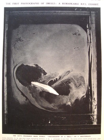
    that I think hasn’t been dealt with too terribly much: the first photograph of an odor.

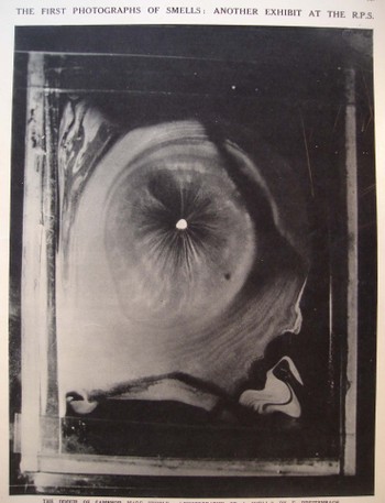
    These beautiful images appeared in the 10 September 1938 issue of The
    Illustrated London News and were exhibited at the 83rd Annual International
    Exhibition of the Royal Photographic Society, and were made by H. Devaux (who
    evidently, according to the snippet of an obituary that I can see from Science
    magazine, was a plant physiologist and “pioneer of surface physics”Dsc04717

    who died in 1956). The note accompanying the photographs read: “The emission of an odor involves
    volatillisation of material. If an
    odiferous material is enclosed in a cell a few millimeters above a clean
    mercury surface, it is possible to collect on the surface of the mercury a
    monomolecular layer of the volatillising or odoriferous substance. If the mercury surface initially is covered
    with talc powder, the gradual formation of the monomolecules layer may be
    observed as the talc is gradually pushed away from the point immediately below
    the specimen of material.”

    The photos
    are that of the odors of a lily and of camphor. I don’t know which is which, and a good story could be made up for
    either photo belonging to either item. Needless to say, these images are as gorgeous as they are unexpected,
    especially considering that they were made in 1938.

    FOOTNOTE:

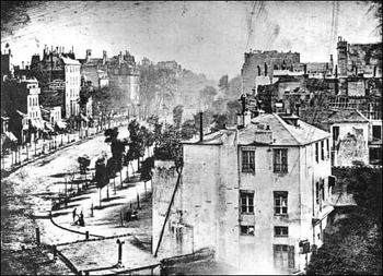
    I’d just like to add here the first photograph of a human being–well, actually, it is the first photograph that just happens to capture a human in the emulsion (discussed Blogoldest_human_photo_2
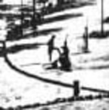
    very nicely on the Doug’s Darkworld  blogsite.  Since the  exposure time was so terribly long for this image to be made, the moving people and horses and carriages on the street, all of the city-life bits, were necessarily spectral, invisible, to the photograph.  Only the stationary items were captured, and the only people captured here were two figures in the foreground, doing something or other that made them still for at least five minutes–long enough for their anonymous but famous photonic impressions to be captured.   Mr. Doug and others seem to think this is a man getting his boots shined–I agree.
    Blogoldest_human_photo_detail

    ·Posted by :

    ·in:


  • The X-Ray of the Imagination 2: Phrenology, Chinese Hell Scrolls, and the Beauty of the Thought Balloon

    The X-Ray of the Imagination:  Internal Dialog, Demons, Humors, and Picturing the Stuff of Thought–On the outer shapes of the inner container

    In an earlier post I wrote about what I thought was the first graphic representation of  the process of forming andBlogxrayfludd
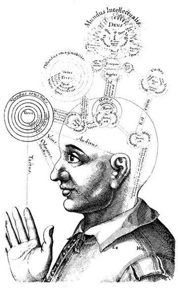
    imaging a complex thought (found in Francis Galton’s Visualizing Numeracy). It is interesting how people tried—over a long period of time—to get at exactly that, the inner process, via some sort of external means, which is almost entirely left in the not-so-exclusive world of the science-like.

    Perhaps the greatest early effort (and certainly the most beautiful yet) to ascribe physical locations and attributes to the mind was the work and drawings of Robert Fludd.  That would be Dr. Robert Fludd (1574-1637), occultist/philosopher, randy logician and hermticist astrologer pseudo-scientist; and maybe the best of his work is found in his fabulously titled work Utriusque Cosmi, Maioris scilicet et Minoris, metaphysica, physica, atque technica Historia (The metaphysical, physical, and technical history of the two worlds, namely the greater and the lesser…), published in Germany between 1617 and 1621.  Things get very deep and complex and confusing, even in the illustrations; so as far as being a key to human knowledge, Fludd probably relaxed the confusion boundaries more than he strengthened insight—but maybe that was supposed to be his job, what with supposedly being a Grandmaster of the Priory of Sion

    Another great effort in the attempt to physically determine what might be going on inside someone’s brain and mind were the physiognomists. Physiognomy (does it really matter how it is spelled?  I should think that if I was to try and determine how I should spell the word using the very methods its practioners employed that the spelling might change daily…) from the Greek, basically meaning “nature” and “interpret”, claimed an ability to judge the scope of a brain by the shape of its container—the skull.  If a skull was sunken or distended or high or pretty or what have you then this shape in some way related to the development of that area of the brain.  So a high forehead could mean great insight or knowledge or intellectual ability; a low, sloping forehead meant, well, not, and to steer clear of such people with yourBloglavater
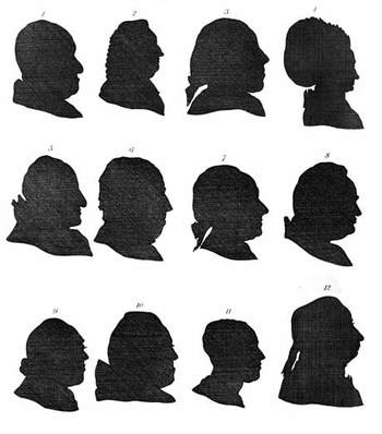
    hand firmly on your purse.  An early practioner was the very formidable Thomas Browne (1605-1682) (in the Religio Medici), but the powerhouse thinker (as it were) was Lavater (1741-1801), who caused and challenged all manner of mischief. The democratic nicety of this pseudo-science is that you didn’t really need to be associated with any extended scientific thought to engage in its application—a nice silhouette-maker would do, along with a series of interpretive and a decent personality was about all you needed.  A nice clear forehead would help.

    Nipping at the heels of Johann Caspar Lavater and company was Franz Gall (1758-1828) and the Phrenologists (from the Greek again, “mind knowledge”), who made a slight step beyond simple head shape by “reading” the bumps and indentations of the skull.  Their educated fingers were in this way were supposed to have the capacity to feel the special elements of that part of the brain manifesting itself via cranial nodules or something.
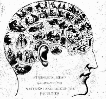
    Blogphren
    Pathognomy was yet another step in the stairs to the flooded basement, where passions and emotions resident in the voice, or gesture, or facial expression, would somehow reveal the structure of the mind.  I found this one pretty curious because it concentrated on the motions of the physical ramifications of the brain, which somehow seemed very elegant in a ghost-like, narcotized way.

    But this is just the attempts to ascertain thought—actually picturing it, literally, was not all that common.  Dreams,Blogxraycruikshank
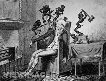
    fears, thoughts, pain, interpretative inner dialog—seems to have occupied artists far less than love or creed or ambition or devotion.  Being able to “see” someone’s pain, or nightmares, was really quite special.

    Thomas Cruikshank made this a sub-specialty for himself, depicting people suffering extreme anguish as a result of gout, or delirium tremens, or fear, and anthropomorphizing them, giving these concerns/fears/pains a human-like quality.  So instead of seeing  a badly inflamed gouty ankle and imaging its pain, we see anti-cherubs, demons, spikey creatures at work on the ankle, pricking it, setting it on fire.

    Bosch of course performed miracles in setting out the fear of the Lake of Fire in very explicit, basic, understandable ways.  In my opinion though the Chinese Hell Screens (as a genre) have Mr. Bosch beat by a long mile, as they were terminally specific in elucidating even what might seem to be trivial transgression for the casual viewer.  (For example, a person who wasted paper would, according to one scroll, spend eternity in a lake of flaming feces, bobbing to the surface occasionally to be stuck in the face by a flaming spear.  Now THAT’S Hell!)

    We have certainly seen people in the throes of nightmare in art, but the relative subtlety of the visions of HenryFuseli
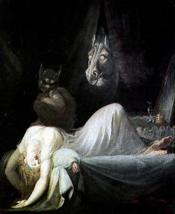
    Fueli (The Nightmare, 1782) and William Blake (“Jeruslaem”, 1820, for example) and of course Fransico de Goya’s “The Sleep of Reason Produces Monsters” (from Los Caprichos) really do wane in comparison to some of the highly explicit horrors of Cruikshank and James Gillray and Thomas Rowlandson.  Perhaps this is so because the later group seems to address the masses and making the nightmare more universal, visiting the ample-butted poor as it would the couch-bound Faintress of the Upper Classes. (I guess I should really remove Goya from the former class, as he really did intend to reach the working poor as much as anyone else.)

    I’ve wondered about the artist Arcimbaldo—the genius portrait painter whose artistic palette was fruits and vegetables—and whether his use of various types and shapes of foods were supposed to correspond to any internal dialogs in the person sitting for him but, well, I think not.  Nice thought, though.

    Most effective though in graphically revealing the inner workings of someone’s mind is, yes, the word balloon, which takes a second seat to its younger sibling, the glorious thought balloon.

    What a fantastic creation!

    The word balloon, or the idea for it, exists for quite some time in Mesoamerica, incised in sculptures from 1000 yearsBlogxrayyellow_kid
    ago.  (See Hull, Kerry Michael (2003). “Verbal Art and Performance in Ch’orti’ and Maya Hieroglyphic Writing”).    Something that we begin to recognize in a more modern form comes up in the 12 th century with word scrolls—elegant, flowing, appealing bits of fabric upon which the words of the person in the painting are written.

    Word balloons really come into their own in political art in the 18th century (and do have a very curious, artistic affect in their longish, elongated appearance with tiny 3-point type inside).  Sometimes the word balloons look like smoke with words in it—these might be my favorite, as they give the clear impression of the immediate and dissipating nature of most speech.

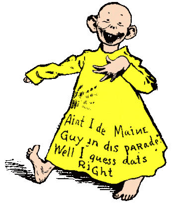
    The Yellow Kid, generally acknowledged as the first “cartoon character”, at first had his speech written directly on his flanged shirt.  It was around 1896 (I think!) that the words moved from his apparel and into a balloon over his head.

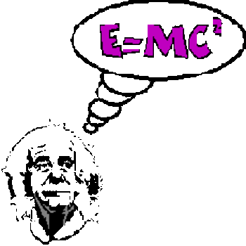
    The most beautiful innovation though came a little later (exactly when I’m not sure, I’m sorry to say) with the invention of the thought balloon.   What a magnificent idea!  Why hadn’t this concept been employed earlier, anyway?  How come it took until that unparalled period of time—1895-1915, when virtually everthing became “modern”, when just about everything (save politics, unless you include the creation of the concentration camp) experienced a paradigm shift—and not earlier?  Certainly it is common and debased, and runs amok with the very idea of art and its attempt to show the viewer the inner machinations/beauty of its subject; but wouldn’t it be interesting to have the thought balloon for Lisa Gheradini (the wife of Francesco del Giocondo, “Mona”)?

    Well, probably not.

    But the thought balloon–bubbly, cloud-like apparitions above its thinker’s head—certainly has it place, and isBlogthought_bubble
    absolutely a more elegant invention discerning thought than Lavater or even the lovely Mr. Fludd could ever dream.
    ·Posted by :

    ·in: