A Daily History of Holes, Dots, Lines, Science, History, Math, Physics, Art, the Unintentional Absurd, Architecture, Maps, Data Visualization, Blank and Missing Things, and so on. |1.6 million words, 7500 images, 4.9 million hits| Press & appearances in The Times, Le Figaro, Mensa, The Economist, The Guardian, Discovery News, Slate, Le Monde, Sci American Blogs, Le Pont, and many other places… 5000+ total posts since 2008.

Category: Uncategorized

  • A Ghost Print of a Buried Manhattan

    JF Ptak Science Books  Quick Post

    Concentration camp austria006

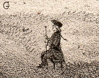
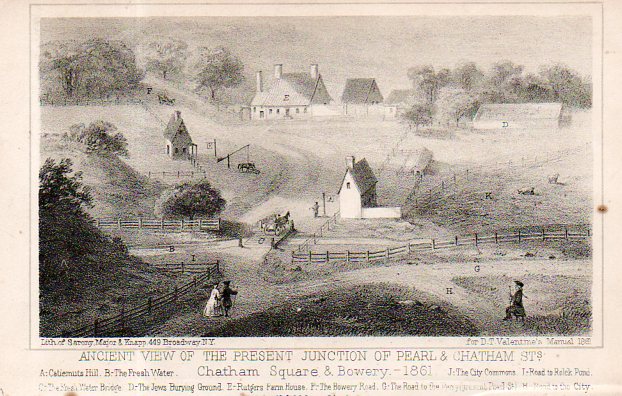
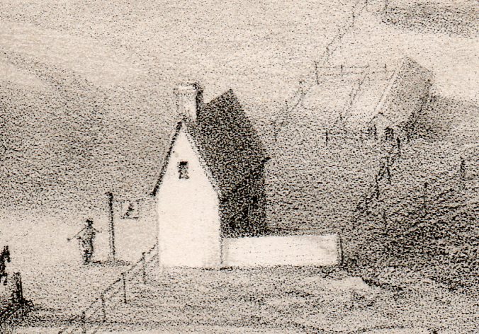
    I found this concentrated view of a concentrated house in a non-concentrated area that would become a super-concentrated locale. The tiny concentrated house with the tiny fence was situated about 1000 feet away from where the Brooklyn Bridge onramps are today.  The “Ancient View of the Present Junction of Pearl & Chatham Square” shows an acre or two of lower Manhattan in the 18th century. The concentrated house isn’t on the legend, but it looks like some sort of public house, as does the next concentrated house just across the lane. 

    Concentration camp austria007

    Legend: (A) Catiemuts Hill, (B) the Fresh Water, (C) the Fresh Water Bridge, (D) the Jews Burying Ground, (E)  Rutgers Farm House, (F) Bowery Rd., (G) the road to the ferry (present Pearl Street), (H) road to the city, (I)  road to Rolck Pond, (J) the City Commons, and (K) Walpherts Meadow.

    [Image source: the lithograph is from the Manual of the Corporation of the City of New York by D.T. Valentine for 1861, opposite page 521.]

    Concentration camp austria008


    ·Posted by :

    ·in:


  • Tall Structures and Dropping, Stopping, and Sliding Stuff (1892)

    JF Ptak Science Books  Quick Post

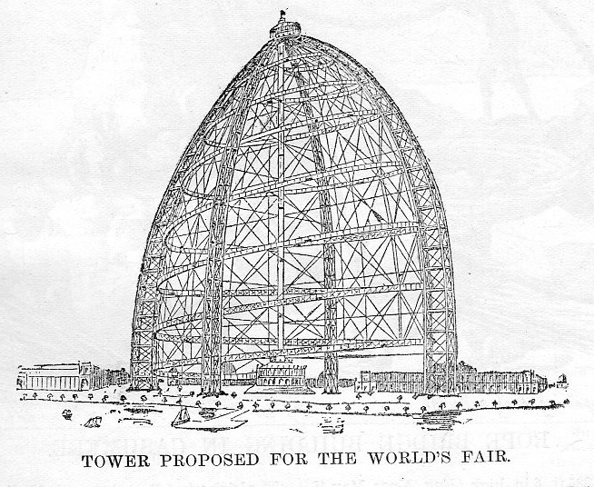
    Earlier in this blog I wrote a bit called “Dreaming of the 10-Ton Eiffel Tower Bullet, 1891” which was about the massive free-fall bullet ride that was to be part of an Eiffel Tower entertainment package–the apparatus wasn’t built, which was probably a good thing, what with dropping 20 people in a steel bullet from 900′ feet not being such a brilliant idea1.   The Eiffel Tower had been built a few years before for the 1889 world’s fair in Paris to mixed reviews–actually there was a call for its deconstruction post-fair because so many people found it so confounding/unappealing.  The Columbian Expo’s greatest “response” to the Eiffel Tower and the not-building-another-one was probably the 264′ Ferris wheel–it was very popular, and after the fair it was dismantled and moved to another location in Chicago in 1895, and then disassembled again and moved for use in the St. Louis World’s Fair of 1904–after that it was ingloriously retired and sold for scrap (for $1800). 

    This all came up just now because in browsing the 1892 volume of Scientific American I bumped into this drawing of a proposed exhibit/attraction for Chicago–an observation tower with a “slide”. Folks would be hauled up to the deck at the top, after which they would be loaded onto a car (descent controlled by air brakes) and sent back down on a 5o grade. There’s no help in the article or drawing to determine just how massive this structure was supposed to be, though it looks very substantial, hundreds of feet tall.  Given that the new form of building at this time was the skyscraper and that the only thing to make the skyscraper practicable was an elevator, this was probably a good advertisement/display/p.r. stunt for the machine–even more so for the brakes on the sledges and the elevator, because you really can’t have tall buildings without elevators, and you can’t have elevators without good brakes. 


    Columbian expo tower429

     Notes:

    1. (Check out this link for a fuller story on this bizarre and probably fatal idea https://historyofideasblog.com/thesciencebookstore/2011/11/dreaming-of-the-10-ton-eiffel-tower-luxury-bullett-addendum.html )


    ·Posted by :

    ·in:


  • Found Poetry in the Sciences (1610 and 1698)

    JF Ptak Science Books   Post 2578

    “The truest attraction of “found poetry” is that it should remain lost”– not Marcel Duchamp

    “The highest pleasure in finding poetry is the ability to lose it again”–not Ambrose Bierce

    There’s a certain identifiable current that runs just beneath the surface of created quotes about found poetry–and I tend to agree, except that I think I enjoy “found poetry” more so than the great majority of poetry-in general, so if I am to read any poetry at all I think that poetry must be found now and then.  And the thing about Found Poetry (now capitalized!) is that is can be obscure  (“Obscurity is never so clear as when it is never noticed”–not Mark Twain) or so much part of the visual culture that its very unforgivable presence makes it invisible–though I have no doubt that the overt intellectual and traitor E. pound would disagree.  

    Found Poetry I think has been around for a century or so, finding its roots with the Dadists and the solitary art anti-movement M. Duchamp.  And probably an argument could be made for the acoustomatic  continuation of another found-hyphenated movement–like Stockhausen/Varese/Xenakis musique concrète–is an outgrowth (or something) of the Found/Readymade embarkation of the nineteen-teens.  Maybe too something could be made of the argument that they are all coming from a long and very slow development of trompe l’oeil and Still Life, as there is a definite visual/found quality to many of these works (as with “A Bachelor’s Drawer”, painted between 1890-1894 by John Haberle).
    Found poetry Haberle bachelor drawer

     [Source: Wikimedia]

    Still Life images like this of “discovered” assortments of human-created bits, snapshots of unintentional arrangements, must certainly have a sense of Foundness surrounding them.  Of course, a pastoral scene of cows-in-a-field or a John Constable sky or some such are necessarily “found” because they are an uncontrollable part of nature–what I’m talking about is a discovered sense of some sort of human construction, and that certainly includes words. (On the other hand, I did write a post “The Found Poetry of the Vocabulary of Clouds” on a John Comenius text of 1726, here: https://historyofideasblog.com/thesciencebookstore/2015/05/annotated-found-poetry-of-clouds-1726.html.)

    So, for today, one part of the concept of Found Poetry I’d like to look at is in the science–in particular, title pages and indexes for works int eh sciences, and in this case the works are historic, though they could easily have been from any odd page in any opened book, anywhere.  

    The first example is the title page of Galileo’s epochal Sidereus Nuncius (1610):

    SIDEREAL MESSENGER
    unfolding great and very wonderful sights
    and displaying to the gaze of everyone,
    but especially philosophers and astronomers,
    the things that were observed by
    GALILEO GALILEI,
    Florentine patrician
    and public mathematician of the University of Padua,
    with the help of a spyglass lately devised by him,
    about the face of the Moon, countless fixed stars,
    the Milky Way, nebulous stars,
    but especially about
    four planets
    flying around the star of Jupiter at unequal intervals
    and periods with wonderful swiftness;
    which, unknown by anyone until this day,
    the first author detected recently
    and decided to name
    MEDICEAN STARS

    [Full text via internet archive, here: https://archive.org/details/siderealmessenge80gali]

     A second example comes from the impossibly accomplished Christian Huygens’ Cosmotheoros, The Celestial World Discover’d: or, Conjectures Concerning the Inhabitants, Plants and Productions of the Worlds in the Planets–and it comes from the table of contents:


    ·Posted by :

    ·in:


  • A History of Dots, Periods & Points, Part I: Descartes and a Year-Ending Post

    JF Ptak Science Books 

    I’ve posted this bit on most December 31sts since 2008, and I’m doing it again. I don’t have any other year-enders, so this will have to do, on ending the year on the dot.

    0 blog dec 31 descartes330

    In closing out my first year of blogging, I’d like to take an incidental look at one of our language’s most important fragments.  Like Mr. Eliot’s observations of Baudelaire being a fragmentary Dante, and like the brilliantly arranged frammenti of Piranesi, the great bits of our communication processes owe a breathy thanks to the lowly period.  A dot.  A point.  It separates to provide analysis and coherent recognition of thought. 

    A simple dot (.). But dots are as little or as big as you need:  there’s “Little Dot” (the cartoon character of Harvey Comics, created 1947, who was fascinated bylines and dots and dashes), “Admiral Dot”, polka dots, Mama Dots.  Dots get considerably ratcheted up in quantum dots, and then expanded beyond that with the idea of the dot as an abbreviation for the multiplication sign, both of which increase things rather than bringing them to an end, a conclusion.  The dot used after a musical note delineates that there is an increase in time by half, which would be an interesting notation to adopt in literature, if we were somehow able to magnify and increase that which would normally have been ended by the same notation.

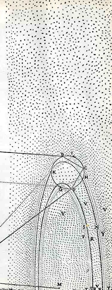
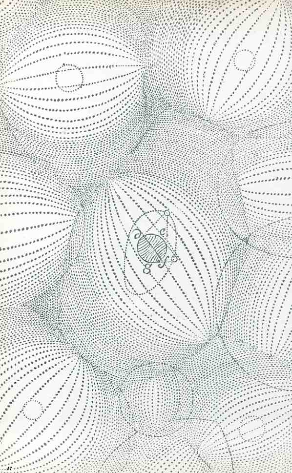
    Dots have formed the background to some of the most significant scientific illustrations of all time, like these two images, the first of which Descartes’ illustration of the decomposition of the rainbow, found in his Dioptrics, a fabulously important illustration. The second is from Descartes’ Principia Philosophiae (1684) which display his theory of vortices, accommodating an idea of physics eliminating atoms and vacuums and joining matter and space, matter being constantly deflected from moving in a straight line, moving in vortices.  Then of course there’s the fantastically appreciated advancement of Samuel Morse’s telegraphic instrument and his abbreviated transmitting alphabet (his “code”), which fascilitated the distribution of information in the 1840’s  in the same sort of way that the internet increased the flow and ease of data in the 1990’s. (Actually that’s only half correct for Morse, as his was a system of dots and dashes.)


    0 blog dec 31 descartes331

    Things get more interesting if we expand the idea of the “dot” to a “point”, as just about everything we have discussed in math for thousands of years has been based upon the idea of a “point in space”, forming the bits of the coat hanger on which the whole fabric of the heavens has been hung.  Going the other way, there’s the decimal point, which brings us to negative powers of ten, into smaller and smaller worlds, to the incomprehensibly small, showing that “nothing” probably doesn’t exist. (We’ll leave the idea of “spot” alone, tonight.)

    That’s quite a bit of expansion from a word that starts out life in Middle English as the definer of the head of a boil.

    But this year will end in about 50 minutes from now, and I wll be able to put the final keystroke to the final sentence to my final post of the year, and put it all to sleep.  And the year will end, at 11:59:59.  On the dot.


    ·Posted by :

    ·in:


  • Eleventh Hour, Eleventh Day, Eleventh Month

    JF Ptak Science Books   Veterans Day Repost

    I want to thank all Veterans today, all of our Veterans everywhere, for all of your sacrifices. I particularly want to say to say how much I appreciate the members of our family who have served: Uncle Pete (USMC, WWII), Uncle Ray (RCAF, RAF+USAAF, WWII), Uncle Stan (Navy, WWII), Uncle Alex (Army, WWII), Uncle Joe (Army, Korea), Uncle Jerry (Army, WWII), Uncle Frank (USAAF WWII), Uncle Walter (Navy WWII) and my other Uncle Stanley (Army, WWII), Uncle Francis (Army, WWII), Uncle Vincent (Army, WWII), cousin Billy (USMC, Vietnam) and Grandpa (Army, WWI); Patti’s father Melvin Lonnie (Navy, WWII) and stepfather Boyce (Army, 2nd US Cav WWII), Uncle Guy (USMC WWII), Uncle Max (Army WWII) and her four relatives in the CSA. Nearly everyone was in battle, and nearly everyone came home.
    [Image: Uncle Walter looking at the 5-star Blue Star flag at my great-grandparents’ house,  Housatonic, Mass, 1943.]

    Brothers 2990

    ·Posted by :

    ·in:


  • What 1,104,890 British Dead of the Great War Looks Like

    JF Ptak Science Books

    Blogmarch
    The Illustrated London News
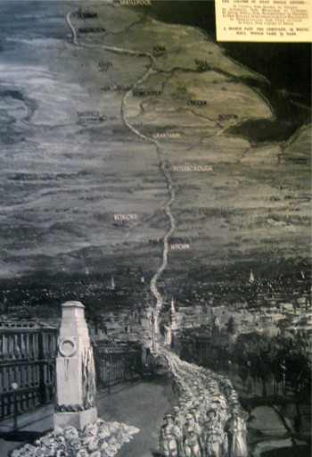
    published this very sobering image showing the general reader in London in 1933.  It is entitled “In Memory of the 1,104,890 British Dead of the Great War”, and was drawn by D. Macpherson.  It very graphically represents all of the war dead of the British Empire of 1914-1918, depicted as a line of men, four across, extending from London to Durhham. 

    The column passes from London through Hitchin, through Bedford and Peterborough and Grantham, past Sheffield and Leeds and York, and then on to Durham.  An extraordinary column of the war dead: 900,000 of the dead were not soldiers at the beginning of the war, but they sure died that way, and this map shows them all in a line, marching from  a point 269 miles distant.

    And a detail of the column:

    Blogmarching_2


    ·Posted by :

    ·in:


  • Charting the Winds: a Superb Anemographic Chart from 1598

    JF Ptak Science Books   Quick Post

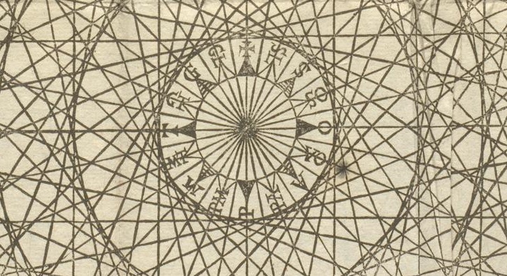
    Map wind rose detail


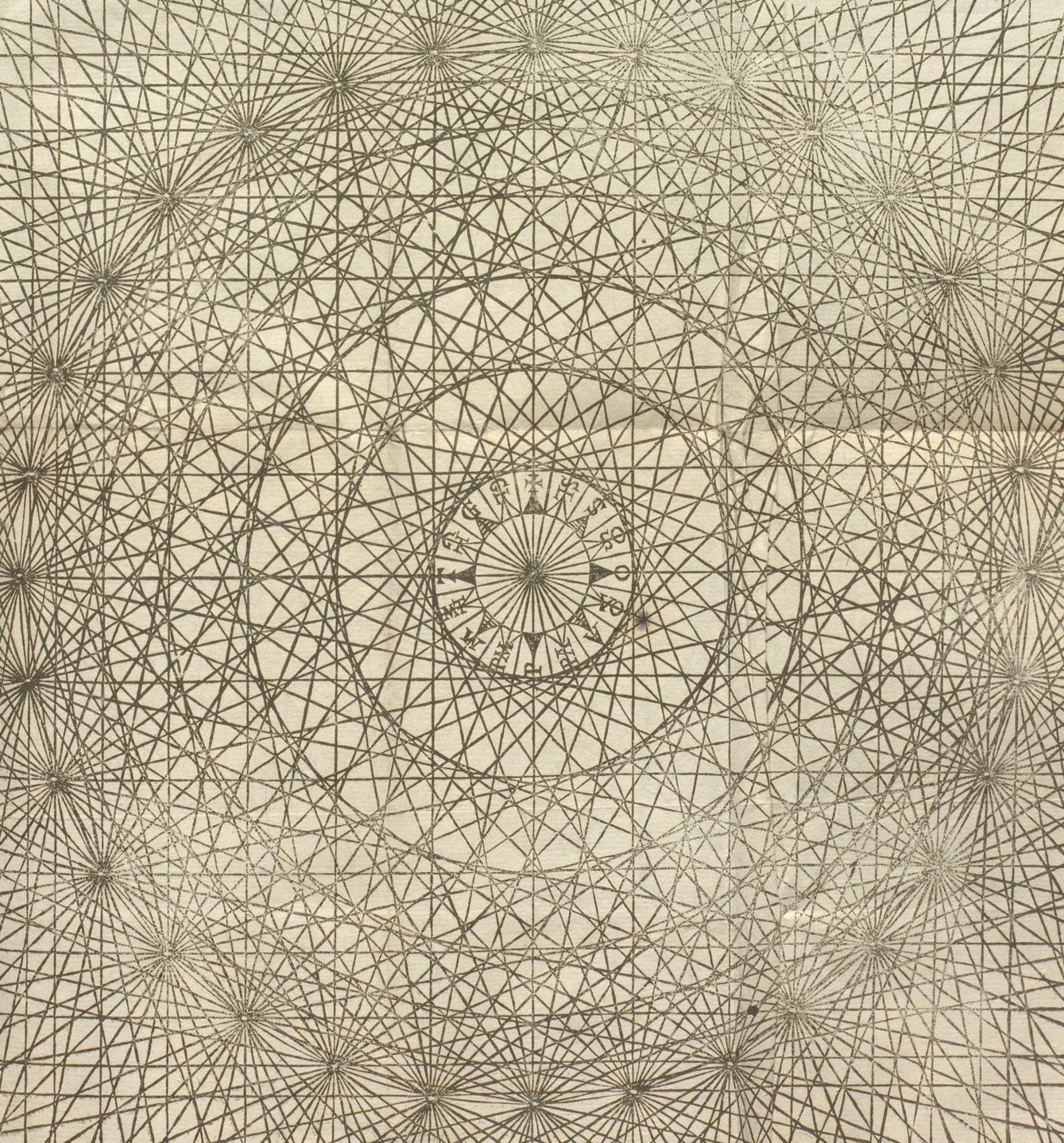
    Map wind rose

    Source: ETH-Bibliothek  http://www.e-rara.ch/zut/content/pageview/5616752

    It seems to me that the winds were named long before clouds were were–in many ways that is understandable given the nature of winds and clouds, and also given the burden of understandable “proof” in that the winds were categorized for centuries before clouds received their first scientific treatment in the early 19th century.  (See this earlier post on Luke Howard, “On Naming Clouds But Not Illustrating Them, 1815” https://historyofideasblog.com/books/2012/01/on-naming-clouds-and-not-illustrating-them-1815.html.)

    The chart above,”De ventis” is a gorgeous and half-hypnotic anemographic chart of wind roses, which was an engraved illustration from Francesco Barozzi’s (1537-1604). Cosmographia in quatuor libros distributa summo ordine, miraque facilitate ac brevitate ad magnam Ptolomaei mathematicam constructionem, ad universamque astrologiam instituens… and published in Venice in 1598. 1598

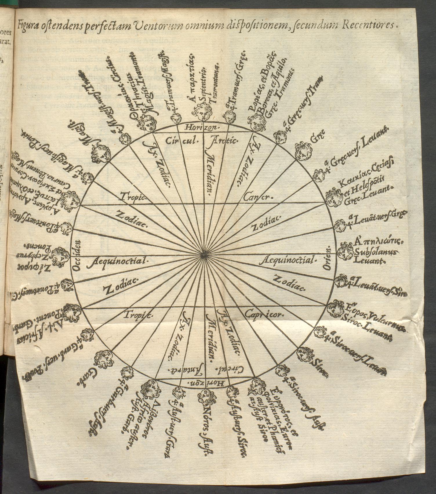
    From the same source–which was a general work on cosmography but included exercises in perspective as well as extended discussions of terrestrial interest–comes this excellent chart of the wind names:

    Wind names


    ·Posted by :

    ·in:


  • A Beautiful Maintenance Manual–The Double Wasp Rotary Engine, 1946

    JF Ptak Science Books   Quick Post

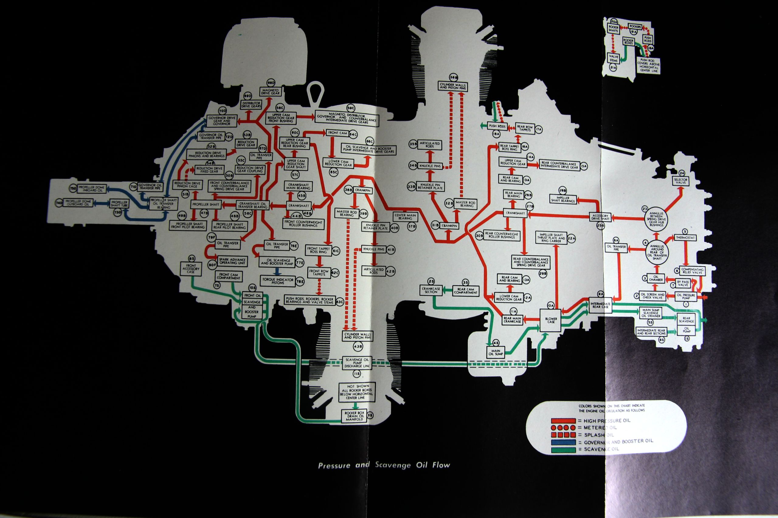
    I just wanted to take a moment and compliment those responsible for crafting these fine engine catalogs for the famous Pratt & Whitney Twin Wasp engines. The 46 liter twin-row, 18-cylinder air-cooled radial engines were among the finest of their kind ever constructed, and were flown in some of the greatest aircraft produced by the United States (including the A-36 Invader, P-61 Black Widow, P-47 Thunderbolt (!), F4U Corsair (!), DC-6, C-46 Commando, and others).

    Twin Wasp024
    The first of two catalogs here for the Double Wasp R-2800-CA was produced by Pratt & Whitney in 1946 and for its 112 pages looks like a superior maintenance catalog, with concise and well written explanations and clear illustrations.  It also has a great cross section which utilizes a black background, making the image jump from the page. (You can compare it with a similar image taken from a Twin Wasp catalog four years later; I’m not sure more use of the black background is not made.)

    Twin Wasp

    Twin wasps two

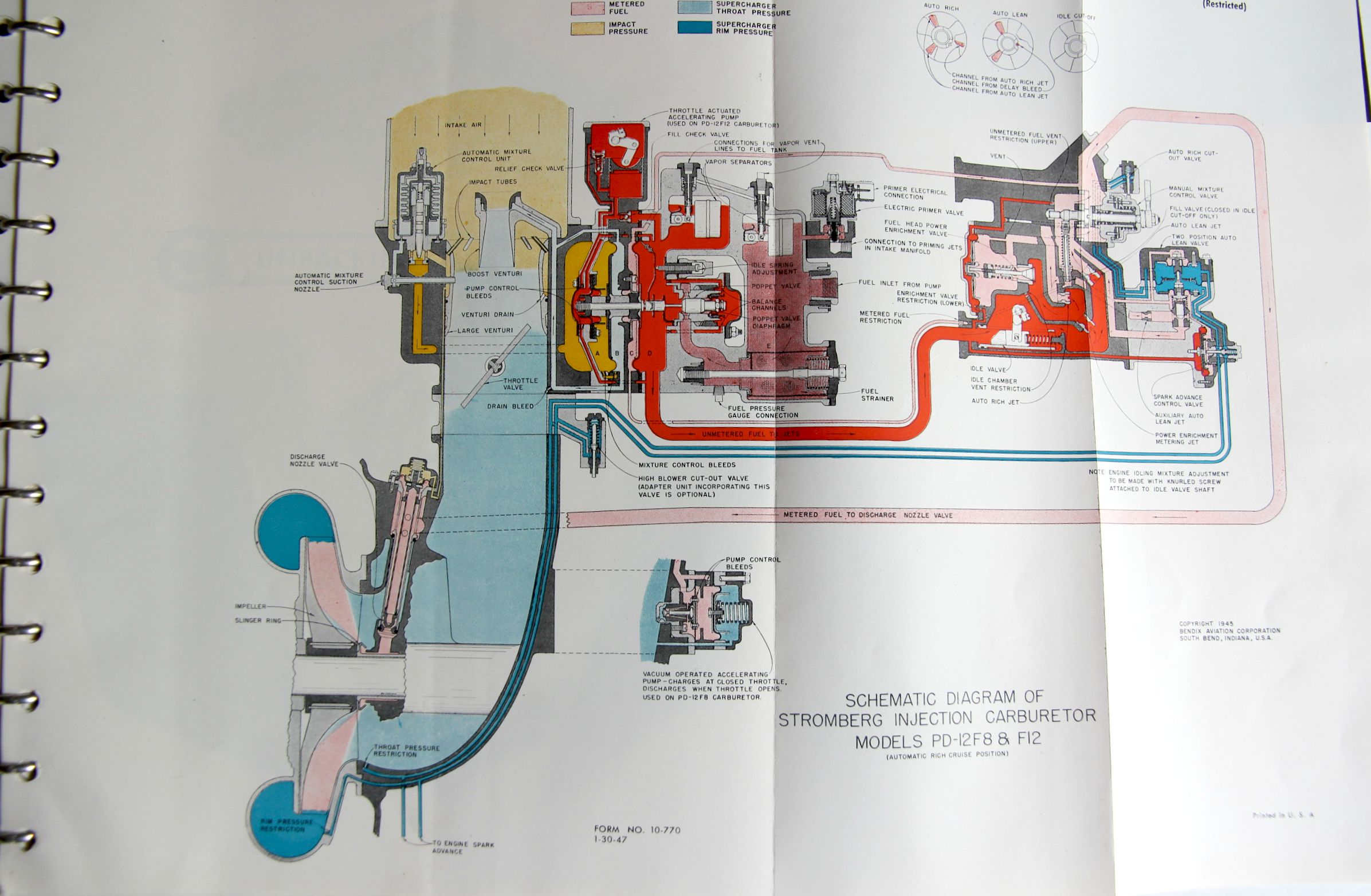
    The second manual (Twin Wasp 2SD13-G and D5 Engines) was a restricted document when produced in 1949, and was much chunkier (170+pp), and somehow seems a lot more accessible to the not-a-mechanic writer.  There is even a six-page “Unpacking the Engine” chapter with many photo illustrations–now it seems like reading the table of contents and seeing the six pages dedicated to unpacking was a little over the top, it turns out when you read the section and see the gigantic wood en box it came in and the other packing bits around it, you actually could use an unpacking manual.  It is just an impressive document. 

    • If you had use for such thing they are both offered for sale in the blog’s bookstore, here. 

    ·Posted by :

    ·in:


  • Superior Designs in Red

    JF Ptak Science Books   Quick Post

    There’s something about a strong design in brilliant red:

    Posters There are two reasons BIG

    This striking work is the cover for a circular produced by the National Fire Protection Association in 1929.  It is a simple folded sheet, with some basic data about joining the association, and someone did a very good job of creating artwork for the front cover of this simple publication.

    Here are some other small designs for pamphlet covers that I’ve found, and scanned, and cleaned  up, and made into 14×19 posters, which look pretty good and which are also crazily color-hungry:

    Poster Red design And just at the last moment, another found design in red:

    Posters a new Americareasons022

    This is the cover of a small pamphlet by W. Howard Grady, published in Kansas City, in 1925.  From what I can tell in a quick read there seems to be no overriding approach to the New America outside of faith, freedom, and “buy American”. 

    ·Posted by :

    ·in:


  • Tubular, Streamlined Boat Constructiuon, 1935/6

    JF Ptak Science Books   Post 2504
    Bester _5_

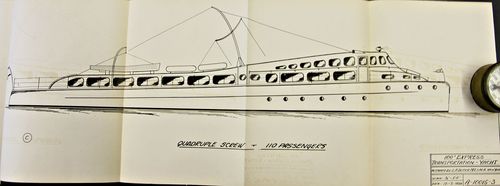
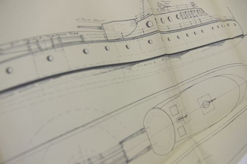
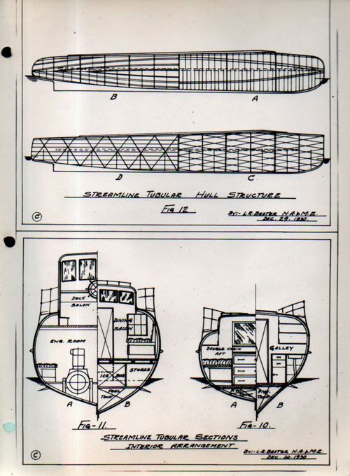
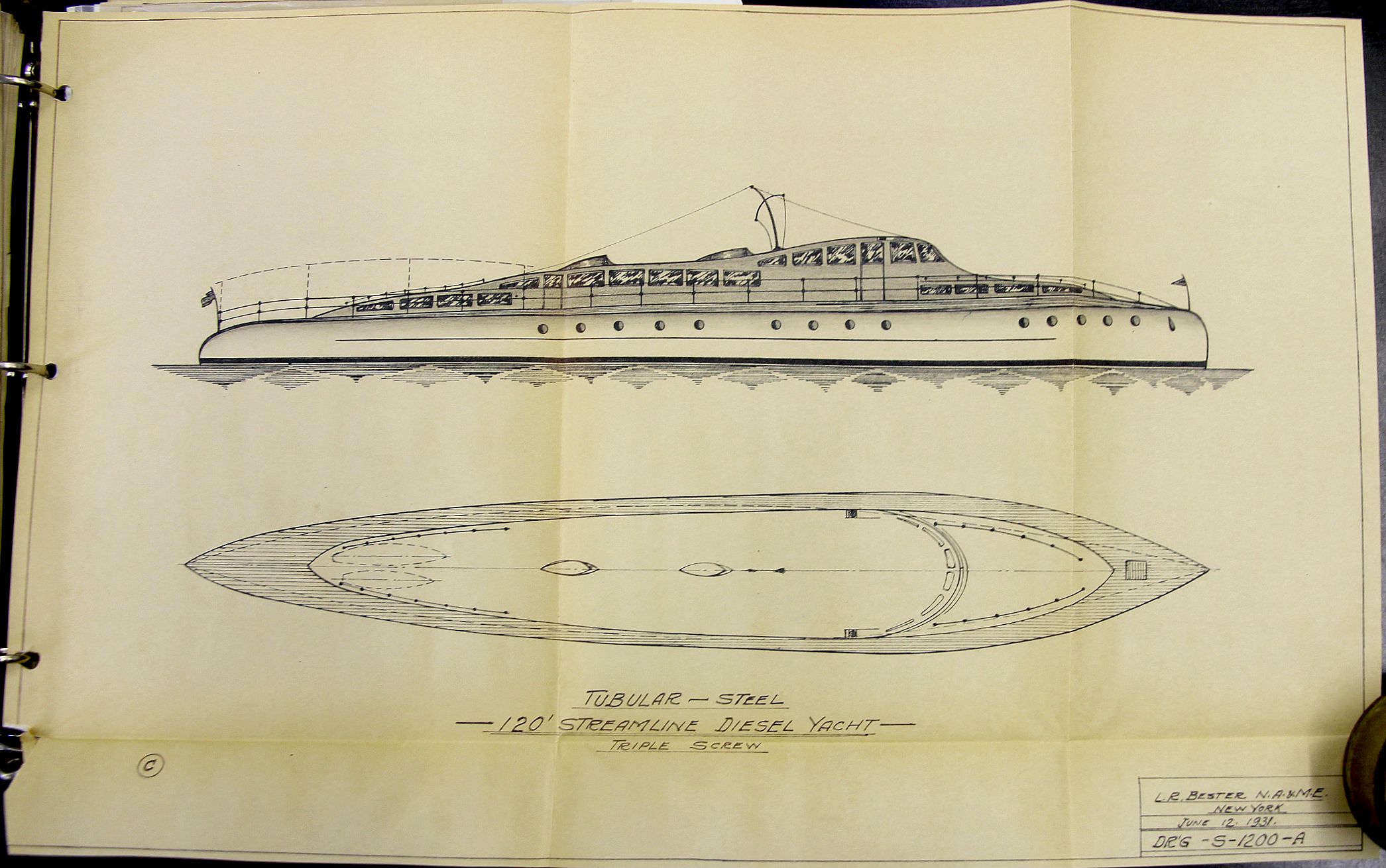
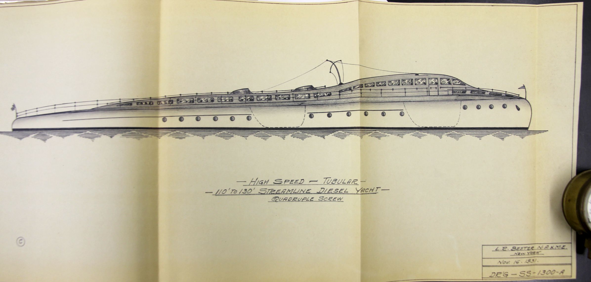
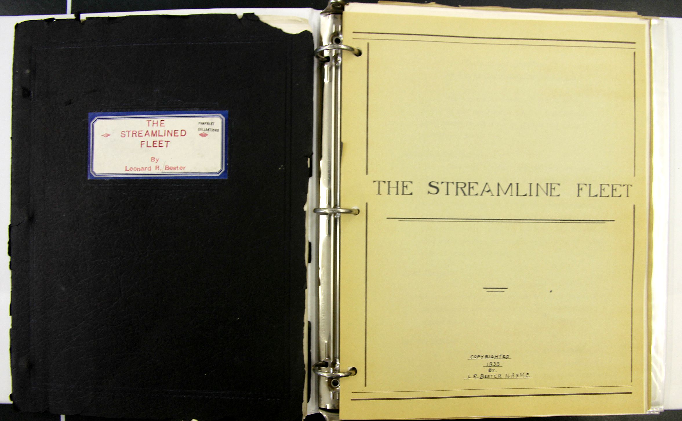
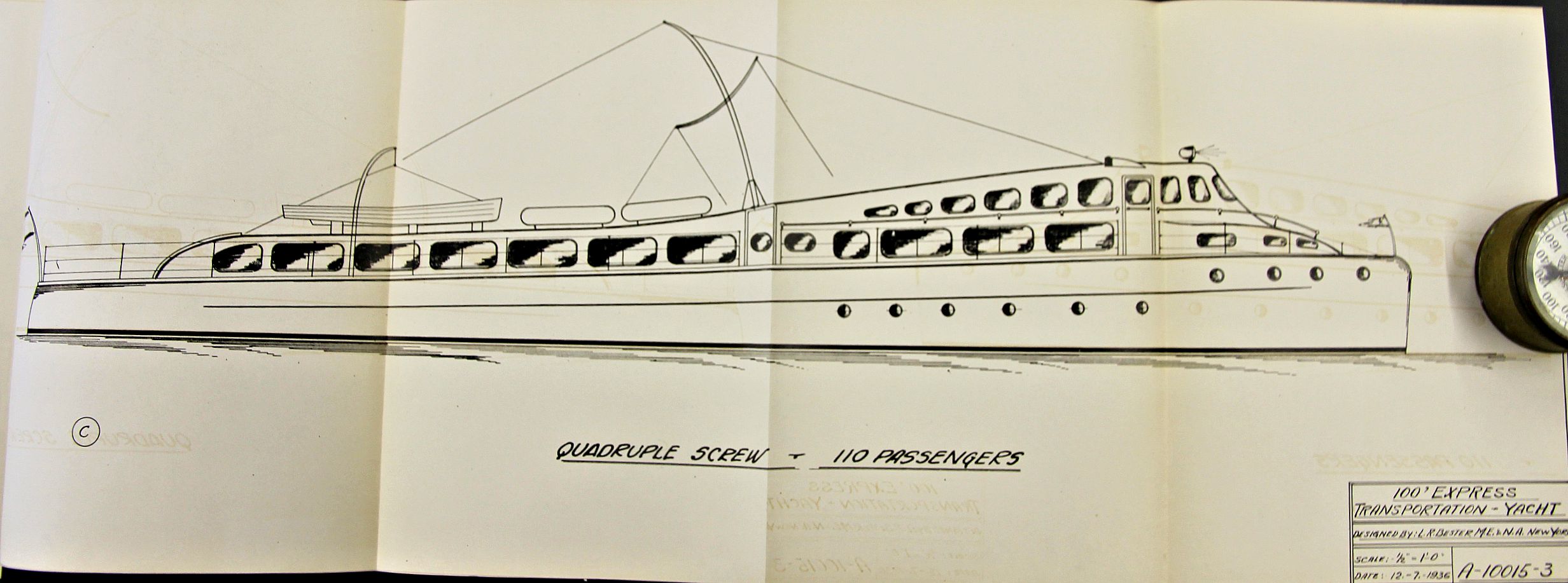
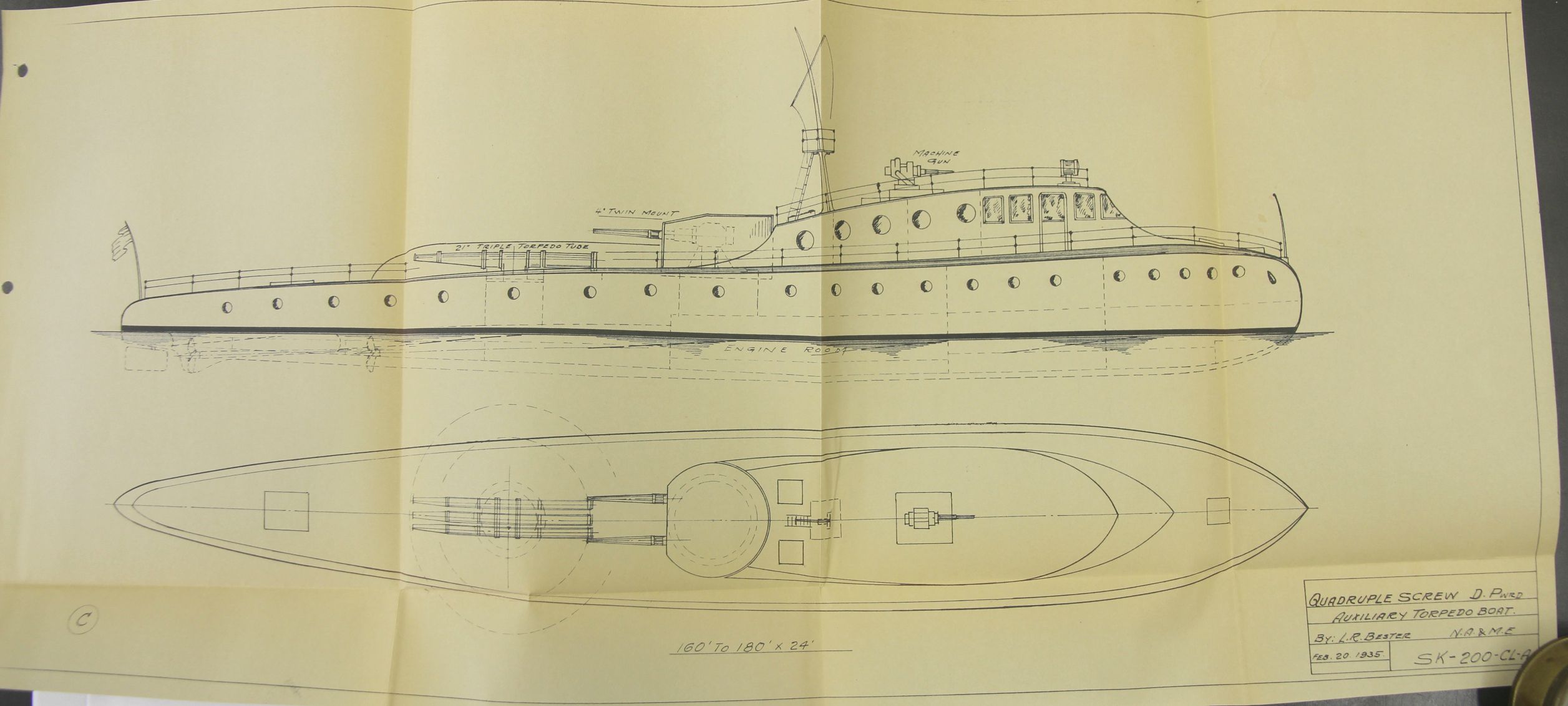
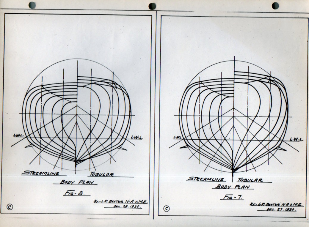
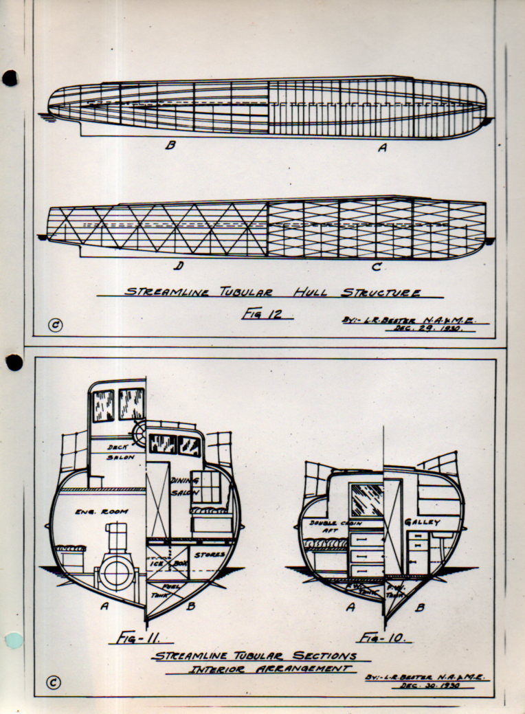
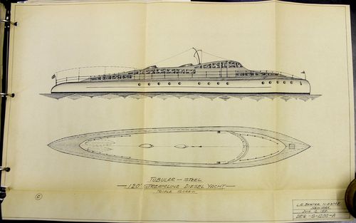
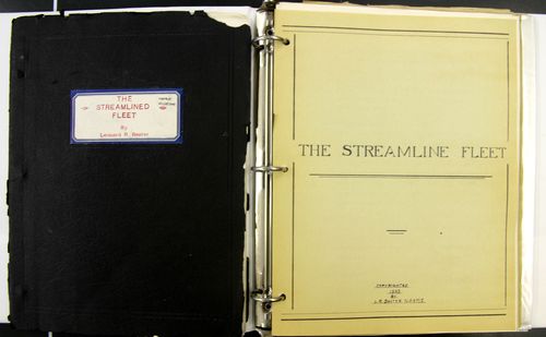
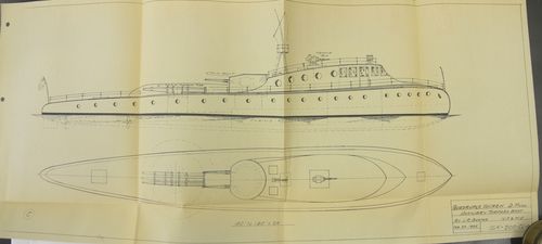
    Leonard R. Bester was a marine architect and naval engineer who produced this very interesting document on his highly-stylized concepts for boat/ship design. The vessels are all  certainly streamlined, and are long and narrow, and share the same “tubular” hull construction. He recorded them in these documents (below) which were sent by him to secure copyright protection to the U.S. copyright office, one copy of which was sent on to the Library of Congress.  They were certainly produced on a very small production scale, perhaps only a few copies made, given what looks like their home-cooked flavor–in any event, they did not receive any circulation that I can find, and are not listed anywhere in WorldCat (which is a librarian’s tool for recording and documenting books) showing that nothing by Bester is listed in any contributing library worldwide.  

    Bester _3_

    Bester was definitely a working naval architect who possessed at least several patents1 who worked for the Todd Shipping Company (NYC) and who was listed by 1919 as a member of the Society of Naval Architects and Marine Engineers2 . The work looked interesting and intriguing to me, but is also in a field that I know basically nothing about, so I thought that given the possible interest in it to designers and engineers that I would at least enter the information about the work here in internettubewebland where it might be findable to someone interested in this sort of creative thinking. 

    • All of this is offered for sale at the blog bookstore, here. 
    Bester _6_

    Bester _7_

    The work seems to be divided into two section, each section with three parts,  and although not dated per se the title pages such as they are are copyrighted 1935 and 1936, with the later having a copyright/Library of Congress acquisitions stamp for 1936. The blueprints, on the other hand, date back as far as 1931, so there’s a bit of a mix. The work certainly is not passed 1936.  Altogether there are 19 folding blueprints of boats, 36 pages of text, 12 photographs on three leaves, and several folding charts. 

    Section I:  The Streamline Fleet (1935), divided into three sections.

    Part I

    • “Features and Advantages of the New Tubular Type Boat”, pp 3-6
    • Tech illustrations in 12 figures, pp 7-9, followed by 6 leaves  of 2 figur/leaf of various cross-sections
    • “Design Features”, pp 10-14, with a folding plate: “Comparative plate of tubular type hull structure”, 13×18″
    • “Main points of advantages of tubular design”, pp 15-17
    • “Summary of the Streamline Tubular Boat”, pp 18-19
    • “High Speed Yachts”, p. 22
    • “Future of the Yachting Industry”, pp 23-26
    • Conclusion, p. 27

    Part II

    • “Propulsion Machinery, Diesel Power”, pp 28-30, with 3 leaves of tables and 2 folding plates on the turbine

    Part III

    • “Navy Boats”, pp 31-36.

    Part IV (folding plates)

    • “High Speed tubular 50′ to 60′ streamline diesel cruiser, twin screw”, 11×17″, 1931
    • High Speed tubular 54′ streamline diesel cruiser, twin screw”, 11×17″, 1931
    • “Strealine 85′ Diesel Yacht”, 11×17″, 1932
    • “Tubular steel 100′ streamline diesel commuting yacht, twin or triple screw” 11×17 inches (1931)
    • Schematic: “tubular design showing strong and light construction”, 12×16″
    • “Tubular steel 120′ streamline diesel yacht,  triple screw” 1931 11×17
    • “High Speed Turbine–Tubular–110 to 130′ Streamline Diesel Yacht, quadruple screw”, (1931)  11×24″
    • “High Speed Turbine–Tubular–150′ Streamline Diesel Yacht, quadruple screw”, (1931)  11×24″
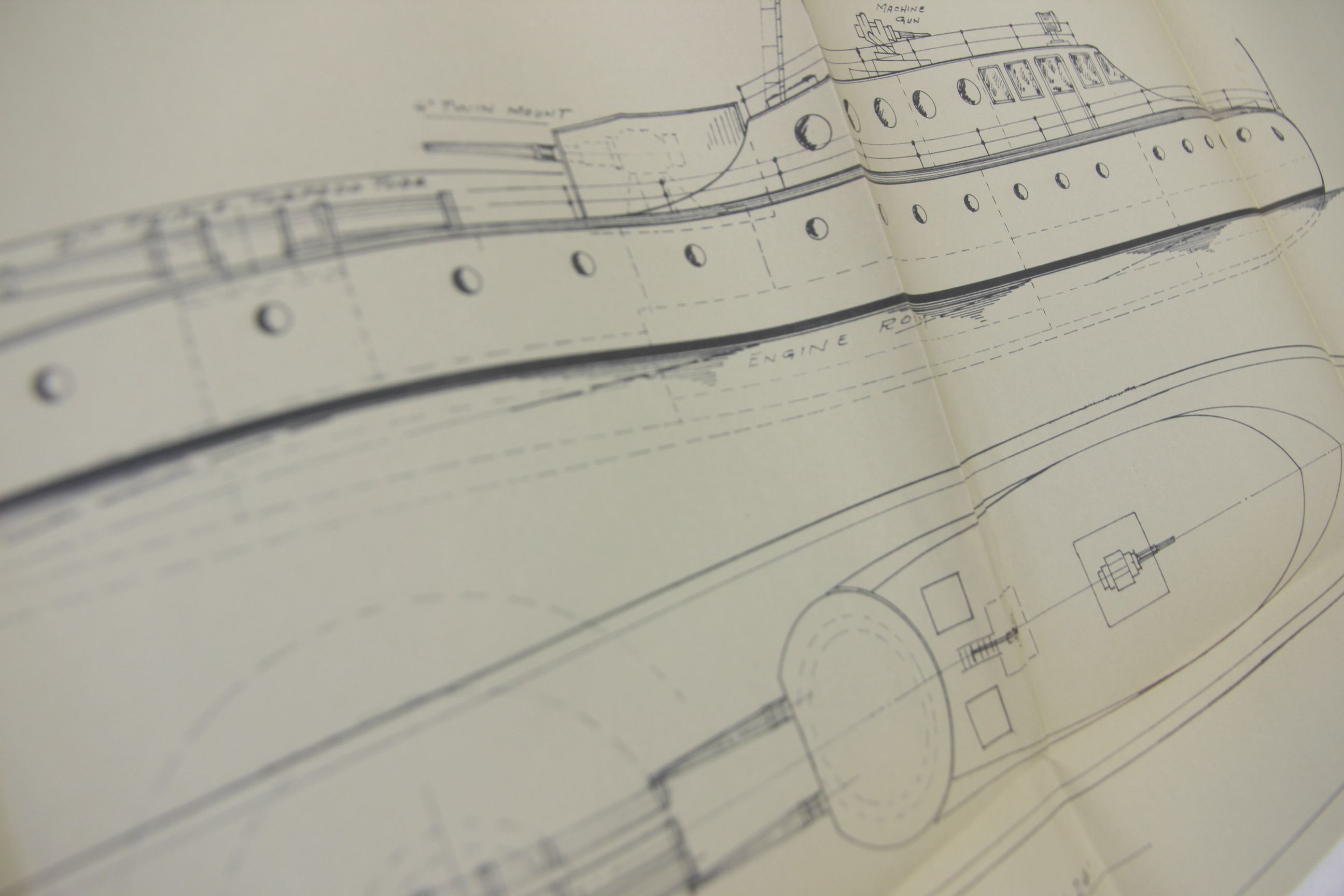
    • “Quadruple screw diesel powered auxiliary torpedo boa”, 1935, 12×30″
    Bester _2_


    Bester _1_

    Section II:  Streamlined Tubular Hull Structure, Design, Layouts, and Interior Arrangement of Cruisers and Yachts

    Part I contains seven folding plans and cross section blueprints of the design, includes the following sections:

    • Streamlined Diesel Cruiser, 1936, 34×8′, 10×13 inches
    • Streamlined Diesel Cruiser, 1936, 40×8′, 10×13 inches
    • Streamlined Diesel Cruiser, 1936, 45×9′, 10×13 inches
    • Streamlined Diesel Cruiser, 1936, 50×10′, 10×13 inches
    • Streamlined Diesel Cruiser, 1936, 57×11′, 12×17 inches
    • Streamlined tubular twin screw diesel commuting yacht, 23×16 inches
    • another copy of Streamlined tubular twin screw diesel commuting yacht, 23×16 inches, though with different applications.

    Part II contains 3 leaves, each with four original photographs each, with tissue guards. These are photos of scale models of Bester’s designs, though the dimensions are unfortunately not mentioned.

    Part III concentrates on “express transportation yachts”, and contains five folding cross section blueprints:

    • 65′ Express Transportation Yacht, drawing measuring 17×11 inches
    • 65′ Express Transportation Yacht for 60 people, 19×11 inches
    • 75′ Express Transportation Yacht for 75 people, 10×22″
    • 85′ Express Transportation Yacht for 85 people, 10×23″
    • 100′ Express Transportation Yacht for 110 people, 10×30″

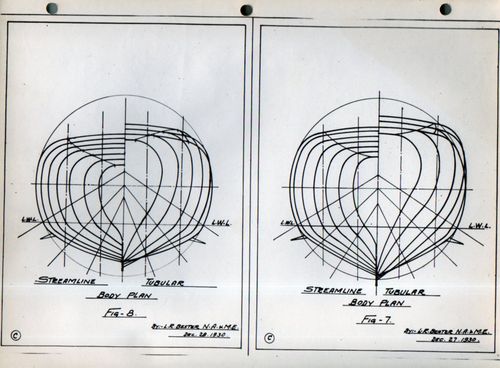
    And some hull lines:
    Bester hull line026


    Bester hull line025

    Notes:

    1. Bester patented an approach to “tubular” hull construction (“Ship hull design”, filed in 1936 and patented in 1939, US2158214A), which seems reasonable to me (as a non-engineer). He describes it so:  “It has been the practice in the making of steel vessels such as are commonly used, to provide framework consisting essentially of transverse web frames coupled with longitudinal members, whereby to give form and rigidity to the vessel. Even where the vessels were oval or cylindrical in general cross-section, the framing invariably embodied straight pieces. This type of construction had the considerable disadvantage that it was quite heavy and it was not possible to attain any great amount of saving in weight by variations in the arrangement and size of the several frame members. It was also impossible in such construction to reduce the labor cost in the building there of and also to reduce the cost of propulsion or materially increase the speed of the vessel without overstraining the hull structure.”   Source:  Google Patents, http://www.google.com/patents/US2158214

    2. Proceedings of the Society of Naval Architects and Marine Engineers, volume 25, 1918, listing of the Society’s leadership and membership.
    ·Posted by :

    ·in: