A Daily History of Holes, Dots, Lines, Science, History, Math, Physics, Art, the Unintentional Absurd, Architecture, Maps, Data Visualization, Blank and Missing Things, and so on. |1.6 million words, 7500 images, 4.9 million hits| Press & appearances in The Times, Le Figaro, Mensa, The Economist, The Guardian, Discovery News, Slate, Le Monde, Sci American Blogs, Le Pont, and many other places… 5000+ total posts since 2008.

Category: Uncategorized

  • Data Visualization and Enormity 2: NYC Overtaken by Gigantic Corn, Bread, and Cigars (1912)

    JF Ptak Science Books  Post 2745

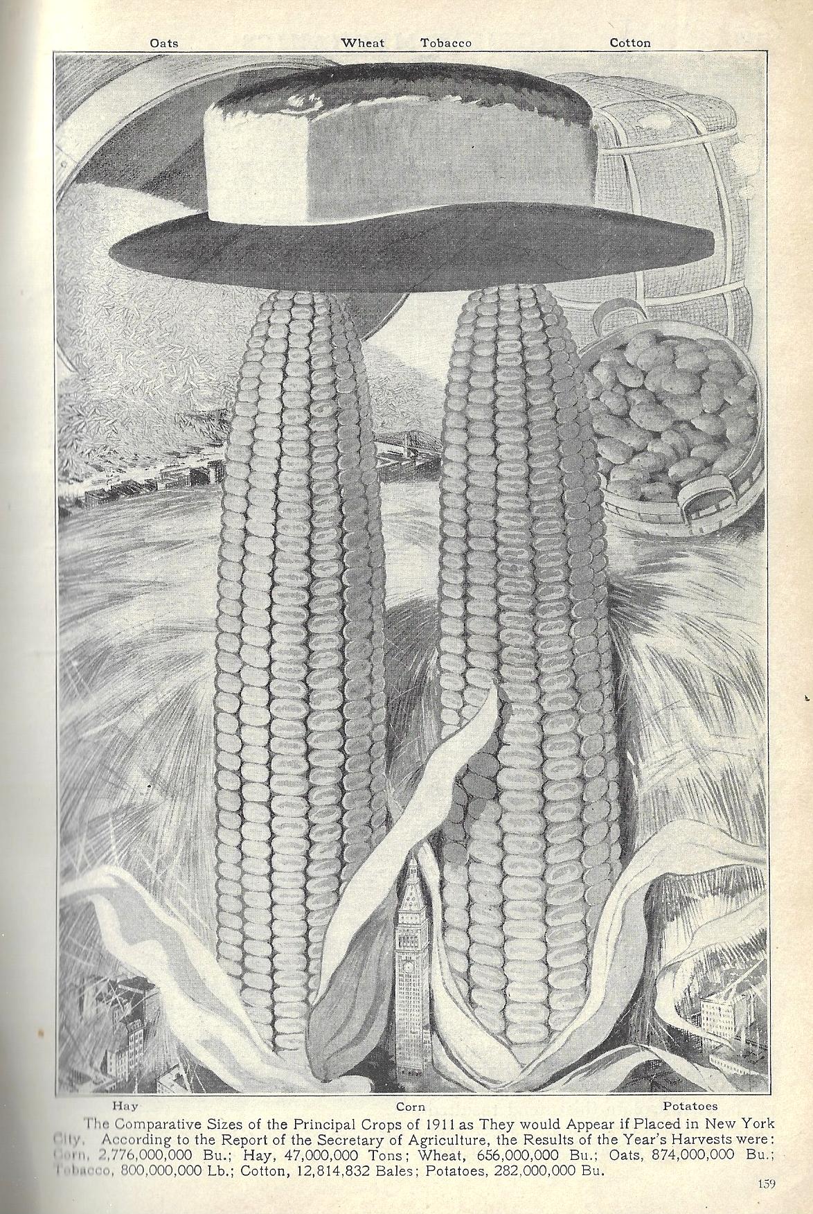
    On this blog I have entertained stories about Manhattan being completely detached/uprooted, attacked by bloomers and aliens and spaceships and spaceship aliens, floated above itself, nuked (numerous times), miniaturized, crushed under sudden ice, joined to Brooklyn and New Jersey (?!), and other such game-enders. There have also been posts on data visualization techniques comparing the known to hard-to-grasp bits of other information or statistics or entities, using the Brooklyn Bridge, Woolworth Building, Empire State Building, Eiffel Tower, Hoover Dam, and so on, as measuring sticks for oil or nail or auto production and the like. It seems that only once before on this blog of nearly 5k posts has Manhattan been used as an intellectual tool of comparison for something non-nuclear-related, and that was for a salt mine. (And according to advisers to President Merkin Muffley the salt mine comes close to playing a strategic nuclear role.) This in mind, finding today’s piece of Overtaken Manhattaniana was a fabulous bridge between two imaginary islands of not very useful data visualizations(s). 

    Pop Mech 1912 Dataviz crops NYC

    Image source: Popular Mechanics, 1912, pg 159.

    So what we have here is the presentation of the yearly production of some principal crops of the USA for 1911, spread across Manhattan with a wide-data butter knife. Nestled between the two ears of corn is the tallest building in NYC (and the world) for 1911, Metropolitan Life, which stood 700′ tall, and reigned for a few skinny years until the Woolworth Building was finished off at 792 feet in 1913. So it looks like the corns were about 2100′ tall with a 600′ diameter at the base. Big. On top of that rests a cigar which is crowned buy a loaf of bread, all of which lords over a sea of hay that covers the rest of the island and almost all of its buildings. For some reason nothing very creative is done with the potatoes, which are just sitting there in a 1000′-tall basket. In the upper left there is a positively enormous pouring of something-or-other of disaster movie proportions. It is slightly disappointing that the maker didn’t figure out how many people it would take to eat all of that stuff in one day. (Throwing caution to the wind mainly because getting to the mostly-useless answer to this is not all that interesting, I will guess that it would require 10x the current global population to eat Manhattan clean in one day.)

    There you have it.   

    The ironic thing here is that this use of corn size really doesn’t tell you very much, except that corn production in the U.S. is (1) a lot and (2) more than bread, which of course you can tell by just looking at the numbers…though that isn’t quite fair as it does give some basic common denominator for measures that are given in pounds, bushels, and bales. The point is that whether the twin corns were 2000′ or 8000′ tall probably didn’t help your understanding of what the numbers meant. But all is fair in war and war, and since this is basically an info-toon, we’ll just enjoy it for what it was, or is.  

    ·Posted by :

    ·in:


  • High Realism in Anatomical Art: the Skull (1690 and 1872)

    JF Ptak Science Books   Quick Post

     Anatomy--braun--

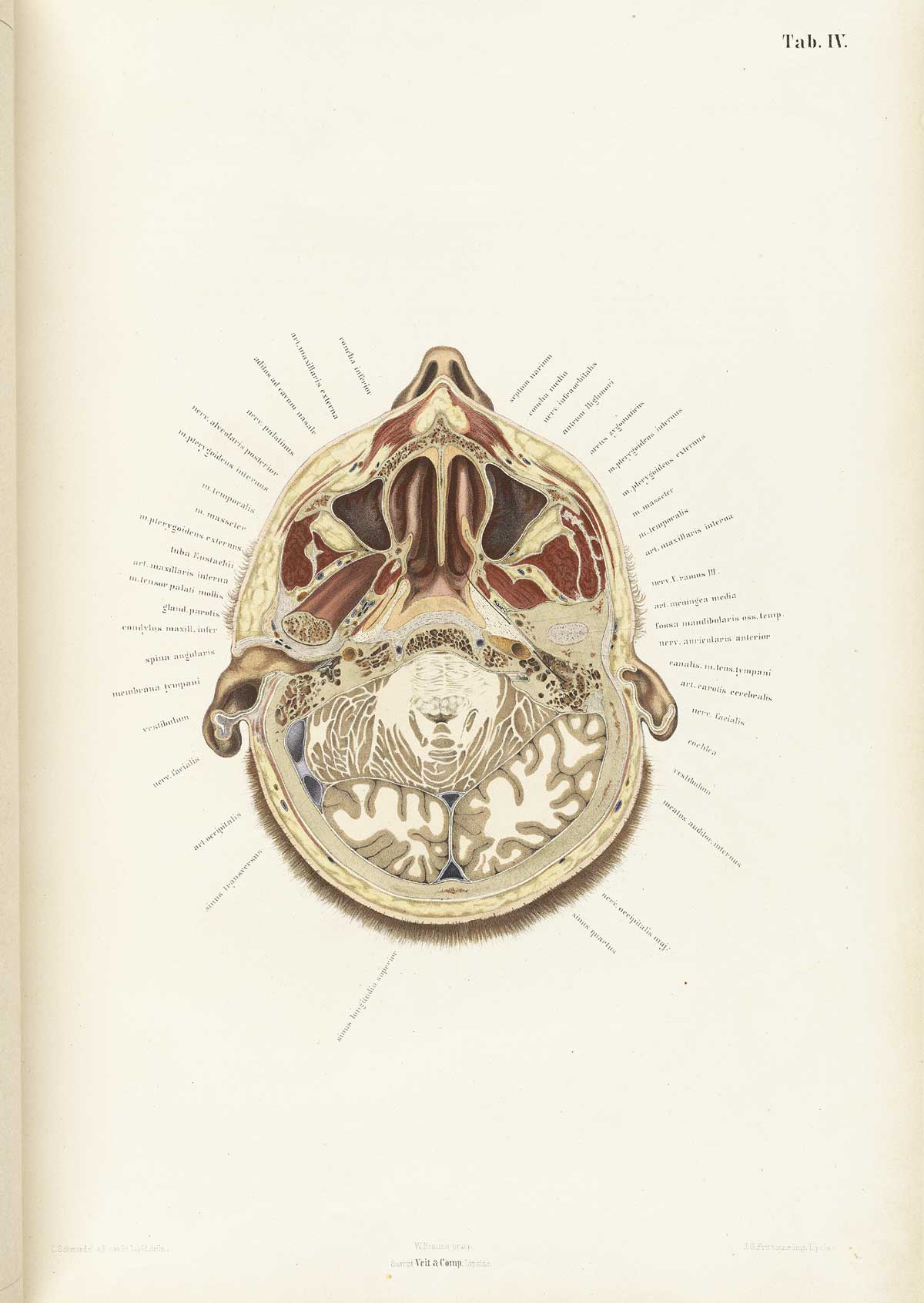
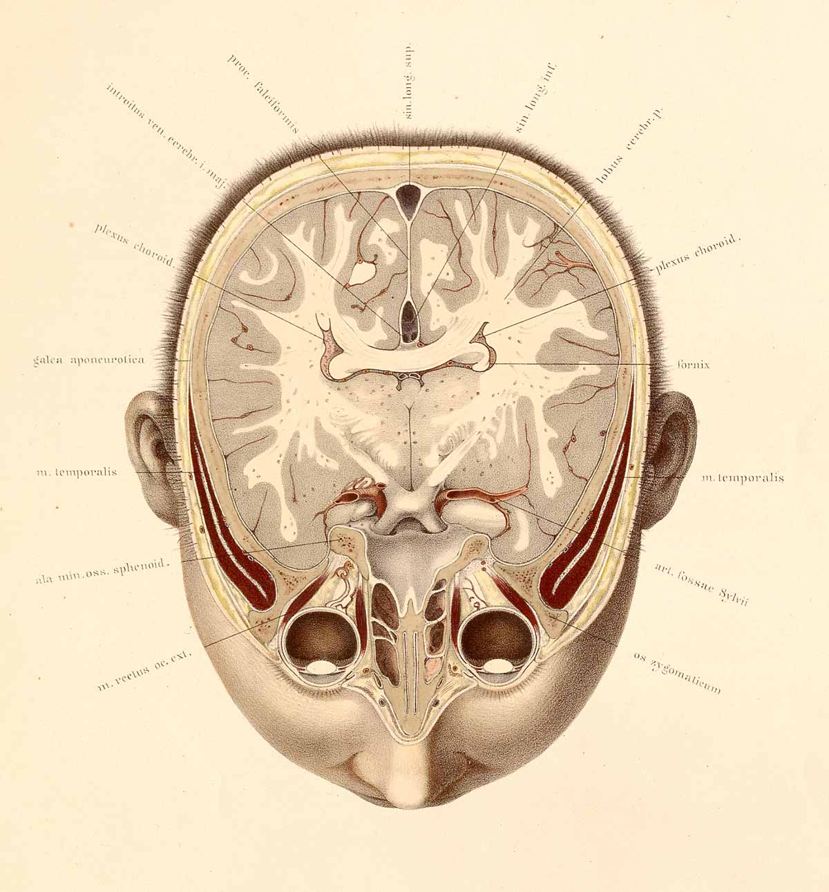
    The collaborative work of anatomist Wilhelm Braune (1831-1892) and artist C. Schmiedel (fl. mid-1800s) produced a singular work,  Topographisch-anatomischer atlas nach durchschnitten an gefrorenen cadavern…(published in Leipzig in 1872), which was an oustanding example of high-realism in the art of anatomy. This book is pretty much right-to-business, with no extraneous bits as had appeared in many anatomies for centuries. And even though these practices had pretty much expired by the first quarter of the 19th century, Braune/Schmiedel was ever more so detailed and simple–their design was fabulous, and their detail light and exceptional. 

    I love the detail of the eyelashes and the short haircut.  


    Anatomy braune04[Source: National Library of Medicine.]

    They also made use of sliced frozen sections of cadavers, which seems to give their work that crystalline touch.  The first image looks at the brain from top-to-bottom, while the second reverses the view, which is in itself somewhat unusual, even in 1872. 

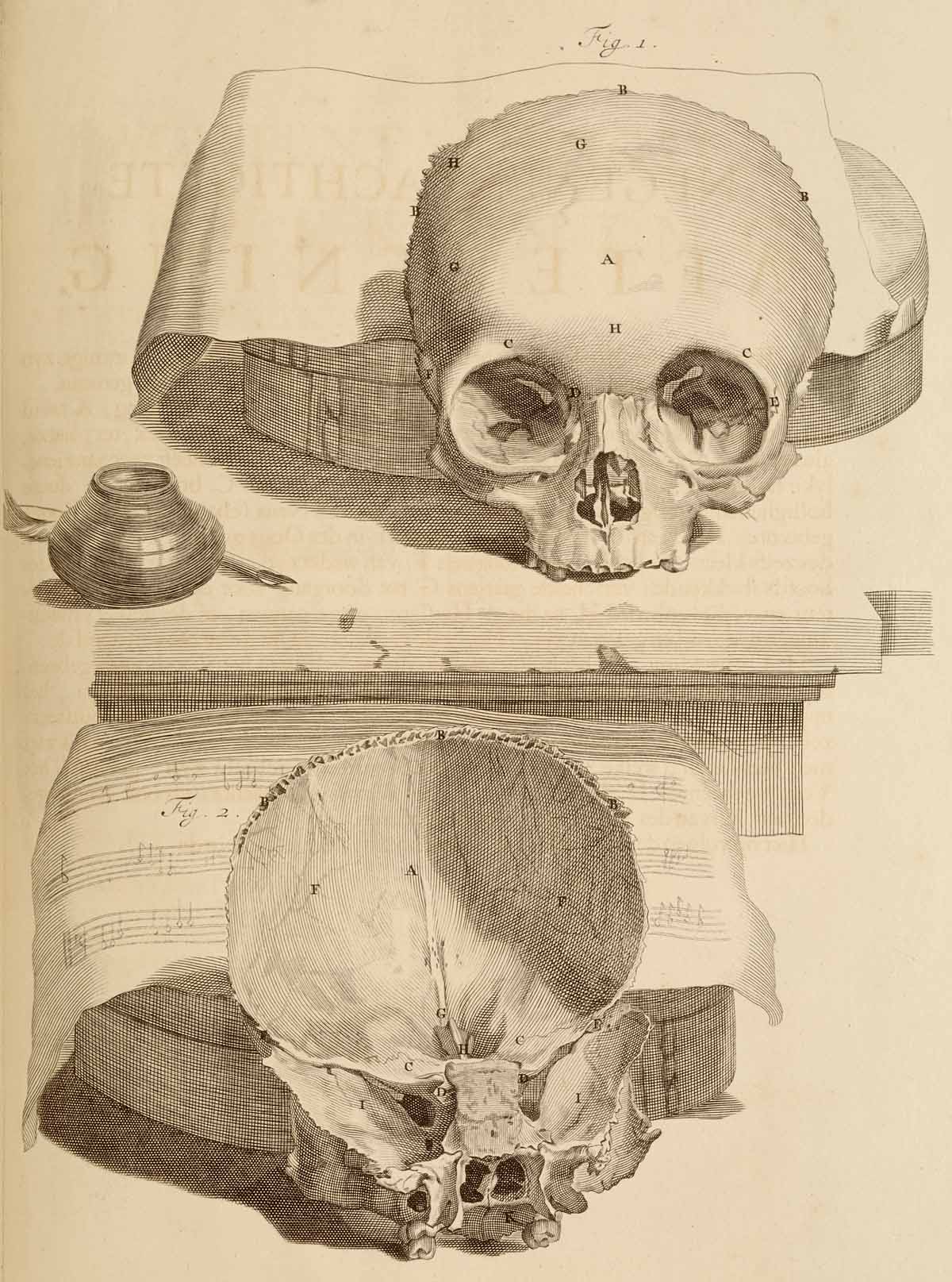
    Looking into a very finely-produced skull from an earlier period in the work of the anatomist Govard Bidloo (1649-1713) and the artist Gérard de Lairesse (1640-1711) in their Ontleding des menschelyken lichaams, (which was printed in Amsterdam in 1690) we find a bit of a different story.

    Anatomy skull[Source: National Library of Medicine.]

    One interesting aspect of Bidloo is that he can be extraordinarily dedtailed and still lend a rather baroque still life to engage his subject–like the skull with musical score, above.  There’s no reason for the added bit of scenery, its just a luxurious background for the anatomy. And then there are examples like this incredible facial/neck dissection below, which is very hard-core realisitc, just as what you might find on any dissecting table, which most assuredly did not come equiped with pen/ink/music score.  Bidloo here is ulrta-real, more so than the greater majority of anatomist/illustrators. [Ontleding des menschelyken lichaams...printed in Amsterdam, 1690, as a copperplate engraving with etching. 


    ·Posted by :

    ·in:


  • The Wright Brothers in the Popular Press: Scientific American, 1902 (Revisited)

    JF Ptak Science Books  Post 2738

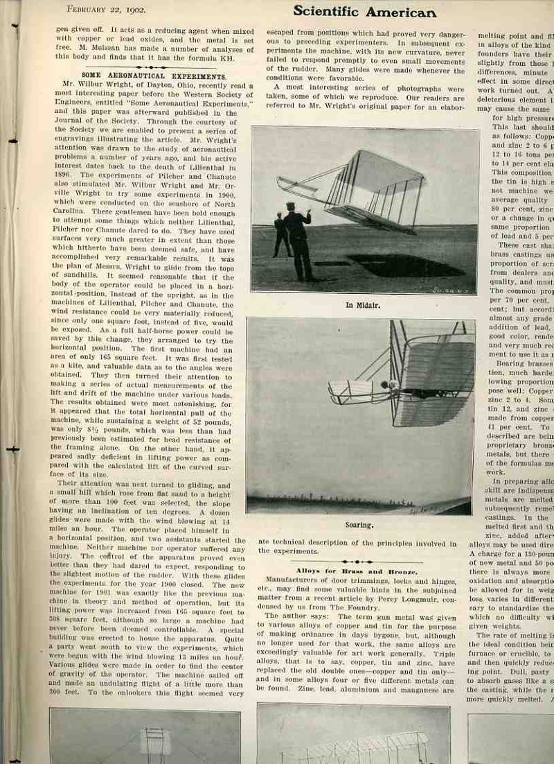
    Wright bros 1902 Sci AmI used to wonder why the Wright brothers’ experimental gliding flights at Kill Devil Hills in 1901 received so little attention in the popular scientific press at that time–particularly the coverage in Scientific American. The reporting on their successful experiments was tucked away safely in the depths of the SA issue for 22 February 1902, cushioned and obscured by other news reports on minor but newsworthy subjects.

    The report is sandwiched in between “Winter Railroading in Alaska”, “Experiments of M. Moissan  with hybrids of potassium” and “A Garbage-Consuming plant” on the page opposite with  “Alloys for Brass and Bronze “ just below it.  And as it turns out there are more words devoted to the Alaska railroading article than to the Wrights as well.  There are dozens of articles given better placement in this issue: steam boiler inspection, variable speed gears for pumps, making photographs with electric headlights, domestic manufacturing of Portland cement, assorted announcements of electrical progress, and other such stuff. The front page of the issue is dedicated to the new bridge of the Redheugh Bridge at Newcastle-on-Tyne; the Wright article follows on page eight. 

    Even though the brothers had been experimenting with gliding flight at Kill Devil since 1900, reports of their activities had been mostly unreported–and this partly of their own accord, for the sake of security and privacy, partly from the event being dismissed as another crackpot flying idea, and possibly partly because the location of their flights was so removed and obscure.  And this seems to have suited them—the brothers seemed not to need or even want publicity, or recognition, at this point. The Wrights were not predisposed to be accommodating to strangers, necessarily, though neither would they ever be rude; as they did enjoy their privacy, and they would protect the details of their flying machine with scrupulous vigor. So, even though there weren’t necessarily public demonstrations of their flying machine, neither were they done in secret.

    Kill Devil Hills was very remote at that time, and few people outside of the Outer Banks made the trips to bear witness. There were people who  did witness  the Wrights’ successes here, but it seems that this was not enough to convince many people that the remarkable achievements made there were true and accurate. So here were reports on their progress, that they had made incomparable strides since they first became interested in flight in 1896 following the failure of Samuel Langley and the Potomac River crash of his aerodrome. (Just for the record, Alex Bell also referred to his aircraft as aeromdomes.) And there was still at this point the perceived lunacy of people who pursued the construction of flying machines, an unbrilliant assumption that would persist until 1908, when all of that would change.

    This report for February seems to be the earliest on the 1901 flights in North Carolina, with the principle difference (from what I can see) is that this earlier glider didn’t yet have a tail which would make an appearance a little latter in the year (followed by a very critical discovery on the need for the maneuverability of the tail.) It also seems that the 1902 gliders were as different from the 1901 gliders as the 1903 glider/plane would be from the 1902 model. 

    Still, given the competing news of the day, and the importance of the Wrights’ experiments, and the amount of interest in flight at this time,  it is a little bothersome to me why the report on their sandy accomplishments got so gobbled up in the nonchalant scientific bric-a-brac and standardiana of 1902. 

    Of course there is the whole “crackpot” angle, and the endless parade of significant people who claimed that human flight (not in a balloon) was impossible, and experimenting on that a waste of time and money…and there were plenty of experiments to back this up. The Wrights were different–they weren’t just two engineering-able tinkering brothers with a bike shop and some tools; they were scientific explorers, observers of a high order, scientific method men. 

    Even after the success of the December 17, 1903 powered flights, the Scientific American seemed lukewarm (and even critical and questioning) to the reports of the brother’s achievements, not really embracing them until April 1906. It certainly seems that they were far more asknowledged in Europe during their tour there in 1908 than they had been in the U.S.–even the U.S. army  expressed no interest in the flyer when first presented with the opportunity to purchase it in 1905, though the Wrights found very willing potential buyers for their aircraft in England in France. It was after the Wrights European exposure that the Army finally became interested in the aircraft enough to have the Wrights perform test trials prior to purchase and contract at For Myer in 1908. (Actually it was just Orville there in the summer of 1908 as Wilbur was in Europe entertaining business interests of a similar sort.) It was really with these flight trials in Fort Myer in 1908 (and concluding) in 1909 that the U.S. public seemed to truly understand and accept the success of the Wrights in human powered flight–after all, the Army did begin purchasing aircraft and began training pilots in the autumn of 1909, so it was outstandingly obvious that the new era had begun.

    Notes:

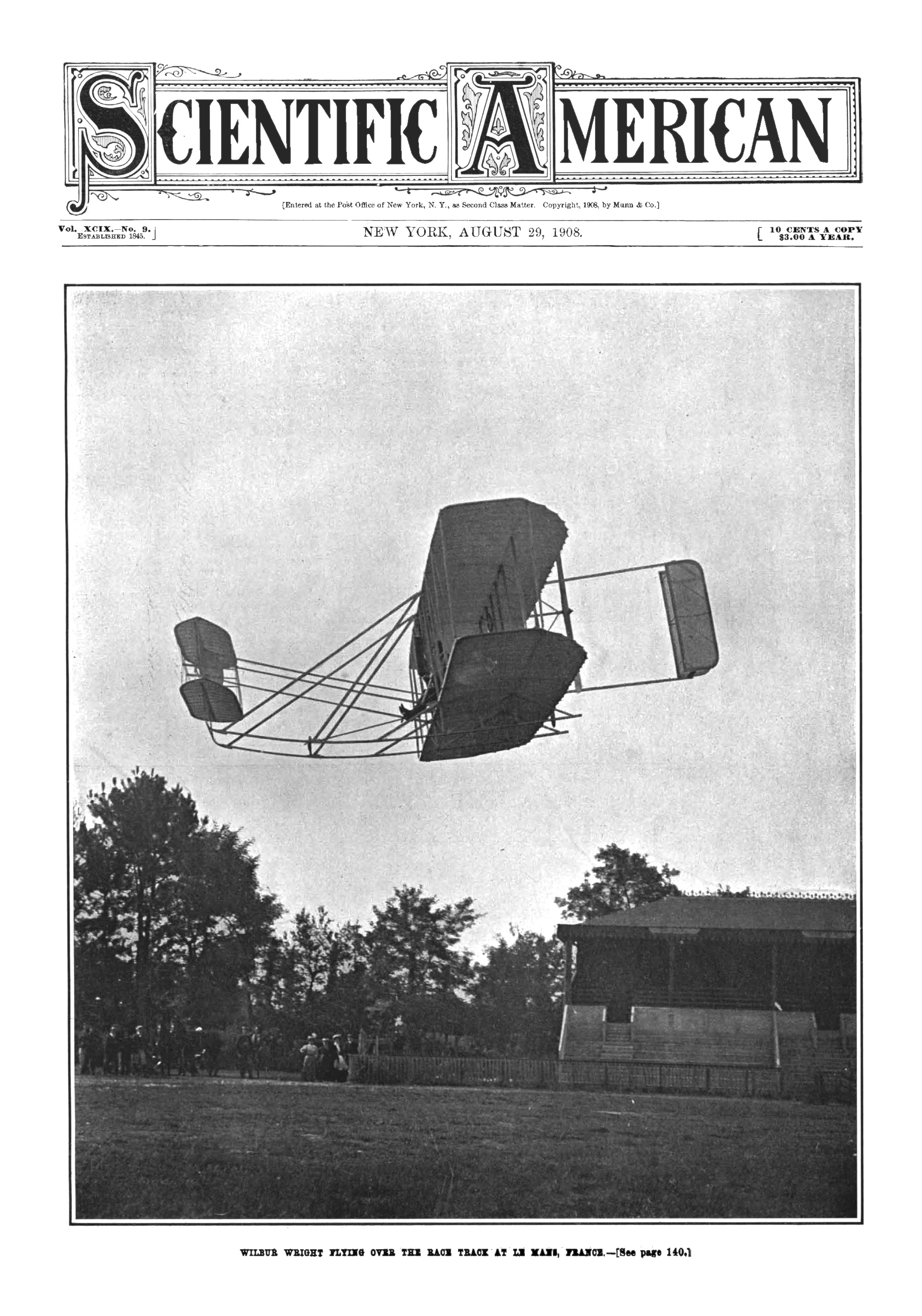
    By my reckoning from what I can see in my run of the Scientific American that the magazine did not dedicate a cover to the Wrights until 1908: 
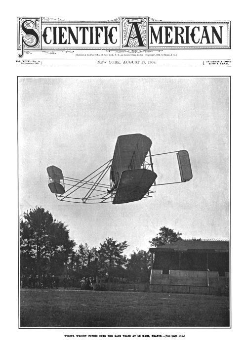
    Wright flyer 1908 cover Sci Am

    https://blogs.scientificamerican.com/observations/first-airplane-flight-marks-111th-anniversary/

    Since this is outside my area I quote liberally from the US Commission on the Centennial of Flight for a more exact description of the difference of the gliders between 1901 and 1902:

    “Their 1902 glider had a new wing with a shallow camber and high aspect ratio. It was a major departure from their earlier machines. It had roughly the same wing surface area as the 1901 machine, but the similarities ended there. The wingspan was ten feet (three meters) longer and the chord two feet (0.6 meter) shorter than the old machine, making the glider look larger and more graceful. It had an overall length of 16 feet (5 meters) and weighed 112 pounds (51 kilograms). The wing camber followed a shallow parabolic curve, and the elevator was extended farther out in front of the pilot. This gave it more leverage, which allowed better control. The 1902 glider also had a new rudder that consisted of two fixed vertical surfaces located behind the aircraft . Wilbur and Orville calculated that these would help prevent the skidding that had occurred when they warped the wings.”

     And the following on the 1902 flights from Orville Wright “How We Made the First Flight”:

    “The flights of the 1902 glider had demonstrated the efficiency of our system for maintaining equilibrium, and also the accuracy of the laboratory work upon which the design of the glider was based. We then felt that we were prepared to calculate in advance the performance of machines with a degree of accuracy that had never been possible with the data and tables possessed by our predecessors. Before leaving camp in 1902 we were already at work on the general design of a new machine which we proposed to propel with a motor…”
    ·Posted by :

    ·in:


  • Background to this blog

    Welcome!  This blog started in January 2008 as a history of science blog that related to my bookstore, but within the first two months the content spilled over into all sorts of unexpected areas, and I’ve happily not tried to steer a clear course since then.  The categories bar makes sense of the mass of the posts, I think.  At this point there are some 2730 posts (plus another 1200 Quick Posts) that run about 2 million words and illustrated by 7000 images.  This blog has been referenced or has been re-posted in The New York Times, The Times, Scientific American,  Le Point, Slate France, Le Monde, Le Figarro, The Economist, The Wall Street Journal, Boing-Boing, Jezebel, Wired, Bloomberg,  Discovery News, The Guardian, the Huffington Post and many other places, and has been viewed more than 4 million times. 

    ·Posted by :

    ·in:


  • H.L. Mencken’s Copy of a Stone Catalog for the Big Sleep

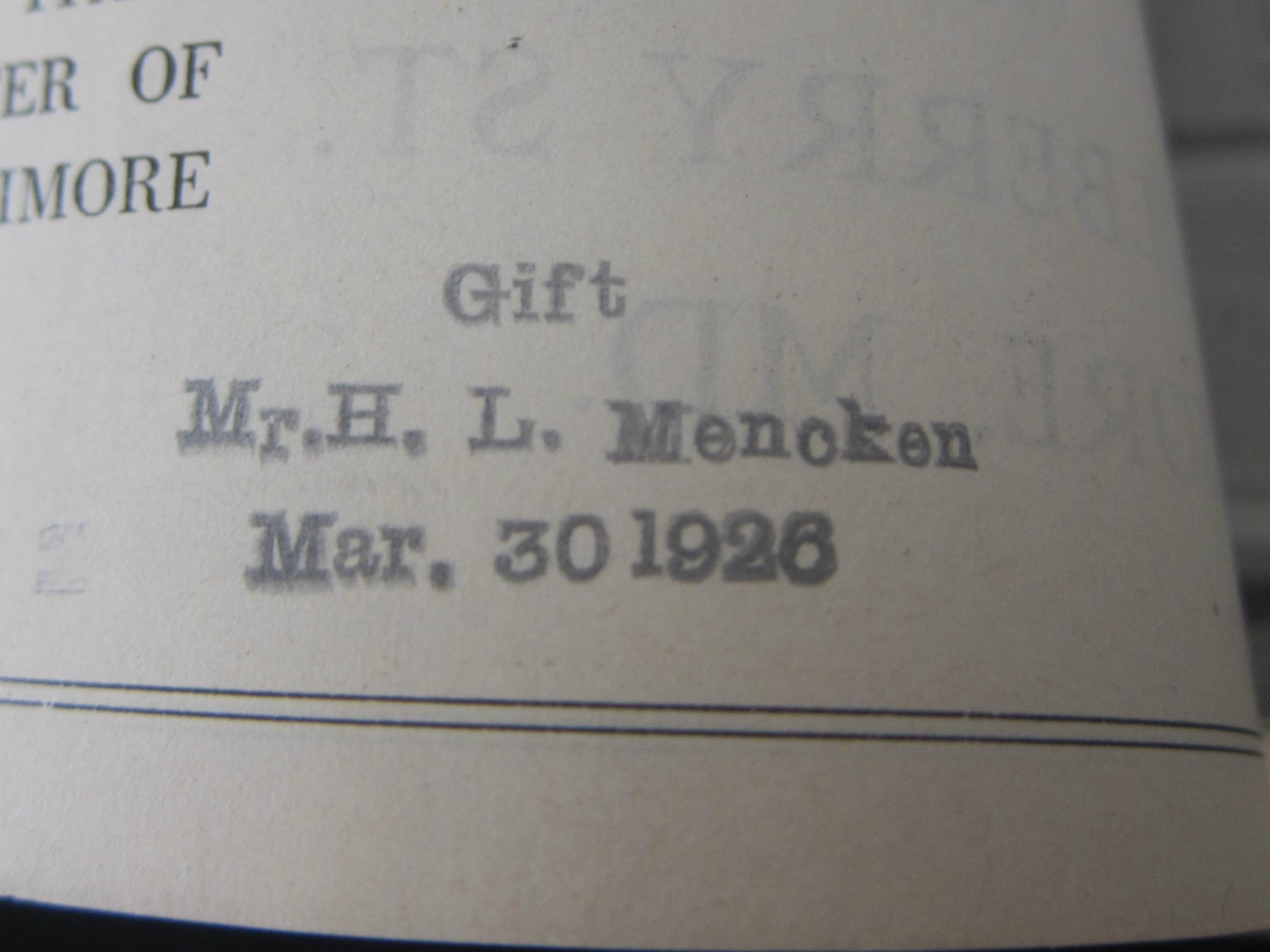
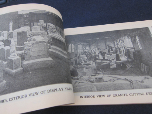
    Mencken tomb _5_ I came upon this curious pamphlet1 by Maurice Knight, curious in itself, being a manufacturer’s catalog for gravestones/markers/monuments, which was something I knew must have existed in dozens of different incantations through the years, though I had never actually seen one. Opening the catalog I saw at the bottom the small and distinctive rubber stamp stating that this was once the property of H.L. Mencken, who shed it to the Library of Congress in 1926, and which later was sold to me in the library’s Exchange Program for surplus and duplicate material. 

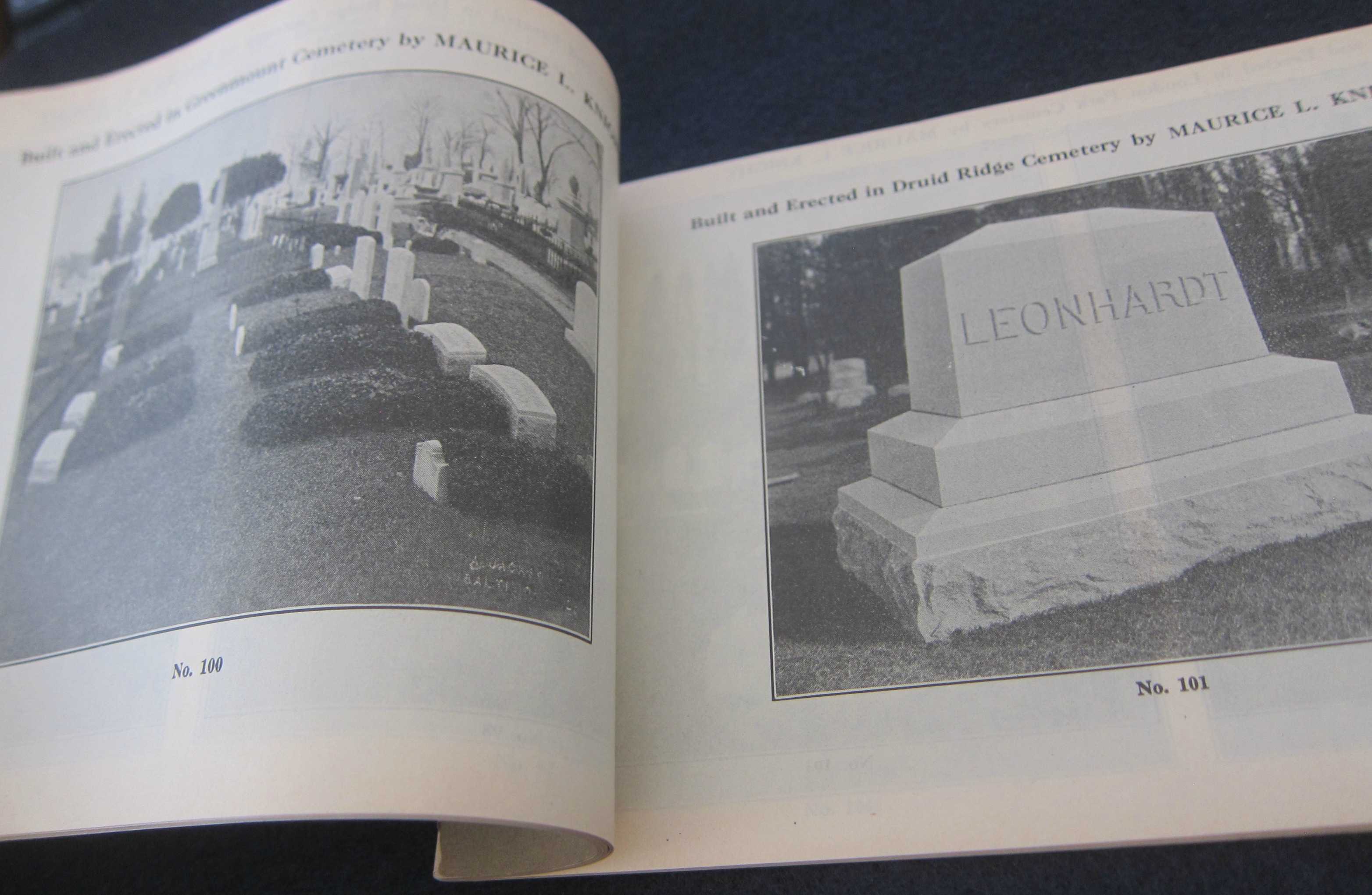
    Knight was a Baltimore man and firm, and as it turns out there are numerous examples of  Knight’s work pictured (“in use”) in a number of Baltimore cemeteries, but most interestingly in Loudon Park Cemetery, where the Mencken family plot is located. I cannot tell if the Mencken stones have any connection to Knight, or if Mencken was planning something else. (There are no annotations by Mencken in the text nor I guess should there be–I just state this because if I don’t I imagine that someone will ask.). Mencken’s family plot was already well-established, so I’m really not sure why he would have this prospectus.  

    Anyway, here it is. The title of the catalog tells the reader to “Consult the Master”–with Mencken, I wonder who that master might have been? 

    Ironically the location of the stone works (1025 West Mulberry St, Balto) is now a simple empty lot, its nothingness secured by a chain-link fence. Not a very romantic end to a business who purpose was remeberance. 

    Notes:

    1. Consult the Master, Maurice L. Knight, for your Monument-Tomb-Vault. Office and Works, 1025 West Mulberry St., Baltimore, MD. 9×6″, ca. 75pp, with 150+ illustrations of the work of the stone master. Title printed vertically though the book opens horizontally. Original wrappers. The wrappers are scuffed and bumped a bit around the edges, though the text is bright and clean.  Provenance: stamped on the reverse of the title page “Gift/Mr. H.L. Mencken/March 30, 1926”, being a gift to the Library of Congress, with their surplus stamp on the rear cover. 

    Mencken tomb _2

    Mencken tomb _2

    ·Posted by :

    ·in:


  • We Can’t See Martians Because We Can’t See Them (1944)

    JF Ptak Science Books   Post 2725

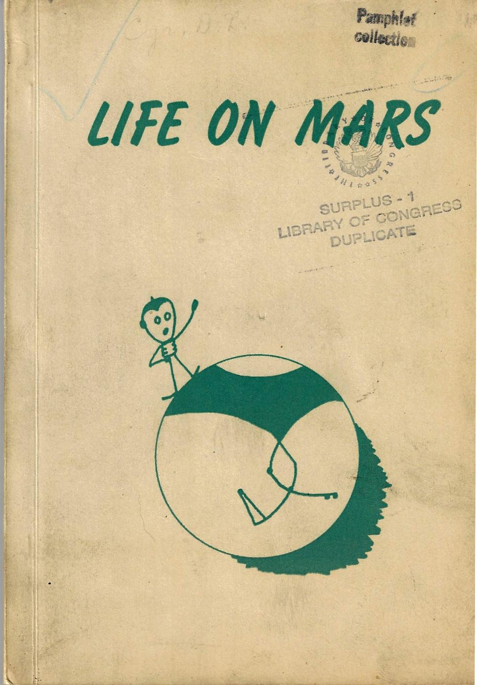
    MArs life on 1944Mr. Cyr made some very wide and radical remarks and observations in this pamphlet on life on Mars1, which he is convinced exists, and on an advanced level. The problem is that we can only see the results of the civilization, and not the society itself. The Martians, I (quickly and haphazardly) read can’t be seen because they can’t be seen (“like atoms”), “only the collective efforts of Martians are visible”.  And some of the “collective efforts” of the Martians can’t be seen, either, like the canals (which run 1000′ deep and cross the planet)  which are invisible not because they are so small as to be invisible, but rather it is due to the vegetation growing on their walls that obscure the structures themselves. The canals are also filled with water, or they are canyonlands, with animals using them as a highway. In another found paragraph we are told that “two or more craters near each other have an economic effect on Martian inhabitants”, which must give rise to speculation of some sort.  And in my last bit of random reading, I saw that the canal networks of Ascraeus Lucas (“the Wall Street of Mars”) are more than likely built upon earlier trails, and that “the only comparable highway network on earth [sic] is that radiating outwards from Indianapolis”. 

    It seems that Mr. Cyr was an observer of Mars, and then went well beyond the observable to make his deeper observations.  

    Also in 1944 Mr. Cyr printed the oxymoronic Saturn Has Rings. Sometimes publications have absolutely no pretense, stating exactly what it is that sleeps between their covers. And sometimes these titles seem more like declarative broadsides or posters and not books at all, the “book part”, or any writing furthering the cover’s statement,  being unnecessary, their contents being obvious. This other work by Mr. Cyr is a good example, the title of which begs the response “Yup!”.  Saturn Has Rings, should’ve stopped at the end of the title of chapter one, “A Rose has Petals”, and probably could have ended on the title page.  But no, it didn’t, and stretched itself over another fifty thin pages.

       blog mar 10 obvious sublime saturn679

    Notes:

    ·Posted by :

    ·in:


  • A Scientific/Industrial Vision of the Future City (1842)

    JF Ptak Science Books  2723

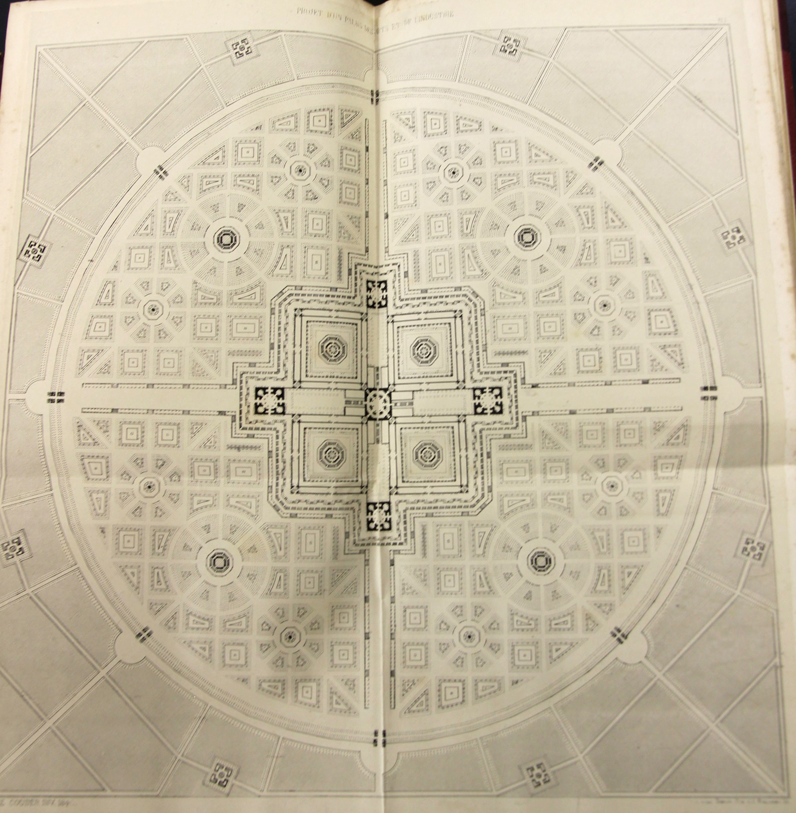
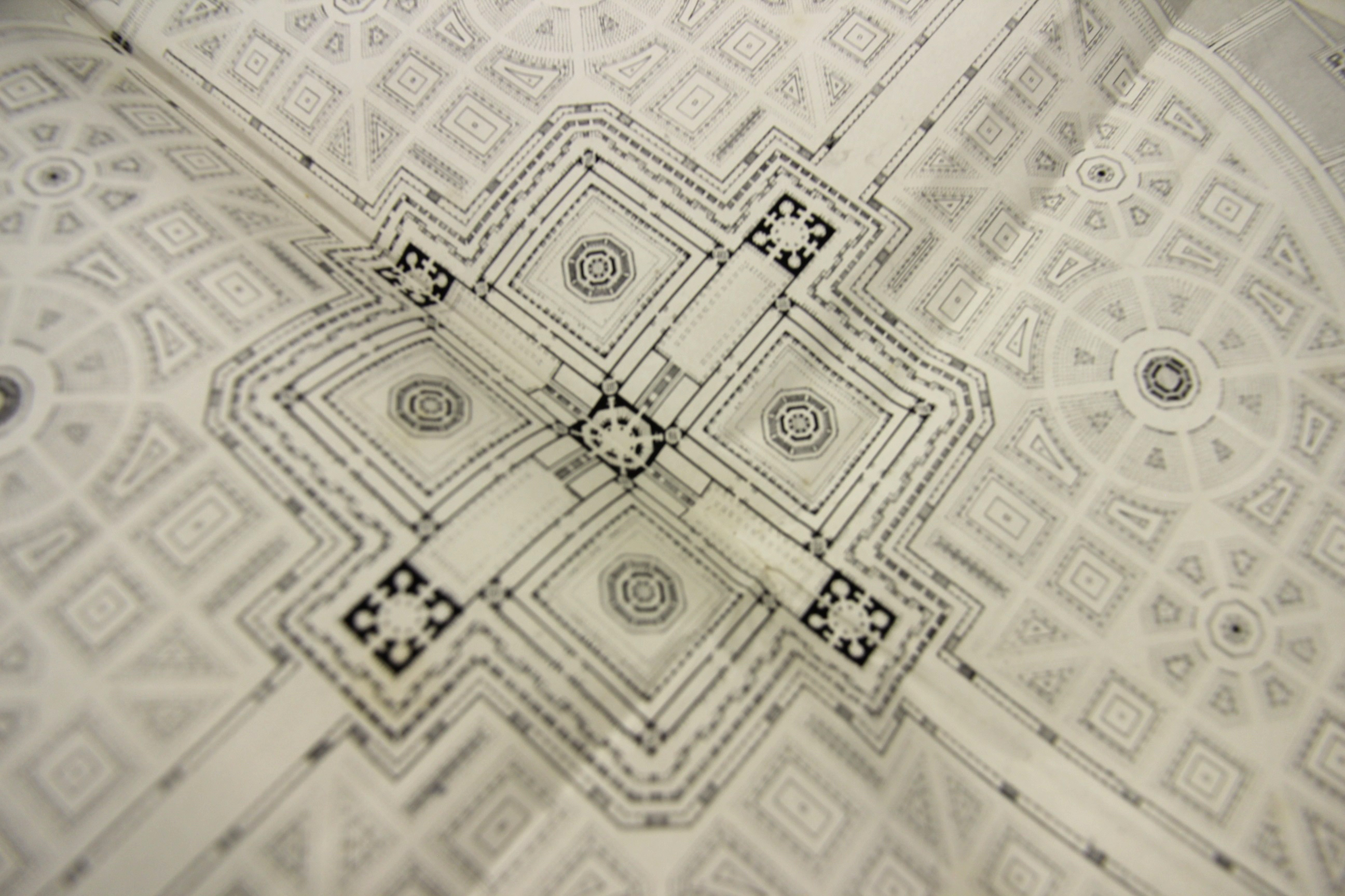
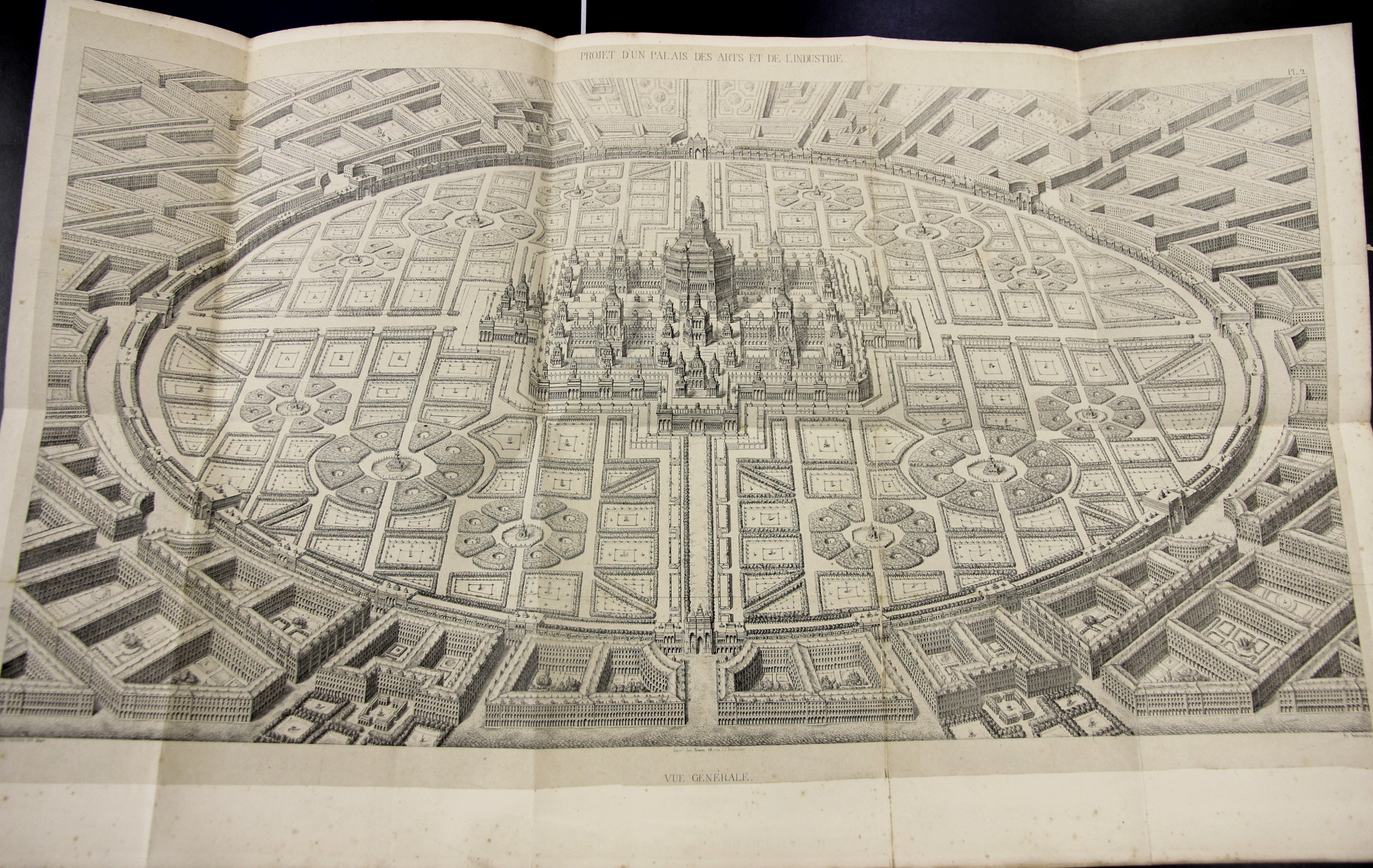
     Amédé Couder wrote L’Architecture et l’industrie comme moyen de perfection sociale, a fine work that was published in Paris (by Brockhaus et Avenarius) in 1842.  The work presents Couder’s rather stroing visionary plans for a perfect city of industrial and scientific harmony, laid out in suggestively-fractal harmony, with the suggestions of a Renaissance-laden snowflake design. Whatever it was, it was beautiful to look at, at least on paper, though I’m not so certain that I’d care to live in the canyonlands of stone and shadow on the other side of the garden wall of the perfect scientific-industrial conclave. 

    Couder 1

    Couder 2 detail

    Couder 5

    ·Posted by :

    ·in:


  • The Almost-First Photo of Plutonium (October 1946)

    JF Ptak Science Books   Quick Post

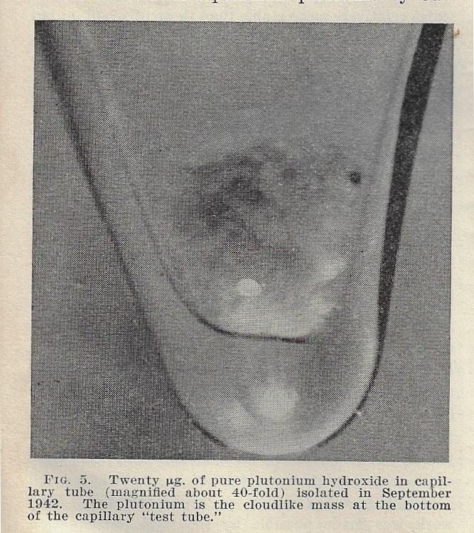
    Plutonium 1946 _2__0001While writing a post for the bookstore section of this blog on Seaborg’s “Transuranium Elements” article that appeared in Science in October 1946 I was struck by the home-made quality of one of the illustrations for the periodic table. Mainly I was curious to see the representation of the actinides (which at this point included up to Curium (synthesized in 1944) and was still three years away from Berkelium (synthesized in 1949). And since I have been on a small mission to define terms I looked up the discovery of actinium, which turns out to be a little complicated, but was perhaps first discovered by André-Louis Debierne  in 18991.  This distraction led immediately to another–a photo of a speck of plutonium (hydroxide) in a capillary tube (even at 40x it appears as a tiny white cloudy splotch).  Since plutonium after a certain date was not discussed for obvious security reasons in the Physical Review and  other journals (a date that I keep forgetting but I believe was in late 1940 when the nuclear/explosive aspect of Pu-239 was discovered), I wondered about when the first photo of plutonium appeared, anywhere..and if this was it.  But no, it turned out not to be, though it was close.  The “first” award seems to go to Fritz Goro (1901-1986), the great science photographer for LIFE magazine, who made an image for July 27, 1946, some three months before the Seaborg article appeared and just over a year after the Nagasaki bomb. In any event, I reprint the Science photo (left).


    Notes: 
    1. André Louis Debierne  (1899). “Sur un nouvelle matière radio-active”. Comptes rendus  129: 593–595.

    ·Posted by :

    ·in:


  • Study Guide to anti-Semitism, 1944

    JF Ptak Science Books  Quick Post

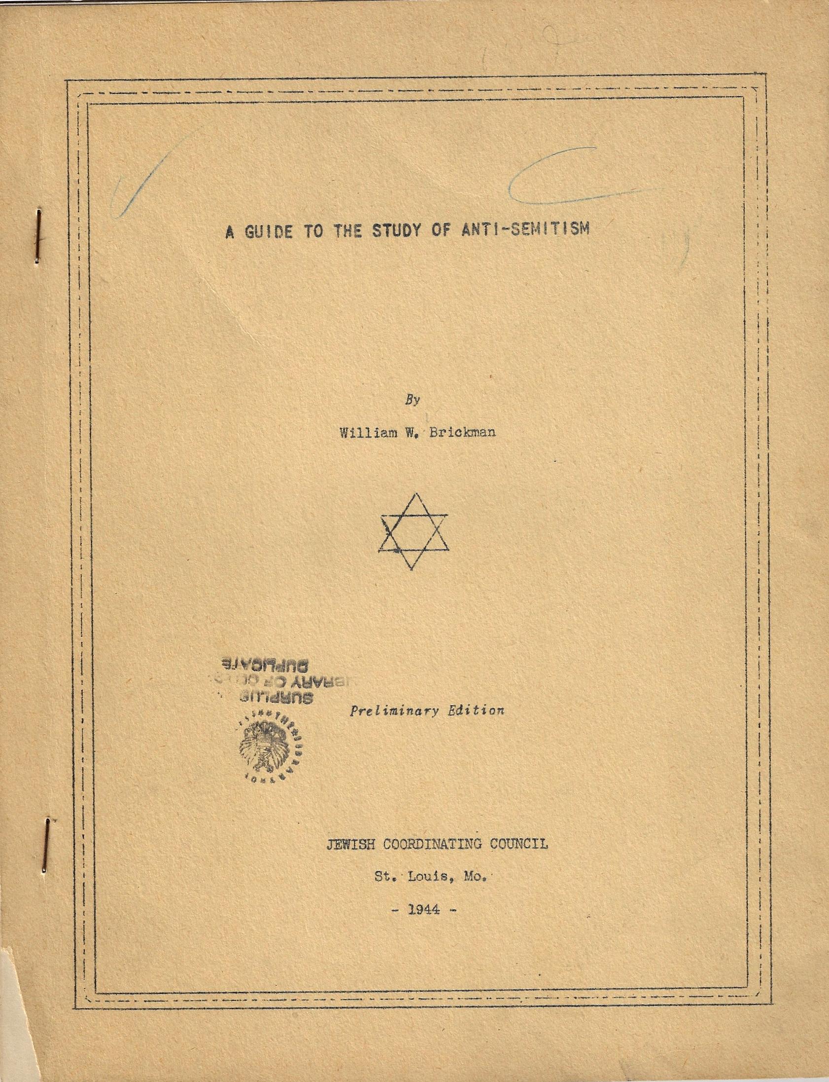
    I found something interesting in this study guide for anti-Semitism, something that may give a little more weight to some already pretty-weighty things.  The pamphlet was written by William R. Brickman1 in 1944, and in its 26 leaves about half was devoted to what I think is the jewel of the pamphlet–an annotated bibliography–and the first half or so formulated as a study guide.

    Jewish annotated bibliogr anti-semitism_0002In the “historical background” of the guide , in the between-the-wars section, there are eleven points, including the Russian Pogroms of 1915, the Petlura massacre in the Ukraine in 1919-1920, the Iron Guard of Romania… and then the KKK, and of real interest, “Ford and the Protocols”. that was Henry Ford of course and his connection and support of the fraud and forgery Protocols of the Elders of Zion, which in 1919 when Ford sunk his teeth into it was already at least 50+ years old as a malignant conspiracy theory of no value.  Ford went on to begin his own series of articles on the “International Jew” as having led the world into WWI and who was a general scourge of the civilized world, publishing a weekly called The International Jew, which Ford published and provided content for from 1920-1927. It was vicious conspiracy pap that finally caught up to Ford in 1927 when was sued ; to escape the coming troubles he claimed that he did not know the contents of the newspaper and basically blamed the editors for the content he never saw.  By that time, the damage had been done, while Henry Ford–even after having issued an apology for having been duped by the Protocols–would later maintain that the Jews had managed to start WWII for financial gain.  So, to be one point in an eleven-point study guard leads me to believe that the Ford business was loftier in the general social consciousness than I expected.

    The other detail of note comes in the next section, “In the shadow of the war” which is only four points long, though one of them is on the growth of anti-Semitism in the U.S. (during the war). This was a little surprising in the amount of weight given it in the study guide, or at least a little surprising to me.  

    I don’t have that much to say on these topics presently as it is a long and hard road, but I did want to at least pass along the notation. 

    Notes:

    See: the Jewish Virtual Library for background on Ford and the Protocols

    1.  Published by the Jewish Coordinating Council, St. Louis, Mo. 28cm, 26 leaves, offset printed from a type original, and bound in wrappers and staple-bound at left. PROVENANCE: Library of Congress, with their surplus/duplicate stamp on the front cover. 

    ·Posted by :

    ·in:


  • The Shock of (Color) Recognition (1939)

    JF Ptak Science Books   Quick Post

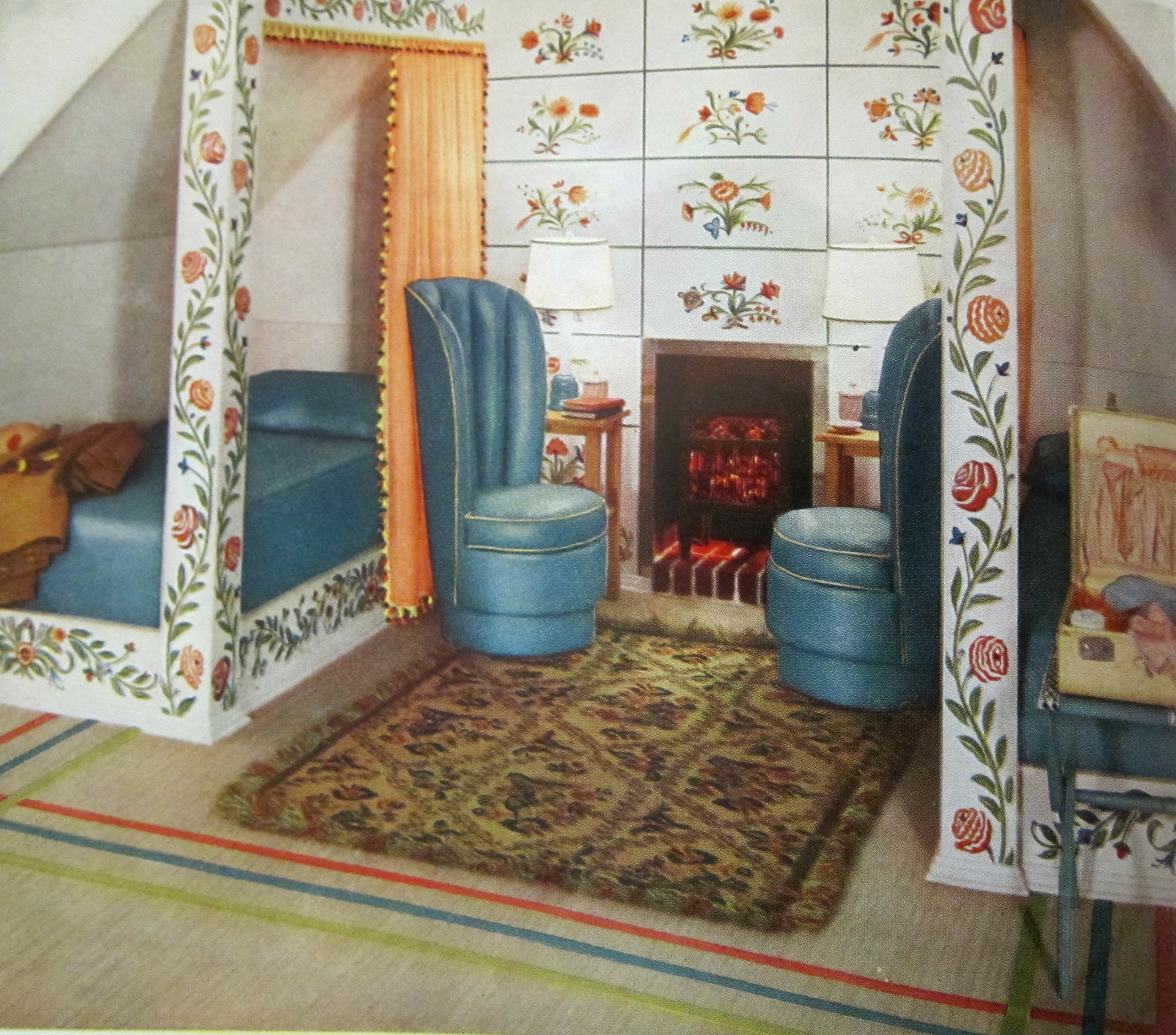
    Continuing a post from earlier today on the idea of applying a diacritical to an adjective expressing surprise (!) in the recognition of a color I share the following series of images appearing in the 1939 edition of Armstrong Cork Company’s Beauty Hints for the Home Decorator. Now, somewhere in there should be an exclamation point or two, liberally applied sentence enhancers. And that’s what I looked for, my little box of exclamation points (absent the non-existent diacriticals) when I saw photos of these spectacular rooms of distinction in the Armstrong catalog.  As I’ve written earlier, the colors (!) were quite a surprise, like seeing painted Roman statuary. For example, there is this magnificent (?) bedroom, with two twin beds, tall skinny chairs next to a tall skinny fireplace, and then those colors:

    Armstrong _3_


    ·Posted by :

    ·in: