A Daily History of Holes, Dots, Lines, Science, History, Math, Physics, Art, the Unintentional Absurd, Architecture, Maps, Data Visualization, Blank and Missing Things, and so on. |1.6 million words, 7500 images, 4.9 million hits| Press & appearances in The Times, Le Figaro, Mensa, The Economist, The Guardian, Discovery News, Slate, Le Monde, Sci American Blogs, Le Point, and many other places... 5000+ total posts since 2008.. Contact johnfptak at gmail dot com
People have been worrying about the end of the world for as long as they have realized that the world could have an end. The more-modern concerns for world-ending collisions with asteroids is relatively recent and does have a lot of truth to it; likewise the ending of large lifeforms on the planet via nuclear holocaust, which came very close to being in a number of situations over the last 55 years or so. Less convincing arguments have been made through biblical interpretations and resurrections of ancient myths about the coming end-of-times because of of confluence of floating numbers which are after all is said and done just numbers and not actually attached to very much. There have been untold numbers of predictions and world-end scares, but reality was not at all accommodated. (An interesting end of the world date prediction timeline appears here.)
One of the earliest printed menaces scaring people into believing that the world was coming to an end appeared in 1524, when a conjunction of the planets in the constellation Pisces was supposed to be similar to that which appeared in the times of Noah and in the sign of Aquarius. The conjunction plus the bits about Pisces and Aquarius evidently lead to the belief among some that there would be a great flood. There were over one hundred pamphlets published on this topic in the early 1520's, though to be fair the bit about Noaic deluge was evidently an outrigger--most of them it seems (at least to Lynn Thorndike) were argumentative over one principle or another of astrologic practice.
Of the many people who addressed this topic--including Machiavelli, Luther, Apian, Rabelais and Vives, among many others--was Tommaso Gianotti (Rangoni) (1497-1577), who gave his predictions this fantastic woodblock visual life in his work De vera diluvii prognostications (and printed in 1522). It was 16 pages long, and was one of many such slim pamphlets--his, though, did have this marvelous illustration. I think the blank sky helps set the sunken world and the collapsing boat of mankind into stark contrast on what lay ahead. (Gianotti led a long and distinguished career teaching logic (Padua) and astronomy (under the direction of Pope Leo X) as well as astrology (Bologna), and managed to outlive his many dire predicitons by half a century.)
I have a notion that when we enter the infinite library of Jorge Borges that what we find somewhere in there, in the middle (where every place is the middle) we find that the books being read are just like the volumes from this illustration. It may only make sense that in a place where everything that could be written had been written, and that in the place where there was a finite amount of the infinite and vice versa, that the whole mechanism would go spinning fractally out of control once the Primum Mobile got the chance to introduce the notion of the Blank Book. Reproducing nothing infinitely may be a lot more cumbersome than reproducing everything than can be written. At least the written aspect has some sense of order to its infinity, and that--like when approaching the speed of light--that when you get near "the end" that everything gets a little, well, funny. When confronted with infinitely reproducible nothingness, there's nothing that quite reproduces to the end of pi like the blank book. It's nothing all the way down. And all the way up, too, for that matter.
[Image source: Statuta ordinis cartussiensis a domno Guigone priore cartusie edita, printed in Basel by J. Amerbach, 1510. Illustrated with woodcuts by Urs Graf. This is a beautiful and important work, a great effort by an early and important press, and this image happens to show study timne in a Monastic setting. Their books of course weren't blank.]
I found this by accident, and needed to share it immediately, because in the splendid and chilly vastness of the infinite Encyclopedia of Bad Ideas, this entry would seem quite the poster child for such a stupendous effort--the mud to which all dust aspires.
The centrifugal machine for human birth...its hard to even finish that sentence, let alone finish it without wincing.
I think what we have here is the Vitruvian Woman of Bad Ideas relating to human birth, the patent described more fully in this great piece by Marc Abrahams (of the Annals of Improbable Research) in The Guardian, 2006):
At the end of WWII there was a tale of two battles, both by the name of Kolberg. One was a propaganda tool filmed in Agfacolor at the request of Josef Goebbels, a movie begun in 1944 about the mythically-endowed victory of Germany over Napoleon at Kolberg. It was an epic, costly movie made at a time when the 180,000 "extras" composed of Wehrmacht troops could not be spared, but it was seen by Hitler and whoever was around to agree with him that a movie selling selflessness and sacrifice (blood sacrifice) was more valuable than a military victory1. When it was finally put to bed, the movie "opened" virtually nowhere in Berlin in January 1945, as the city was becoming a bombed-away shambles--much more so in the next three month. The visions of resistance-to-the-last-breath played in few places outside of Hitler's bunker, where the dictator professed the qualities of sacrifice and the fight-to-the-death messages in the movie, though not applying those necessaries to himself.
The other Kolberg battle was the Battle of Kolberg (a Baltic seaport city in Pomeria located about halfway between Berlin and Koenigsberg), which took place in real life from 4-18 March 1945. It was a fight between the Germans and combined forces of the Soviet and Polish armies--it ended in Polish hands on the 18th following the retreat of the Germans and he destruction of most of the city.
It is ironic that the defeat of the Nazi forces in the real city of Kolberg occurred at nearly the same time as the wasteful film of the 1807 battle extolling the virtues of heroism and sacrifice was released.
It is interesting too that the actor depicting the leading German hero in the movie Kolberg (directed Veit Harlan and Wolfgang Liebeneiner) Heinrich George--who acted in a number of Nazi propaganda films after finding ways to get back into favor following his pre-Nazi pro-Communist politics--found himself arrested and imprisoned in Sachsenhausen concentration camp, where he died of "complications" in 1946.
Sachsenhausen was one of the longest-lived concentration camps, being in operation from 1936 to 1950. From its beginning to May 1945 it was of course a Nazi concentration camp (Konzentrationslager Sachsenhausen), where from 1943 until the fall of Nazi Germany it was also an extermination camp. As many as 200,000 people were seized and sent through Sachsenhausen and its satellite/tributary camps. From the end of 1945 to 1950 it was operated by the Soviet Union, where another 15,000-30,000 people were imprisoned, Heinrich George being one of them.
In addition to the many horrors of Sachsenhausen, there was also this--it was the center of a plot to destroy the British economy with the production and distribution of a hundred million pounds worth of counterfeit British currency. The lead counterfeiter at Sachsenhausen, Salomon Smolianoff (a gifted artist who once said "why make art when you can make money?") was an inmate with exceptional skills and who basically headed the team of workers responsible for this effort, For good work in his part of pulling down the economy of Great Britain, Smolianoff was rewarded with an occasional go at a ping pong table, as well as less-rancid pieces of meat.
[One of the forged Sachsenhausen notes.]
This was operation Bernhard, named for its director, SS Major Bernhard Kruger (the leader of the VI F 4a Unit in the Reichssicherheitshauptamt (Reich Main Security Office) or RSHA), who was responsible for the operation from 1942, and which eventually extended from Sachsenhausen to other camps, most notably a major operation at Auschwitz. More than 134,000,000 pounds of what the Brits considered to be the most perfect counterfeits ever were produced, but for various reasons--not the least of which was sabotage instigated by extraordinarily brave concentration camp internees--the vast part of the plan was never implemented.
As it turns out, Smolianoff survived Sachsenhausen, survived the war, and then became a puff of smoke. He was a wanted-but-not-found fugitive, and spent his last days in Brazil, painting. And creating toys. He died in 1976.
Bernhard Kruger (born in 1904), also survived the war. When the pound-forging plan was scuttled in 1944, he moved the idea over to American currency, which he worked on until the end of the wat. Although he was kept by the British for two years, and then by teh French for one year, he was eventually released, and faced no charges until a Denazification court ordered him to trial, where he was somehow acquitted. He died an old man, aged 85, in 1989, in his bed.
Notes:
1. At least this is so as reported by Sir Ian Kershaw in his biography, Hitler, 1936-1945.
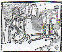
Sir Thomas Mallory (c. 1405 – 14 March 1471), translated and compiled a collection of mostly 14th century romances regarding King Arthur known and published as the Le Morte Darthur/Le Morte d'Arthur. It was first published by the great William Caxton in 14851and became quite popular, being reprinted with additions and corrections in 1498 by William Claxton and then again by Wynkyn de Worde (in 1529). It is, in its way, beautifully illustrated, or at least interestingly illustrated--I can't really say for sure if the woodcuts were done with great care or not. But their effect is significant, and, whether naive or not or careless or not or simply at the artistic limit of its executor or not, the images do have their own peculiar beauty. One that struck me in particular was this,
the "floating river", an out-of-perspective element of a very stationary world, a controlled chaos-ness in a static landscape. I'm not sure what is going on with the trees, if the blankness is a part of reflected light, or if it is a representation of spaciousness between the limbs, or if they are simple wormholes in the woodblock. Everything in the image seems to have its own sphere, locked into their own environment, existing apart from everything else.
I see the same issue with many other such works, bits dropped into place in a scene or landscape, all making their way into the viewer's mind on their own, not really a part of a cohesive whole. This may have been the intent, or again it may have rubbed up against the outer limit of what the artist (and their tools, and medium, etc.) was able to actually produce. Here's another example:
Its another lovely, lonesome image of separates from the beautifully-named book by Bartholomaeus Anglicus All the Properytees of Thyings, which was published in Westminster in 1495 (and also known as De proprietatibus rerum, also translated as On the nature of things, or On the properties of things), and which was originally written around 1225). The book was a bestiary, a marvelous encyclopedia, a collection of all things as known in the 13th century--it would be interesting to represent all that is know today and compact it into a workable, logical, usable (printed !) book of a thousand pages. The question of organization of knowledge would be the key, of course, and how to make one flow to another complementarily as practicable...it would be an interesting project (for someone else) to try and arrange the basis of human knowledge in a finite space like that. The author of the book above organized his work as follows, in 19 books: "god, angels, (including demons), the human mind, or soul, physiology, of ages (family and domestic life), medicine, the universe and celestial bodies, time, form and matter (elements), air and its forms, water and its forms, earth and its forms including geography, gems, minerals, and metals, animals, and color, odor, taste and liquids." The 2012 variety of categories would be somewhat different.
Notes:
1. This period, from say 1494 to 1525, was one of great creativity. For example: 1494, Pacioli: Everything About Arithmetic, Geometry and Proportion; 1498, Leonardo da Vinci: Last Supper; 1500, Michelangelo, Pieta; 1504, Michelangelo: David and Bosch Garden of Earthly Delights; 1505, Leonardo Mona Lisa; 1506, work begun on St. Peter's Basilica; 1508-1512 Michelangelo paints the Sistine Chapel; 1511, Erasmus, Praise of Folly; 1512: Erasmus, De Copia; 1513, Machiavelli The Prince; 1516, More, Utopia; 1517, Start of the Reformation.
[I wrote earlier in this blog on maps of the Garden of Eden, here.]
This island is Island Earth, the chuchified beginnings of humanity, showing the creation of Woman from the rib of a sleeping Adam. I'm not referring to the 500-odd place names in the U.S. identified as "Eden": there are cities, towns, and villages named "Eden", plus valleys, creeks, lakes, schools, shopping centers, malls, plazas, forests, and cemeteries--though I must say the though of an "Eden Cemetery" does sound appealing. I'm talking about the Eden of Genesis--though Eden hardly makes an appearance anywhere else in the Bible. Nor for that matter does the Fall of Man. I'm also not talking about earlier references to Eden-like places, like Heden of the Persians, or the "Islands of the Blessed"/Elysium of the Greeks, or any of the other earlier versions of a paradise (some complete with a tree of knowledge/life guarded by a serpent/dragon) from which the Genesis version must surely have drawn. This is strictly Old Testament, here.
It is interesting that this image is a suggestion of the anatomical event, because Adam is shown whole and unmolested--I've seen many versions of this image showing Eve actually emerging from an opening in Adam's side, but the artist here is content enough with the suggestion of the bio-event.
[Source: Jac. Phil. Foresti Bergomensis, SUpplementum supplementi chronicarum ab ipso mundi exordio...printed in VEnice, by G. de Rusconibus, 1510. See the full image in the continue reading section.]
Eden seems set adrift in the sea of everything, floating there while the big change comes over Adam. (It is also fun to note that the hallow of the creator is given a three-dimensional affectation--perhaps later we'll deal with the various shapes of hallos.) Eden is supposed the perfect circle, held afloat by the great waters.
Here's another version, keeping somewhat within the Island Earth concept, but showing Eve emerging from a dourly distracted Adam--definitely this time connected to Adam in some way, though without any open cut. (This image is from the great Bible of Anton Koberger, 1493. Picture source, here.)
Here's nother image of the Garden of Eden as rondo, from Ludolphus de Saxonia (a Dominican for many years and a 14th c figure), Thoeck vanden leven ons heern ihesu christi (1487), which was I think the greatest Dutch achievement in the making of books in their history of early printing, century, and in general one of the most beautiful woodblock books ever printed:
Eden is again fortified, this time in stone, with the ornamental drainspouts of the four rivers making their exit in the foreground. The glory of Eden abounds, but it is temptation that is presented them.
Another version of Eden, this time in a rectangular configuration, is seen in this 17th c engraving, finding Eden on the map on lower Mesopotamia.
There are other versions of Round THings that abound in Renaissance images, and we'll get to them later, along with the depictions of caves, islands, and roads/paths meandering into infinity--those will come in just a little bit.
People, working people, the so-called "vulgar classes", sailors, unescorted women, married women with babies, people who worked with their hands, people who worked (in general), all began their assault on the previously-just-for-the-"correct"-classes knowledge base of England--the British Museum--in the first third of the 19th century. It was a failed attempt, really, because the powers-that-be of the Museum were repulsed by the idea of the underclasses coming in to the place were the proper people came to learn, fearful that they would be repelled by their lowered and unfortunate brethren.
["A Dream of the Future"--the Sunday Opening, from Judy, 1885. Source: Lynn Barber, The Heyday of Natural History, Doubleday, 1980, page 166.]
The Museum wasn't open very much at all--only three days a week, receiving people between the hours of 10 and 4, restricting access to women with children, to women in general, as there weren't any restrooms for females. I'm not sure when the first women's facilities came into being at the Museum, but it took them until 1879 before the place was opened daily. And "daily" means every day, every day but Sunday, Sunday being a day not only of various religious obligations (which I think was the least of it), but also a day in which the greater percentage of the working class was not working ( which I think was the root of the issue). That privilege of opening the Museum to the great unwashed, opening the place on Sunday, didn't occur until 1896. I imagine even then that there was resistance to the innovation of reaching out to working people.
The odd thing, now, is that many museums and libraries have been limiting their public hours, closing on Sundays, the day on which most people today find themselves not at work, restricting themselves to availability to a population of people who may mot be working a 5/6 day workweek. Plus ca change, plus c'est la meme chose.
I've owned this photograph for a long time. It has been in the files for many years, waiting for something to happen to it, waiting for it to be a little understood in some slight way of identification. I've still not gotten around to it. To me, it has always seemed like a photograph of a small post out in the American Far West, 90 men in dress uniform inside their "fort", or outpost, the commander and the camp dog addressed in front and the sergeants out on the flanks. The enlisted men stand at ease.
I'm really not sure though who or where they are. The camp is very spread out, for one thing. And for the age (I reckon this to be made around 1885, perhaps a little earlier) I would've thought that boots would've been visible under trousers. And their hats/helmets--they really don't look to be made for the sun, and also seem too much of a bull's eye/target. That's on first glance--nothing about their uniform seems fitted to the place: no protection from the sun, trousers caught on low burrs and scrub, and so on. But the uniforms--and helmets--seem to be in line with the Prussian-influenced dress of the time (or at least around 1882), including the ribbon-y materials draped around the commander's neck. (I really don't know enough about U.S. Army uniforms to make a good qualified guess about who these men are.)
But the photo as art has always intrigued me, capturing the heart of a lonely place. I know, though, that having spent a little time hiking in the desert that the place is hardly empty, or blank. But it can still be lonely if you want it to be, a state which isn't dependent on any of the conditions mentioned in the title of this post--its a created space, the loneliness.
I've wondered too about who those people are, sitting together, (huddled?) at the far end of the soldiers' barracks, a speck visible over the shoulder of the sergeant (the last figure on the right in the top photo)? I suspect they must be Native Americans, or at least indigenous people. They've faded into history too with the rest of the people in the photograph, a chance at a piece of tangible memory missed because, well, no one made any notes (that survived, at least) about the image.
The photograph looks hot and cold to me at the same time...
(This image is available for purchase via our blog bookstore, here.)
[An earlier post on this blog, Mapping the Invasion of America, 1942, addressed another vision of the invasion of the United States--it is also the Most Viewed post that I've written, having been read more than 400,000 times. Try out this bit on the Invasion of America (naval, at Pearl) in 1932; see also Part II of this post, here; and consider a related post on the Nazi sub-orbital Amerika Bomber]
Philip Diamond discovered an interesting concept in "blurryness" in the pursuit of building with a purpose. In his pamphlet Should it Happen Here, self-published (and printed by the Brighton Press of Brooklyn, U.S.A.) in 1937, Diamond established a need for creating (1) inexpensive housing for the unemployed and (2) poison-gas-proof housing for Americans in general, and came up with (1.5) inexpensive poison-gas-proof housing. In blurring the lines between the two needs I'm not sure that he satisfied anyone's needs, spreading his engineering/architectural gifts jut a little (or a lot) of bit too thin.
One thing Diamond was sure of was that the next war would be governed by "one man flying in an aircraft and releasing vapors of poisonous gas for destruction" and assured his readers that in this new war "there would be no front lines". "The future war will not be carried to the front line; it will be carried to the front door." That of course was true for hundreds of millions of people in Europe and the Soviet Union and South Asia, but not so in the same sense for anyone in America--unless those Americans happened to live on a remote chain of Alaskan islands. Diamond was sure that war was coming directly to the U.S., and although he doesn't name the country/countries that would be responsible for attacking America with poison gas, he did name one of the aircraft that would come here to do that--the HE112. (The HE 112 was a prototype fighter aircraft that wasn't adopted, with fewer than 100 produced. How this would get across Europe and then across the Atlantic and then across the U.S. I'm not sure.)
Once Diamond gets to the design of his house things get a little fuzzy--and heavy./ Very heavy. HE proposed a domed structure with a foot-thick "exterior roof" and a foot-thick "interior roof" of concrete, between which would be sandwiched three feet of sawdust. The sawdust was supposed to act as both a filter to noise and soot and dust from the outside world, as well as a filter for poisonous gases.
The 5-foot thick structure would be embedded on a 10-foot thick concrete bed (for earthquake protection) and surrounded on its sides by another 10-foot concrete structure of something that I can't figure out. Not surprisingly, the author announced with a section headings that there would be "No WIndows". There would be a double entry equipped with an "air condition" that would wash folks entering the house and decontaminate the gases that might've impregnated their clothing or bodies (though Diamond says nothing about outerwear).
Once inside (charmingly referred to as "the vault") the occupants would find two bedrooms, a kitchen/dining room, and two lavatories (one "miniature" for the children, not so much for "hygiene", but to "protect the delicate moal grace amongst the children". That was the best line in the pamphlet, and about the only thing that really made any sense.)
6 million of these houses could be constructed for the unemployed, costing $3,000/each, meaning that this part of the project could be funded with 18 billion dollars. This was at a time when the New Deal was having a heart attack, unemployment was spiking again, and the entire GDP of the U.S. was $91 billion, which means that Mr. Diamond was seeking a 20% cut of the GDP pie. In current terms, that 20% would mean $3 trillion.
So far as I can determine Mr. Diamond's plan was not taken seriously.
Also, this I think is my only encounter with a title pages that starts out with the words "Sub-title".
I was grazing a large bound volume of the Illustrirte Zeitung (Leipzig) and came across this photo in the issue for 10 February 1938--it was sandwiched between two stories on Austria's attraction to National Socialism. The German invasion of Austria would begin on 12 March, just a month away, and end a day later. Czechoslovakia would follow soon thereafter.
But what we see here is a photograph of the 12-cylinder Mercedes W125 which was driven by Rudolf Caracciola in 1937 to a world speed record of 268.9 mph over a mile-long stretch of highway from a flying start. Most of the images you see of this automobile all through the internet are like those in the Mercedes-Benz Museum (which may or may not by law be able to show photographs of the racer with the symbol), and are all pretty much the same--they almost all are missing one detail, one symbol that the car carried on its record-breaking run:
JF Ptak Science Books Post 1644 [Part of the Series on the History of Blank, Empty and Missing Things.]
"Other maps are such shapes, with their islands and capes! But we've got our brave Captain to thank" (So the crew would protest) "that he's bought us the best- A perfect and absolute blank!"--Lewis Carroll, The Hunting of the Snark.
[This post fits perfectly in our History of Blank, Empty and Missing Things. Ditto for the series on The History of Lines--making this a great confluence for a History of Blank and Missing Lines (in the History of Nothing series).]
For all of the brilliance of all of the cartographers and map makers who have drawn a line in the sand or strung a strand of quipi or drawn a celestial rendering on a cave wall or imagined the Americas in 1504 or ventured out and away from the Medieval T-maps or drew maps of other worlds or fashioned spiraling maps of Hell, I think the maps I most like are maps of imagined places. Of course I enjoy the extremely rigorous and steadfast maps (like those of the German Stieler Company of Gotha who for a hundred years routinely drew the most detailed maps in a particular scale than any other mapmakers in creation—you know, the big maps of the U.S. that would locate minute places like Truman Capote’s “out there” town of Holcomb, Kansas) and of course maps of the solar system and galaxy and universe (as knowledge expanded and collapsed and expanded again). And of course there are the representational maps showing the comparative heights
of mountains and lengths of rivers, or the grouping of all the world’s lakes, or the divorce rate map of the United States at Centennial, or the heights at which different sorts of trees are found, or geological speculations on the thrust of the Appalachian chain, or the wanderings of the course of the Mississippi River (below), and other hosts of things.
As much as detail is attractive to me—complex, staggering information correctly displayed—there is also the opposite: the quick, thoughtful, spare map. The Tabula Peutingeriana is sort of like that—this is a 17th century reproduction of an ancient Roman map that was, basically, a road map of the world (or the Roman World) that was linear and included all manner of detail of the roads themselves, with little else. It is a spectacular thing—one version I had once was 14 inches high and 16 feet long, just a skinny map of how to get around in the world from 2000 years ago. There was of course nothing “quick” about how the map was made, coming at the expense of countless hours of careful observation, keen observation, and lots of general human tragedy.
Folrani's world map of (ca.) 1575 (which appeared in Antoine Lafrery’s (1512–1577) Geografia tavole moderne di geographia) is a glorious thing and a fantastic accomplishment for its time (and also being the first map to use the name "Canada"). It has a sumptuous artistry to it in addition to including (and excluding) certain of the newly known discoveries. In this version of the map he chose to not use the newly-incorporated Straits of Ainan
[I'm sorry to say that I've misplaced the original source for this map--I will try and supply. My apologies.]
In another edition of the m-which appeared a few years later--North America is still attached to Asia, but now there is added another bit, a gigantic land mass to the south, Terra Incognita. This was basically put together by some sightings in the southern seas that located different land masses, and Forlani took it upon himself to connect all of those pieces of information and draw them into one continuous land mass, greatly expanding his own version of Antarctica from a few years earlier. It is a wonderful example of leaving something(big) out and making something else (even bigger) up.
But the map that I think I love the most illustrates Lewis Carroll’s The Hunting of the Snark, an Agony in Eight Fits, and occurs in the Bellman’s tale, starting the second fit. It begins:
The Bellman himself they all praised to the skies- Such a carriage, such ease and such grace! Such solemnity too! One could see he was wise, The moment one look in his face!
He had bought a large map representing the sea, Without the least vestige of land: And the crew were much pleased when the found it to be A map they could all understand.
"What's the good of Mercator's North Poles and Equators, Tropics, Zones, and Meridian Lines?" So the Bellman would cry: and the crew would reply, "They are merely conventional signs!
"Other maps are such shapes, with their islands and capes! But we've got our brave Captain to thank" (So the crew would protest) "that he's bought us the best- A perfect and absolute blank!"
Sometimes there is nothing so fine as something that beautifully illustrates the nothing that isn’t there, and this lovely map, unencumbered of all of the elements and details that define the mapness of something, perfectly explains the origin of its need.
For a lovely work on the complexities and simplicities and just sheer beauty of what things like maps are check out former Ashevillean Peter Turchi's Maps of the Imagination, the Writer as Cartographer.
[Part of the Atomic and Nuclear Weapons series and the History of Blank, Empty and Missing Things series.]
I think no plumb line was ever so worked with pulleys and wheels, strings and catclaws and other Rube Goldberg devices as were the demographic studies of nuclear warfare.It is as though their compass rose had no compass, with everything centered on the center, no way out, no way in: just there.A faceless clock face describing “G-2 o’clock” whenever it pleased.These studies seem to me the nuclear warfare equivalent of the Bellman’s map (described earlier in this blog as the most perfect map ever constructed): a pretty polygon describing a totally blank surface.
I have a number of these things here, some of which are restricted-distribution publications, works of statistical fancy/fantasy meant for other eyes in the same community dedicated to the fancies described, a tautological audience for self-referential.
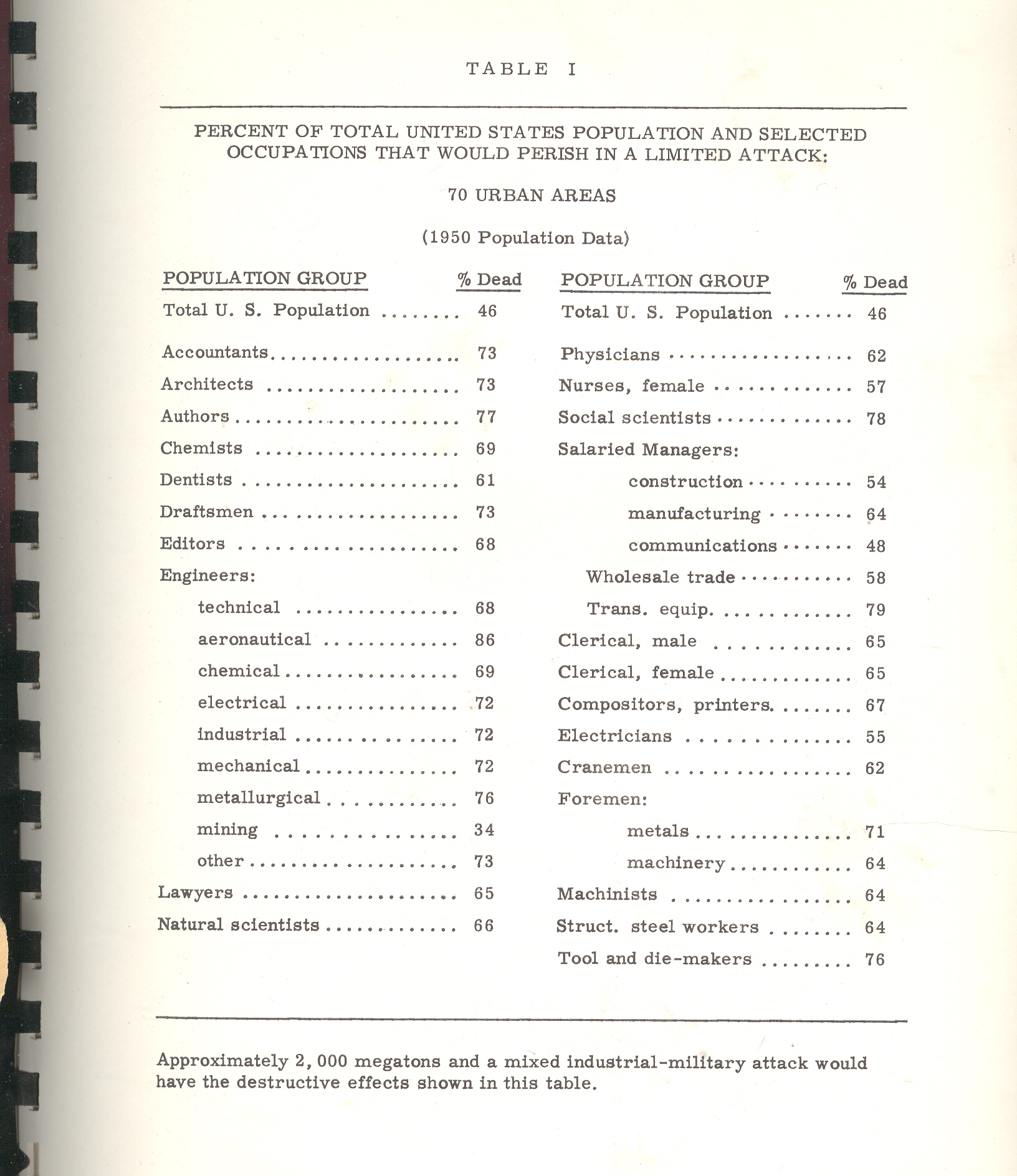
One such bit, plucked from this pile is William W. Pendleton’s A Study of the Demography of Nuclear War produced by “Human Sciences Research, Inc.” [This item is available for purchase from our blog bookstore.] Outside of its statistical foray in survivability and the procreative prospects of the left-overs of vast nuclear exchanges, the work is a solemn attempt at institutionalizing the death requirements of nuclear combat.The necessity of overwhelming carnage is presented in ironic and underwhelming language, the first bits of which are seen in the conclusion of pamphlet’s abstract1:
“Cities differ in the kinds and magnitudes of change to which they might be subjected. Considerable variation in the demography of surviving populations can be expected; that variation would be related to policy decisions; and those decisions should therefore be examined for their demographic implications.” [Emphasis mine.]
Put another way, the city is the main focus of the survivability equations, and the chances of the humans being bombed in those cities would change with—god help us—the amount of bombing.
Cities differ in the kinds and magnitudes of change to which they might be subjected.
This is the key I think to understanding documents like this, making a simple foundation statement so convoluted and tortured that it and most of what follows make any sense outside of restating themselves. Which I guess is a strength.
Back to the pamphlet and the interesting table that attracted my attention.According to one study [and for the sake of brevity I’m not going to describe the scenarios or data estimation methods and so on] the U.S. would suffer 46% casualties [meaning immediate deaths and not as a result of radiation or illness or starvation or the encyclopedia of whatever that would lead to death somewhere down the road].The resulting demographic of the “perished” by job description postulates that the most-killed category of worker would be: (#1) aeronautical engineers, 86% dead; (#2) transportation equipment salaried manager, with 79% killed; (#3), social scientists, with 78% of them going down with their clients; (#4), authors, with 76% gone.
Authors?Of what, I wonder?The good ones with the bad?Are authors different from writers?And what do you call folks who produce tv shows?Since the stats here are for 70 cities there’s no wonder that there aren’t any farmers in this table, as the majority target areas (some 450 cities cited elsewhere as targetable, including my own little burgh of Asheville, N.C.) would naturally have city folk in them.And so I’m guessing that three-quarters of all “authors” in 1960/6 were living in these target cities and were going to go up in smoke.The aeronautical engineers category is more understandable as every one of those industries employing 50 or more people would be a target; frankly I’m surprised that given the possible firepower of the Soviet Union in 1966 that 14% would survive; I’d guess offhand that the number would be 2%.
Even though this stuff is spread out in only 98 pages or so it would keep a person busy segregating the Orwellian gems from those not; it would be a tricky business as most of the “text” in the “not” category would be largely limited to prepositions.
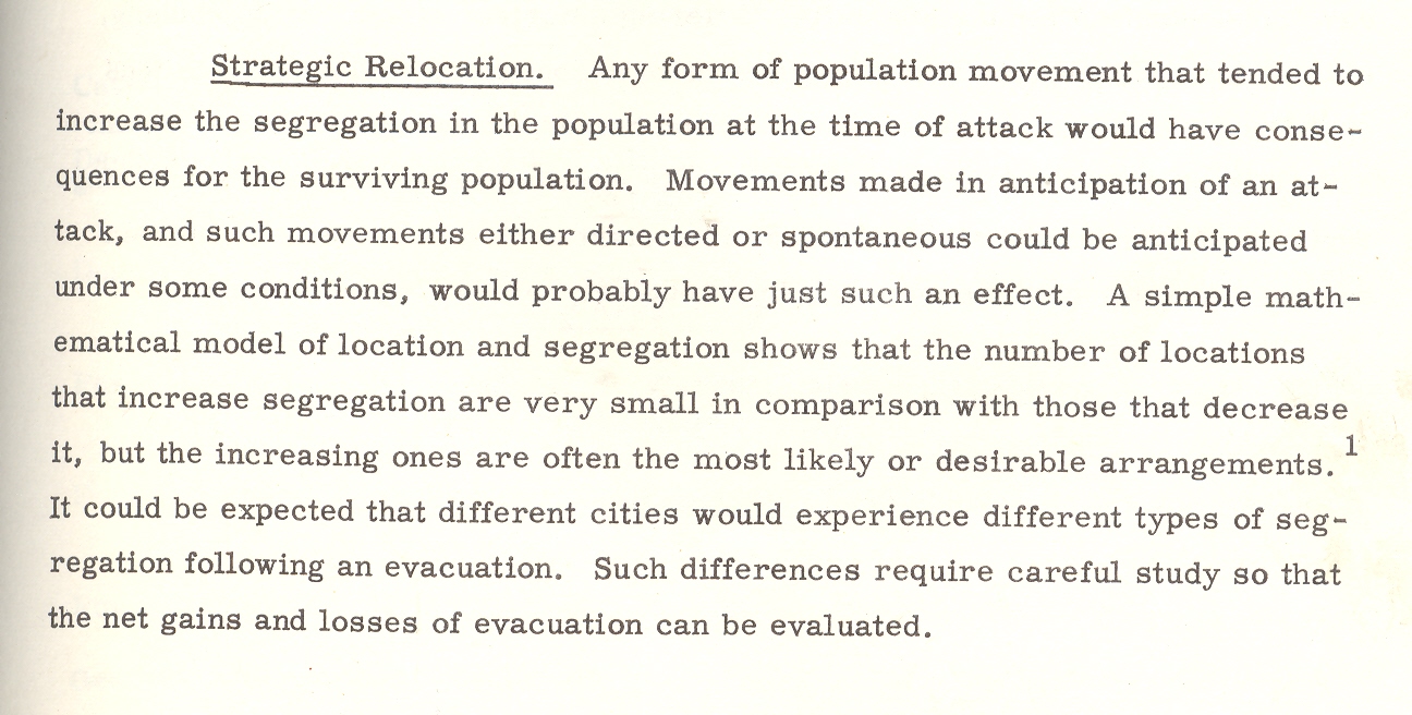
Here’s another bit:a parenthetic poke at the post-attack composition of Congress. It is stated that the “postattack” (hyphenated no longer) Congress would be “quite different”. It would also be (“in their eyes”) “more Conservative than the pre-attack (hyphenated!)Congress.It isn’t a cause for great prognosticational (?) liberty to assume that the Congress might be more Conservative, but why on Earth did the author qualify the assumption by saying “their eyes”?Pish and posh.
The paper goes on its merry way, connecting the necessaries of Goldbergian delight, and somehow nothing ever happened, which to me is a secret miracle.Especially given the weight of papers like this one, which seems to medicate the effects of war, assuming that there will be a Congress and that people will report back to work once the factories are rebuilt and that there will be more segregation in the colossal world of post-attack America, and on and on into the red dawn.
Mr. Mencken’s view of Warren Harding comes to mind when I read this stuff and wonder about how it was that we didn’t blow the whole place up:
“I rise to pay my small tribute to Dr. Harding. Setting aside a college professor or two and a half dozen dipsomaniacal newspaper reporters, he takes the first place in my Valhalla of literati. That is to say, he writes the worst English that I have ever encountered. It reminds me of a string of wet sponges; it reminds me of tattered washing on the line; it reminds me of stale bean soup, of college yells, of dogs barking idiotically through endless nights. It is so bad that a sort of grandeur creeps into it. It drags itself out of the dark abysm of pish, and crawls insanely up to the topmost pinnacle of posh. It is rumble and bumble. It is flap and doodle. It is balder and dash.”
Notes
1. The abstract from the above paper: “The basic problem with which this report is concerned is that of determining the kinds of demographic change that might result from a range of nuclear attacks, ascertaining the effects of those changes on the future of the surviving populations, and indicating possible areas for Civil Defense action and planning. Earlier studies of the demography of nuclear war were examined and their relevant conclusions and methodology incorporated in the report. A different methodology--expected to be more sensitive to compositional effects--was then designed. The new methodology was tested and found to be more effective than the old. Surviving populations representing a wide range of variation in attack conditions were created on the basis of both old and new methodologies, and the demographic significance of these populations was examined. Assuming a range of post-attack demographic conditions, a series of projections was made on the surviving populations. The demographic significance of the recovering populations was then examined. On the basis of the analysis a series of recommendations relevant to Civil Defense planning was made: Within the framework of this analysis the crucial variable is the demographic pattern of the city. Changes in composition, as well as size, could be of substantial magnitude and would last for generations in some cases. Cities differ in the kinds and magnitudes of change to which they might be subjected. Considerable variation in the demography of surviving populations can be expected; that variation would be related to policy decisions; and those decisions should therefore be examined for their demographic implications.”
This quasi/faux statistical/graphical modern art image by Max Ernst is found in the journal Mecano (issue no. 3 “Rouge”), which was the principal Dada publication vehicle, and issued by the artist Theo van Doesburg (in the Netherlands). It arrived in 1922, just 10 years after the publication of Marinetti’s “Manifesto tecnico della letteratura futurista” and a year before Marcel Duchamp retired from painting, and just another two years before Andre Breton nailed down the meaning of Surrealisme (and again like a particle collision changed the direction of some of modern art).
The Dada Movement is generally thought to have started by WWI escapes in the neutral haven of Zurich (where the war was escapable for the duration), at the Cafe Voltaire, in 1916, the word "dada" being found as is generally believed by Tristan Tzara.) I am trying hard to form some sort of memory for other Dadist, Futurist, Symbolist or other modern movements from the ‘teens and ‘twenties to use a graph such as this in the artwork but I cannot think of any.
(By the way, also appearing in this issue of Mecano were Man Ray, R. Hausmann, Hans Arp, Kurt Schwitters, and others.)
This is just a very quick post making use of the excellent cigarette advertisement resource at Stanford University (all images used below are found in their archive, here). This is the third installment on this blog on cigarette advertisements that are as wrong as wrong can be, so wrong--as I've said in earlier posts--that they aren't even wrong, that they are on-beyond wrong in that classification that defines terminal wrongness.
This stuff is worse than wrong--it is substantially a wrongness where the word "wrong" is too weak and impotent to describe a particular wrongness, much like the very-overused and not-replaced "spill" could be used to describe what happened in the Gulf Coast. There is no one word in English I think that described that occurrence, just as there really isn't one suitable word to describe this behavior of the tobacco industry. The wrong that isn't even wrong isn't that it is nothing, but that the wrongness of the thing is too weakly described by the word.
Rudolf Peierls (a phsyicist of very high order and co-author of the Frisch-Peierls memorandum of 1940 that theorized a workable weapon fahioned of U-235) described the original use of the "not even wrong" phrase, attributing it to the great Wolfgang Pauli (Nobel physics 1945), who when shown a paper by a young physicist commented sadly that it wasn't right, and it even wasn't even wrong. It was nothing. (It is interesting to note that if you took two of the things that these physicists were known for and placed them out of context in a literary/philosophical arena, they kinda work to describe Pauli's wrongness principle: that would be the Peirels Instability and the Pauli Exclusion principle.)
These ads weren't nothing. And the odd thing is that they exist in their contemporary flavors today, efforts that will be seen in our short future as being as impossible as these antique ads seem to us today. More's the pity when we know almost all of the story.
What is it about the pinky ring that makes you want to smoke? And makes you want to smoke the cigarette in the pinky-hand's counterpart?
The psychology of advertising in cigarette ads in the 1940's or thereabouts is a strange thing to me. The secondary items in the ads--the stuff there besides the cigarette--are sometimes baffling and occasionally troubling, disquieting, unusual things sent to capture the attention once the cigarette has been removed from the field of attention. I'm pretty sure why those things are there--because of their suggestive natures and their attempt to relate directly with cigarette smoking--but I'm not aure how that connection between the object and the suggestion (of power, or control, or social beauty, or sex and so on) takes place. The meaning and connection can be forced out with a little muscle, but that wasn't supposed to be so hard for the viewing public back there eight decades ago. The social contrivance of the connection seems to have slipped over time into a smoky nothingness, and I think that it would be interesting to try and restore it, if only for the sake of understanding that lost part of advertising's quadratic equation.
And so on to a few examples from the advertising world, all of the images coming from the great cigarette advertising archive at Stanford University (here). Removing the cigarettes as a main focus of attention in the following ads leaves us with pinky rings, puffy man-ladies, cigarette holders, close touching, electronics, stub-handed stubby cigarettes, wedding rings and suggestive "product placement".
The vast smokey elegances of pinky ring (from above):
The smokey, puffy man-lady ("so round, so firm, so fully packed"):
Phil Harris just looks entirely and completely out of place, and not comfortable, though perhaps he just wanted to "feel pretty" getting a light from man-handed Alice Fayew?


 :
:


