
Google search
The Fine Print

The History of Ideas Blog by John Ptak is licensed under a Creative Commons Attribution-Noncommercial-No Derivative Works 3.0 United States License.
Based on a work at longstreet.typepad.com.
Permissions beyond the scope of this license may be available at http://www.thesciencebookstore.com.


Buckets of Missing Smiles--an Incredibly Brief Anthropology of an Expression in the Face of the Sun
JF Ptak Science Books Post 1666
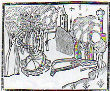
The depiction of the anthropomorphic Sun featured with a broad toothy smile seems a commonplace fixture in modern times--at least in the very popular media--but it seems to me that the Sun was an impressively dour character in the most misty and moldy past. Its a much harder issue for me to locate a happy Sun than a phlegmatic one, as we can in the coming examples. Here, for instance, the Sun is actually disappointed, and dark:

[Georgette de Montenay/Anna Roemer Visscher, Cent emblemes chrestiens (c. 1615)]
The Sun (representative in this case of the Christian god) disavows the heavily robbed false philosopher, finding nothing but fault in the erroneous thinking and pronouncements, so much so in fact that it distances itself from the phonylogian by turning itself black and devoid of light, absenting the light that was supposed to be shone via the heretic's teaching.
Feigning to be a philosopher with your long cloak
You bring forward all false theories about the pure Sun.
First learn to recognize what is the true light.
The balmy day does not shine in obscure night
Conversely, the sun would also shine to dispel the false teaching of other philosophers, as so, though this time without any face at all:
 [Source: Pieter Huygen, Beginselen van Gods Koninkrijk (1689)]
But mostly it seems the Sun appears to those who came before with a mostly blank expression:
 Where was the smilign Sun hundreds of years ago? Anthropomorphic images of the Sun have appeared in books in the West for several hundred years, and in almost every case where the Sun has a face, it is usually expressionless, its mouth drawn into a mid-Western farmer/Abe Lincoln horizontal, a tightly drawn nothing. Two thin lips, firmly repulsing all emotion. The face of the Sun was insurmountable, a tabula rasa, showing perhaps that there was nothing there at all inhabiting this iconographic image of The Creator to give the poor observer a glimpse into the depths of the future.

This observation seems to stand for Sun Gods and Goddesses as well, even the ones who are being tugged or pulled or charioted a cross the vaults of the heavens—the Nordic Sól, Greek Helios , Roman Sol Invictus, Vedic Surya and of course Elijah ascending to Heaven in a Chariot of Fire, all seem pretty intractable. But in general images that we see of Sun deities like Apollo, Greece and Rome; Freyr, Norse; Garuda, Hindu; Huitzilopochtli (Uitzilopochtli), Aztec; Inti, Inca; Liza,West African; Lugh, Celtic and Re (Ra) and Isis, and on and on, show a small, set pair of lips, if they have a mouth at all, and this going back beyond the Sumerians (Shamash).

When the Sun really loses its human personae in the 17th century (the scientific sun and stars beginning much earlier, as in for example Allessandro Piccolomini's Della Sfera del Mondo, 1552, with simple star maps unadorned by icons and written in the vernacular), it is replaced with starry images which seem to somehow have more emotional authority than the sun images with faces. Perhaps the sun was meant to have this Delphic, blank-mirroring quality, given its importance as a giver (and taker) of things,

and that it was not within human capacity to understand it as an emotive entity, especially during bad times. But in those times of Good and Bad it wasn’t necessary to see a frown or a smile on an image of the Sun, I guess because of the complaints of redundancy.

No matter, though, as the modern astronomical text took care of the Sun and its missing buckets of smiles in due course—until more modern times, when the Sun is made to have a matching disposition, a result of kinder modern artists.


This Sun seems to rule with an ennui Daniel de la Feuille, Devises et emblemes (1691); and then again, in the following superbly engraved work by Jacob Cats, Sinne- en minnebeelden (1627):

The Sun here seems to have a knowledge-worn expression, a sense of having-seen-it-all, in this beautiful work by Georgette de Montenay/Anna Roemer Visscher, in Cent emblemes chrestiens (c. 1615)

And again from the Montenay we see a smirking Sun (definitely not a smiling one) judging the efforts of humans once again, and finding them coming up far to short:

I guess you could make a case for an "amused" Sun in the Montenay, though in a third-person sort of Royal way of being removedly amused. Here--in a rare and very important work in the history of alchemy--we see a rising Sun in an amused state, welcoming the book's author, on his alchemical pilgrimage.

In another illustration from this book (by Salomon Trismosin, Auretum Velius oder Guldin Schatz und Kunsthkammer, printed by Georg Straub at Lake Constance in 1598/9, and also known as "Splendor Solis") we find the following expected facial posture:
![[trismosin, salomon (?pseud., fl. 1473?). <i>aureum vellus, oder guldin schatz und kunstkammer.</i> rorschach: 'gedruckt in des f. gottshausz s. gallen reichshoff' leonhard straub, 1598-99.]](http://www.christies.com/lotfinderimages/D54552/trismosin_salomon_aureum_vellus_oder_guldin_schatz_und_kunstkammer_ror_d5455284h.jpg) |
And so on and on this continues, this presentation of the Sun as both removed and judging, until--in some cases--the business of representing the Sun anthropomorphically disappears altogether, even in allegorical representation, like so:
The Man in the Moon will just have to wait his turn, though I can't resist the following couple of images, the first of which shows the Moon in a phase of nothingness and a nil expression:

[Source: Daniel de la Feuille, Devises et emblemes (1691)]
And then this classic image from an iconic and early science fiction film:

And from the 1905 motion picture version of Jules Vernes From the Earth to the Moon called A Trip to the Moon--upon the approach, the Moon's surface was blank, but quickly developed a face, which was sort of smiling--until struck in the eye by the Verne capsule.
Offhand, though, my memory doesn't offer too many smiling-Moon expressions.
|

Extra-Earth Department #5--Primordial Pre-Cretaceous-Paleogene-Industrial Bubble-Earth
JF Ptak Science Books Quick Post Addition to the Extra-Earth Series
Today a reader of this blog forwarded a lovely image for the series on Extra-Earths that appears here--one installment of which (with links to the others) appeared just this morning.
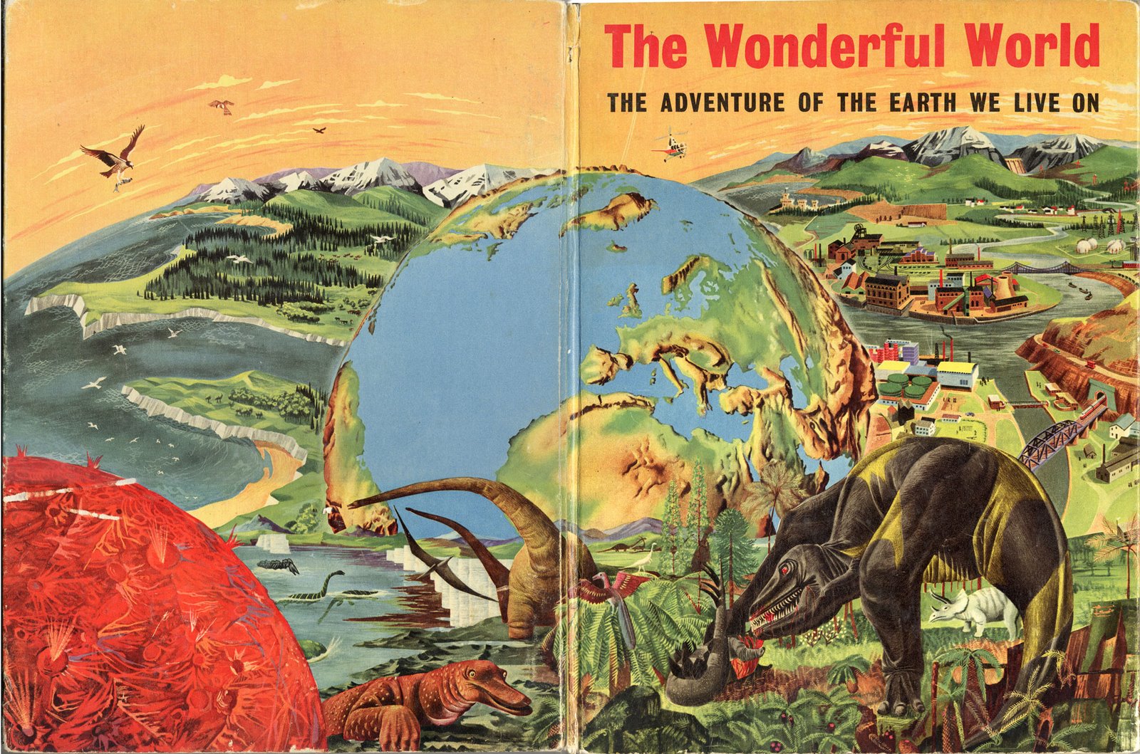
The Wonderful World--the Adventure of the Earth We Live On (by James Fisher, and with art editor F.H.K. Henrion, and published by Hanover in 1954) is a clunky title even for expressing its idea to juvenile audiences. And speaking of which, if the intended reader was eight years old, the cover art might be a little confusing: what is that bubble-Earth doing there, and why is there a T-Rexy thing standing there on a mountaintop overlooking a city and observing the whole Earth-emergent process?
But when we look inside the book (at the images provided by our reader, Kevin, from his own 2006 blog ("The Balloonist") entry on this book, we can see the elements of the cover's montage, and which would I guess alleviate a young reader's consternation with the confusing image:

|
Extra-Earths Department #4: Brueghel Dips into the Late Renaissance Allegorical Sky
JF Ptak Science Books LLC Post 1664
See the other Extra-Earth posts: Mondo Bizarro, Science Afflictions and the Dubious Mind—Bad Science, Part 1. NYC in Space (?!) here and Extra-Earth Humano-Alien Souls From Outer Space Repopulate Earth-Hell!!(??) here.
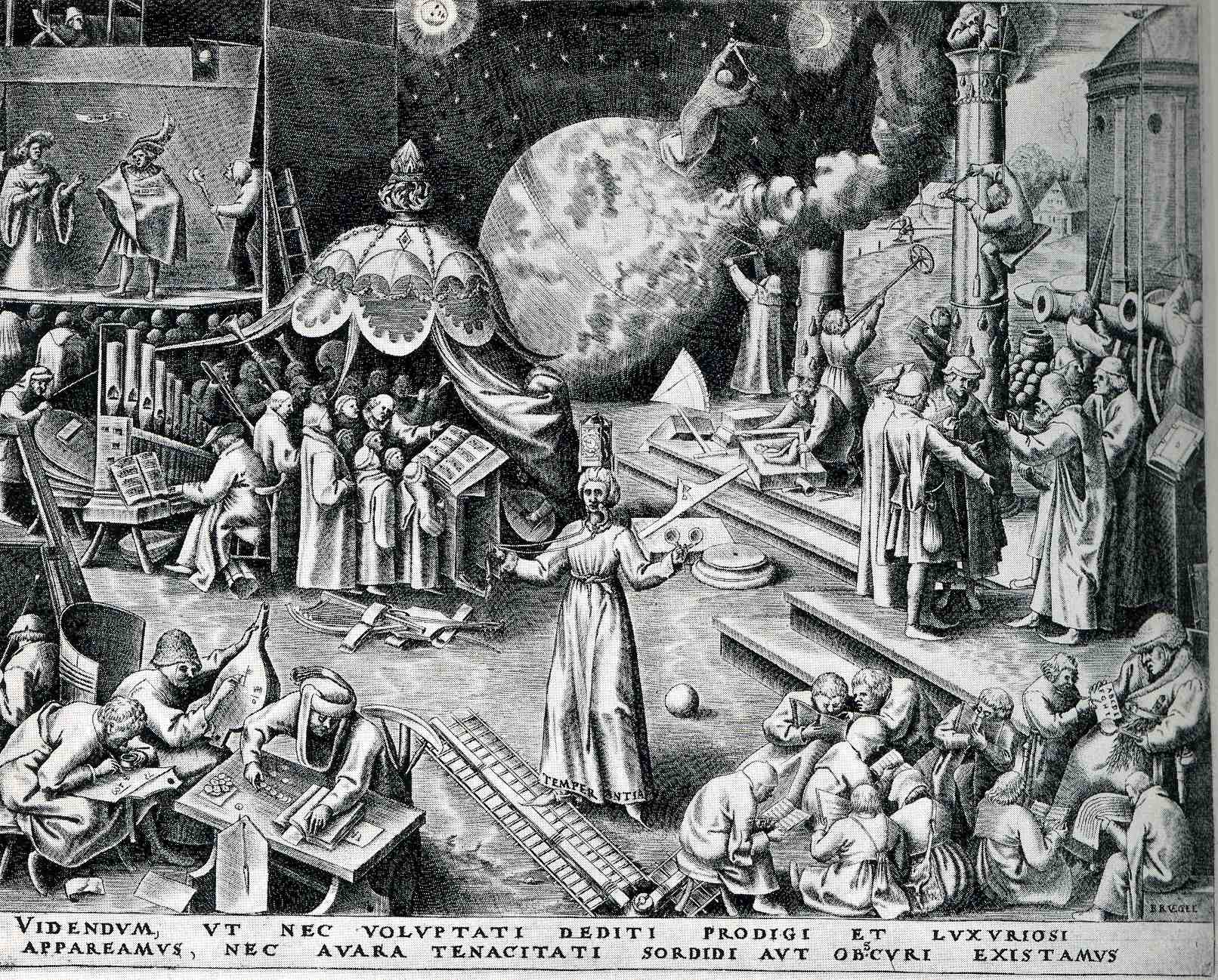
Peter Brueghel (the elder, born ca. 1525 and dying in 1569), was the Dutch semi-discoverer and king of "normality" of Renaissance art--and by "normality" I mean that he depicted non-royal things that were generally off the palette for almost everyone else, finding subjects in peasants and small life (hunting, meals, working at agriculture, festivals, dances, and so on). Brueghel was also perhaps the first painter to depict a landscape for the sake of its own beauty, without being a backdrop for a religious study or building or historical scene. He was extraordinarily prolific in his skimpy 45 years, fully populating his scenes with suites of busy and evolving life.
Browsing through some of his work, I came across the print called "Temerpance", which in general I think was supposed to warn us against excessive pleasure, but which really just confused me a little.
(TEMPERANTIA; and then, VIDENDVM, VT NEC VOLVPTATI DEDITI PRODIGI ET SVXVRIOSI//APPAREAMVS, NEC AVARA TENACITATI SORDIDI AVT OBSCVRI EXISTAMVS. "We must look to it that, in the devotion to sensual pleasures, we do not become wasteful and luxuriant, but also that we do not, because of miserly greed, live in filth and ignorance".)
To me, it looks like people here are pretty industrious, mostly engaged in scientific or musical pursuits: lots of books, musical instruments, people writing and reading. But I guess that these were sensual pleasures, pleasures of the mind and heart, and not a pleasure devolved from the godhead. Perhaps the complete opposite is true: the print showing the triumph of the pursuit of the mind over sensual graft, lifting mankind above the filth and ignorance of the body. Sheesh.
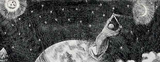 But the real grit of my interest is the action lurking in the background, the man, the astronomer, making measurements in the sky, triangulating the Moon and the Sun (perhaps). What on earth is he standing on? He does seem to be standing on earth in the background of the earth on which thee people in the foreground are standing--which means, with a stretch, we have the fourth entry in this blog's short "Extra Earths" category.
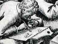
The more I think about it, and the more closely I look at the print, this confusion must be my own--this must be Brueghel's way of showing the possible worlds that exist outside the sensual and self indulgent. He shows children (and adults) learning their ABC's at the feet of teh schoolmaster at bottom right, a theatre scene at upper left, a large musical ensemble (complete with choir). An industrious man measures his fields, while builders to his right measure their progress and trueness on a column; at bottom right we see an "accountant" of the times working his tables and figures, while another to his right works on a math problem, clutching his pot of ink. The figure in the middle (with "temperance" written in the hem of his garment), reminds us of our mortality, with a sword in one hand and a clock on his head. All in all, it is a delightful scene of industry and invention--and it has an extra earth.
Of course the extra-earth is allegorical, but, still, it is an unusal thing to see.
|
States of Perfection: Television Advertisement Images within Television Images, 1950
JF Ptak Science Books Post 618--expanded 26 Nov 2011
See also States of Perfection, the Archaeology of Refrigerated Meat, 1954.
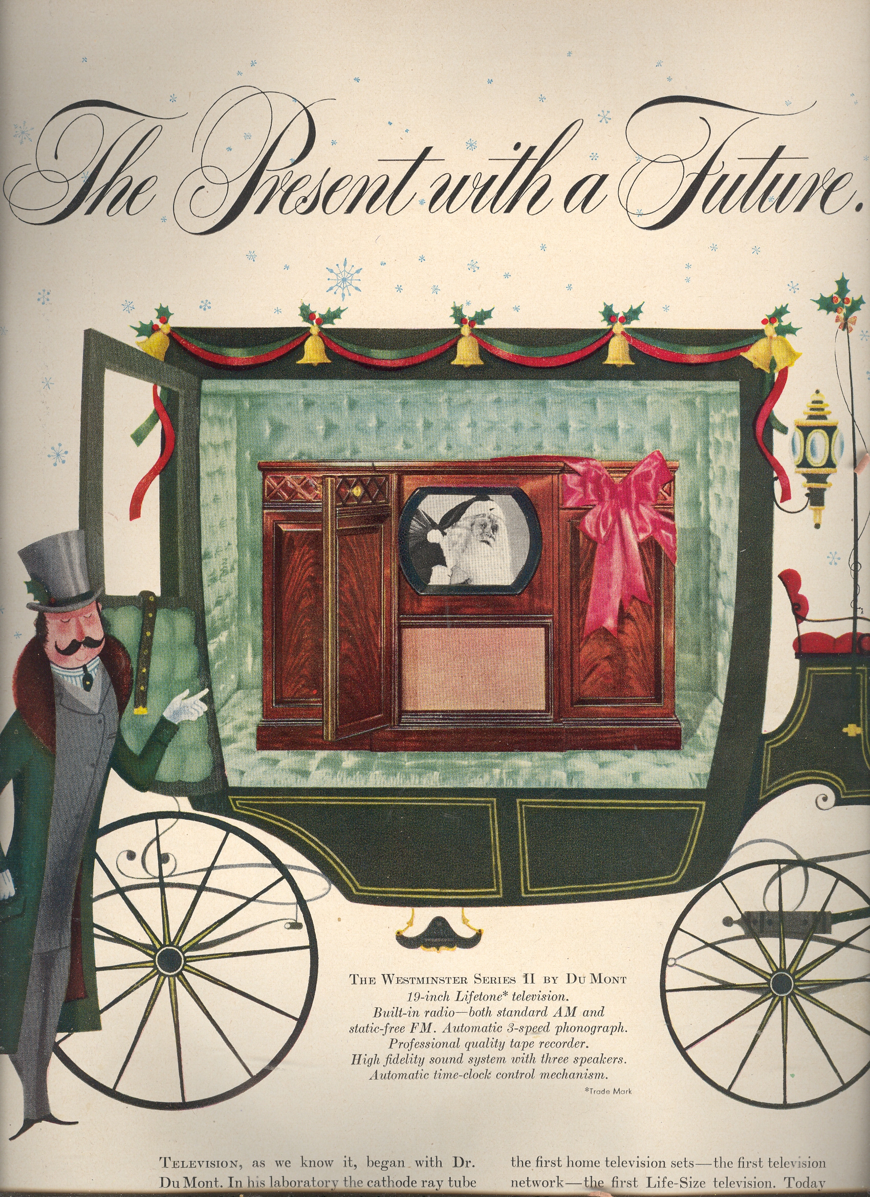
The concept of the television started pushing its way obliquely into the literature as far back as the 1880’s (with Paul Nipkow’s 18-line resolution “electric telephone”), bumping up again with Arthur Korn in Germany around the turn of the century, and making its way through the ‘teens and early ‘twenties until hit it big in 1927 with Phil Farnsworth’s “image dissector”. (Baird promised a hope with a mechanical version of the television, complete with a 30-line vi ewer, but it would very soon be replaced with electronic boxes with ten times the resolution.) There were little or no stations available for viewing even though sets were manufactured and sold. It wasn’t until the end of WWII that the television industry took off—the increase in home-ownership of tvs exploded, beginning in 1950.*(A decent timeline of the development of tv is here.)
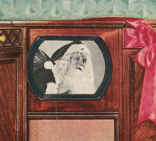
While looking through a year’s worth of LIFE magazine for 1950 I was struck by the number of ads and the number of different companies selling televisions in the major print market. But the creeping surprise for me were the images that were used in the tv sets that were pictured in the ads—images within images. The pictures in the tubes were meant to be enticing, imaginative, imagery of the possible, displaying the possibility of entertainment--the possibility of losing yourself in the new medium. It was an idea of fabulousness, of great expectations, of the promise of being swept away by the new convenience—and all of that rolled up in the pictures used in the ads.
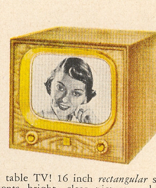
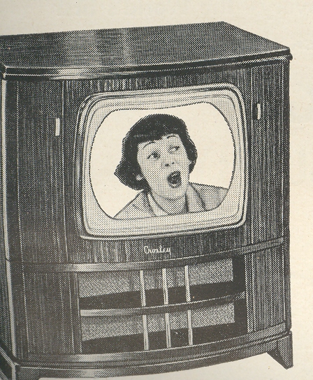
To me, sitting here 59 years in the future, it is hard to imagine getting excited by any of these images—except Santa. Even with the benefit of having looked at millions of images and having an historian’s occasional perspective on stuff, I just can’t appreciate these pictures in the ways that the advertiser meant them to be savored—and they were meant to be savored, as they were the libidinous bait to make the reader jump into the Hudson and buy the advertised set.
There are vocabularies for defining the breadth of fabulousness across difficult genres, like describing the fineness of a wine or the scent of a good desert rain. Difficult perceptions to quantify and describe, but it is done and successfully so. I can’t find the words fort these pictures.
Their fabulousness to the viewer in 1950 must not have been very long lasting—the images seem so contrary to being interesting, as they seem to project almost nothing at all. I do get the overall effect of polite culture and a race at the occasional arts, but by and large the pictures were vanilla headshots of women.
|
The Children's Battalion--Santa and Guns, 1916
JF Ptak Science Books Quick Post

I don't know the Illustrated History of Santa and Gun Gifts, but I guess that a book could be written if one already doesn't exist. Well, that or something associating Santa with unusual, or questionable, gifts in his bags of joy could be made into something, something disappointing. I'm not that person to collect those sorts of images because I have always held Santa in very high esteem, and I don't care to have too many of those images floating in my mind, exploiting some dark corners of unknown memories, disturbing the happy bits with unneeded and unwanted visual info. But, well, these pictures below, found in the December 1916 issue of the uncommonly-seen journal, Illustrated World, provides a little glimpse into the manufactured desires of kid-wishes for toys during wartime, and so I'll pass them along. These things do tell us something about the period--like the famous multiple images of Santa hanging cigarette carton Christmas ornaments (seen here in the post on Gift Porn, 1954), or a smoking Santa stuff a stocking with a box of Lucky Strikes--so it makes sense to make sense of them.

I guess kids have fairly well always wanted toys (or not) guns for Christmas, gifts from Santa, or at least so long as Santa has been around or identified as so, and to see Santa with a rifle would not be so unusual, especially given that this was deep into the second year of the bloody Great War. (I have another interesting image here, somewhere, showing Santa distributing presents to British troops in trenches, riding a tank, but presently I can't find its stack in a stack of stacks.)
Perhaps the issue of playing with guns and cannons and so on was a way of easing fear and distress during wartime; perhaps it meant something soothing for the developing mind of a child. I don't know.
Continue reading "The Children's Battalion--Santa and Guns, 1916" »
|
An Episode in the History of Bread Photography: Monumental Bread and Infographics, 1914
JF Ptak Science Books Post 1662

In the history of pictures of bread, this loaf seems to be about the biggest. The 60-million-pound loaf is meant to represent a week's ration for teh newly-fighting German army. The war, the Great War, WWI, was just beginning when this article hit the newsstands on 22 August 1914. There wasn't much yet printed in the Scientific American regarding the war, and it seems as though this was the first cover of the magazine to deal with the new world-ender. But in the blazes of the guns of August (B Tuchman) the end of the conflict might've looked a little close at hand. I doubt that many would've seen the 100,000,000 dead and wounded that would come as a result of the war, at this point just finishing its first month.
I am not sure why, but the editors of SA chose to think about supply for their first stab at making a cover-comment about the war. It does give some idea of the sheer numbers of people involved, at least on the German side. Hoiw this is iterated by a 400-foot-tall loaf of bread, I can't exactly say.
(Are potatoes one tenth the density of :"meat"? The potato sack and the meat chunk look to be about the same size, though the meat bit is less than a tenth of the weight of the potatoes.)
Two issues later--5 September 1914--we see the following artistic display of quantitative data, a much more effective way of generating understanding on the differences in troop strengths among the waring countries:

The United States would not get involved in WWI until 1917, and so American statistics were not included in this image. But if they were, the U.S. Army's size would be somewhat larger than little Montenegro there at the far right. Given the American population of 92,000,000, the army was quite small, with barely 98,000 soldiers under arms (half of whom served overseas). (Montenegro's force of 50,000 was somehow pulled out of a population of 350,000 people--Belgium, with a population of 7 million, had an army more than double the size of that of the U.S.) Of course this was a peacetime, hands-off army for the United States, and by the end of 1914 President Wilson expanded the standing army to 140,000; by 1918, when the newly-instituted draft1 really kicked in, more than 4,000,000 people would be in the armed services, half of whom would serve overseas.
Notes
1. Beginning in 1917 all males between the ages of 21 and 30 were required to register for the draft/military service, and by September 1918 more than 23,000,000 men had done so. This was an extraordinary leap from the Army totals for 1914.
|
A Curious Episode in the History of Sitting--Speed Chairs & Trainless Trains
JF Ptak Science Books Quick Post

It may be that the history of human locomotion is the story of fast sitting. Except for some of the earliest incarnations of powered movement, it seems one of the most significant engineering aspects moving a person forward is how that person should be carried in the vehicle. And, well, it seems that in the vast majority of cases, the person is sitting. (There are of course exceptions, notably in say the standing of the engineer in the Tom Thumb when that locomotive set the land speed record;or the Wright Brothers' powered aircraft, where the pilot was laying down; or say in a chariot powered by a team of horses. Even in some of the earliest versions of steam-powered tractors, the mammoths were steered by a standing operator. It seems though that in very quick order the operator in most of these vehicles find themselves in a seated position.)

A very curious application of moving seated humans is seen in this woodcut of a chaired walkway--for all intents and purposes, the pedestrians looking to use the moving sidewalk would have been offered a chair instead. It seems as though as its base that this was a very simple form of an elevated subway or trolley, though without the train.
The moving seated sidewalk was the dreamchild of Alfred Speer (1823-1910), of Passaic, New Jersey, and it seems as though it might have been the first form of mass rapid transit in the city for which it was intended, which was NYC. It stood fairly high in the opinions of some prominent New Yorkers (like Horace Greeley and Peter Cooper) when it was presented in the early 1870's, and even passed the New York State Legislature in an act authorizing funding for the program in 1873 and 1874--but it was each time vetoed by Governor John Dix, and the people-moving dream ended there, right before the Centennial. (See here for the New York Times obituary for Speer., and see All Ways NY blog for a longer look at Speer's moving sidewalk, here.)
Here's another version of Speer's idea, though this look more like a moving sidewalk, complete with trolley cars, all of which were stationary objects located on the moving walkway. The idea of course was to free up the chaos and gridlock of the very busy areas of Broadway by placing a large chunk of the confusion on a moving second floor. It seems as though it might have been a good half-year idea or so, and the $3.7 million dollar price tag might've been a hefty one if you calculated the cost per minute of relieved traffic.
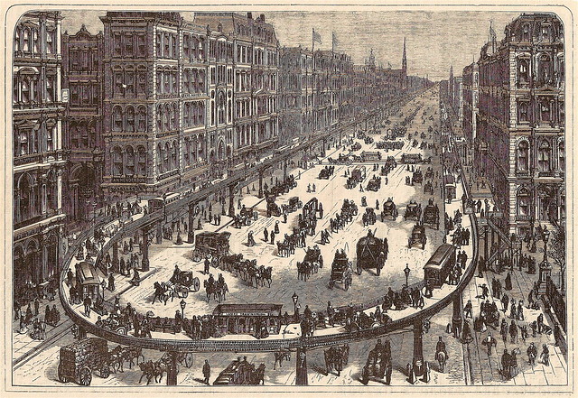
[Picture source: All Ways NY.]
Mr. Speer seems to have let his vision go and settled down to a life of wine making.
|
Rooftop & Floating Airports -and!- Rooftop Airports in a Levitating NYC, 1929
JF Ptak Science Books Post 1652 (Part II of an earlier post on Rooftop Airports, here.) Part of this blog's History of the Future series.
I really just wanted to post these two images before I lost them again. I've written earlier here about high-rise, in-town/downtown airports settled on the tops of buildings (or loaded onto newly-constructed structures over rivers and etc.), but these two images offer a nice distinction on the height's of elevated airports of the coming future. The first is by the great Paul Frank, and appears in Amazing Stories for 1928:

The taller of the two airports seems to be 75 stories above the ground, maybe more--its hard to tell. It is interesting to see that there is another (of no small size) right next door, but not quite so high. The 500'-tall elevated walkways/roads are impressive.
In April, 1936 another artist saw an even taller airport, which caps off an enormous building that seems at least not only twice the height of the Empire State Building (just newly completed), but also far wider. If you made the "...tropolis" airport signifier on top the midway of the landing field, I calculate the width of the building to be at least 600', meaning it would be something like 250x600', or about four acres (or more) per floor. Big building, with an enormous volume. 
[Picture source:Modern Mechanics, April 1935, as pictured in Dark Roasted Blend]

[Picture source: Paleofuture.com]
And here, another big rooftop creation of a 16x17 checkered grid, complete with, well, nothing at all, not even guard rails or fences--this would be rooftop-airport-landing Old School. The runways aren't even particularly long, though I have no doubt that the magazine's cover space dictated most of the size, anyway.
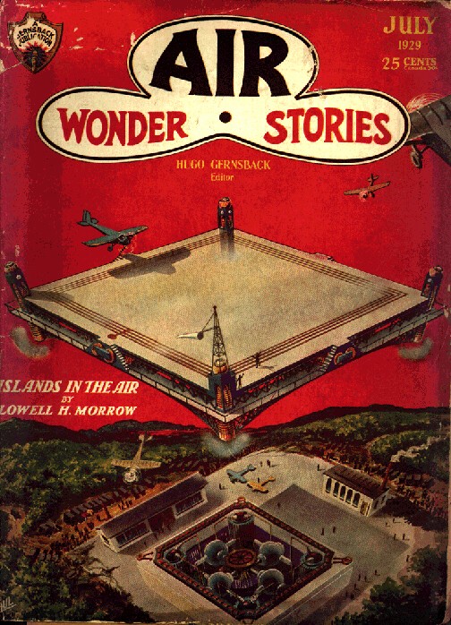
Of course the idea of very-elevated high-rise airports become secondary when you introduce the idea of floating/flying airports, as we see in this fantastic idea by (again) Frank Paul in the July 1929 issue of Air Wonder Stories. (This image and next from frankwu.com website dedicated to the artwork of Frank Paul, a great and wonderful thing.)
And of course when the idea of the flying airport fails, you can always go for the flying city, with airport:

This is again Frank Paul, from November 1929's Amazing Air Stories, and depicts--of course--New York City removed from the ground to levitate, above its former self. Luckily there isn't just a hole in the ground where is used to be, the rock and bedrock picked up along with the buildings and the rest of the (non bridge) infrastructure. It is still a busy place. I presume that given the crowding of the place that there are still high-elevation rooftop airports in the floating city.
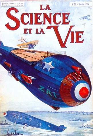
There are other sorts of air-borne airports, though they are mainly built on/in large airplanes and airships, and really don't qualify for a post on the simple rooftop airport. Perhaps it is time now for an all-inclusive Odd Places for Airports post to appear here...
For example:

The magnificent possible, 1924, saw another kind of airborne airport:
|
Gigantic and Unbuildable Buildings, Part 2: Eiffel Out-Eiffled
JF Ptak Science Books Quick Post
 This was the handiwork—that is really too demeaning—the inspiration, the dream, of Eugene Freyssinet (1879-1962), an accomplished French engineer turned architect, and widely viewed as the “father of reinforced concrete”. Freyssinet graduated from two of the most prestigious French engineering institutions (the Ecole Polytechnique and the Ecole Nationale des Ponts et Chaussees in Paris) and was really quite an innovative engineer—beautiful even. His airship hangers at Orly airport are instantly recognizable as elemental design features of concrete—elegant, useful, practical, and huge.
I don’t know what happened exactly with his design for the Paris International Exposition of 1937. The building just isn’t right—even the timing of its underlying deification of the automobile is off by decade, at least*. His effort to construct a half-mile high reinforced concrete tower with an exterior corkscrewing road for autos climbing up the building to a parking lot is just, well, off. Setting aside the difficulties in using this building material for a structure of this magnitude, there would’ve been an astonishing amount of vibration problems from the grueling efforts of the cars on the (probably) two miles of road to the top. (The image comes from the Illustrated London News for 1 June, 1933.)
And all of this effort for what was effectively the world’s most gigantic restaurant, because outside of the parking garage, that’s all this building was meant to be. The eatery would’ve begun where the Eiffel Tower stacked on top of the Empire State building would end. The room was big enough to accommodate 2000, who after eating could repair to the hotel upstairs, or who could’ve gone upstairs from there to take the rays in the solarium.
Somehow this was all supposed to cost 500,000 pounds (about $75,000,000 in today’s currency, which might by you one or maybe two ultra-swanky pre-war condos in NYC...500k pounds was only about 2 million 1937 dollars, which would've paid for 5% of the Empire State Building), Freyssinet noting that it would cost less to build than the Eiffel Tower (which would've been true if you didn't take inflation from 1889 into account). I have no idea how that would’ve worked out, given that the Eiffel was a steel skeleton and this would’ve been concrete. All told, however, none of it made very much sense, and the structure wasn’t even very pretty. 
*(Cars traveling up the outside of a building so that you can park your car in a lot 2000 feet in the air…certainly the car was king (and queen too for that matter) and that fact become new and abundantly clear, but it happened earlier, in the early 1920’s. The need to drive a car into Jove’s lap just wasn’t necessary as the world nudged its way to war in 1937.)
|
Floating River, Lonely Tree: a Little Bit on the Aloofness of Things in Renaissance Illustration
JF Ptak Science Books Post 1651

Sir Thomas Mallory (c. 1405 – 14 March 1471), translated and compiled a collection of mostly 14th century romances regarding King Arthur known and published as the Le Morte Darthur/Le Morte d'Arthur. It was first published by the great William Caxton in 14851and became quite popular, being reprinted with additions and corrections in 1498 by William Claxton and then again by Wynkyn de Worde (in 1529). It is, in its way, beautifully illustrated, or at least interestingly illustrated--I can't really say for sure if the woodcuts were done with great care or not. But their effect is significant, and, whether naive or not or careless or not or simply at the artistic limit of its executor or not, the images do have their own peculiar beauty. One that struck me in particular was this,

the "floating river", an out-of-perspective element of a very stationary world, a controlled chaos-ness in a static landscape. I'm not sure what is going on with the trees, if the blankness is a part of reflected light, or if it is a representation of spaciousness between the limbs, or if they are simple wormholes in the woodblock. Everything in the image seems to have its own sphere, locked into their own environment, existing apart from everything else.
I see the same issue with many other such works, bits dropped into place in a scene or landscape, all making their way into the viewer's mind on their own, not really a part of a cohesive whole. This may have been the intent, or again it may have rubbed up against the outer limit of what the artist (and their tools, and medium, etc.) was able to actually produce. Here's another example:
 :
:

Its another lovely, lonesome image of separates from the beautifully-named book by Bartholomaeus Anglicus All the Properytees of Thyings, which was published in Westminster in 1495 (and also known as De proprietatibus rerum, also translated as On the nature of things, or On the properties of things), and which was originally written around 1225). The book was a bestiary, a marvelous encyclopedia, a collection of all things as known in the 13th century--it would be interesting to represent all that is know today and compact it into a workable, logical, usable (printed !) book of a thousand pages. The question of organization of knowledge would be the key, of course, and how to make one flow to another complementarily as practicable...it would be an interesting project (for someone else) to try and arrange the basis of human knowledge in a finite space like that. The author of the book above organized his work as follows, in 19 books: "god, angels, (including demons), the human mind, or soul, physiology, of ages (family and domestic life), medicine, the universe and celestial bodies, time, form and matter (elements), air and its forms, water and its forms, earth and its forms including geography, gems, minerals, and metals, animals, and color, odor, taste and liquids." The 2012 variety of categories would be somewhat different.
Notes:
1. This period, from say 1494 to 1525, was one of great creativity. For example: 1494, Pacioli: Everything About Arithmetic, Geometry and Proportion; 1498, Leonardo da Vinci: Last Supper; 1500, Michelangelo, Pieta; 1504, Michelangelo: David and Bosch Garden of Earthly Delights; 1505, Leonardo Mona Lisa; 1506, work begun on St. Peter's Basilica; 1508-1512 Michelangelo paints the Sistine Chapel; 1511, Erasmus, Praise of Folly; 1512: Erasmus, De Copia; 1513, Machiavelli The Prince; 1516, More, Utopia; 1517, Start of the Reformation.
Some samples of other bestiaries (compiled by The Medieval Bestiary):
Hrabanus Maurus : De rerum naturis
Isidore of Seville : Etymologies
Lambert of Saint-Omer : Liber floridus
Brunetto Latini : Li Livres dou Tresor
Jacob van Maerlant : Der Naturen Bloeme
Konrad von Megenberg : Das Buch der Natur
Thomas de Cantimpré : Liber de natura rerum
|
Finding Surrealism in Antiquity--Unintentional Bizarreness in Plato
JF Ptak Science Books Quick Post
I was grazing through a new find, Veterum Illustrium Philosophorum, Poetarum, Rhetorum et Oratorum Imagines ...by Josseph Petri Bellorii, a lovely work illustrating great thinkers of antiquity, and printed in Rome in 1739. And among the busts and statues of Pythagoras and Euclide and Socrates and so on, the holy thinks and philosophers and orators and poets, I found this unusual non-statue of Plato. "Marmoreus Platonis Herma Truncato Capite" reads the legend of the not-completed statue, and it describes the work on many levels. Of course, the eye is drawn instantly to the center--and, well, there you have it. The surviving bit, half-survived.

Decapitated, indeed. There's a lot that could be done with "Herma", but I think the best is to take it for the root of hermeneutics--the study of the theory of interpretation--which comes from the god Hermes1, the messenger to the mortals and inventor of fire. Certainly the statue as it stands is open to discussion.
As it turns out fully 10% of the images in this book were like this one, which means I guess that finding fitfully/partially-completed statues like this of Plato was much more common than I realized. Or imagined.
I wonder what Plato would've done with this one.
Notes:
1. Hermes also had a son, Hermaphroditius, with Aphrodite, a person created with a nymph, Salmacis, creating a person endowed with the traits of both sexes.
|
Greasing the Turtle Stack: Derrida's 10-Second Sentence-Generating Machine
JF Ptak Science Books Quick Post (Part of our History of Boredom series)
(An episode in comic history in which is found a common thread in Dr. Seuss, SpongeBob SquarePants and Jacques Derrida.)
It may have been Bertrand Russell, or William James, or Arthur Eddington that this story begins with, but since the ending is the same, it really doesn't matter where it begins. The story goes like this: one of them was giving a lecture on cosmology and the idea of infinite regression, when he was suddenly interrupted by an old lady (or young man) who asserted that what they just heard was rubbish, and that the universe was supported in an ark that was traveling on the back of a turtle.
"And what is the turtle standing on, I wonder" asked Russell/James/Eddington.
"Why, its turtles all the way down" came the reply from the old lady/young man.
And that is indeed what we have here with the vocabulary of the post-moderns and deconstructionists--vocabulary built upon nothing and wrapped around itself, all the way down.

This business suffers far too much from living within its own self-defined and unaccountable vocabulary, in spite of it being a happy place where things can't go wrong because it is both simultaneously supported and crippled by "its own criterion of validity" (thanks to Walter Johnson for an utterly accurate book-tearing lesson on that hideous phrase from long ago). So just like any other belief system when something doesn't quite agree with something else, a new word/meaning is added into the stew to make everything add up to gumbo.
And so what I came to was a way of greasing the turtle stack, creating a phrase constructor for post-structural/deconstruction conversation. Even though it is entirely farcical it seems to me to make as much sense as the original. Try it and see. This would work much better with drop-down boxes and such, but I didn't want to spend very much time on this, at all. And much like Dr. Seuss' Yertle, the view seems very much clearer back down in the mud.
If I was to try to market this "program" on a plastic circular disk for $4.95 in college bookstores, the ad copy might read something like this:
Jacques Derrida’s Own, un-Patented 10-Second Homespun Intellectual Travel Kit of Words, Wordified
"Monsters cannot be announced.
One cannot say: 'here are our monsters',
without immediately turning the monsters into pets”—JD, 1979
“Words are nothing
and nothing is nothing,
then double nothing is words—JD, 1982
Caveat: the following may, or may not, be true.
Background: Jacques Derrida, Algerian-born philosopher and non-historian, came into prominence in America with his critical approach or methodology or philosophy of deconstruction. In the areas of philosophy and literary criticism alone, Derrida has been cited more than 14,000 times in journal articles over the past 17 years; more than 500 US, British and Canadian dissertations treat him and his writings as primary subjects.
History and source of the sentence-generating template: Owing to a monstrous schedule of speaking and writing it leaves little to wonder how M. Derrida infused his confusing private vocabulary. The mystery was partially solved in 1996 when an attaché case was discovered in M. Derrida’s vacated Muncie (Indiana) hotel room. Mysteriously the name tag on the old valise was that of Justice Louis M. Brandeis, but inspection of its contents revealed additional documents naming the owner as “:Mine” and “Jacques Derrida”. The valise, originally tied together with 150-year old paper, was filled with inscrutably marked papers-in-progress as well as notebooks written in non-discernable French and heavily ill-written English. Of the highest interest though was the “Word Machine” taped to the lid of the attaché, the contents of which we outline below.
Taped to the machine was the following note in which Derrida writes of himself in the third-person:
"The Hydra has many heads. You will not be able to choose between this one on the one hand, on the other that. And the play of differences between the right and the left hand that Jacques Derrida insists on in writing about Heidegger's hand disrupts the demonstrability of the properly human as the being of pointing or monstration: Hands, that is already or still the organic or technical dissipation. Nonetheless, what is pointed out or towards, what may even be handed to you (t)here is an alpha-bête, an ABC of deconstruction and Derrida, a monstrous beginning, written without hands, and with the help of many hands."
Below we offer the "monster’s" tool of arranging and affecting words into being.
“Meanings have some when their infused with the infusion of applicable privilege falsehoods which heterogenate the stratagem dilemmas of truth strangleholds. Incipient speech sensates the implied messaging of meaning of words; we and I mean to retrend those meanings discursive into their logocentric signs or irrelevant relationships. That is my journey, and by journey I don’t mean journey.” --JD, 1972
The Three Column Meaning Machine for Constructing Deconstructionist/Post-Structuralist Phrases
Simply take one word from each column, string them together, and place them in the middle of any sentence. You will instantly achieve a confused status with any listener, and create a "sentence enhancer" without needing to know the meaning of the words, just like everyone else.
(Assume that others will be confused by incorporating any combination of three-word phrases from the following constructions—just choose any one word from each of the three columns, put them together, and—voila—you’ve got the vocabulary that will confuse and delight your associates in the occasional way that Derrida did.)


Use this wisely.
Or not.
This effort was first published on utility poles in downtown Asheville, North Carolina. None of the 15 postings survived more than a day.
|
America Attacked, 1937--and the Bizarre Architectural Response to Poison Gas and the Homeless Unemployed.
JF Ptak Science Books Post 1648
[An earlier post on this blog, Mapping the Invasion of America, 1942, addressed another vision of the invasion of the United States--it is also the Most Viewed post that I've written, having been read more than 400,000 times. Try out this bit on the Invasion of America (naval, at Pearl) in 1932; see also Part II of this post, here; and consider a related post on the Nazi sub-orbital Amerika Bomber]

Philip Diamond discovered an interesting concept in "blurryness" in the pursuit of building with a purpose. In his pamphlet Should it Happen Here, self-published (and printed by the Brighton Press of Brooklyn, U.S.A.) in 1937, Diamond established a need for creating (1) inexpensive housing for the unemployed and (2) poison-gas-proof housing for Americans in general, and came up with (1.5) inexpensive poison-gas-proof housing. In blurring the lines between the two needs I'm not sure that he satisfied anyone's needs, spreading his engineering/architectural gifts jut a little (or a lot) of bit too thin.
One thing Diamond was sure of was that the next war would be governed by "one man flying in an aircraft and releasing vapors of poisonous gas for destruction" and assured his readers that in this new war "there would be no front lines". "The future war will not be carried to the front line; it will be carried to the front door." That of course was true for hundreds of millions of people in Europe and the Soviet Union and South Asia, but not so in the same sense for anyone in America--unless those Americans happened to live on a remote chain of Alaskan islands. Diamond was sure that war was coming directly to the U.S., and although he doesn't name the country/countries that would be responsible for attacking America with poison gas, he did name one of the aircraft that would come here to do that--the HE112. (The HE 112 was a prototype fighter aircraft that wasn't adopted, with fewer than 100 produced. How this would get across Europe and then across the Atlantic and then across the U.S. I'm not sure.)

Once Diamond gets to the design of his house things get a little fuzzy--and heavy./ Very heavy. HE proposed a domed structure with a foot-thick "exterior roof" and a foot-thick "interior roof" of concrete, between which would be sandwiched three feet of sawdust. The sawdust was supposed to act as both a filter to noise and soot and dust from the outside world, as well as a filter for poisonous gases.
The 5-foot thick structure would be embedded on a 10-foot thick concrete bed (for earthquake protection) and surrounded on its sides by another 10-foot concrete structure of something that I can't figure out. Not surprisingly, the author announced with a section headings that there would be "No WIndows". There would be a double entry equipped with an "air condition" that would wash folks entering the house and decontaminate the gases that might've impregnated their clothing or bodies (though Diamond says nothing about outerwear).

Once inside (charmingly referred to as "the vault") the occupants would find two bedrooms, a kitchen/dining room, and two lavatories (one "miniature" for the children, not so much for "hygiene", but to "protect the delicate moal grace amongst the children". That was the best line in the pamphlet, and about the only thing that really made any sense.)
6 million of these houses could be constructed for the unemployed, costing $3,000/each, meaning that this part of the project could be funded with 18 billion dollars. This was at a time when the New Deal was having a heart attack, unemployment was spiking again, and the entire GDP of the U.S. was $91 billion, which means that Mr. Diamond was seeking a 20% cut of the GDP pie. In current terms, that 20% would mean $3 trillion.
So far as I can determine Mr. Diamond's plan was not taken seriously.
Also, this I think is my only encounter with a title pages that starts out with the words "Sub-title".

|
Postcards to the Future--the year 2000 in 1910
JF Ptak Science Books Post 1646 [Part of the History of the Future Series]
This entry is a simple exhibit of French postcards from the edge--of the near-future. The future that they spoke to wasn't all that far away standards of change in the history of history--they called out to a history 85 years away from 1900, 85 years to the great beginning of where the future would take new and entirely different steps up from Victorian discovery and breakthroughs. There are some novel intuitions, including electrically-induced knowledge, production-line robotics, and television, but overall the thinking being done and displayed on these postcards wasn't very edgy.
Electricity, perhaps the defining improvement of the 19th century, would still be a main source of power and energy, though with new and incredible products. For example , the classroom in the year 2000 would distill information directly into the minds of students by some sort of electrically-based information crunching apparatus, which would evidently grind the good stuff from the pages of books and be electrically implanted directly into the brain. Why the machine was manually operated is a mystery.

Artificial or synthetic food--or food, at least, as we do not recognize it now, here being consumed like vitamins. Even though the food-ness of food is gone, the social ambition of replacing spent energy resources has not changed, the coming-together at the dining table remaining intact as a practice even without the demand of the time it once took to actually eat food. [Image source and notes, below.]

Continue reading "Postcards to the Future--the year 2000 in 1910" »
|
Recent Posts
- On Getting "E=mc^2" Wrong, Twice in 1.5 Square Inches
- Colossus in the Colosseum
- Birds and Human Flight
- Cross-Section of an Arctic-Exploring Balloon, 1890
- The Goubet Submarine, 1886
- A Monumental and Fantastically Bad Idea: Lowering the Mediterranean (1929)
- Two Uncommon Crowd Scenes, 1932 and 1945.
- Mathematical Exercises and Found Art
- Bridges Never Built: the Hudson River Bridge (Midtown) 1896
- An Episode in Antiquarian Depiction of Upside Down Things (1506)
Categories
- Absurdist, Unintentional (726)
- Alphabets (68)
- American History: Western Exploration & Native Americans (60)
- Anticipation, History of (407)
- Architecture and Building (239)
- Art (54)
- Art History (342)
- Astronomy (162)
- Atlas of Dead Ideas (36)
- Atomic and Nuclear weapons (181)
- Aviation & flight (296)
- Bad Ideas (504)
- Beautiful books (31)
- Biology (12)
- Blank and Empty Things; A History of (362)
- Books--Great Cover Art (57)
- Books--title pages, beautiful (35)
- Books: Great & Lost in the Dust (25)
- Books: Title Pages, Unusual (31)
- Boredom, History of (11)
- Brevity and Complexity (51)
- Calculating (59)
- Chemistry, history of (16)
- Children's Art (23)
- Circles, Geometry (6)
- Color & its advanced Abuses (31)
- Color Theory (33)
- Computer Tech/History (130)
- Contraries (11)
- Cross-Sections (51)
- Daily Dose from Dr. Odd (84)
- Economics (8)
- Electro-LUXurious (21)
- Exploration (3)
- Fantastic Beasts and Tales (9)
- Fantastic Titles (45)
- Fear, History of (21)
- Future Punk (27)
- Future, History of the (312)
- German Design (14)
- Histories of Smallness (30)
- History (2)
- History of Dots (72)
- History of Goodbye (61)
- History of Holes (68)
- History of Lines (83)
- History of Memory (32)
- History of Nothing (47)
- History of the Future (346)
- How Fast Stuff Is. (3)
- Iconography (80)
- Imaginary and Impossible, Museum of the (14)
- Impossible Books (35)
- Industrial & Technological art (171)
- Information, Quantitative Display of (618)
- Inventions (66)
- Lines, History of (36)
- Literature (2)
- Magnifcent Mundane (14)
- Manuscripts (6)
- Maps, Cartography, History of Mapmaking (250)
- Maps/Diagrams of Imagination & Ideas (174)
- mathematics, logic (111)
- Medicine, History of (180)
- Memory, Historry of (12)
- Militaria (476)
- Mistakes, The Importance of (7)
- Music (12)
- Mythology (14)
- Naming Things (147)
- Outsider Logic (98)
- Patents (59)
- Perception (187)
- Perspective (199)
- Photography (144)
- Photography, history (69)
- Physics (115)
- Picture Post/Image Dump (5)
- Piles, History of (1)
- Politics, American (3)
- Poster Series (5)
- Prints--looking HARD/deeply at (279)
- Propaganda (55)
- Psychology (20)
- Questionable Quidity (26)
- Reference Tools (39)
- Science (7)
- Social History (292)
- Sports (5)
- Statistics--Fossil, Found, Odd, Forgotten (29)
- Strange Things in the Sky (41)
- Tech-Quiz (15)
- Technology, History of (838)
- Title Page Art, Beautiful (32)
- Travel (3)
- What is It? (14)
- Women, History of (98)
- WORD art (15)
- World War I (247)
- World War II (56)
- Writing Systems (8)
- You Are There (6)
- Zoomology (25)