JF Ptak Science Books Quick Post
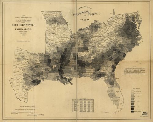
Continuing several posts on slavery made here over teh last few days is this extraordinary map depicting slave ownership in the U.S. on the county level (!) based on data from the 1860 census and then published in 1861. Titled Map showing the distribution of the slave population of the southern states of the United States. Compiled from the census of 1860, I find it an enormous success in putting all of this data on one piece of paper, especially since the proportion of slave ownership is depicted also in shades of gray so that a visual impression of the state of slavery in this country can be seen and comprehended almost instantly.
The image below is clickable and expandable; mega files are found at the originating site of the Library of Congress (link follows).
[Source: the Library of Congress: http://www.loc.gov/resource/g3861e.cw0013200/]
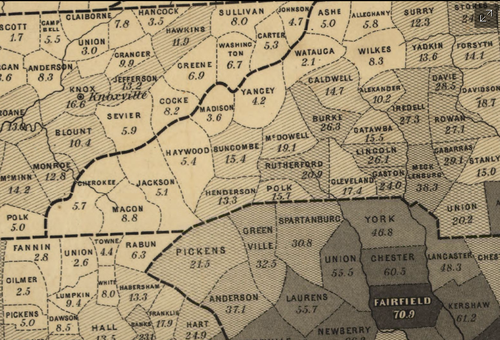
And a detail:
Adolph Von Steinwehr Hergesheimer, E. Hergesheimer, E. (Edwin) |
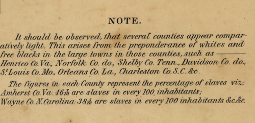
"Scale ca. 1:3,000,000.- LC Civil War Maps (2nd ed.), 13.2- "Entered according to Act of Congress, A.D. 1861 by Henry S. Graham."- "Sold for the benefit of the sick and wounded soldiers of the U.S. Army."- "Census Office, Department of the Interior, Washington, Sept. 9th, 1861. After a careful examination of the above very interesting map I am prepared to state that it not only furnishes the evidences of great care in its execution, but can be relied on as corresponding with the official returns of the 8th Census. [Signed in facsimile] Jos. C. G. Kennedy, Superintendent."- Map indicates by gray patterns, the percentage of slaves in each county. "It should be observed, that several counties appear comparatively light. This arises from the preponderance of whites and free blacks in the large towns in those counties. . . The figures in each county represent the percentage of slaves. . ."--Library of Congress website http://www.loc.gov/resource/g3861e.cw0013200/]


Comments