JF Ptak Science Books Post 2410
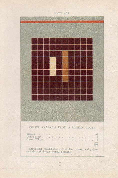
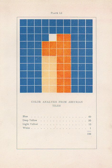
Earlier in this blog, about seven years ago, I wrote about an extraordinary book by an aesthetician named Emily Vanderpoel called Color problems : a practical manual for the lay student of color (1902). It is "extraordinary" in a narrower sense, and that "extraordinary" might not actually be positive for its original intent. The extra-intent of the book, what has come out of it for me, was something that was unintentionally accomplished by the author. The images that she used to illustrate her color theory ideas--the basis of which are not really comprehensible to me--turn out to be artwork in themselves, a found art, the artistry of the images taking over the original intention for the arrangement of their color. She winds up with beautiful illustrations all on their own, a pre-abstract art abstract art, predating the non-representational art world by 11 years.
Here's an example of her vision:
 Here are some earlier posts on Vanderpoel on this blog:
- What Color "Is"--an Unintentional Modernist Masterpiece of Book Illustration? (Here)
- Quantifying art: the Art-ematics of Roger de Piles and Emily Vanderpoel (Here)
Color theory is old and pretty—as a matter of fact there is a very attractive gathering of color theory models (in black and white, though) displaying some two dozen or more color models from the last 400 years. People like Della Porta (1593), our old friend and resident oddball polymath crank Kircher (1646), the smarter-than-you-could-imagine Newton (1660), Waller (1686), Lambert (1772), the wide ranging and again polymathic Goethe (1792), Herschel (1817, who also ushered in our understanding of the other light-sensitive shape spacing medium of photography in 1840), the semi-forgotten Chevreul (1835), the beautiful Maxwell (1857), Wundt (1874, the early experimental psychologist who also looked for spirits/spiritmus and ghosts), von Bezold (1878), Rood (1879), Munsell (1918) Kandinsky (1914 and not decipherable by me) and Klee (1924), and so on towards the present, all tried to analyze the prospects of color.
The funny thing is here is that I didn't look at the Klees, so I didn't see how much they have in common with the Vanderpoel color studies. In a way it seems that they were both after the same thing: an understanding of the object in color-sense.
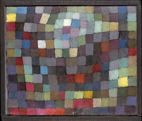
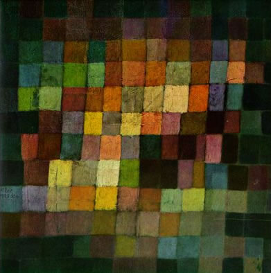
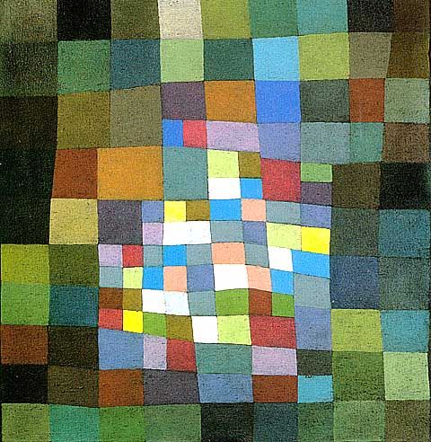
Here are some examples of Klee's grid paintings, so-called (by Will Grohmann) "Magic Squares", which weren't square and not even straight, necessarily, but they were magical, and they did generate a divisional articulation of the color field that Klee was studying. And in their way they do remind me of the earlier Vanderpoel work.
There is of course a lot that has been written on this aspect of Klee's work,by Klee himself and many others, so I'm not going down that road this morning--I really just wanted to get on board with the Vanderpoel/Klee attributions.
Maibild 1925 ("May Picture") Source: Metropolitan Museum of Art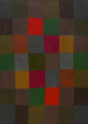
New Harmony (Neue Harmonie) 1936, via the Guggenheim Museum and the Painters Table

Comments