JF Ptak Science Books Post 1895
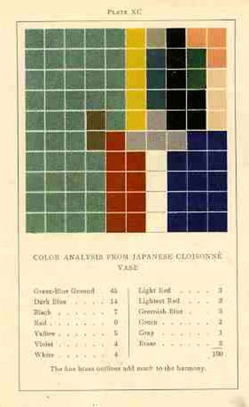
This blog has long hosted a series of posts on "accidental" or "unintended" works of pre-modern modernist art found in displays of information and statistics in the sciences and mathematics, and even occasionally in art and design. One such work--a 1904 triumph of accidental art issuing from an usunal work on color theory--belongs to an aesthetician named Emily Vanderpoel. It is extraordinary in a narrower sense, and that extraordinary might not actually be positive for its original intent--the extra-intent of the book, what has come out of it for me, was something that was unintentionally accomplished by the author. The images that she used to illustrate her color theory ideas--the basis of which are not really omprehensible to me--turn out to be artwork in themselves, a found art, the artistry of the images taking over the original intention for the arrangement of their color. She had introduced (though to no one, not really) a concept of beautifully arranged spatial color, artwork without a subject that could be recognized as any sort of natural object--non-representational art, finding publication several years before what is seen as the first inentional attempt at that genre, by Vassily Kandinsky in 1911. (Images below.) And when one strolls through the history of scientific illustration it becomes easier and easier to find such things, fabulous precursors to non-represnetational art, and Dadism, and Cubism and Surrealism.  These elements seem to be most populous in the illustrated sections of early encyclopediae, and dictionaries, and even encyclopedic dictionaries, where a number of different elements are displayed on the same page, different and generally unrelated images on the same engraved sheet, references for articles found in different parts of the book.
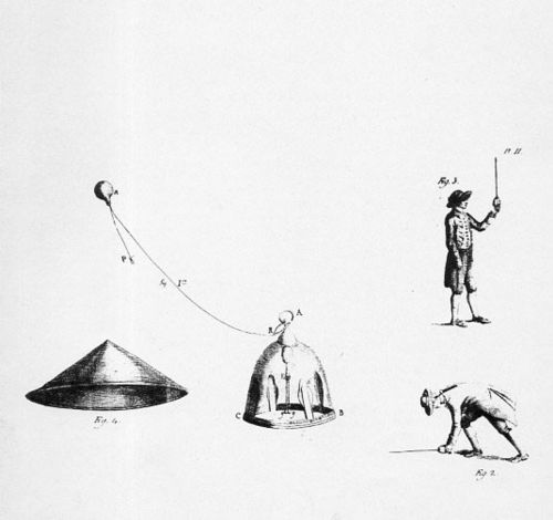
Here is a good example of that, with unintentional Surrealist images found in the image refernce pages of Horace Benedict de Saussure's Voyages dans les Alpes....(published in Neuchatel in 1803):

[There are a number of other examples that I've written about on this blog: here, for example, in "On the Paper Sculpting of Nothing".]
And then there are examples like Vanderpoel, where the entire image from one sheet is the pre-modernist image in question--to my experience this is the more uncommon occurrence.
Which brings us to today's installment: the infographic displays found in Francis Walker's Statistical atlas of the United States based on the results of the ninth census 1870 with contributions from many eminent men of science and several departments of the government, which is the atlas of data to accompany the 9th Census of the United States, published in 1874. This is a beautiful work, and a pioneering challenge. Walker was one of the earliest to produce a statistical atlas, and was perhaps the earliest to display this huge and broad amount of data in so many different ways--it must have seemed a semi-miracle to see the information displayed so, like going froma black & white television to color, or color to infared, and so on. It may well have represented anentirely new way of looking at data.
The first image (above) in this post is from the illustration showing proportions of the white/non-white population, and the following image shows a detail of that, offset against Mark Rothko's 1959 Black on Maroon.
|
Francis Walker's statistical mapping, above, 1873; Mark Rotko, 1959, below: |

[Black on Maroon (1959) by Mark Rothko, part of the Seagram mural series, via Tate Modern.]
The first and third images are details from this full-page illustration:
It is easy to see the similarities between the data display and the Rothko, though it would really not be within anyone's power to identify the Walker diagrams as "art" in the modern sense for another five decades. But it certainly seemed there, ready to be of influence and service, though I'm not aware offhand of artists being influence by these images as they were with, say etienne Marey's photographs. I'm not sure that these statistics images ever came into the service of art in the beginning of the modern era. And maybe that's the biggest question here.
Sources:
- Guide to National Atlases: here.
- The Walker atlas for the 1870 census from the LC site: here.
- And an improvement on the Library of Congress presentation, by HandsomeAtlas (Brooklyn Brainery): here.


Comments