JF Ptak Science Books Post 1380

It is a hallmark in displaying ideas and information that brevity, design and clarity carry the day. For this reason we have the Pie Chart (happily invented by a very ingenious and polymathic idea-experimenter in the form of William Playfair in 18011), and not the Enormous Cake Chart, which had been baked previously for hundreds of years in the ovens of Raymond Lull2 (and those he influenced) and then to a lesser degree by Giordano Bruno. The entwined, overlapping combinatorial diagrams that were initiated by these folks didn't really start to get straightened out until the ideas were in the hands of Leibniz and Euler, and then prettily and usefully, finally, by Playfair. It was through the 19th century that the pie chart began it great ascent in the hands of Guerry and Lalanne and Nigthengale, and then on to Jevons, and then on into modernity. But the thing that made these contributions significant was the amount of information they were able to easily and cogently display.
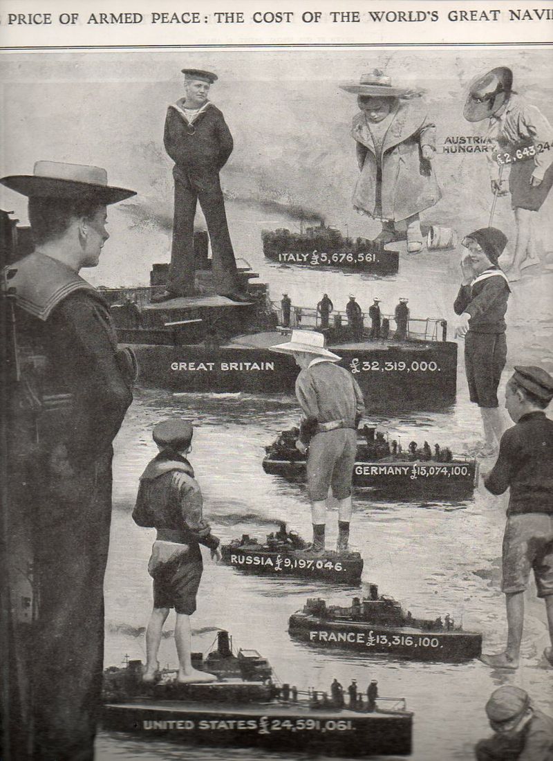
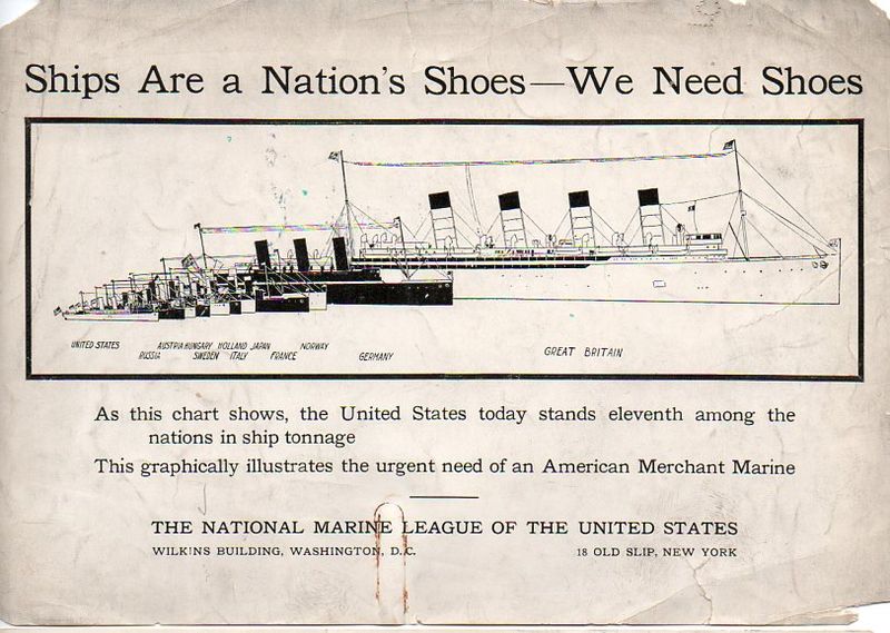
The pie chart could definitely have been used in these two displays, below--the information was certainly simple enough, and the comparisons easy. But there was a certain genius to displaying the data using children and shoes that enabled the information to ride along with its viewer deeper into the future than if it had simply been encrusted in circles.
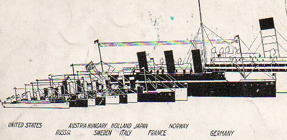
For example, in the first image, a full-page illustration from The Illustrated London News for 21 August 1909, "The Price of Armed Peace, the Cost of the World's Great Navies", displays the size of expenditure on leading navies in terms of children's toy boats. I am positive that the lasting image here would've been the size of the German toy gunboat compared to the dreadnaught of Great Britain. Likewise the ships/shoes comparison of the next image, published by the National Marine League of the United States, a sort of PAC for the merchant marine. They simply state that ships are the nation's shoes, then interlace a graphic showing the paltry showing of American ship tonnage compared to 10 other leading maritime nations, and then simply state that "we need shoes". The graphical display shows vividly that the United States' total ship tonnage was tiny--eleventh of eleven powers--but the bit that would no doubt stay in the heads of any readers was the shoe part, which would then be associated with the diagram, which on the face of it was a little muddled and not clear. This was a smart sales job, delivering a brisk message that would not be befuddled by numbers--it wasn't that the U.S. ranked 11th in total maritime tonnage against other leading powers, it was that we needed shoes.
Notes
1. Playfair wrote his Statistical Breviary in London in 1801.
2. For example in his logic machines as seen in the Ars Magna.


Comments