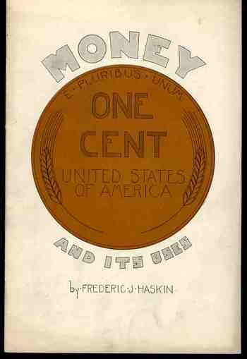
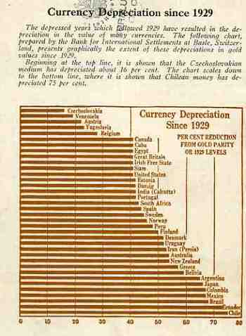
I initially chose this pamphlet to be part of a larger series on terrific/unusual/bizarre cover designs--unfortunately its contents got in the way, a little. The cover still borders safely on the unique, and so does most of its contents, except for the graphical analysis of the depreciation of worldwide currencies that appears on its back cover. Here the information is actually pretty useful and unusual. It would've been more useful had the author included an end date for his comparisons--all we know is that he is looking at 1929 and the beginning of the Depression as a jump-off point, and we can assume that the end date is before the date of publication of the pamphlet (which actually isn't stated). Still, the graph is almost very useful. It is for this reason that Money and its Uses Winds Up in the "Blank and Empty Department" for its diligent but ultimately useless graphical display of data.
The Fine Print
Recent Posts
- On Getting "E=mc^2" Wrong, Twice in 1.5 Square Inches
- Colossus in the Colosseum
- Birds and Human Flight
- Cross-Section of an Arctic-Exploring Balloon, 1890
- The Goubet Submarine, 1886
- A Monumental and Fantastically Bad Idea: Lowering the Mediterranean (1929)
- Two Uncommon Crowd Scenes, 1932 and 1945.
- Mathematical Exercises and Found Art
- Bridges Never Built: the Hudson River Bridge (Midtown) 1896
- An Episode in Antiquarian Depiction of Upside Down Things (1506)
Categories
- Absurdist, Unintentional (726)
- Alphabets (68)
- American History: Western Exploration & Native Americans (60)
- Anticipation, History of (407)
- Architecture and Building (239)
- Art (54)
- Art History (342)
- Astronomy (162)
- Atlas of Dead Ideas (36)
- Atomic and Nuclear weapons (181)
- Aviation & flight (296)
- Bad Ideas (504)
- Beautiful books (31)
- Biology (12)
- Blank and Empty Things; A History of (362)
- Books--Great Cover Art (57)
- Books--title pages, beautiful (35)
- Books: Great & Lost in the Dust (25)
- Books: Title Pages, Unusual (31)
- Boredom, History of (11)
- Brevity and Complexity (51)
- Calculating (59)
- Chemistry, history of (16)
- Children's Art (23)
- Circles, Geometry (6)
- Color & its advanced Abuses (31)
- Color Theory (33)
- Computer Tech/History (130)
- Contraries (11)
- Cross-Sections (51)
- Daily Dose from Dr. Odd (84)
- Economics (8)
- Electro-LUXurious (21)
- Exploration (3)
- Fantastic Beasts and Tales (9)
- Fantastic Titles (45)
- Fear, History of (21)
- Future Punk (27)
- Future, History of the (312)
- German Design (14)
- Histories of Smallness (30)
- History (2)
- History of Dots (72)
- History of Goodbye (61)
- History of Holes (68)
- History of Lines (83)
- History of Memory (32)
- History of Nothing (47)
- History of the Future (346)
- How Fast Stuff Is. (3)
- Iconography (80)
- Imaginary and Impossible, Museum of the (14)
- Impossible Books (35)
- Industrial & Technological art (171)
- Information, Quantitative Display of (618)
- Inventions (66)
- Lines, History of (36)
- Literature (2)
- Magnifcent Mundane (14)
- Manuscripts (6)
- Maps, Cartography, History of Mapmaking (250)
- Maps/Diagrams of Imagination & Ideas (174)
- mathematics, logic (111)
- Medicine, History of (180)
- Memory, Historry of (12)
- Militaria (476)
- Mistakes, The Importance of (7)
- Music (12)
- Mythology (14)
- Naming Things (147)
- Outsider Logic (98)
- Patents (59)
- Perception (187)
- Perspective (199)
- Photography (144)
- Photography, history (69)
- Physics (115)
- Picture Post/Image Dump (5)
- Piles, History of (1)
- Politics, American (3)
- Poster Series (5)
- Prints--looking HARD/deeply at (279)
- Propaganda (55)
- Psychology (20)
- Questionable Quidity (26)
- Reference Tools (39)
- Science (7)
- Social History (292)
- Sports (5)
- Statistics--Fossil, Found, Odd, Forgotten (29)
- Strange Things in the Sky (41)
- Tech-Quiz (15)
- Technology, History of (838)
- Title Page Art, Beautiful (32)
- Travel (3)
- What is It? (14)
- Women, History of (98)
- WORD art (15)
- World War I (247)
- World War II (56)
- Writing Systems (8)
- You Are There (6)
- Zoomology (25)


Comments