JF Ptak Science Books LLC Post 253
I'm sorry to report that the publisher and beneficiary of this
brilliant 1940's advertising art--General Electric--swallowed up the
identity of their artist. Nowhere in the 1942 publication with the
Huxleyesque title of Electronics, a New Science for a New World is
there any mention of the poor artist who gave vision to this retread
idea...or retread if you don't consider the "electronics" part. Yes,
the art is a little removed and slightly, spatially, naive; and the
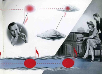
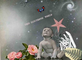
colors are too much and the symbolism too big (there's allot of host of hosts stuff, offerings up to the big sky),and the images are a little ridiculous, but they are jolting (for good or for ill) and it really does speak for its time. And in 1942 electronics was just about to come to the rescue and save World War II: from tracking aircraft for anti-aircraft weapons to RADAR to the development of computers to the Enigma to the development of the atomic bomb, and on and on, "electronics" did ride in on a white horse to save the day. I can understand perfectly well the sentiments exhibited in these fabulously bombastic illustrations: the extraordinary power of radio and the beginning of television, the beautifully rendered hands on the front cover (the shadows on the fingernails are done very well) holding the electronic chalice, the baby and the butterfly (and all of that other weird stuff strewn about); all are getting ready for the bigger world that was coming as the beneficiary of this electronic revolution. And, as a matter of fact, no one really had a clue as to what was coming--that baby would be retiring now, and the changes that occurred during its lifetime are so supremely removed and incalculable from 1942 that it makes even the vast hope exhibited in these electronic icons seem mild. It also makes me wonder about what brave oceanic beliefs and expectations of the future that we have today will look common and sugary (or saccharin, or whatever) in the year 2074.





The cover is much like the art on religious tracts ... the kind with blue skies and smiling nuclear families (father, mother, one boy, one girl) and carnivores and ungulates living peacefully side by side. The last used to p*ss me off until I decided to interprete it as merely a peaceful "moment," when the ungulate is grazing and the carnivore is just lying there waiting to be hungry, which is what they do most of the time. Anyway, it's probably not worth the effort, but it would be interesting to know if this pamphlet played on an existing sensibility in religious commercial art or if came from a secular sensibility that leaked into the religious art. You can still see this today in religious tracts, albeit it with the addition of a certain latte hue to include people of color.
Posted by: Jeff | 10 September 2008 at 10:50 AM
You're right, Jeff! Now that I think about it, this odes remind me of the religious track-bric-a-brac of this period. There is a major exception, though--this pamphlet doesn't *smell* like one of those others. This one is actually a pretty high-end production, all glisteny-like and slickee. But I can defintely see where you're headed...
Posted by: john ptak | 10 September 2008 at 11:52 AM
I think the artist was Herbert Bayer
Posted by: Ian Heller | 18 October 2009 at 07:21 PM