JF Ptak Science Books Quick Post [Partof the series on the History of Blank, Empty and Missing Things]
This is a good example of one of those "mysteries" which seem hardly so when you find the very straightforward answer. The appearance of this floating "a":
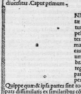
The non-mystery is a product of a chapter beginning in a beautiful and very early (1476) printed edition of Aristotle's De animalibus. At first glance it looks like it might be an attempt at design/spacing, an illustration in a modern Dadaist vein, capturing space and attention while using hardly anything at all, a simple floating letter, an intentional placement of an object in an unusual field. It is that, in a very minor way, but the attention-getting device was used to gather up the focus of only one person. The little "a" is simply a place-holder, waiting for the the next stage in production of the book, for the rubricator to come in and decorate the space with a magnificent/articulated/flourishing capital "A", which was the practice of this time.
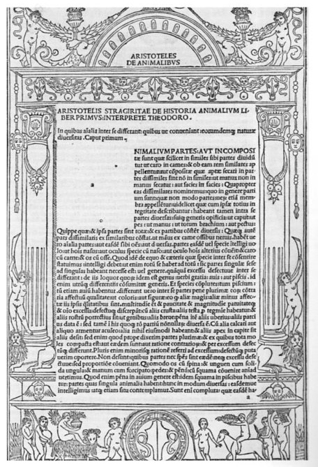
The reason why rubricated letters weren't printed with the rest of the book is that in general the initials (and intricate coloring) were too complex and too colorful to be a product of the press. (The first Gutenberg book appeared in 1456 and although the first printed color appeared in the next year from the press of Fust the practice of multi-color printing with any sort of intricate application would take until the first third or so of the 18th century.) The artist responsible would come in and work on these sheets calling for decorated capitals before the book was bound--the letter "a" was there as a reminder for the work to be done--it also was the only way some of them knew what needed to be painted, as not every rubricator could read (thought they knew the letters of course).
Continue reading "History of Blank and Missing Things: Letters" »


