A Daily History of Holes, Dots, Lines, Science, History, Math, Physics, Art, the Unintentional Absurd, Architecture, Maps, Data Visualization, Blank and Missing Things, and so on. |1.6 million words, 7500 images, 4.9 million hits| Press & appearances in The Times, Le Figaro, Mensa, The Economist, The Guardian, Discovery News, Slate, Le Monde, Sci American Blogs, Le Point, and many other places... 5000+ total posts since 2008.. Contact johnfptak at gmail dot com
I came upon this table of the heights of structures while looking for another chart showing the heights of mountains and the lengths of rivers, with the lengths of rivers nestled between the mountains in an upside-down pyramidal mountain form in the sky--yes, it is a striking design. In the attempt of not finding a good copy that could be downloaded and shared there was however success in the serendipitous find of the following print:
SOURCE: I was happy to find this at the tumblr account of Atlas of Affinities: http://atlasofaffinities.tumblr.com/image/76306197926 Barbie du Bocage, "Tableau Comparatif de la Hauteur des Principaux Monuments", 1852.
The color isn't quite right but that came as a result of manipulating the sharpness and clarity (and contrast) to make the legend somewhat more legible than in the original, which wasn't a very chunky scan. In any event there is a clearer image if you click on this, and I'm pretty sure that all of the numbers and structures are reasonably legible.
There are hundreds and hundreds of pamphlets like the one below in the store's Outsider Collection--honest work that somehow has gone a little astray, or over-the-side, or reached too high, or fell too low, or some such thing. Sometimes I read in the work a little, and sometimes not--the present pamphlet is in the later category, which means I really have no idea what the author is channeling, except that I know it is fairly evangelically religious and capitalist. I don't know why the human head profile is on the cover, and I also don't know what it means. But no doubt it was something encapsulating, something representative to the work as a whole, otherwise it (probably) wouldn't be there. If I was 25 years old I might stop to read the 193-page work a little; but I'm not, so I won't.
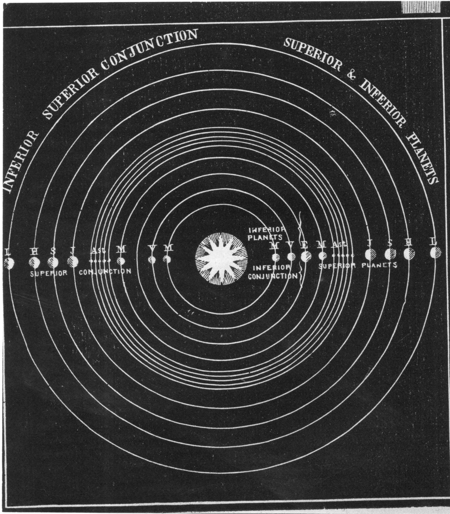
I was looking through some of the astronomical prints here and came upon this lovely piece of frammento, a bit detached from its source. I think it may be from Elijah Burritt's astronomical atlas, but probably not. From what I can tell my guess for the source is the U.S., mid 19th century--or at least after 1846 when Urbain Le Vernier brought its mathematically-suspected existence into the world, and as we can see in the chart Neptune is clearly included in the realm of the planets. In any event the image is very striking, and it does its job.
During WWII the Allied forces engaged in extraordinary subversive and hearts-and-minds psychological warfare against the Axis military machine and its population. The mechanics of the effort undertaken by the OSS and other agencies is long and complex (and potentially confusing) and too much for getting into right here, though I did want to address one example of their work. This comes in an archive that I have here (formerly part of the "Pamphlet Collection" at the Library of Congress) and is a single-sheet newspaper leaflet printed to be dropped from planes on the enemy lines. Nachrichten aus der Heimat ("News from Home") was made to resemble, well, news from Germany that just wasn't being disseminated, like the report of Berlin under attack) and other unflattering military news that was intended to weaken the will of the soldier to fight and the civilian to support Hitler's regime. This issue, dated 17 April 1945, also carries a short notice regarding the Buchenwald concentration camp ("Kz", Konzentrationslager, one of 1000+ that were built from 1933-1945 by the Nazis) that comes six days after its liberation. Beginning in early April 1945 the camp (along with many others) was partially evacuated in an attempt to cover up the activities there, the result being many thousands of deaths due to prolonged marches and executions. On the morning of 11 April there was a revolt by some of the remaining prisoners--as stated in the published note below--who were able to seize control of the camp; elements of the 3rd Army 6th Armored arrived at the camp and liberated it later that afternoon. There were still 23,000 people at Buchenwald at that time, and the condition of the prisoners and the camp were appalling.That part however was left out of the Nachrichten report--only the revolt part of the liberation is mentioned, while the nature of the camp and its "political prisoners" was left unspoken. Why this is the case I do not know--perhaps the forces at work in crafting the propaganda thought it not-expedient to mention the horrors for teh consumption of the German soldier thinking that might play against a willing to surrender/cooperate. The story of the liberation of the camp was the main thrust of the intelligence, showing another part of the Reich collapsing and failing. The Holocaust would have to wait.
All that said the rest of the world would find out about Buchenwald right away. Edward R, Murrow was the first reporter there on the 12th, and on the 15th he reported on the radio exactly what he saw there--it is a very powerful piece of reporting. Murrow actually moves to the first person viewpoint to do most of the report--something that "the reporter" certainly would not do.
For text of the Murrow report see: https://www.jewishvirtuallibrary.org/jsource/Holocaust/murrow.html and another http://www.scrapbookpages.com/Buchenwald/Liberation3.html ("If I have offended you by this rather mild account of Buchenwald, I'm not in the least sorry....")
Murrow's radio broadcast can be heard here: https://youtu.be/1o-CUOiKCCg
A few days later Eisenhower and Patton and a host of others toured the Ohrdruf concentration camp (a sub-camp of Buchenwald)--their visit was graphically reported by the Illustrated London News on teh 28th of April--you can see the story here: http://longstreet.typepad.com/thesciencebookstore/2008/09/eisenhower-at-t.html
This one piece is part of a 164-item propaganda leaflet collection that my bookstore is selling--here's a link to the full collection:http://longstreet.typepad.com/books/2016/04/wwii-psychological-operations-leaflets-and-related-materials-january-april-1945.html
This lovely pamphlet has a design that seems to me deeper into the modern future than it was--it seems a product more of the 1930's and perhaps into the 1930's than the 1909 item that it is. The pamphlet was on a proposed gyro-monorail, a project funded by publisher August Sherl (1849-1921), who had the idea for constructing separate high speed (200 kph) rapid transit lines while maintaining existing rail for shipping. But as sleek and as stable as it may/might be, the gyro-monorail is one idea that never really got past prototypes and development, as was the case with Sherl's project, which did actually get to a full-size prototype which was demonstrated in Berlin, but the idea did not flourish, and the project was cancelled.
The use of aircraft in bombing was relatively new in WWI, and not terribly effective. And then, so was the defense against raiding aircraft--anti-aircraft, massed riflemen, searchlights, listening devices, all very new to the conduct of warfare, as were the airplanes and airships that ground forces were protecting themselves against. I was thinking about this just now after having seen the (following) short notice in the April 1918 issue of Popular Mechanics (with the text following the images, below). The diagram shows a version of an early warning system against incoming aerial assault, which was quite a good idea, complete with a central directorate to coordinate a response to the attack.
The "listening posts" were exactly that, a sort of biological-analog to RADAR--large bellow-like acoustic imaging objects that would collect distant sound and "download" themselves into the ear of the listener:
It is extraordinary that from the time of the Wright Brothers' first powered flight in 1903 that just 15 years later a casual reader could find an article on how to construct your own airplane at home, which is a long leap from a first-in-history to building-your-own-in-the-garage. And that's really not fifteen years--development was rather incremental until about 1908 or so, so the tremendous growth period was probably about a decade. Of course, developments in aviation were accelerated during the war, and that in general revolutions in thought were occurring within nearly every discipline (in that magical period of 1895-1920), but still, it stopped me to see this five-page article ("A Scout Monoplane, Built in the Home Workshop" by George D. White) in the pages of Popular Mechanics for June, 1918.
The article starts off with a very useful dictum, announcing one of the "prime necessities" for building any type of airplane is "first, the greatest simplicity without weakness". which can be applied over many areas. Then in short order the author gives instructions on construction for a 35 h.p., 575-pound load aircraft 10' long with a 30' wingspan.
I found a small notice in the September 18, 1877 issue of Scientific American on employing the following chart for an eye exam--and I just liked the big B and thought to share it. (The original measures 1.5x2.5 inches.) That's it!
It is interesting to see this ad for the beverage that is the grace of the gods, using the Spitfire as a comedic backdrop to the stout. The ad appeared in the Illustrated London News on November 29, 1941, a year and a month past what is recognized as the end of the Battle of Britain (July 10, 1940-October 31, 1940). The facts and figures on the battle read less than the actual scope of the victory by the Brits in their defense of the U.K. by the R.A.F. On the British side there were 1542 RAF killed (Fighter/Bomber/Coastal Commands) with 1547 aircraft destroyed; the Germans lost 2698 killed, 967 captured , 638 missing, with a loss of 1887 aircraft. The civilian deaths and wounded was high: 90,000 casualties including 40,000 killed. It was a decisive victory for the U.K. and a costly loss for the Nazis.
This is what Winston Churchill famous said at the beginning of the great trial:
"What General Weygand has called The Battle of France is over. The battle of Britain is about to begin. Upon this battle depends the survival of Christian civilization. Upon it depends our own British life and the long continuity of our institutions and our Empire. The whole fury and might of the enemy must very soon be turned on us. Hitler knows that he will have to break us in this island or lose the war. If we can stand up to him, all Europe may be free and the life of the world may move forward into broad, sunlit uplands. But if we fail, then the whole world, including the United States, including all that we have known and cared for, will sink into the abyss of a new Dark Age made more sinister, and perhaps more protracted, by the lights of a perverted science. Let us therefore brace ourselves to our duties, and so bear ourselves that, if the British Empire and its Commonwealth last for a thousand years, men will still say, "This was their finest hour". — Winston Churchill, June 18, 1940 For the full text see: http://www.winstonchurchill.org/resources/speeches/233-1940-the-finest-hour/122-their-finest-hour
In any event, the comfort level was high enough for the Guinness folks to use a Spitfire in their ad:
Here's the entire (30 minute) speech--the part I quote above is the last paragraph of the speech:
This yellow is similar to the cover of Dr. Seuss' One Fish, Two Fish..., the color yellow symbolizing courage/nobility in Japan, wisdom in Islam, and a deity-color in Hinduism; the color so fond of many great writers like London and Doyle, and Harte and Stevenson that they employed in in titles of the books. The favorite color of Van Gogh1, and perhaps not-so-favorite of Shakespeare (appearing in references to bile and melancholy and falling leaves), it is usually a positive color--except that it also can signify cowardice, ego, caution, and illness (malaria, jaundice).
And so, yellow. The yellow here is a color of soil, and a beautiful yellow it is, the chart a piece of found-art in itself, a found-Abstraction. It actually was published in the Atlas of American Agriculture, lithographed by A. Hoen, and published in 1936--a particularly bad year for U.S. western soils.
And a detail:
Notes:
1. The Van Gogh museum's "Van Gogh Letters" is a must-visit if you are interested in his correspondence. http://vangoghletters.org/vg/ Actually the word "green" pops up about 15% more often than "yellow" as the most often mentioned color in the correspondence, though I think that the scholars say that his favorite color hands-down was yellow.
[Source: Women of Imperial Italy, by Alice Seelye Rossi; printed in Rome, 1937.]
Not anymore. Probably not so much in 1937, though I am sure that the picture of the "fascist" in the "fascist Woman" was prettier and rosier than what people would come to know by 1942. In 1937, when this pamphlet was published, the "women" were broadcasting far and wide--one aspect of radio propaganda from the Fascists in Italy, a hearts-and-minds attempt at a part of the coercion of Italia imperiale that occupied the years 1935 until the end of the war. By 1937 Mussolini's National Fascist Party (in power since 1922) had extended itself by occupying Libya and by invading Ethiopia; Albania, Greece, and Yugoslavia would come between 1939-1941, as would France, when Italy entered the war in 1940 and entered into the country at the tail-end of the German invasion. So the broadcast heard here in 1937 was the beginning of Italy looking for the "Fourth Shore", and deep into Mussolini's Fascist state. (Ezra Pound would also do his level best to look the part of traitor that he was, lobbying the Italians for years before being allowed to get on the air to broadcast to the Allies on his misunderstood and inscrutable economics, vicious and virulent anti-Semitism (offhandedly addressing the U.S. president as "Franklin Delano Jewfeld/Jewsevelt"), and general attempts to tell the U.S. population to not support the war effort against the Fascists and that instead they should be down on their knees praising Mussolini, who he saw as another Thomas Jefferson. And so on.)
I've shared the few pages in this brief pamphlet on the Fascist Woman as it appears in the pamphlet. For the great majority of people living in the U.S., Europe, Great Britain, Australia, New Zealand, Canada, and many other places, the idea of the "fascist" would change dramatically in about a year, and then spin its grinding way downward until the start of the war in 1939.
Some of the most interesting Found-Art images in the history of science belong to astronomy, and within that, some of the most expressive and least-populated images of great appeal and haunting beauty are for early images of comets. And so it goes for this ("tinted") engraving of Biela's Comet, which illustrated an article by London-born W.T. Lynn (at the time with the Royal Observatory, Greenwich) which was published in the April, 1867 issue of The Intellectual Observer. The comet was named for Wilhelm von Biela who discovered the periodic nature of the comet (6.6 years, it had been identified as early as 1772), and had disappeared by the 1850's, but not before breaking up into at least two large pieces, which is what we are looking at below:
This is one of four images from the May 25, 1895 issue of Harper's Weekly, and they show eight different views of before-and-after photos of filthy city street cleaned up and maintained by the Civil War vet Colonel George E. Waring. Waring (1833-1898) was also an engineer and a sewer pioneer, and was responsible for instituting a real department of sanitation in New York City. To that end he hired some 2000 men and put them in white uniforms to perform their functions--the uniforms gave the workforce a dignity and also made the population at large aware that there was a serious and dedicated effort to clean the city--it was a brilliant success.
This story is told in the six pages (located below) from the great social observational/photo-documentarian Jacob Riis' The Battle with the Slum (1902) describing Col. Waring's efforts to clean the streets of Lower Manhattan. Riis is vicious with his treatment of the Tammany political machine for not undertaking any real effort to reduce the amount of street waste/filth, and heaped much praise on Waring, who he declared as the first to open the slums up to the light. That is just about right, and probably understates the case somewhat, as he was responsible through these efforts in saving the lives of thousands of people and improving the living condition for most of the city, in general.
Evidently the photos from Harper's are sometimes credited to Riis, though evidently it seems that the experts say he only used these images made by someone else for his 1902 book. No matter--Riis did much else.
"Keep then the sea which is the wall of England, and then is England kept in Gode's Hand, so that fore anything that is without, England were at peace withouten doubt."
This fantastic three-foot-long panorama was published as a folding centerfold for the Illustrated London News Supplement of May 30, 1942. By the middle of 1942 I think it was pretty clear that Germany could not hope to compete with the U.K. in the production of ships, and especially in the area of submarines, where the Luftwaffe demanded and received the lion's share of resources necessary for construction.The Battle of the Atlantic was being won, the blockade was working and intact, and the U.S. had entered the war militarily. No doubt it was a good thing for the reader's of this popular magazine to be reminded of their stellar naval history at this point of the war. There are 45 ships and boats on this panorama, ranging from the times of Alfred the Great to the King George V.
There were two images that I came across tonight in the studio as I was chasing Pooches the Cat/Dog--they're not quite on the opposite ends of themselves on the compass rose, but they are certainly in the neighborhood. I like it though that they came to me by chance, one after the other. One is very, very flat; the other is very "full", and has a large sense of dimensionality. The first is a 1832 woodcut of a 1648 rendering of Ponterfract Castle. Although perspective had been discovered (or rediscovered at 250 years earlier, the image has a Medieval taste to it, as we see both two- and three-dimensional representations together in the same image. I think that most of that was done by design and the print was dual-purposed--first to show the plan of the castle and then secondly to show the fortifications and some buildings in elevation. The overall effect I think portrays more flatness than not.
The second perspective is something that I've always thought had a deep depth for a piece of paper. My copy is simply a loose engraving, bought years ago at Pageant Book Shop in Manhattan--a stray bit in a "sciences" bin or some such, and I've had it ever since. Again I'm not sure of its origin but my guess is that is is English from a popular science dictionary or geological text 1825-1850. It just has a great perspective--plus it also looks as though we've just surprised it, a little. It is a Megatherium ("giant/beast") and was discovered first in 1788 by Manuel Torres and then assembled in the next year by Juan Bautista Bru, who evidently made the first illustrations of it. An engraving of the magnificent mammal appeared in the second edition of Georges Cuvier’s Recherches sur les ossemens fossiles, (1812)which was a justifiably iconic image, though I like this little and odd-perspective one from above better.


