JF Ptak Science Books Post 2515 [Part of the Atomic and Nuclear Weapons Series]
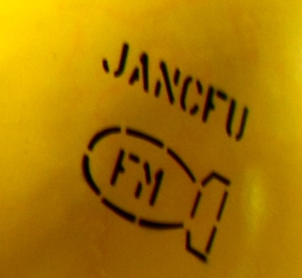
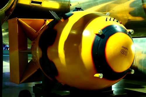
Somewhere between transporting the Fat Man bomb to the loading lift and raising it up into the bomb bay of Major Charles Sweeny's B-29 Superfortress Bockscar, it acquired a stencil-painted acronym: JANCFU, right on its nose.
[Source: http://military.wikia.com/wiki/Fat_Man]
It was black on a bomb painted mostly yellow, a zinc-chromate yellow. The yellow similar to the cover of Dr. Seuss' One Fish, Two Fish...; the color yellow symbolizing courage/nobility in Japan, Wisdom in Islam, and a deity-color in Hinduism; the color so fond of many great writers like London and Doyle, and Harte and Stevenson that they employed in in titles of the books. The favorite color of Van Gogh1, and perhaps not-so-favorite of Shakespeare (appearing in references to bile and melancholy and falling leaves), it is usually a positive color--except that it also can signify cowardice, ego, caution, and illness (malaria, jaundice). It is also the color of the Star of David worn by Jewish people living under Nazi-occupied/controlled places/
Fat Man was yellow. But it was yellow because like a fire truck it was the easiest and quickest thing for the eye to register, and what needed to be registered with Fat Man was its trajectory on its way down to detonate 1640 feet above Nagasaki.
JANCFU, painted or airbrushed on the nose of the bomb at the last moment, or so it seems, stood for "Joint Army Navy Civilian Fuck Up".
It was hardly that. It was like another yellow--Yellowstone--but of a different sort of indescribable awesomeness, this more like an impending enormity, too large to be known.
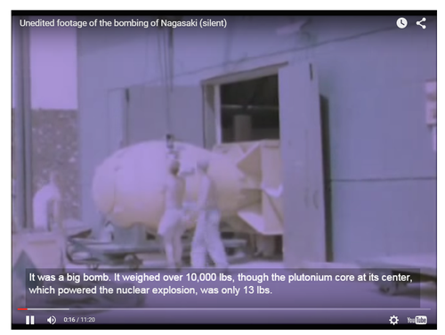
[Source: Business Insider, For the video, see here: http://www.businessinsider.com/nagasaki-raw-video-2014-2 The article is worth the read, but if you just want the video, scroll to the end.]
Notes:
1. The Van Gogh museum's "Van Gogh Letters" is a must-visit if you are interested in his correspondence. http://vangoghletters.org/vg/ Actually the word "green" pops up about 15% more often than "yellow" as the most often mentioned color in the correspondence, though I think that the scholars say that his favorite color hands-down was yellow.
John Coster-Mullen's Atom Bombs: The Top Secret Inside Story of Little Boy and Fat Man must be the most complete description of the bombs ever published. And it was accomplished by the relentless study of the "nuclear archaeologist" Mr. Coster-Mullen, a truck driver by trade who had no formal education in physics or metals or engineering. He produced not only this remarkable work, but also created a life-size nearly perfect replica of Fat Man. I'm pulling up this reference because in there Coster-Mullen states that it was Project Alberta engineer Harlow Russ who painted the JANCFU on the bomb. There was other stuff written on the bomb, but nothing quite so surprising, or shocking, than this. Perhaps the small tattoo underneath the acronym is almost as shocking, but not really--the Fat Man bomb profile with the letters "FM" ("Fat Man") in the interior of the design has its moment of shock/recognition, as though any identifier was needed for the thing. (It is like the surgeon circling the correct kidney he needs to remove, drawing on their patient--just in case there was any confusion, this stencil assured everyone that this was indeed what it was.) See this great article in The New Yorker about Coster-Mullen, here.


Comments